Pop Up Pink (Part 1)

IMG_8280

Tuesday night was the Pop Up exhibition of Pink inspired by and a result of the ‘Pink’ talk for Colour Studio Northumbria (http://colourstudionorthumbria.weebly.com/). These are weekly conversations mostly led by fellow course mate Rebecca Gavigan. Having led one this week myself on the topic of ‘Time’, I am even more in awe of how she puts them together – especially on a weekly basis with everything else we have to contend with as final year students. Other students and tutors have also led talks  and it’s a really interesting mix of topics that are discussed including things like laughter, material, chance, etc.

IMG_8281

So it was really exciting to see one of the talks mould and shape an exhibition. One of the primary focuses of the exhibition was the motif of ‘shifts’ due to the development of our conversation during the Pink Talk. We covered and shifted across so many different topics that it seemed appropriate to incorporate this aspect into the exhibition. Whilst researching in preparation of the talk I kind of hit a wall. As I have an incredibly girly girl sister, it is difficult for me to look at pink in a way that surpasses my sister’s excessive use of it! I’m not saying that’s a bad thing, I love that when I think of her a colour instantly springs to mind, I think that’s a beautiful way to visualise someone you love. However, it did mean I had to try really hard to distance myself from those associations in an attempt to research more broadly.

IMG_8282

‘Transfer’, Sue Spark, Highlighter and oil on paper, 2016

The Pink Talk was mainly questioning the ‘art pink’ that is so present in the art world today. If you look at art thinking about pink you really do start to notice it’s presence everywhere. Whether it’s a pastel pink, a funky neon pink, or a muted dirty pink; all sorts of variations can be found in different places and across artistic practices. Even in catalogues and publications, pink really is the ‘in’ thing! I can’t tell whether or not I’m surprised it has become a trend, I suppose given the conventional associations of the colour all of these interpretations are an attempt to redefine what pink can be. 

IMG_8286

‘Untitled Slants’, Charles Danby, Acrylic, oil, pencil, ink, magazine, highlighter, paper, linen, 2008-16

What I love most about the Colour Talks is they take something simple and expands it into realms you had never even considered. In my reading of pink I was thinking about gender, feminine elements, flesh – those kind of associations. Of course in the talk we did discuss these. It turns out pink was historically more of a boy’s colour, as it is a diluted version of red which of course symbolises male strength. This is something I would never have guessed myself given all the pink baby girls clothing we are constantly bombarded with! The talk also covered things such as pink in the natural environment and how this colour  can be really striking in that context. The discussion had so many components to it that I don’t think I will ever look at pink in the same way again!
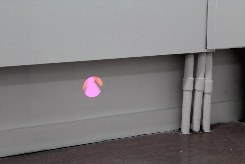
IMG_8283

‘Jawbone’, Projection, Matt Young and Nikki Lawson, 2016

It was interesting how for the most part, those of us who exhibited a work were drawn to the use of a more high frequency pink. This was completely accidental as nobody had discussed the exact tone they would be using in their piece prior to exhibiting. We only realised once all the works were placed in the room. It therefore perfectly demonstrated exactly what we all felt was ‘art pink’. 

IMG_8285

‘Oh Sorry’, Rebecca Gavigan, PVC and highlighter, 2016

We were also all free to choose what we submitted in terms of media, so there was a good range as a result. The mix included installations, video, paintings, drawings, work in situ – there was a bit of everything. Eclectic textures were present too which evoked tactile sensations. Each work had been carefully placed and hung in order to allow the eye to travel across each piece. Placement was key to how the pieces were all viewed and navigated so I found having work on the floor as well as the wall added a dynamism to it all. It was curated in a day and although this was a very brief time period, it was long enough to let me see the thought and process that goes into curating. Something that I currently have little experience of!

IMG_8294

‘No Sexual Connotations Intended’, Samuel Johnson, Timber, mesh voile, gloss, oil and iridescent paint on canvas, 2016

Following this exhibition however I am intrigued by the idea of curating. There’s a responsibility to assembling works effectively; not only to the pieces themselves, but also to the artists who made them. I’ve never done it before but having seen how thoroughly Rebecca considered the hanging of each work, I feel it could be a really exciting thing to try!

IMG_8291

Close up of ‘Rizzo’, Camilla Irvine-Fortescue, Acrylic on canvas, 2016

Jim Lambie at GoMA

DSC00513.JPG

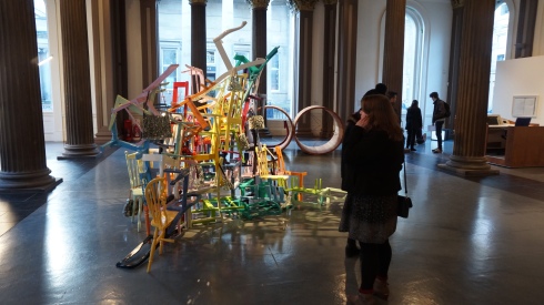
‘Forever Changes’, Jim Lambie

DSC00514

As well as visiting Kelvingrove at the weekend, we also visited the Gallery of Modern Art – or as it’s known in art slang – GoMA. There was an interesting collection of work on display, some that appealed to me, some that did not. The mix included well known art world names such as Karla Black, David Shrigley, Claire Barclay and of course Jim Lambie to name but a few. Yet a name is not everything as I felt some pieces really did not belong or were misplaced within this gallery setting. Particularly when set against the backdrop of another work. Frankly, anything alongside this exciting piece by Lambie took a backseat for me! I have a real thing for colour at the moment. I don’t know if it’s all the Colour Talks I’ve been attending in uni which are led by my friend and course mate, or if it’s just that I haven’t properly painted in so long I’m starting to yearn for physical colour again. Probably a mix of the two.

DSC00516

Either way, the colour and apparent clumsiness of this piece instantly appealed to me. What appears as a cluttered and chaotic arrangement of useless half-chairs, is in fact a highly considered and contemplated arrangement. As Eva Hesse would say, “it’s chaos structured as non-chaos”. It’s almost like something Alice would find in Wonderland. There is no sense of guidance for the eye to travel over, it is merely left to its own devices in registering and comprehending the work.

DSC00515

I thought the mirrored handbags were a fantastic addition to what was already a very exciting work. I have not researched the work, but I wonder if they are a commentary on our commercial and self-absorbed society. After all, women (and men) spend hundreds on an item used simply to carry other items. Then there is the addition of mosaic mirrors which allow us as viewers to view our own reflections. I am simply contemplating here but this was my interpretation of the piece. I may be entirely wrong and be taking far too obvious a reading from it. Either way however, Lambie is an artist I will definitely be looking into more following this absorbing experience!

Yvonne Hindle ‘Supertranslations’

IMG_8227

IMG_8239

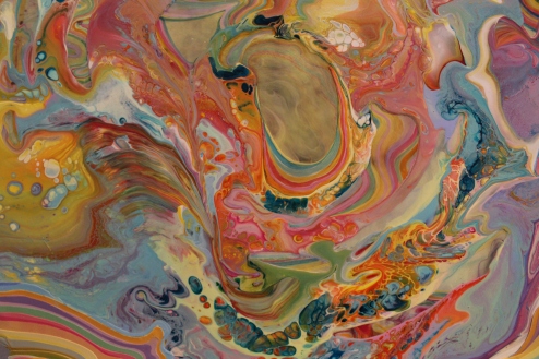
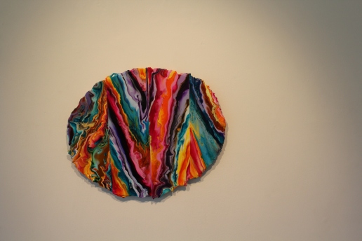
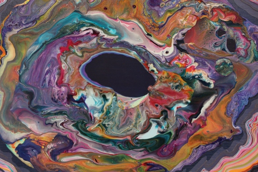
Yvonne Hindle’s ‘Supertranslations’ is an exhibition at Gallery North which sadly ends today. It is truly beautiful and she is clearly a master of paint.  There is so much going on in her paintings, they’re like her own individually created universe. When you look at them you feel as if you are falling and being absorbed by a city of colours. They have so much energy that the paintings seem to pulsate and burst from the wall. What catches your attention first and foremost as you enter are of course the colours; they are truly stunning. What I love is the bold mix, there’s everything from soft yellows and pinks, tame blues, to black-like purples. The contrasts are therefore strong and this is enhanced by how Hindle has segmented them. What looks like a swirling mass of coloured chaos is in fact an orderly and structured arrangement, almost like the stratas of a layer of rocks.

IMG_8231

IMG_8243

This is where her interest in the micro comes in. From afar the paintings look like happy accidents; close up they look highly intuitive – no layer or colour has been added without purpose. There is a precision to it all, clear divides between segments and carefully considered colour dilution. Texture also plays a part in it all. Most pieces are relatively smooth, allowing the swirling colours to take centre stage. Others are far more textured and temptingly tactile. Personally, I prefer the smoother ones as that way I can concentrate solely on the colour. I’m not saying however the textured ones aren’t interesting, if anything they make me want to get my modelling paste out and work in a truly impasto style! Which I may do anyway having seen all of this work. The marbled effect of the paint allows me to see it’s movement; how it’s seeped and ebbed together. You feel as the process has the potential to still be going; as if at any minute the colours are going to start moving into each other again.

IMG_8228

IMG_8236

What I also like about all the paintings are the edges of them all. The paint starts to tailor off in lot of cases and that is where the layering technique starts to be revealed. The pieces hint at how the colour has been built but at the same time gives nothing away. I also really like the lack of hard edge, I think this works really well in relation to the contents of the paintings. It adds to that sense of chaos ordered as non-chaos. Scale wise it’s perfect too, not too big and overwhelming but not too small to prevent you from viewing the detail. They really are such energetic and lively pieces, if I had a wall of them in my house I’d never be uninspired ever again!