Berlin Berger Style

Recently I have been reading the art critic John Berger’s two books ‘Ways of Seeing‘ and ‘About Looking‘. Both are truly inspiring reads; Berger’s insights highlight things you think or notice on a subconscious level, but had never fully come to realise yourself. He is like the stepping stone to realization. He draws out your way of thinking and forces you into a mode of questioning that can be applied to everything from that point onwards. ‘Ways of Seeing’ was particularly eye-opening for me; the way in which I read paintings, their composition and their form has forever changed for me following these two poignant books.

What I particularly liked about ‘Ways of Seeing’ was it’s composition; it is split into concise sections which are well structured and coherent in their point. Yet between each of these sections is a visual essay, an essay composed entirely of images. This was unlike anything I have ever seen before. Each visual essay acted as an introduction to the subsequent written essay. This forces you to try and decipher the images themselves in isolation from the written word, before having Berger go on to elaborate their context in the next chapter. I thought this was an incredibly interesting way of conveying an idea and I was delighted when I was able to comprehend most of the visual essays. Recently I have been drawn more to visuals than writing, particularly with all of the interesting content I follow on Instagram in the form of various galleries and art collectives. So reading the Berger books and discovering the visual essay came at the perfect time for me. In Berlin I was looking, sketching and trying to capture what I saw. I needed a more instant way of absorbing the city which writing did not quite satisfy and so visuals became my supplement tool. Following all of this visual inspiration, I thought I would have a go at compiling a visual essay/visual summary myself of our time in Berlin and how I saw and perceive the city.

IMG_9424

IMG_9303

IMG_9331

DSC00835

DSC00898

DSC00895

IMG_9426

IMG_9442

IMG_9313

IMG_9417

IMG_9351

IMG_9386

IMG_9341

Photo credits also to Jamie Strathearn.

The Late Shows

DSCN8023[1]

Last night I was helping out at Vane Gallery with their display for the Late Shows. The Late Shows are a city wide series of exhibitions and cultural events which range from open studios to performances. This is the tenth year it has run with over 70 venues participating. Vane Gallery were previewing two new exhibitions and were also hosting a 1960s style photo shoot for people to play dress up. This looked like great fun and the polaroid photos of everyone came out really well. The vintage clothing was selected by Sara Makari-Aghdam, the curator of Vane’s current ‘Vinyl Icons…’ exhibition, and let’s just say she has great taste! In among helping out behind the bar, I was allowed to pop up to see what was happening on the other floors of Union House.

DSCN8029[1]

B&D Studios had a silent disco playing, something which was incredibly surreal as I have never experienced it before. It was strange seeing people dance to no music. Then you put the headphones on yourself and close off the rest of the world as you enter your own little bubble of sound. The music was mellow and upbeat and really added to the fairy light lit atmosphere. There were also these amazing graphic drawings on display by the talented artist Luke Dixon. I love the colours and the geometric components of the animal’s faces and they were suitably eclectic artwork for the atmosphere of B&D.  

DSCN8030[1]

It was really interesting to travel throughout all the floors of the building as there was everything from fashion to printmaking on display. I knew it was a creative hub of a building, but I hadn’t realised quite to this extent! There was also a floor where people had made imaginative creatures in art therapy classes and the option to take classes in pattern making.

DSCN8024[1]

The night was so filled with artistic contrasts and I think this was what I was most intrigued by; you didn’t know what was going to happen from room to room. When you visit an art gallery, or know there is an artist exhibiting, you kind of expect there to be a sense of continuity within the space. With The Late Shows it was just full of surprises and seeing traditional crafting techniques followed by colourful projections, followed by taxidermy really did highlight the range of what forms art could take.

DSCN8032[1]

There was a very scientific-based floor with a UV cloud installation. I have a bit of a thing for these kind of works, UV just excites me! I think it’s partially my childhood fondness of having glow in the dark stars on my ceiling. Having seen Benedict Drew exhibit at The Talbot Rice Gallery was another instance I got quite excited by UV as he effectively employed it to transform and manipulate structural components of the gallery. 

DSCN8031[1]

What’s great about The Late Shows is that it encourages people that aren’t necessarily that interested in art to participate and visit gallery spaces that they may not otherwise. It’s a chance for anyone to engage and although I didn’t see everything given I was helping with Vane, I saw enough to realise what a great sense of community art can create.

DSCN8035[1]


As Light Falls Through

DSC00585

Sadly I have not been near this blog in a while – it’s been far too long and I have really missed it. It’s funny, ‘absence makes the heart grow fonder’ is something I was always skeptical of, but then I have moments like this. I miss writing and reflecting on things as for me that is my quiet time; that is the time where I allow my creativity to solidify into something I can understand and convey to both myself and others through text. However, preparations and the heavy workload that comes with putting on not only a Degree Show, but also publishing the catalogue that goes alongside it have taken over for the time being. So I’ve started thinking back and reminiscing about holiday time. Over Easter I had a lovely trip with my boyfriend and his family which involved Hadrians Wall, Alnwick Gardens and the little museum town of Beamish. A perfect little getaway with some really interesting and beautiful sights! 

DSC00579

In the town of Beamish, not only was I delighted by the running trams and bustling little places such as the bakery which transported you back in time, but I was particularly taken by the colourful stained glass. Now, I think one of the reasons I love stained glass so much is because it is an art form I know very little about – the techniques and timing aspects of the process are something I have never touched on myself. This is coming from someone who has tried everything from analogue photography, to performance art, to video art, to batik ink, to oils, acrylics, watercolours, you name it! I have tested out a lot of different mediums but I am always particularly fascinated by the ones I’ve never tried. Such as marble and bronze sculpting (not that I think I have the arm strength for such techniques). I think one of the reasons glass appeals so much to me though is because there is an element of danger; that risk when manipulating molten hot glass.

DSC00578

When I was younger, I used to do ballet lessons (I hated every single one of them – tutus are not for me!) But what I did like about my lessons was they were next to the glass blowers workshop, so my mum would use that as bait to lure me to ballet class. I still remember being mesmerised by the molten glass as I nibbled on a rice cake. As a youngster I could hardly believe that a solid could become a liquid in such a beautiful but dangerous way. So when I saw these windows inside the little cottages of Beamish, I was instantly drawn in. The way light falls through and illuminates what is essentially a drawing is utterly beautiful. The contrasts between the colours and their vibrancy cast colourful shadows across the room. 

DSC00577

For me it’s inevitable that I always think of Rennie Mackintosh in relation to stained glass; the bold blocks of colour, the simplicity yet elegance of design. There’s also a kind of melancholy to the pictures, as if the depictions are a lost world trapped inside a solid frame. Working with glass is something I have always wanted to try, but I feel it’s the kind of thing you need a workshop for – and especially with my clumsiness levels a lot of protective gear too! Pottery is also something I’ve been thinking a lot about recently and I’m realising that having worked in contemporary art for almost three years now, I’m ready to take a break and maybe study or take up a new and more traditional art form. 

‘Vinyl Icons: Persian Pop and Turkish Psychedelia’ Part III

IMG_8707

People often say that a photo is worth a thousand words and I am a strong believer in this. Photos tell stories, document fond memories and capture funny moments. Personal photos are the stills to your life. Documentary photos allow us visual access to the past; whether it is a glimpse into the harrowing life of trench warfare, the horrific effects of Napalm in Vietnam, or more light-hearted occasions such as Royal Weddings. It’s incredible to think that we can see a visual of someone who existed hundreds of years ago, that we can put a face to the name of ancient geniuses. ‘Vinyl Icons: Persian Pop and Turkish Psychedelia’ demonstrates the importance of the photograph. Within the exhibition this takes on a variety of forms, such as a photographic collage of family photos as above. 

IMG_8753

It also took the form of more explicit photographs, such as this found postcard of an Iranian pop star. As I said before, a picture is worth a thousand words and what interests me most about this fact is that different people will all take different things from what they see. Such as with the above photo; some people will find it crude, others will find it sexy, generally people will find it cheeky and naughty. Personally I like it, I think it’s got a wacky side to it and a sense of pride within the woman as she commands her body. I also find the setting incredibly interesting and the material of her net leotard provides an interesting contrast against the plush velvet of the chair. Having written extensively about ‘Vinyl Icons: Persian Pop and Turkish Psychedelia’, I have realised that as a whole it is of course a flourishing exhibition. Yet it’s only really when you break it down and truly examine the details that you realise just how effective and important every single element is. 


Vinyl Icons: Persian Pop and Turkish Psychedelia Part II

IMG_8736

‘Vinyl Icons: Persian Pop and Turkish Psychedelia’ is a unique exhibition unlike anything I’ve seen in Newcastle before, despite having lived here for almost three years now. This show  perfectly encapsulates what contemporary art represents. It is about making art in the present and using this as a platform to reflect and comment on the world around us. The strength of this show lies in its explorations of history; the revolution in Iran and how an oppressive regime followed, forcing artists and musicians to close shop and adapt to more censored ways of working. Yet throughout the show this historical narrative is not overly explicit and loud in its protest, but instead it is subtle and sophisticated. Snapshots of the world and stories of the past come through in the objects, in the travelling and collection process that has been carried out.

IMG_8720 

One of the things I love most about this exhibition is it creates a real sense of the nomadic lifestyle. The evidence of travelling to far flung places and finding hidden gems is entirely present throughout. It makes me want to be more imaginative with my findings. I am a sentimental person in the sense that I have an old shoe box filled with my special moments. The box contains what would be considered throwaway items to most people, such as a cinema ticket or a used stamp, but for me these little things hold precious memories. My box contains items such as concert tickets, doodles done on restaurant napkins, brooches, Kinder Egg toys, clothes labels, cards I’ve been sent, photographs, plastic and childish rings, the list goes on. Now, some people may consider that junk and to an extent I suppose it is, but each of those items retains a precious moment for me; a good time where I was laughing with my siblings or joking with my boyfriend. Through items we capture and record life and ‘Vinyl Icons: Persian Pop and Turkish Psychedelia’is the perfect example of this. 

IMG_8696

Having lived and travelled a lot throughout my life, it’s fair to say I have my fair share of collected exotic items. Little marble statues from India, patterned scarves from Kenya, silver rings from Oman, postcards from all over Scotland. These items are the little jigsaw pieces that come together to document my life and where I’ve been. I love the surprise of going into an old handbag pocket and finding within it a keyring I picked up on my travels. Much like curator Sara Makari-Aghdam, I find stories in the items we keep and I think that is why I love this exhibition so much, because I can truly relate to it. Sara discovered her father’s old cassette collection of Persian pop music years ago and it has fueled and inspired this show. What I find most intriguing about objects is their own personal journey; if it’s a vintage dress who owned it before it was procured? What kind of occassions was it worn to? Was the person told by their lover that they look lovely? Looking at old items, all these questions come flooding to my mind. Through objects a strong sense of presence comes through and in ‘Vinyl Icons: Persian Pop and Turkish Psychedelia’, this presence is excitedly overwhelming. 

‘Vinyl Icons: Persian Pop and Turkish Psychedelia’

IMG_8729

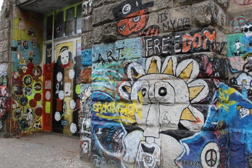
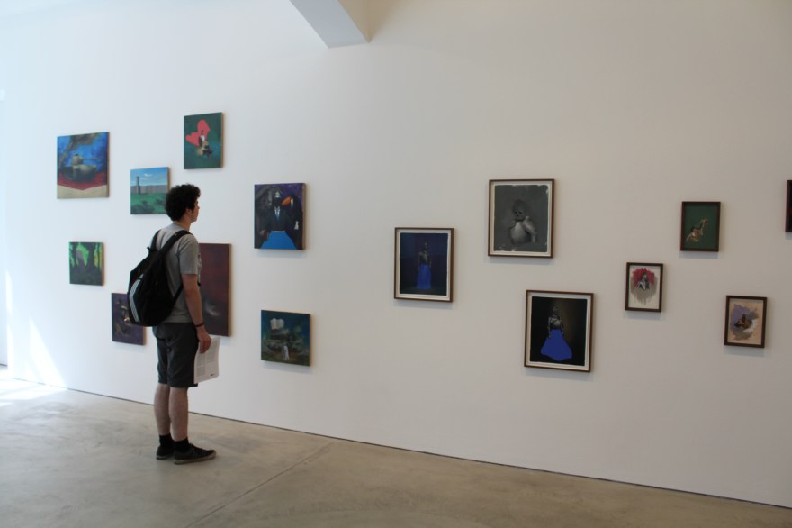
Having been away from Newcastle for a while, visiting Vane Gallery’s preview of ‘Vinyl Icons: Persian Pop and Turkish Psychedelia’ was the best way to get me inspired enough to return to writing. Curated by Sara Makari-Aghdam, this exhibition explores her dual heritage, as she is an exotic blend of Persian and English. ‘Vinyl Icons…’ also explores the rich Iranian culture of the 1960s and 70s by combining the work of five artists, three of whom lived through the 1979 Revolution. The show is therefore bubbling with culture and heritage, histories and lost pasts. It encapsulates these themes through an explosion of colours and textures; the pieces bounce off the walls in their ecstatic vibrancy. As I enter the gallery space I am greeted by the soaring melodies of Turkish and Iranian pop music and a wave of nostalgia instantly hits and transports me back to the souks and markets of Oman. I recall the smell of incense that used to burn as I walked along the corniche to watch the sun set over the Omani coastline. Having lived in the Middle East for several years, this exhibition brought about a lot of sentimental feelings for me.

IMG_8745

‘Vinyl Icons…’ consisted of an eclectic blend of items, much like an Arabian or Turkish market would. There was opulent jewellery and brooches dripping from and decorating vintage clothes collected and found in America. There were vintage Clarks shoes from 1969, there were extravagant light boxes paying homage to religious shrines, there were photographic montages, family photos, handpainted dresses, a wide collection of sexy record covers and vintage magazines from the ’60s and ’70s. There was even a piece inspired by Afsoon’s mood boards that she creates in her London studio. 

IMG_8740

I was particularly taken by this piece. As the eye shifts across the work, it is constantly met with fantastically bold items such as maps, stamps, tapestries, dish towels and jewellery. It is highly tactile piece that for me really appealed as I felt like I was being invited into the artist’s methods and thought process. I could see from the variety of items present that collecting is integral to her practice. Colours, textures and the considered distribution of both these elements contributed to the success of this beautifully energetic work. 

IMG_8708

Talking with Afsoon, she told me she uses a lot of matchboxes in her work. She likes the surprise of finding unexpected items stored inside such as a hair pin or a tooth, when she buys and collects vintage match boxes from places. Who would have thought an everyday object that I mostly associate with frustration (given my inability to light most matches) could be transformed into something so delicate and beautiful? Housed in their little plinth-based box, these match boxes stood proudly showing off their collaged covers. 

IMG_8706

I was delighted by the constant surprises this exhibition held for me. What originally seemed like pretty little hand-painted shoes (above), soon revealed as I circulated the delicate figure of a nude female body. This simple yet highly effective manipulation of the object was for me one of the best parts of the exhibition. It was cheeky, beautiful and unexpected. Hand-painted shoes were also present on another lower laying plinth, which brought the eye nearer to ground level. From a distance the boots look as if they are decorated in loose swirls, but upon closer inspection exotic feminine eyes can be revealed. 

IMG_8702

 Feminine motifs ran throughout the gallery, with dresses, jewellery, naked bodies and portraits littering the walls. Having lived in regions of the Middle East where women wear abyas all of the time, it was interesting to see a mix of clothing  that ranged from the hand made to collected  vintage items. It was also really interesting to see such Arabian looking objects such as the vinyl case (below left), cleverly placed next to another casing with such an erotic depiction of the female body (below right). Yet Iran was originally very much influenced by the West and was very liberal and this exhibition successfully highlights and explores this blend of East meeting West.

IMG_8722

‘Vinyl Icons: Persian Pop and Turkish Psychedelia’ is for me one of those exhibitions that completely transforms the white walls of the gallery space. Through the highly visual and tactile materials, the variety of items on display and the ever-present music, I felt entirely transported to another place. I felt incredibly inspired by the colours of it all and the memories of Oman that it reminded me of. It was a strange sensation as I stepped back out onto ordinary Pilgrim Street and my doorway into the rich culture of the East faded and remained within the walls of Vane Gallery. I was transported from one world to another, but that is not the end of my experiences as I will definitely be returning to this show on numerous occasions!

To read more blog posts about this exhibition see:

Part II

Part III

Sensual Materials

IMG_9554

I have this absolute nightmare of my tights ALWAYS getting holes in them. It drives me nuts; my toes peep out, the ladders run up the back of my leg, I don’t think I own a single perfect pair of tights! So being an artsy creative person I of course think of new ways to use them when they’re on their way out, otherwise there are far too many tights going to waste!  When I did these shots, I’d recently been using cling film to cover and wrap my body in. So these photographs were kind of an extension of that experiment. Of course, wrapping your body in cling film holds very different connotations from interacting with fragile tights. 

IMG_9552

I was quite pleased with how these photographs turned out. They are completely unedited, I just used a desk lamp directed at a very certain angle to get these colour shades. Normally putting something over your head is claustrophobic and uncomfortable, but given the transparency and delicacy of the tights there were no problems at all. It was more exciting trying to develop a relationship with the material and mould it into interesting shapes that worked both within the frame of the photograph and in relation to my body. I had a tripod set up to take these, so it was all very trial and error; I only got three good photographs out of all the ones I took. That happens most of the time with photography though and the shapes I did manage to create here complemented the warm hues of the lighting. 

IMG_9546

Despite the lack of editing, the colours came out really well; they shift between pale pastel yellows and orange-tinted pinks. I was also really happy with the blend of focuses; the fixed outline of certain areas such as the head in the photo above, against softer and more ambiguous outlines as in the case of my fingers in the above. Out of all components of my torso, I think my hands looked the most interesting encased in the tights, as the fingers are usually so mobile and free to use that is was strange to see them restricted. Yet the conflict present within the restriction is interesting as the hands are encased by the most fragile material and have the ability to break free at any moment. This potential is most evident in the middle picture where my fingers are most pronounced. I also think this potential is evident in the blend of static and movement. Although I am holding still and posing for the camera, there is so much movement in the light and the material which provides an interesting contrast to the overall result. I think these aspects are why these photographs are successful to me; I’ve taken a simple everyday material and tried to adapt it into something entirely new. 

Acrylic Work


eye
Eye Study (Warm Hues)

It’s fascinating looking back at old work and seeing how my style has evolved and changed over time. What intrigues me most is not simply my evolution in technique, but my interest and use of material. I have experimented a lot over the years and have come to find that you can never fail with fine liner pen! You could argue it’s a very simple material; everyone owns a black pen, yet I have come to find it is also the most effective in a lot of cases. For me the addition of fine liner is often the perfect finishing touch to a painting. My love for pen has remained constant over the years, yet my feelings for other materials have changed drastically. When I was younger I found watercolours difficult to use and frustrating to control, yet these days most of my paintings are water and ink based; I can’t seem to get enough of the fluidity!

eye2
Eye Study (Cold Hues)

I went through a phase where acrylic paint was my favourite medium (this was before I discovered oil paint!) mainly due to the layering it allowed. When I paint I build my work up slowly by gradually applying multiple layers, as you can see in these colourful eye studies. Acrylic was perfect for working in this way as it meant a short drying time which was perfect for my instantaneous manner of working. It’s also a very affordable material, especially when compared to oil paint which is depressingly expensive most of the time. I came across these old painterly experiments when I was looking through things I’d submitted as part of my university and scholarship portfolios. They’re about four or five years old now and I haven’t used acrylic paint much since then. Having looked back over them, I’m tempted to give acrylic paint another go given how much my skills have changed over time.

John Virtue

P1180052

I was looking through some old work when I came across these images of my First Year studio. This was probably the one and only time my choice of topic deviated from Body Art and instead focused on the natural landscape. I think I surprised even myself in this shift as there was no real explanation for it apart from my discovery of oil paint. I think I felt that abstract landscapes were a better means of exploring this medium, as opposed to again working with the female body which I was already so familiar with. This shift was also due to the fact I discovered the work of John Virtue (see below).

 john virtue

‘Landscape No. 707’, 2003-4, image sourced from The National Gallery website.

I fell in love with his whimsical monochrome depictions; how they were abstract yet figurative simultaneously. How he combined nature with industry. The blend of such intense darkness against the stark white also lends a satisfying balance to his work I found. This equilibrium allows the eye to shift peacefully across the page, taking the time to absorb intricate aspects such as texture which are so imbued with the studio aesthetic.

P1180042

What I found particularly interesting about Virtue’s work was his ritualistic aspect of his art making. Every day without fail he would walk to the same location to sketch. This of course resulted in an excess of drawings, but the dedication this required fascinated me. So for a while I chose to copy this method of working and walked to a park everyday. It was quite out of my way and in some cases an inconvenience to all of the other daily necessities occuring in my life. However, having this task and this escape also gave me the best kind of zehn I could have wished for. I had an excuse to leave behind the rush and pace of daily life to focus fully on ritual-based art making. 

P1180051

I also tried to employ Virtue’s use of the monochrome palette by removing colour from my work. Depicting landscapes and working with oil paint was a time where I was using really vibrant and sunset-based hues, so this removal was a real challenge for me. It forced me to think a lot more critically about texture, shape, scale and all of the other elements that could compensate for lack of colour. I poked needle-thin holes through paper, I worked with impasto and modelling paste, I used charcoal and inks to create that messy studio look. I tried everything and had great fun experimenting, but of course I gradually began bringing colour back into my work. I also sadly had to stop my daily excursions to the park given all my other commitments, but I may some day start that again for a brief period at least. Employing the working methods of another artist was a really interesting and liberating experience for me, as I was giving up all sense of control that I had over my work and instead completely yielding myself to working in a certain way. It was an incredibly enjoyable experiment and is something I think I’ll definitely go back to at some point!

Benedict Drew

IMG_8496

I think it’s say to say that Benedict Drew’s wacky installation was by far my favourite work in The British Art Show 8. Exhibited within the Talbot Rice Gallery, Drew’s work is the definition of transforming a space into something completely new and exciting. What had been quite a clean cut angular-looking gallery space prior to my entry into this room, was soon turned upside down as I entered Drew’s work. I was instantly transported from the traditional gallery layout to what felt like a psychedelic sci-fi space. I was in awe. Sound pulsated heavily across the room; I could feel it in my core and reverberating through my entire body. There were headphones placed on the table which of course I reached out and tried on only to find that they amplified the sound that was already echoing around the room. It was almost like an electro heartbeat and instantly made me feel like I myself was a part of the piece.

IMG_8476

The utilisation of the architecture within the work furthered Drew’s success as I felt the gallery dissolved and blended into the installation to the point I felt fully consumed by the piece. Just like this installation, Drew’s practice spans a wide range of media including sound, performance, video and various other forms. He often creates chaotic and absorbing environments that pulsate with life, drawing in the viewer and providing them with a multi-sensory experience. Although there was a lot to take in when I viewed Drew’s work, surprisingly it was not overwhelming. Installations such as this have that risk factor; bombard your audience and your work is often lost on them. Yet Drew defied this by carefully distributing the pieces, creating a walkway for the viewer to enter and navigate their way effectively through his work. The shapes I was met with and the colours that were used all complemented and blended with each other allowing the human eye to adjust to the bright colour palette that was present. 

IMG_8481

When I got to the back end of the installation I was greeted by large, cinematic screens. Drew’s attention to detail was plain to see with the modern white speakers contrasting to the excess of cables wrapped believe it or not, in tinfoil. Drew took a domestic everyday item and turned it into an art piece that distracted nicely from the ridiculous amount of cables that all his technology requires. It also furthered my reading of the sci-fi elements. It was not just the detail in the cable layout, but also in the stands of the screens. Instead of being a dull conventional black they were a lime green that instantly caught my eye (probably due to the fact I seem to have developed an unexplained love for lime green). 

IMG_8482

According to The British Art Show’s text accompaniment to this piece, Drew was articulating “the horror of the modern world” through this work. Through his multi-media approach he explored this horror thoroughly! It was impossible to ignore the screens that bombarded you as you approached, an obvious reference to our screen culture of today. There was sound that shook through your bones, the way music does in a club. Colours and structures clustered everywhere in excess alluding to our material and consumer culture. There was no escape in this whimsical and all-consuming environment; the pace of it drew you in and refused to let go much in the way that modern day life does. 

IMG_8480

Yet in among all this technological-based motifs I was surprised to view what looked like mud puddles on screen. They were very anthropomorphic and alien given their electric colours, yet I half expected a David Attenborough voice over mixed up DJ style to come on!  It would not have surprised me, as this work was a constant succession of surprises – and puzzles. There was one area of each screen which had a shell attached to it and a spot light which remained the same colour despite the constant shift in imagery. I could not for the life of me figure out how Drew had managed this! 

IMG_8485

There was not a moment of boredom in this space. Despite this being the first piece I saw of The British Art Show, and despite me witnessing several other works that day, this was the one I could not stop thinking about. I couldn’t get this psychedelic experience out of my head. Partially I think because I was both impressed and fascinated by how Drew had used technology and created such an absorbing work. But also partially due to the elaborate colour scheme – I myself almost wanted to start glowing and blend into the work! I think it’s safe to say Benedict Drew succeeded in captivating his audience, whilst also posing some challenging questions concerning modern life today.