Surreal Encounters: Collecting The Marvelous

img_2623

Installation shot including various works by Salvador Dali

“Everything tends to make us believe that there exists a certain point of the mind at which life and death, the real and the imagined, past and future, the communicable and the incommunicable, high and low, cease to be perceived as contradictions.”
– André Breton, Manifesto of Surrealism

Recently I visited the Scottish National Gallery of Modern Art on what I thought would be a brief afternoon excursion. Almost four hours later I emerged from’Surreal Encounters: Collecting The Marvelous’ enlightened and inspired. Marvelous; there could not be a more apt word to apply to this broad collection of artworks. Immediately upon entry you are greeted by renowned and famous names including Picasso, Man Ray and Duchamp. Seeing a collection of those artists merely in the corridor – before I’d even entered a room – made me realise the sheer stature of this exhibition. This was and is quite the collection of Surrealist works. Never before have I seen so many Dali and Magritte pieces clustered in such close proximity. The result was mesmerizing. I felt like Alice in Wonderland tumbling down the rabbit hole into a world of dreams, blue endless skies, obscure depictions and dripping, blurring creatures. For someone who has read countless books on Dada and Surrealism, two art movements that changed and shaped the course of art history, it was like walking into a shrine dedicated to works of the past. I couldn’t quite believe what I was seeing.

img_2624

Installation shot hosting the works of René Magritte

The exhibition was beautifully curated and very insightful in terms of how the collections came about. As a viewer you are given an in depth account of how Roland Penrose, Edward James, Gabrielle Keiller and Ulla and Heiner Pietzsch came to acquire the works. This was done through a series of conducted interviews. I thought this was a very effective component of the exhibition as in among all of these monumental and historical works by Miro and Magritte, there were TV screens with the interviews being played out. With the giggles between partners Ulla and Heiner Pietzsch echoing throughout the space as they discussed their plans for their collections, I couldn’t help but feel that their stories brought the collections and the artwork even more to life. As a viewer, not only were you busy plummeting into a whimsical world within the frame and trying to decipher and make sense of something so non-nonsensical, but you also became aware of how it came to be hung on the wall in front of you. The care and thought that went into the collections and the articulate eye required to amount such works, was extraordinary. It was fascinating hearing how Gabrielle Keiller had realised Duchamp’s artistic potential and decided to gather his works. Of course it was equally fascinating seeing the works themselves; Duchamp’s mini replication of ‘The Bride Stripped Bare By Her Bachelors‘ was rather mesmerising in itself. 

feuille-de-vigne-femelle-female-fig-leaf-1950-1961

‘Female Fig Leaf’,  Marcel Duchamp, 1961

Marcel Duchamp is an artists I have studied very closely, so for me seeing his work was kind of like seeing a celebrity on the red carpet. His concept of the Readymade turned the art world upside down when he declared a urinal a work of art. A Readymade is a work that consists of objects that were, believe it or not, ready made. They become an artwork essentially through the declaration of the artist. This of course caused outrage in the artworld at the time and Duchamp’s urinal, or ‘Fountain‘ as he named it, was in fact refused entry to the Parisian Salon des Indépendants. At the time it was revolutionary and outrageous, now this act and the creation of the readymade is just another dictionary term in the art collection alongside Minimalism, Impressionism and all of the other movements which were not accepted at the time as they are presently. I loved’Female Fig Leaf‘ (above), I think it was one of my highlights of the exhibition not only because it was a Duchamp piece, but also because of its cheekiness. It is an imprint of the female genetalia, which Duchamp actually gifted to his wife. 

94d7ac8dcb40d950a6b342fcf3d010dd

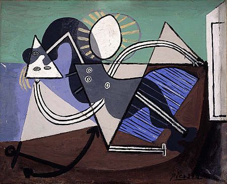
‘Nude Woman Lying in the Sun on the Beach’, Pablo Picasso, 1932

Picasso, dare I say it, has always been very hit or miss for me. I can appreciate his work, his technique, his skill and his status. However his work has never quite struck the cord with me on a personal level. That is of course with the exception of ‘Guernica’ (1937), one of his most famous works depicting the horrors and brutalities of war. However, in this Surrealist exhibition, I was for once incredibly taken by a Picasso piece in the form of ‘Nude Woman Lying in the Sun on the Beach’. It absolutely fascinated me. The title provided the perfect insight into the subject of the work and the colours and composition were incredibly satisfying to my eye. I love the muted and restricted palettes of mint green and baby blue alongside the triangular creations. I was so drawn to this work that I even bought a postcard of it as a momento to the exhibition! 

coupleauxtetespleinesdenuages_dali

‘Couple aux tȇtes pleines de nuages’, Salvador Dali, 9136

‘Surreal Encounters’ was surreal for me in more ways than one. It was of course surreal in the sense that I was seeing the biggest body of Surrealism I have yet witnessed in my lifetime, but it was also because I was in a dumbfounded haze of surreal disbelief at seeing works such as these. Particularly the large scale Dali pieces. The skill and techniques, the mastery Dali displays with his paint and the colour choices and balances are all compiled together to form compositions so breathtaking that I was grateful to be able to occupy the seats dotted throughout the gallery space! It was one of those exhibitions where you really have to sit down and just breathe in and absorb the work in front of you. Realise how insignificant you are when faced with these grand works, grand scales and even grander artists. There was a room filled only with Dali and Magritte pieces which has to have been my favourite. Mainly because René Magritte is in fact one of my favourite artists. Coming from someone who has a very long list of favourite artists, that is quite the compliment to Magritte. I will never forget the first time I saw his work. It was at The Peggy Guggenheim Collection in Venice. Again, there was a room filled primarily with Dali and Magritte and I remember feeling as if the air in my body had been physically knocked out of me. I had only ever come across these works in books or on the internet prior to that moment and to be greeted face to face with the brush strokes (or lack of them) of Magritte was truly one of my most memorable moments in my experience of viewing art.

14134560_294394854251021_1491073811_n1

‘La Représentation’, René Magritte, 1937

Walking into the Dali/Magritte room in the Modern Art Gallery was very much like experiencing my Guggenheim epiphany all over again. Seeing Magritte’s countless sky scapes, his mysterious face reflections and erotic depictions cast a spell of serenity over me. Time seemed to stand still as I immersed myself in the works, trying to read them and imagine what strange things had been blurring through the mind of Magritte as he painted. I tend to avoid reading the information that sits alongside a painting, at least until I return to the exhibition a second time, as I prefer to formulate my own ideas and opinions about a piece before giving in to the direction leaflets and writings provide. Trying to read a Surrealist work however is quite the task and I decided that the best way to do this was to free my mind. To allow my conscious to let go of assumptions and float and drift instead into more sporadic realms.

Eine Kleine Nachtmusik 1943 by Dorothea Tanning 1910-2012

‘Eine Kleine Nachtmusik’, Dorothea Tanning, 1943

I think ‘Eine Kleine Nachtmusik‘ was one of my favourite works within the exhibition (not counting all of the Magritte’s, that goes without saying given how big a fan I am!) However, I have never come across Tanning’s work and this piece really stuck with me. It’s predominantly the bold colours that appeal to me; the blood red carpet against the sunshine yellow of the sunflower. The angles of the staircase alongside the open door at the end of the corridor. The way in which the girl’s hair appears to be sucked and gusted upwards towards the ceiling, yet she remains stood still and straight as if the presence of a giant sunflower on the stairwell was a perfectly natural occurrence. Yet there lies the success of the Surrealists; the ability to take the abnormal, the strange, the absurd and transform it into something so nonchalant that we begin to question our own senses of normality. They take the ordinary and transform it into such an extraordinary that we are left both stunned and speechless yet simultaneously brimming with an overflowing cauldron of ideas in our heads. In heads thatupon witnessing these works of art suddenly feel too small for all of these bizarre and beautiful notions. Consequently, the only thing that we can do is release ourselves to the surreal and the experience it provides. Needless to say, this exhibition succeeded in providing that experience and more. I was left reeling and contemplating it for days and this contemplation will continue, as will our own surreal encounters. 


We were not allowed to take photographs in the exhibition,therefore my images are sourced from the following websites:

https://www.nationalgalleries.org

http://georginacoburnarts.co.uk

Home


NUFA16

IMG_9137

Tyler Coop

I can remember being in my first year of uni and looking up to the third years thinking it was impossible that one day I would be putting on a show. I’ve always kind of felt that when I looked up to older students even at school; I remember wondering how people sat exams, how people traveled by themselves, how people had the confidence to drive cars, etc etc. All these thoughts feel silly and irrelevant now looking back, because of course you learn and grow and change. I didn’t realise however quite how much an art course would change me. I never imagined I would go down the route of performance art, if anything I’ve always been someone who shied away from the stage and was instead content painting background scenery and doing backstage make-up. Yet during the time on this course I have experimented with mediums I never planned to work with such as sculpture, print, photography, video, projection, all sorts. I’ve really pushed the boat out in ways I never imagined or expected.

IMG_9181

Woon Prize Nominee Sheyda Porter 

I think that’s what’s so wonderful about embarking on a course as practical and creative as this. Not only are you exploring your artistic potentials, but you are also exploring the tools which allow you to realise your ideas. You’re learning so much theory too, with all the seminars, Art History lectures  and of course extensive research and reading meaning my knowledge of the artworld has grown so much. As has my coffee table collection of artist books which are now looking to require a bookshelf…

IMG_9169

Saman Ahmadzadeh

That’s partially the exciting thing however, the fact that my bookshelf keeps expanding. The fact that despite finishing this course, I am nowhere near finished. There’s so much more to explore, there’s so much more to experiment with. Despite all of the nostalgia I am currently feeling, I am also feeling incredibly inspired. Seeing everybody’s work come together in this way is amazing not only because there are some incredibly strong and thought-provoking works, but also because we have witnessed one another’s artistic journeys. We’ve seen experiments in the studio go horribly wrong, or moments where tubes of purple paint explode everywhere (yes, it had to be all over me), moments where you walk into the studio to find your studio floor has been taken over by glitter, glue and sprinkles (I have the best studio pal – we are the messiest bunch together and it’s been great!)

IMG_9146

Rebecca Gavigan & Victoria McDermott

So seeing everything reduced to this clean cut and perfectly executed Show is almost overwhelming. I suppose it must be kind of like being a director and finally watching your own Broadway Show. You’ve had moments where everyone is yelling backstage, costume changes haven’t worked, scripts haven’t been learnt, people are stressing and scrabbling around. Yet on the night it all flows smoothly and could not be more perfect. And in that moment you have a feeling of pride in how it has all came together, in how the stress and tears of backstage have dissolved as the characters dominate the stage. I suppose it’s kind of like that, just instead of one director, there are seventy-eight emerging artists.

IMG_9174

Joseph Crookall

Seventy-eight of us whose work could not differ more greatly from the other. I will always remember local artist Narbi Price saying in one of his talks at Vane Gallery, that the more artwork that is made, the more there is a burden on artists to come. This has stuck with me because it is so very true. A lot of people dispel history and say it’s in the past, it doesn’t matter. Yet in being an artist and making artwork it is absolutely critical you know your history, you have to be so aware of what came before you. I have found this particularly vital in looking at the female body in Performance Art, because the 1960s really shaped a lot of things today in that realm and no one can ignore that. So when Narbi said that, it really hit home and seeing such a broad range of work in the Degree Show alone, it’s resonating with me more than ever and making me excited to push things even further.

IMG_9178

Alexandra Karyn

Artist Takeover at The Laing Art Gallery

IMG_8759

At the weekend The Laing Art Gallery held an amazing Artist Takeover Event. It was the first time they had ever held such an event and it was partially a testing ground and partially to raise awareness in their aim of winning a bursary. If they succeed and win this bursary it will bring artist Marcus Coates to the gallery to host a ‘Museums at Night’ event in October. Given the success of Saturday, I am feeling positive for The Laing, however it will all depend on voting (see bottom of blog page). The Artist Takeover was unlike anything I had ever participated in before. It was a very exciting day with the event running from 10-4pm. Not only was the event open to working artists, but to anyone who considered themselves an artist and a whole range of mediums were therefore accepted. These included contemporary dance, paper-cutting, a blackboard of ideas, modernist installation art, live painting, charcoal and inks, and performance art. This made for an eclectic variety of practices and a room bubbling with creative energy and people. 

IMG_8775

I myself had proposed to do a piece of Performance Art which explores the relationship between the serenity of yoga and the manifestation of trauma within the female mind and body. I had never proposed anything before and this was a very interesting proposal in the sense that only one sentence was required. This was challenging  yet helpful to me; as to sum up my work in such a short word count is difficult, but also beneficial as it forced me to really consider and realise what my work is currently about. 

IMG_8763

So not only was the day itself exciting and new, but the experience was also a great one. I spoke to so many different and like minded people, artists, non-artists, the curator. It was a day filled with learning and inspiration, of pushing the boundaries of what art could be and the way we view conventional gallery spaces. It was also a whole new experience for me performance wise. As it was an entire day event, I decided to perform more than once, which I have never done in a single day before. I thought I would be more nervous doing this, however the relaxed and creative atmosphere helped put me at ease. I did the first performance in the room with all the other artists but in a different room for the other two in order to create a different environment for myself. It was interesting how the differing rooms affected and shaped how the performance evolved as apart from my prop of ribbons it was entirely improvised.

IMG_8780

I had a sound piece to accompany my work which filled the gallery space with the sound of my breathing, which brought an unsual atmosphere into the room. In comparison to a lot of places, I would consider The Laing quite a traditional gallery as it holds a lot of spectacle artwork such as that of John Martin (he is one of my favourite artists and I actually did a performance piece in the room where his works were hung which was an incredibly exciting moment for me!) Yet the Artist Takeover completely transformed this stereotype of it for me. I realised that The Laing was willing to engage with its local artistic community. It is a rarity for local artists to be asked into a professional gallery space which is why I was so honoured to have my proposal accepted. It was such a great experience and can hopefully be the first of many events such as these.

IMG_8783

I think a lot of people can feel isolated from the arts or not good enough to either engage or practice art. Events such as this however I feel help break down those boundaries; they make you realise that art can be anything. There was dance, there was mime and there was performance present in the gallery alongside more traditional art forms such as painting and it was refreshing to have these conventional forms of artistic segregation removed and the broad umbrella of the word ‘art’ applied instead.

IMG_8765

Art is limitless, but art also relies on an artistic community and I think an event such as this truly harnesses this and taps into what contemporary art means today. Hopefully this sense of community and artistic discussion can be expanded and built on with Coates’ arrival in October. 

IMG_8764

If you’re interested in finding out more about the October event, take a look at The Laing Art Gallery’s website: 

https://laingartgallery.org.uk/votesforcoates

IMG_8770

‘Vinyl Icons: Persian Pop and Turkish Psychedelia’

IMG_8729

Having been away from Newcastle for a while, visiting Vane Gallery’s preview of ‘Vinyl Icons: Persian Pop and Turkish Psychedelia’ was the best way to get me inspired enough to return to writing. Curated by Sara Makari-Aghdam, this exhibition explores her dual heritage, as she is an exotic blend of Persian and English. ‘Vinyl Icons…’ also explores the rich Iranian culture of the 1960s and 70s by combining the work of five artists, three of whom lived through the 1979 Revolution. The show is therefore bubbling with culture and heritage, histories and lost pasts. It encapsulates these themes through an explosion of colours and textures; the pieces bounce off the walls in their ecstatic vibrancy. As I enter the gallery space I am greeted by the soaring melodies of Turkish and Iranian pop music and a wave of nostalgia instantly hits and transports me back to the souks and markets of Oman. I recall the smell of incense that used to burn as I walked along the corniche to watch the sun set over the Omani coastline. Having lived in the Middle East for several years, this exhibition brought about a lot of sentimental feelings for me.

IMG_8745

‘Vinyl Icons…’ consisted of an eclectic blend of items, much like an Arabian or Turkish market would. There was opulent jewellery and brooches dripping from and decorating vintage clothes collected and found in America. There were vintage Clarks shoes from 1969, there were extravagant light boxes paying homage to religious shrines, there were photographic montages, family photos, handpainted dresses, a wide collection of sexy record covers and vintage magazines from the ’60s and ’70s. There was even a piece inspired by Afsoon’s mood boards that she creates in her London studio. 

IMG_8740

I was particularly taken by this piece. As the eye shifts across the work, it is constantly met with fantastically bold items such as maps, stamps, tapestries, dish towels and jewellery. It is highly tactile piece that for me really appealed as I felt like I was being invited into the artist’s methods and thought process. I could see from the variety of items present that collecting is integral to her practice. Colours, textures and the considered distribution of both these elements contributed to the success of this beautifully energetic work. 

IMG_8708

Talking with Afsoon, she told me she uses a lot of matchboxes in her work. She likes the surprise of finding unexpected items stored inside such as a hair pin or a tooth, when she buys and collects vintage match boxes from places. Who would have thought an everyday object that I mostly associate with frustration (given my inability to light most matches) could be transformed into something so delicate and beautiful? Housed in their little plinth-based box, these match boxes stood proudly showing off their collaged covers. 

IMG_8706

I was delighted by the constant surprises this exhibition held for me. What originally seemed like pretty little hand-painted shoes (above), soon revealed as I circulated the delicate figure of a nude female body. This simple yet highly effective manipulation of the object was for me one of the best parts of the exhibition. It was cheeky, beautiful and unexpected. Hand-painted shoes were also present on another lower laying plinth, which brought the eye nearer to ground level. From a distance the boots look as if they are decorated in loose swirls, but upon closer inspection exotic feminine eyes can be revealed. 

IMG_8702

 Feminine motifs ran throughout the gallery, with dresses, jewellery, naked bodies and portraits littering the walls. Having lived in regions of the Middle East where women wear abyas all of the time, it was interesting to see a mix of clothing  that ranged from the hand made to collected  vintage items. It was also really interesting to see such Arabian looking objects such as the vinyl case (below left), cleverly placed next to another casing with such an erotic depiction of the female body (below right). Yet Iran was originally very much influenced by the West and was very liberal and this exhibition successfully highlights and explores this blend of East meeting West.

IMG_8722

‘Vinyl Icons: Persian Pop and Turkish Psychedelia’ is for me one of those exhibitions that completely transforms the white walls of the gallery space. Through the highly visual and tactile materials, the variety of items on display and the ever-present music, I felt entirely transported to another place. I felt incredibly inspired by the colours of it all and the memories of Oman that it reminded me of. It was a strange sensation as I stepped back out onto ordinary Pilgrim Street and my doorway into the rich culture of the East faded and remained within the walls of Vane Gallery. I was transported from one world to another, but that is not the end of my experiences as I will definitely be returning to this show on numerous occasions!

To read more blog posts about this exhibition see:

Part II

Part III

Scottish National Gallery of Modern Art

IMG_8525

It’s weird, but sometimes the Scottish National Gallery of Modern Art is the thing that makes me feel most Scottish! That’s not because there’s a bunch of Scottish memorabilia in it – far from it! Instead there’s an impressive collection of artworks ranging from Francis Bacon, to Andy Warhol, to David Hockney, to one of my favourite artists Samuel John Peploe (part of the Scottish Colourist movement). Having lived abroad most of my life, there are moments where I struggle to find places where I feel truly at home or have a strong connection with. This Gallery has become one of those places of nostalgia. I remember visiting it for the first time when I was seventeen, living back in Scotland for the first time. Sixth Form was what I’ll call my ‘art awakening’; the period in which I realised what kind of art I wanted to be making (Barbara Kruger was a key influence at this point). So the combination of this revelation along with several art trips to this Gallery during that time have made it a very sentimental place for me. 

IMG_8528

This of course is partially due to the sheer beauty of the place. The gallery’s architecture in itself is stunning (I think it’s safe to say I have a crush on Edinburgh architecture!) and the lush greenery surrounding it only enhances the feelings of tranquility. As does the presence of water, which on a beautiful sunny day like last Friday, sparkles and dances in the light. 

IMG_8527

Walking around this landscape is an incredibly serene experience and although it is still relatively central to Edinburgh’s center, the hectic bustle of the city seems distant and far removed. Almost as if you are stood in an art filled bubble of peace. This swirling blend of land and water can’t help being viewed as an impressive Land Art piece, which for me brings to mind the works of Richard Long and Robert Smithson with his iconic ‘Spiral Jetty‘. 

IMG_8522

In the grounds there’s also works by Henry Moore, who in my opinion is the father of all sculpture. His ‘Reclining Figure‘ series, one of which is pictured above, was a huge inspiration to me at the time I discovered it. I was and still of course am, fascinated by the blend of abstraction and figuration; by the way in which he has designed his pieces to allow the eye to travel smoothly along the figure. Barbara Hepworth is another sculpture pioneer who I greatly admire and on my list to one day visit is the Yorkshire Sculpture Park! Although I greatly enjoy modern art, I also love stepping away from it and looking to older masters. Particularly given my interest in the human body; there is nothing more exciting than exploring how body art has evolved throughout the decades.

Benedict Drew

IMG_8496

I think it’s say to say that Benedict Drew’s wacky installation was by far my favourite work in The British Art Show 8. Exhibited within the Talbot Rice Gallery, Drew’s work is the definition of transforming a space into something completely new and exciting. What had been quite a clean cut angular-looking gallery space prior to my entry into this room, was soon turned upside down as I entered Drew’s work. I was instantly transported from the traditional gallery layout to what felt like a psychedelic sci-fi space. I was in awe. Sound pulsated heavily across the room; I could feel it in my core and reverberating through my entire body. There were headphones placed on the table which of course I reached out and tried on only to find that they amplified the sound that was already echoing around the room. It was almost like an electro heartbeat and instantly made me feel like I myself was a part of the piece.

IMG_8476

The utilisation of the architecture within the work furthered Drew’s success as I felt the gallery dissolved and blended into the installation to the point I felt fully consumed by the piece. Just like this installation, Drew’s practice spans a wide range of media including sound, performance, video and various other forms. He often creates chaotic and absorbing environments that pulsate with life, drawing in the viewer and providing them with a multi-sensory experience. Although there was a lot to take in when I viewed Drew’s work, surprisingly it was not overwhelming. Installations such as this have that risk factor; bombard your audience and your work is often lost on them. Yet Drew defied this by carefully distributing the pieces, creating a walkway for the viewer to enter and navigate their way effectively through his work. The shapes I was met with and the colours that were used all complemented and blended with each other allowing the human eye to adjust to the bright colour palette that was present. 

IMG_8481

When I got to the back end of the installation I was greeted by large, cinematic screens. Drew’s attention to detail was plain to see with the modern white speakers contrasting to the excess of cables wrapped believe it or not, in tinfoil. Drew took a domestic everyday item and turned it into an art piece that distracted nicely from the ridiculous amount of cables that all his technology requires. It also furthered my reading of the sci-fi elements. It was not just the detail in the cable layout, but also in the stands of the screens. Instead of being a dull conventional black they were a lime green that instantly caught my eye (probably due to the fact I seem to have developed an unexplained love for lime green). 

IMG_8482

According to The British Art Show’s text accompaniment to this piece, Drew was articulating “the horror of the modern world” through this work. Through his multi-media approach he explored this horror thoroughly! It was impossible to ignore the screens that bombarded you as you approached, an obvious reference to our screen culture of today. There was sound that shook through your bones, the way music does in a club. Colours and structures clustered everywhere in excess alluding to our material and consumer culture. There was no escape in this whimsical and all-consuming environment; the pace of it drew you in and refused to let go much in the way that modern day life does. 

IMG_8480

Yet in among all this technological-based motifs I was surprised to view what looked like mud puddles on screen. They were very anthropomorphic and alien given their electric colours, yet I half expected a David Attenborough voice over mixed up DJ style to come on!  It would not have surprised me, as this work was a constant succession of surprises – and puzzles. There was one area of each screen which had a shell attached to it and a spot light which remained the same colour despite the constant shift in imagery. I could not for the life of me figure out how Drew had managed this! 

IMG_8485

There was not a moment of boredom in this space. Despite this being the first piece I saw of The British Art Show, and despite me witnessing several other works that day, this was the one I could not stop thinking about. I couldn’t get this psychedelic experience out of my head. Partially I think because I was both impressed and fascinated by how Drew had used technology and created such an absorbing work. But also partially due to the elaborate colour scheme – I myself almost wanted to start glowing and blend into the work! I think it’s safe to say Benedict Drew succeeded in captivating his audience, whilst also posing some challenging questions concerning modern life today. 

British Art Show 8

IMG_8497

We had an art trip to Edinburgh on Friday to see the British Art Show 8. I felt like a school girl again being on the bus with everyone. Let’s just say I’m not a morning person when lacking my usual caffeine intake! It was lovely to get away from Newcastle to a city as stunning and creative as Edinburgh. I am completely in love with the city and it’s architecture, everywhere you look there is something new to absorb, especially when the sun is shining and dancing across the beautiful buildings. The gallery buildings we were visiting, such as The Talbot Rice Gallery, University of Edinburgh (pictured above) are visually captivating enough in themselves – and that’s before we’d even seen the work in the show itself! The British Art Show takes place every five years and is an exhibition that tours nationally to show the most current contemporary art in the UK today. It hosts a broad variety of artists all of whom work across various media. The theme of the British Art Show this year was materiality and how we approach it both virtually and physically in contemporary art. 

IMG_8498

Initially I misread the text accompanying the exhibition and took it to mean the theme was materiality alone and was consequently disgusted by the ridiculous excess of screens. Not joking, there were more video works in that show than I’ve probably witnessed in my life! In my outrage at this approach to materiality I felt disillusioned by the entire show, until I came to realise my mistake. However, despite the theme being an exploration of materiality across the real and the virtual, I did find the predominant selection of video works quite difficult to absorb. Drifting from screen to screen to screen did start to feel slightly repetitive and exhausting. This is the problem with an excess of video in a gallery setting. You walk in at the wrong time or half way through and the narrative is entirely lost on you! In some cases this approach to viewing video is a success, in other cases it is far from that. Half the time you have no idea of the duration so you are forced to decide when you leave or if you stay and then of course you have all the social pressures of that situation in a gallery setting. You don’t want to be the first to leave the art work, or you don’t want to hurriedly get up when you’ve only just sat down. It can lead to a multiple of awkward situations. 

IMG_8492

That is why I loved this piece ‘The Common Sense’ by Melanie Gilligan so much. There was no issue of when to stop and start viewing. Given the absence of the conventional dark space for viewing video work, I felt under far less pressure and therefore was more inclined to participate with the piece. Partially because I was fascinated by the technology. I put the headphones on expecting to hear things straight away, but it wasn’t until I was in close proximity to the screens that any sound was audible. As you approached each screen you were greeted by a different segment of the film and it’s audio. Yet as you walked between screens you could hear nothing but silence. It was all done through motion sensor and created a highly intriguing experience. Unless of course you didn’t have headphones, then you just felt lost and disinterested. Being lucky enough to have claimed a pair of headphones, ‘The Common Sense’ seemed like a fascinating dystopian film which I would have loved to have been able to see all the way through!

IMG_8489

Also in The Talbot Rice Gallery was this work by Eileen Simpson and Ben White. In the above image, it doesn’t look like much, apart from being a selection of funky coloured record players. However in reality it was an engaging sound installation that echoed throughout the top floor of the gallery. The records played a compilation of extracts taken from chart hits of 1962 – the final year in which commercial records could be retrieved for public use. It sounded like a hollow and empty kind of disco, like you almost wanted to dance and party but the robotic tone was stopping you from letting loose. 

IMG_8519

Sound installations along with video seemed to be core motifs to the Show. The above image is a gravestone bench by Alex Kane, which was in the room of Laure Prouvost’s haunting sound work. There was a silky woman’s voice reverberating across the room as I sat down, the kind of voice that makes the hair stand up on the back of your neck. At first I thought the bench was part of Prouvost’s work, until I read the accompanying text. Although the sound installation was a generic address to the viewer, it felt like the woman’s voice was pinpointing and talking to directly to me. Incredibly haunting and eerie enough that I left that room with my skin crawling. Although The British Art Show was less sculpture filled than I’d expected, it was rich in experience. I left each room with new thoughts and feelings racing through my head, different things making me uncomfortable or mesmerising me into staying. Sometimes I feel contemporary art should have the simple title of ‘experience art’, as that was definitely what I felt the British Art Show was; an experience. 

Flora Whiteley ‘Present Continuous’

IMG_8260

Talking more about getting back into painting is actually relevant to another exhibition I saw recently at Vane; Flora Whiteley’s ‘Present Continuous’. Given her cinematic background, her works have elements of film and stage-like set ups, which bring a new dimension to what are otherwise very painterly works. At present I’m not too interested in researching the background to her paintings and all of the concepts she was exploring; I’m simply wanting to look at and appreciate the paintings themselves. Particularly in terms of her use of colour. The above work is the perfect example. Through her pastel hues and soft palette, the cold of winter she’s depicting in the picture comes through to real life. You can almost feel the cold creeping into the gallery space. 

IMG_8266

It’s the same with this piece (see above) as well. The smoke from the girl’s cigarette has that wispy aesthetic of real life smoke. Although it’s a static image, you can see the cusp of energy it carries, as if the smoke could blow out of the painting and into your face as you view it. I think the lack of hard edges enhances this sense of movement. There’s a softness to the painting and a delicacy to the technique. What looks like fairly heavily applied paint is in fact an abundance of layers built up over time. The technique of the painting application varies between dry-brush and more of a solid application of colour. The contrast between the two creates a nice sense of balance within the painting. In some instances we are able to see the linen on which the paint is applied, in others we are presented with purely a build up of tonal work. 

IMG_8265

There’s a real sensitivity in her depictions of the figures as well. Their stances are not too posed, they simply hold themselves. The muted colours of their clothing allow them to almost blend into the background, not occupying too much attention within the piece. The tilted angles of the head, the slight bending of elbows, every element is thought out and all contribute to create a linear direction for the eye to travel round. 

IMG_8263

The scale Whiteley has chosen to utilise complements her figures as well. They are not quite life-size but they have that element of suggestion. You can relate your bodily proportions to the piece. They also allude more to Whiteley’s cinematic background – not quite on the scale of being a cinema screen, yet they are not far from it and have the potential to be one. There were also far smaller portrait paintings, yet I preferred the larger ones as they really allowed me to closely study her technique. 

IMG_8264

I don’t always take photographic close ups of work, as I prefer to have the entire body of the piece to contemplate as I reflect on it. However in this instance I was far more fascinated by close up studies of it all. The way Whiteley had broken up the pieces through angular lines and blocked colours. The shapes she formed through her placement of the figures. The depth created through the variation in colour. There was so much to see and absorb, that standing far back felt like I was missing out!

Jock Mooney Part 2

IMG_8246

Normally I’m quite wary about using or associating art with the word ‘kitsch’. All it encompasses are elements that do not cater to my usual taste. Kitsch to me normally creates associations of tackiness and poor taste – which to excess form the definition of it. Yet that was the word that sprang to mind when I walked in and saw these pieces. For once in my life I don’t mind using the word, as I think it totally works in this instance. Even better, I’m getting the ironic vibes here which means I’m even more comfortable in applying the term to Mooney’s work. I don’t feel he’s done it without the intention of being sarcastic. 

IMG_8250

So Mooney has succeeded in being the first artist to ever have me accept ‘kitsch’ as a good thing. Kudos. Not only that, he’s also managed to incorporate bizarre and seemingly random motifs into his work which I can’t stop looking at. Of course they’re not random at all. He’s got Janus cats for one. The name Janus coming from the Roman god who is normally depicted looking forward into the future and back into the past with his two different faces. This symbolises Mooney’s contemplation of life in this exhibition. Then there are all these cake-like sculptures, which reference certain religious festivals and religions through grotesque formations that in some instances take the form of the severed head of Marie Antoinette. Culture, history, religion are all just some of the components Mooney explores here. It’s all slightly unnerving and creepy, yet the vibrant colours reign it back into the realm of playfulness. 

IMG_8253

What I didn’t find too playful was this floor-based work. I think this ginger bread picnic mat for me was slightly mad. You’ve got severed fingers scattered across it, along with laughing faces who you can almost hear jeering at you. Not sure I fancy eating a cucumber sandwich sat with all that watching me. But it worked very well within the exhibition context, especially given the play on space. It’s really interesting that modern day sculpture is abandoning the plinth in favour of the floor, as it forces the viewer into a direct relationship with the work. Especially with a piece like this, is it a picnic mat or is it a sculpture? Where does art begin and art end? It’s all about the blurring of boundaries and comes back to that idea of exhibitions that are designed to challenge conventional perceptions of artwork.

Jock Mooney Part 1

IMG_8247

Vane Gallery recently had Jock Mooney’s ‘Who Are You and What Do You Want?‘ exhibited. Mooney is represented by Vane so I’m quite familiar with his work through that. This exhibition however was quite unlike his usual stuff as it was far more personal and autobiographical. It is an exploration of Mooney’s joys and fears surrounding life; his hopes for the future and all the whimsical elements of life. I’m not saying this exhibition was totally unfamiliar given his choice of theme as his iconic gruesome figures and lavish colours were of course still present – it wouldn’t be true Mooney without those components! 

IMG_8249

The pieces that caught my attention most were his incredibly intricate drawings. Not only was the detail and patience they must have required unparalleled, but the variation in tone was endless. Mooney really had pushed monochromatic drawing to the extreme. Along with the slightly grotesque swirling knots and fluid shapes, Mooney had also brought in a bit of cheeky humour. Eye-adorned bottoms were a motif in a lot of his drawings and this balanced out what would otherwise have been quite gruesome and curdling depictions. 

IMG_8248

The one above is my favourite as it is a blend of both an action and a reaction. On the one hand you have what looks like a woman’s dress blowing up, the action, and then within that you have the popping eyes in reaction to this occurrence. Very clever. The eyes have that excessive, over-the-top, Tom & Jerry style look to them as well which heightens this sense of amusement. As does Mooney’s playful titles: ‘Avocado Pear-shaped Palm’, ‘Speculative Teetering’, ‘The Curse of the UHT Guacomole Snowman’, ‘The Dysfunctional Rapture of Brassica Bumface’ the list is endless and just so much fun. I think we really get a taste of Mooney himself through the language he applied to his work which is why I personally find the titling of a work crucial. It is the cherry on the cupcake if you like. And although these drawings are fantastic and fun even if they were titled something entirely mundane like I don’t know…’Cereal Bowl’ (yes, I’ve just had cereal), the title does succeed in adding that extra bit of mischief.