Nostalgic for Newcastle

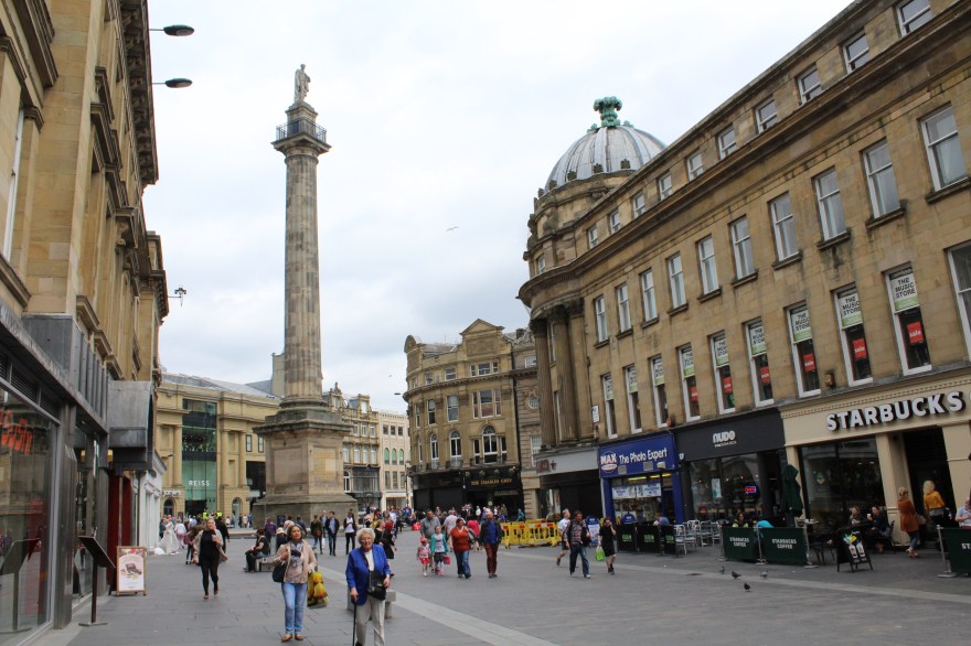
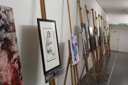
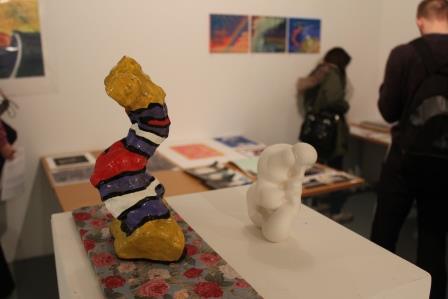
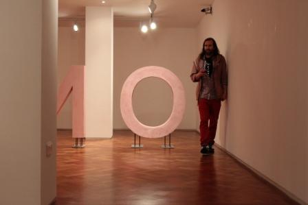
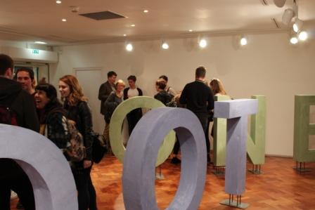
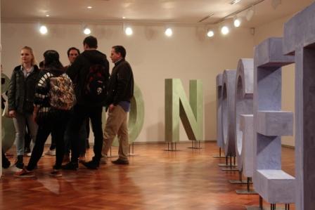
Someone came up with the fantastic suggestion when I was leaving Newcastle in July, that before I say goodbye to the city I should document what have become my favourite and fondest places over the last three years. I thought this was a wonderful idea, especially given how cities change and evolve over time, how interiors get renovated, or places close down. I might come back some day and not be able to go to my favourite little wine bar! I therefore felt taking a few  documentary photos was the perfect way to remember the good times. I’ve had them on my hard drive for a while, but it wasn’t until I revisted the city yesterday that I remembered I’d taken them. I was just visiting for the day to work with the Newbridge and Newcastle-based artist Rosie Morris for her upcoming exhibition at The Laing Art Gallery (preview Friday 30th September, 5-7pm with a live performance at 6pm). It was a fantastic today and I am very excited to be a part of her work (more on this next week or on The Laing Gallery’s website, click here to view).

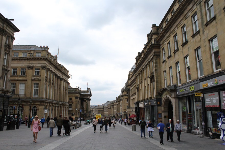
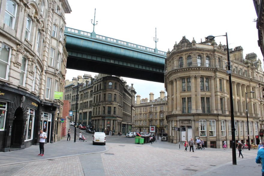
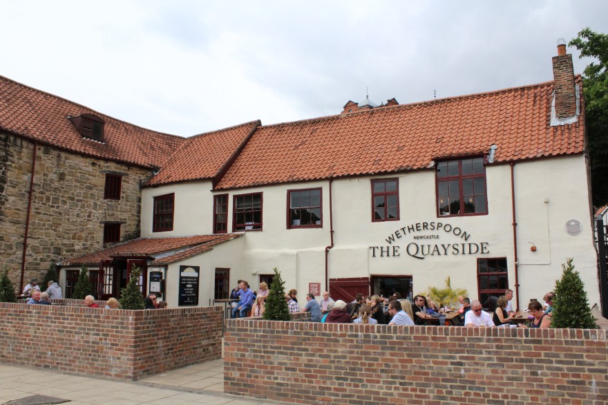
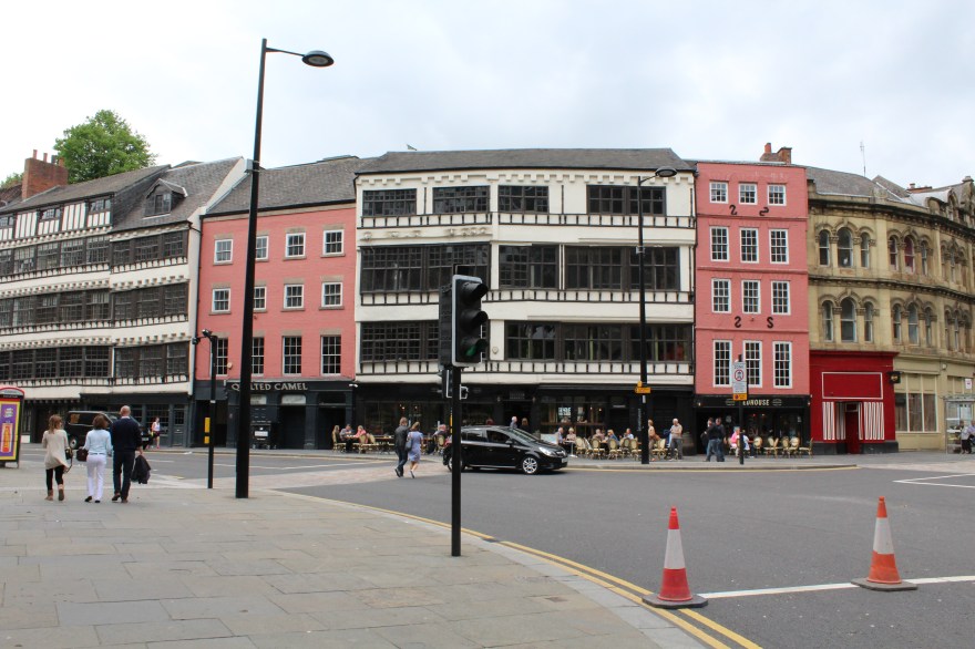
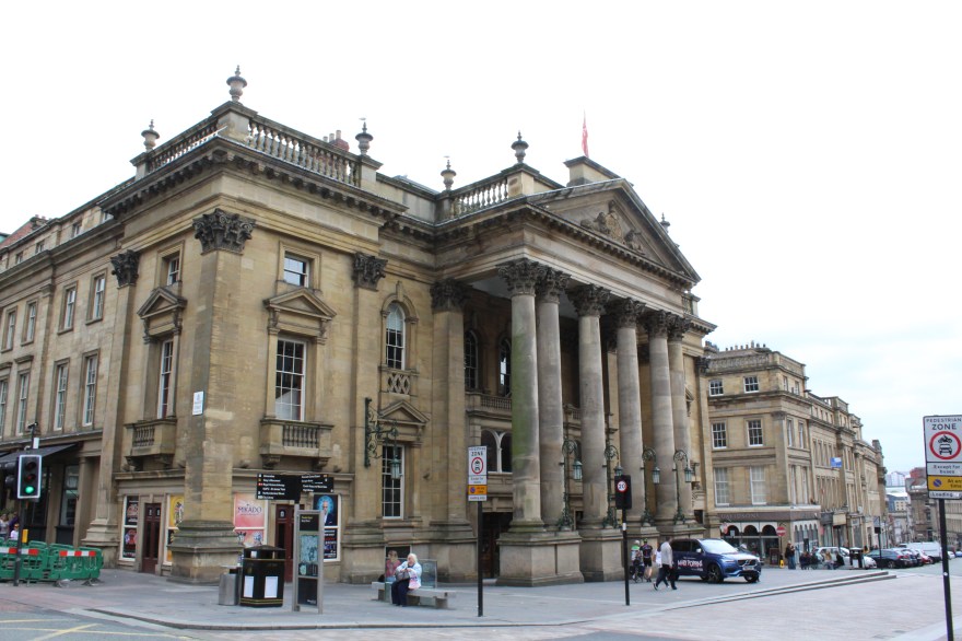
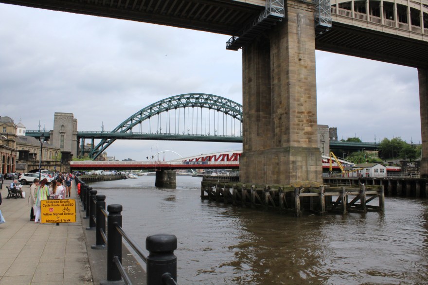
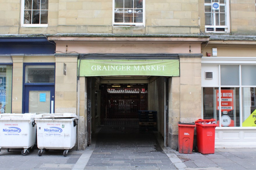
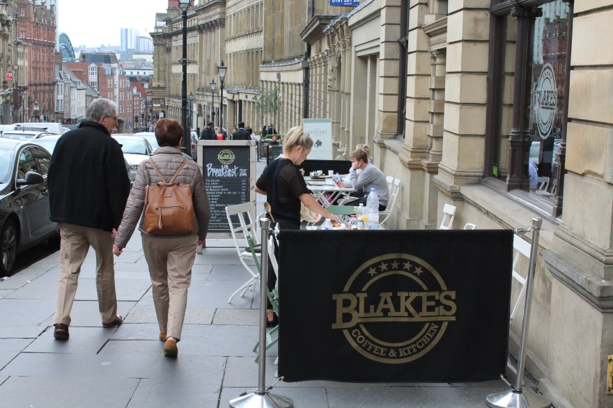
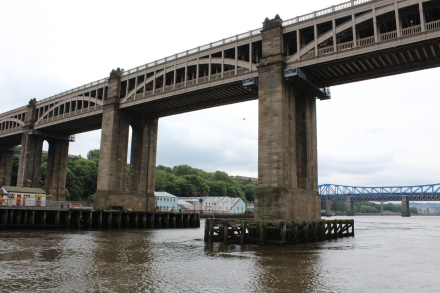
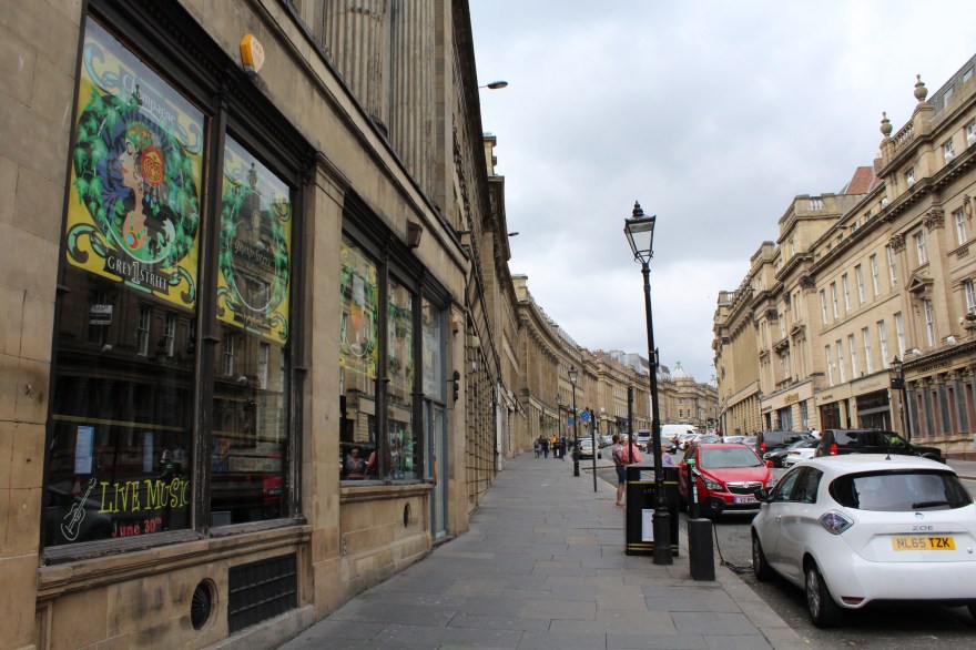
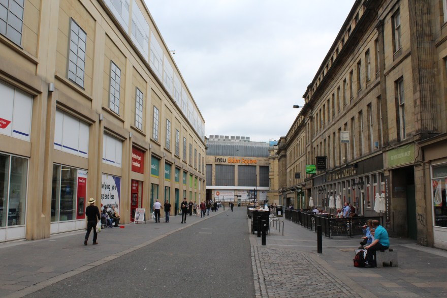
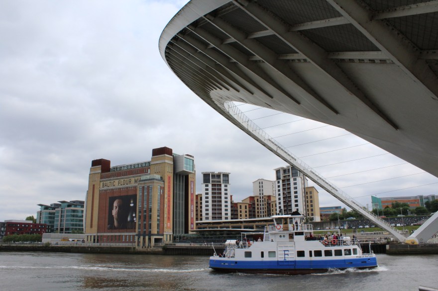
I only realised yesterday however, how lacking my photographic documentation of Newcastle is. I’ve got the Quayside and it’s pubs – the beautiful river front, all of which I frequented often, The Baltic Centre for Contemporary Art (sometimes I kick myself for not keeping track of how many visits I paid there, just for the sake of curiosity!) Grainger Market where I bought all my fruit and vegetables (how I miss it!) Flares, the cheesiest club you will ever enter, but always with the gurantee of a good night! Blakes, one of my favourite cafes, mainly because you can get the yummiest breakfast served as late as 2pm (never miss your breakfast!)

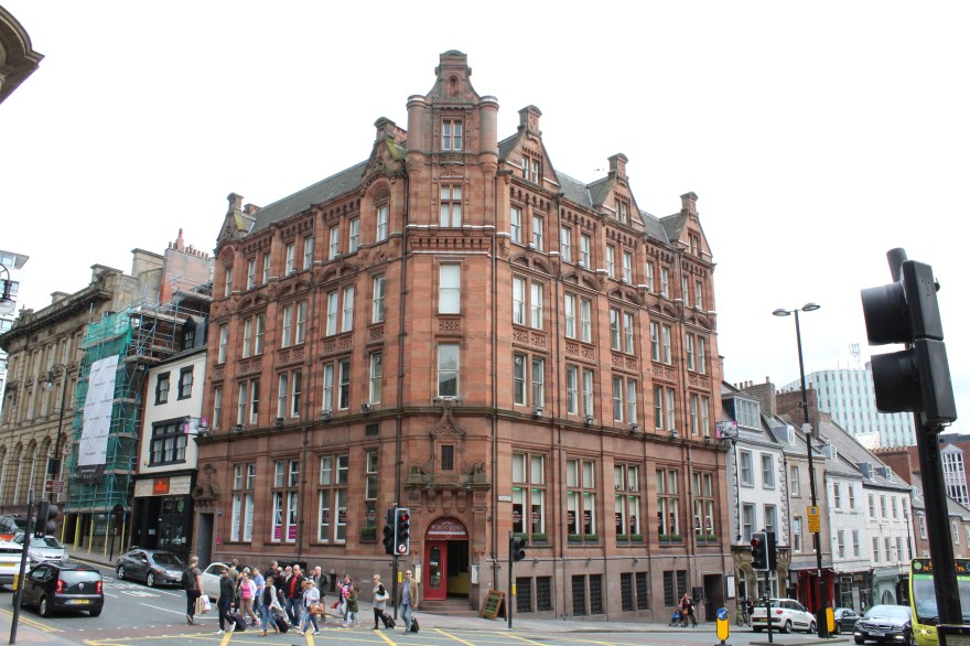
However, I now realise I’ve only really captured the exteriors. The buildings and architecture are of course beautiful, but the interiors are what I want to remember more. I want to remember the dim light of the pub where I was laughing madly with my friends, I want to remember the coffee shop where I had to take my shoes off, I want to remember the chandelier of spoons that hangs in Quilliam Brothers tea house. I suppose, if you have read my previous posts, I am contradicting myself. In the previous statements I mentioned the lack of necessity with imagery, how words can satisfy and be enough. However, in nostalgic projects like these and in the act of remembering, I am definitely a visual person. I feel another few trips down to Newcastle may be needed, for me to complete my collection of memories.

img_9019

img_9116

img_9073

img_9075

img_9080

img_9076

img_9066

img_9081

img_9069

img_9016

img_9020

img_9017

img_9079

img_9072

img_9070

img_9015

img_9096


Pop Up Pink (Part 1)

IMG_8280

Tuesday night was the Pop Up exhibition of Pink inspired by and a result of the ‘Pink’ talk for Colour Studio Northumbria (http://colourstudionorthumbria.weebly.com/). These are weekly conversations mostly led by fellow course mate Rebecca Gavigan. Having led one this week myself on the topic of ‘Time’, I am even more in awe of how she puts them together – especially on a weekly basis with everything else we have to contend with as final year students. Other students and tutors have also led talks  and it’s a really interesting mix of topics that are discussed including things like laughter, material, chance, etc.

IMG_8281

So it was really exciting to see one of the talks mould and shape an exhibition. One of the primary focuses of the exhibition was the motif of ‘shifts’ due to the development of our conversation during the Pink Talk. We covered and shifted across so many different topics that it seemed appropriate to incorporate this aspect into the exhibition. Whilst researching in preparation of the talk I kind of hit a wall. As I have an incredibly girly girl sister, it is difficult for me to look at pink in a way that surpasses my sister’s excessive use of it! I’m not saying that’s a bad thing, I love that when I think of her a colour instantly springs to mind, I think that’s a beautiful way to visualise someone you love. However, it did mean I had to try really hard to distance myself from those associations in an attempt to research more broadly.

IMG_8282

‘Transfer’, Sue Spark, Highlighter and oil on paper, 2016

The Pink Talk was mainly questioning the ‘art pink’ that is so present in the art world today. If you look at art thinking about pink you really do start to notice it’s presence everywhere. Whether it’s a pastel pink, a funky neon pink, or a muted dirty pink; all sorts of variations can be found in different places and across artistic practices. Even in catalogues and publications, pink really is the ‘in’ thing! I can’t tell whether or not I’m surprised it has become a trend, I suppose given the conventional associations of the colour all of these interpretations are an attempt to redefine what pink can be. 

IMG_8286

‘Untitled Slants’, Charles Danby, Acrylic, oil, pencil, ink, magazine, highlighter, paper, linen, 2008-16

What I love most about the Colour Talks is they take something simple and expands it into realms you had never even considered. In my reading of pink I was thinking about gender, feminine elements, flesh – those kind of associations. Of course in the talk we did discuss these. It turns out pink was historically more of a boy’s colour, as it is a diluted version of red which of course symbolises male strength. This is something I would never have guessed myself given all the pink baby girls clothing we are constantly bombarded with! The talk also covered things such as pink in the natural environment and how this colour  can be really striking in that context. The discussion had so many components to it that I don’t think I will ever look at pink in the same way again!

IMG_8283

‘Jawbone’, Projection, Matt Young and Nikki Lawson, 2016

It was interesting how for the most part, those of us who exhibited a work were drawn to the use of a more high frequency pink. This was completely accidental as nobody had discussed the exact tone they would be using in their piece prior to exhibiting. We only realised once all the works were placed in the room. It therefore perfectly demonstrated exactly what we all felt was ‘art pink’. 

IMG_8285

‘Oh Sorry’, Rebecca Gavigan, PVC and highlighter, 2016

We were also all free to choose what we submitted in terms of media, so there was a good range as a result. The mix included installations, video, paintings, drawings, work in situ – there was a bit of everything. Eclectic textures were present too which evoked tactile sensations. Each work had been carefully placed and hung in order to allow the eye to travel across each piece. Placement was key to how the pieces were all viewed and navigated so I found having work on the floor as well as the wall added a dynamism to it all. It was curated in a day and although this was a very brief time period, it was long enough to let me see the thought and process that goes into curating. Something that I currently have little experience of!

IMG_8294

‘No Sexual Connotations Intended’, Samuel Johnson, Timber, mesh voile, gloss, oil and iridescent paint on canvas, 2016

Following this exhibition however I am intrigued by the idea of curating. There’s a responsibility to assembling works effectively; not only to the pieces themselves, but also to the artists who made them. I’ve never done it before but having seen how thoroughly Rebecca considered the hanging of each work, I feel it could be a really exciting thing to try!

IMG_8291

Close up of ‘Rizzo’, Camilla Irvine-Fortescue, Acrylic on canvas, 2016

Auction Preview Night

IMG_1515

So last night was our Preview Night in preparation of our Fine Art Auction next Tuesday. One week to go (drum roll please!) The team did a brilliant job of putting the work on display. Having been one of the people to run around collecting multiple artworks from all over the place I had kind of lost sight of them all as pieces themselves. Seeing them all arranged so beautifully brought back the ability to view them as artwork and not just number five on my list for collection! It’s strange how putting work in a certain setting can completely transform your view of things. I think that’s why taking your work out of your studio is such an important moment, you really get an idea of how it functi0ns without the safety net of a studio.

IMG_1504

I think what I’m most pleased about in terms of the work we had on display last night and in our Auction is the variety. It perfectly demonstrates the expressive abilities of art.

IMG_1519

I was really impressed with the arrangement of things, it was so well thought out. Items leaning against the wall creating interesting shadows, easels all lined up like soldiers, plinths in the centre of the room commanding the space, etc. Makes me feel like I really need to step up and start thinking more about the display and presentation of my work. Definitely not a strong point of mine…

IMG_1512

We have some really strong pieces as well. The above piece, ‘Andria’, is definitely one that’s going to cause some conflict on the night I reckon. This is just a work that says straight out “you need me in your life”. Yes I do you beauty! This is just one of many really strong works. With less than one week to go, feel free to view them at:

http://nuartauction.tumblr.com/

Ken Currie

IMG_1367

Last week I attended a talk followed by a preview of Ken Currie’s work in The University Gallery. Ken Currie is a Scottish artist who’s work predominantly focuses on the human body (yes I know I go on about the body in art a lot, deal with it!). For those of you who are not familiar with his work, prepare to be amazed. His work is haunting, it is eery, yet it is beautiful. It explores themes such as mortality, illness, death, politics, you name it, it’s all there! I have loved his work for years, so when I found out he was doing a talk, I got a bit excited. I lie. I got VERY excited! Not only did I get to hear one of my favourite artists talk about their work, I actually got to talk to him myself and ask all the questions I’ve ever had about his pieces in person! (Yes, I was maybe a little star struck!) I did have this slight fear of meeting him though. What if he didn’t live up to my expectations? What if he as a person affected the way I thought about his art in a negative way? I need not have worried. He was witty, incredibly Scottish and very interesting! 

IMG_1373

The work in this exhibition is very different from what I’ve seen of his previously. It’s more printer then painterly based which is not like Currie at all. It was however very interesting to see his painterly mindset translating across into the realm of print. The way he talked and spoke about his etchings and monotypes was a mindset I could relate to – normally printing is an alien world for me, but Currie made it accessible. As well as discussing everything he had learned in the Glasgow Print Studios, he also went into a lot of detail over who he had chosen to depict in his images. Political activists such as Rosa Luxemburg featured (see below). Currie has always had an interest in history which I think is another reason I am such a fan of his work (yes, you guessed it, I am a history nerd). When he spoke about who was in his portrait, he was also talking how he’d arrived at that particular image. It was purely through repetition. By producing print, after print, after print. Whether he chose the first or last one to display didn’t matter, what mattered was that he had pushed that one image to its absolute limit. When asked how he selected which print to display he said “I think they’re all surprises, that’s why they’re here” Again, a very attractive feature of his art. Pushing it to the point of exhaustion. I in a sense do this too, not to the extent Currie does, but I do drawings repeatedly, just to see what happens as they change every time. As Currie said you have “absolutely no idea what’s going to happen!” Which is the excitement of making art of course. 

IMG_1371

Another thing I find so intriguing about his work is the motif of death. A lot of people shy away from this and treat it as a taboo so it’s refreshing for an artist to address it so directly. Currie’s basically saying ‘shit, we’re all going to die’. Yet he’s also saying that this eventual event, the event of death, is what makes us live life the way we do. If we were here forever would we push ourselves the way we do? Would we enjoy ourselves and value everyday? As Currie did actually say, the inevitability of death “forces us to live in the present”. When I asked him what he was trying to convey through this focus and exploration of such a morbid motif, he said he supposed it was an appreciation of how “fleeting our lives are”. 

IMG_1366

The monochrome colour palette only adds to this sense of the macabre. It’s dark and it’s gritty. It’s haunting. But it evokes something in you. Even if it is just an incredible appreciation for his skills as an artist (seriously, the way he has manipulated ink – stunning!) When I visit an exhibition I want to feel something. I want to walk round and leave thinking about the work. Currie’s does not fail me. I felt uneasy, like every piece was watching me. But I also felt peaceful, because all the works were beautiful despite their dark connotations. And I suppose it’s that delicate balance of beautiful and ugly that make Currie’s work so incredible.

IMG_1372

Alexandra Searle: ‘Empty Vessels’

IMG_0673

I went to what was essentially a ‘pop up’ exhibition last night held at the Second Floor Studios of The Newbridge Project. It was a sculptural exhibit by artist Alexandra Searle in collaboration with Left Leg Gallery. Entry was through the back of Newbridge bookshop and up two flights of stairs. As I climbed the staircase my eyes were bombarded with posters of all sorts of upcoming art events and people to get in touch with. I officially felt like I was entering art world. Almost in the way that Alice fell down the rabbit hole into Wonderland. This feeling intensified as I made my way along the corridor towards the exhibit; there were materials scattered to my left and right and I could feel the creative energy of this building pulsating. As I entered the exhibition space I was met by a small crowd of people and a table filled with pink lemonade and cake. As I turned I was finally greeted by the artwork. There were wooden structures precariously balanced against the wall, a wooden pole stood straight as if it were holding up the ceiling, items hanging from industrial rope. Balance and the precarious nature of the work were evidently strong themes. 

 IMG_0665

The wall was a pastel pink with a drain pipe running along the top of it and the floor a foam blue. I thought these colours were incredibly complementary of the work, yet when it came to discussing the work with Searle, it turned out she had no part in the colour scheme of the backdrop. Sometimes it’s just the happy coincidences in life. As I questioned her it became clear that she had both a relationship with and a truly in-depth understanding of how to use material and fully stretch it to its limits. Playfulness is a predominant part of her work. When I asked her what her core concepts were to these pieces she said “exploring the materials and their weight”. Balance, volume and an element of risk are key features in this. The latex structure in the corner looks incredibly solid, yet of course the material itself is not. I suppose this was the moment where I felt the playfulness theme was the strongest. The temptation to reach out and touch this corner sculpture was incredibly difficult to resist given how tactile it looked! It contrasts brilliantly with the industrial heaviness of the concrete that made up the floor works. Given that this residency was merely ten days long, Searle did not have the time to use concrete but still wanted it present. Although she did not have the time to manipulate it, she did use it as a means of imprinting into her floor-based plaster works. A subtle yet incredibly effective way to correlate the pieces. 

IMG_0664

I suppose in most cases I’m biased in my reading of an artwork. All my work orientates on the human body therefore it’s difficult for me to move outside of myself and perceive a work outwith of this frame of mine. With Searle’s sculptures I felt I didn’t have to. There were too many bodily connotations for me to ignore. Casts alluding to nipples, bum-like works handing from the ceiling and then a piece suggestive of a vagina (above in case you hadn’t already noticed). I asked Searle if this was intentional and she said no, it was merely a happy side effect. She liked that her work could represent bodily elements, but that was by no means the objective. And I like that too. I think ambiguity is something I really struggle with in my work as it is often obvious that it’s all about the body, yet ambiguity is something I find so attractive in art. God damn artists that have it nailed!

IMG_0675

When I spoke to Searle about her influences, I was delighted to hear Eva Hesse featured! Honestly, I am a sucker for all aspects of Hesse’s art. One of the things I find so refreshing about her as an artist is the fact she often favoured her work being presented in her studio as opposed to a gallery. And I suppose last nights exhibition was more studio then gallery based in terms of where it was presented. It’s only as I’m putting this post together that I realise all the photographs I took are close ups, none actually demonstrate how the space was used. Which is kind of irritating and stupid of me, but I think it’s just because I was so taken by the details. I wanted to touch everything and I think the zoom on my camera kind of became my substitute for the ability to touch. 

IMG_0670

 This was one of my favourite pieces (above). Again, I am unable to avoid the bodily connotations as to me it is suggestive of a bladder. What I love most though is it looks like it’s going to fall off at any minute. Yet at the same time it looks like it’s stubbornly going to hang on forever. I almost felt like I wanted to blow on it and watch it swing, tempting it to fall, testing it’s ability to hang on. And I feel like it would have succeeded. Having seen this exhibition, casting is definitely a route I want to go down. I don’t know why I’ve waited this long (well I do, I was going to do it last year but there were complications over workshop spaces.) Anyway, I’m going to try again. Plaster just seems to play with your senses. Invite you in and tease you, yet of course you wouldn’t dare touch an artwork in a space like this. Maybe I’ll make art that people can touch. Or maybe I’ll be too precious about it by the time I’ve made it. Or maybe I’ll try working with plaster and it will be a total disaster. Who knows, that’s the fun of it! And it seems Searle had fun here. Ten days is a tight schedule. Even tighter is the two days in which her work actually came together. I find that in most cases, the last minute rush is where you produce your best and most complex work and then you wish you had more time. But hey, if the end result is anything like Searle’s, who needs time? 

Sarah Daglish: ‘Ichor’

IMG_0531

So last Thursday I went to the preview of Sarah Daglish’s exhibition ‘Ichor’. It was my first exhibition preview I’ve been to with the intention of blogging about it. Normally I’m just an exhibition addict because I love seeing new things and discovering new artists. Now however I have the urge to write about and explore what I’m seeing. Which is very exciting. And slightly nerve-racking. Stupidly I didn’t bring my camera to this preview (a mistake I will not be making again…) I felt kind of naked without it and of course had no images to accompany the thoughts that have been sitting dormant for over a week. So I ran back in the other morning to take some snapshots and here I finally am sitting down to write. 

IMG_0527

 I don’t know what I was really expecting from Daglish. The poster was in my opinion relatively illustrative in comparison to the work which was far more sculpture-orientated. In some cases you could argue this is misleading, but I liked the mystery it held. The poster gives nothing away therefore when you walk in your are met with the work for the first time. And that air of ambiguity really worked on preview night. I was not expecting moving image, yet there was a very mesmerising film of pouring liquid played on loop. I definitely was not expecting there to be such an emphasis on material, but that formed the basis for the entirety of the work. In the case of ‘Sweet Bath’ you have liquid oil and smoked paprika encased and contrasting with solid tin. Oil and paprika are not only both edible materials, but they also appeal to multiple senses including smell. The bath contents were so tactile looking I almost had to resist the urge to dip my finger in it! But that was how the entire exhibition worked. You wanted to touch, you wanted to smell, you wanted to experience the material and I loved that. It was almost as if you could see and feel the relationship Daglish had during creation. Well, you definitely could in the case of the burnt wood. I was speaking to her and she was saying that given these were done in her back garden, there was very much a danger element to burning the wood. And again a sensory element – simply by looking you could almost smell the burning and hear the crackle of it. 

IMG_0535

I was very impressed when she told me her garden shed was essentially her studio. You’ve got all these industrial kind of processes going on, such as with the stamped copper plates, in the least industrial environment. A back garden. The most simple of places. A garden is now officially on my wish list! Yet half of the elements present in this exhibtion could not have been entirely tested in a garden, therefore it becomes evident how truly willing Daglish is for her materials to take control. She “never quite knows what’s going to happen” and that is the magic of it all. She is at the end of the day merely playing about and testing materials. Experimenting. I would even go as far as describing her not merely as an artist, but as a chemist. Her work is essentially an exploration of material properties; the change they undergo when mixed or burnt. There is also a presence of chance and the will to allow a material to evolve itself, such as with the copper plates which Daglish believes will eventually oxidise. 

IMG_0533

Another thing that really got me was the reflections. I don’t know if this was intentional, but given her depth of material understanding I’m going to assume it is. Her use of the fluids against the solids worked beautifully in the sense that people’s reflections fell across the liquids creating a movement in the otherwise static works. This was the case with both ‘Sweet Bath’ and ‘They Eat Not Man’s Food’ (above). Not only that, but there is the contrast between these liquids themselves. In the case of ‘Sweet Bath’, the liquid is encased in a solid frame (which Daglish was hoping would not leak!) and then with ‘They Eat Not Man’s Food’ it sprawls itself in a lazy puddle across the floor. Again there is edible material present, although this time it is in the form of treacle not oil. The urge to touch and the connotations of taste bring in the element of human presence which is hinted at throughout her work. Not only does it have sensory appeal, but also a physical one. The layout of her works in the space forces you as a viewer to navigate your own route; there is no direction, again merely the element of chance. 

IMG_0536

I think my favourite works were the copper plates. I loved how beaten they were, how handmade they looked yet at the same time, how the words were perfectly formed. I’ve worked with copper before and it is not the most obedient of materials! It can also be a very laborious process, but I feel this comes naturally to Daglish in her work, there is a strong sense of will to push boundaries. The words beaten out hinted at the source of Daglish’s inspiration for all of this: Greek mythology. Her exhibition guide reads: “Ichor is the ethereal fluid that is the God’s blood; said to hold the qualities of the immortal’s food and drink; ambrosia or nectar. Golden in colour, Ichor is considered to be lethally toxic to humans.” It sounds so lyrical yet simultaneously menacing. And I suppose in my opinion that sums up her pieces. They are all works of contrast, feeding off each other in a dialogue where material is the undercurrent for it all. Touch, taste and human traces are all integral in this journey of material exploration. And what an experimental journey it has been for Daglish. 

Exhibition Preview

IMG_0499Last night I attended a couple of exhibition previews that were going on simultaneously. One was in Gallery North and the other in the University Gallery. It was a truly inspiring evening with so many interesting people. And lots of wine. Let’s not forget the wine! The exhibition held in Gallery North was Laurence Kavanagh’s ‘October’. Yes you heard me right, an exhibition called October in October. Slightly misleading for the posters but there we go. It was beautifully presented. It was a collection of purely monochrome works whose textures were so temptingly tactile. The gallery space had been fully utilised and the lighting successfully manipulated to really highlight the work. The lighting was also very atmospheric for the evening, I almost felt like I was in some kind of film where all the characters have flyaway hair, speak fluent french and wear fancy black coats as they scrutinize the artwork. Whilst holding a glass of wine. Although for Kavanagh’s exhibit wine was not allowed into the gallery which I’m assuming was because of some of his floor based works. At this point in the evening I hadn’t got my camera out (stupid I know) but don’t worry, I will be going back and photographing ‘October’ for an upcoming post where I will go far more depth about the exhibition. For now I want to talk more about the evening itself because it was damn good night!

IMG_0489

The University Gallery had Hope Stebbing and Oliver Perry’s collaborative work they did for The Great North Run. Having successfully pitched their idea to the Great North Run’s panel they were given approximately a year and £4000 to complete their work. What they created was put at different points of the Great North Run but when run together the words read ‘onward’ ‘together’ ‘as one’. They choose to paint these words in the most gorgeous pastel colours. Honestly, having seen this, pastel is my new thing! The atmosphere across the two galleries was very different I felt. This was interesting and of course inevitable given how different the works and the layout were. Kavanagh’s exhibition was slightly more reserved and serious. People were quieter and observing. In Stedding and Perry’s exhibition people were milling about, laughing loudly, fighting for the incredibly yummy cheese and other nibbles on offer! It’s nights like this where you can learn so much just from looking and being there. Listening is what I did for half the night and some of the things I heard and left thinking about will stay with me. 

IMG_0503