Vinyl Icons: Persian Pop and Turkish Psychedelia Part II

IMG_8736

‘Vinyl Icons: Persian Pop and Turkish Psychedelia’ is a unique exhibition unlike anything I’ve seen in Newcastle before, despite having lived here for almost three years now. This show  perfectly encapsulates what contemporary art represents. It is about making art in the present and using this as a platform to reflect and comment on the world around us. The strength of this show lies in its explorations of history; the revolution in Iran and how an oppressive regime followed, forcing artists and musicians to close shop and adapt to more censored ways of working. Yet throughout the show this historical narrative is not overly explicit and loud in its protest, but instead it is subtle and sophisticated. Snapshots of the world and stories of the past come through in the objects, in the travelling and collection process that has been carried out.

IMG_8720 

One of the things I love most about this exhibition is it creates a real sense of the nomadic lifestyle. The evidence of travelling to far flung places and finding hidden gems is entirely present throughout. It makes me want to be more imaginative with my findings. I am a sentimental person in the sense that I have an old shoe box filled with my special moments. The box contains what would be considered throwaway items to most people, such as a cinema ticket or a used stamp, but for me these little things hold precious memories. My box contains items such as concert tickets, doodles done on restaurant napkins, brooches, Kinder Egg toys, clothes labels, cards I’ve been sent, photographs, plastic and childish rings, the list goes on. Now, some people may consider that junk and to an extent I suppose it is, but each of those items retains a precious moment for me; a good time where I was laughing with my siblings or joking with my boyfriend. Through items we capture and record life and ‘Vinyl Icons: Persian Pop and Turkish Psychedelia’is the perfect example of this. 

IMG_8696

Having lived and travelled a lot throughout my life, it’s fair to say I have my fair share of collected exotic items. Little marble statues from India, patterned scarves from Kenya, silver rings from Oman, postcards from all over Scotland. These items are the little jigsaw pieces that come together to document my life and where I’ve been. I love the surprise of going into an old handbag pocket and finding within it a keyring I picked up on my travels. Much like curator Sara Makari-Aghdam, I find stories in the items we keep and I think that is why I love this exhibition so much, because I can truly relate to it. Sara discovered her father’s old cassette collection of Persian pop music years ago and it has fueled and inspired this show. What I find most intriguing about objects is their own personal journey; if it’s a vintage dress who owned it before it was procured? What kind of occassions was it worn to? Was the person told by their lover that they look lovely? Looking at old items, all these questions come flooding to my mind. Through objects a strong sense of presence comes through and in ‘Vinyl Icons: Persian Pop and Turkish Psychedelia’, this presence is excitedly overwhelming. 

‘Vinyl Icons: Persian Pop and Turkish Psychedelia’

IMG_8729

Having been away from Newcastle for a while, visiting Vane Gallery’s preview of ‘Vinyl Icons: Persian Pop and Turkish Psychedelia’ was the best way to get me inspired enough to return to writing. Curated by Sara Makari-Aghdam, this exhibition explores her dual heritage, as she is an exotic blend of Persian and English. ‘Vinyl Icons…’ also explores the rich Iranian culture of the 1960s and 70s by combining the work of five artists, three of whom lived through the 1979 Revolution. The show is therefore bubbling with culture and heritage, histories and lost pasts. It encapsulates these themes through an explosion of colours and textures; the pieces bounce off the walls in their ecstatic vibrancy. As I enter the gallery space I am greeted by the soaring melodies of Turkish and Iranian pop music and a wave of nostalgia instantly hits and transports me back to the souks and markets of Oman. I recall the smell of incense that used to burn as I walked along the corniche to watch the sun set over the Omani coastline. Having lived in the Middle East for several years, this exhibition brought about a lot of sentimental feelings for me.

IMG_8745

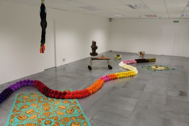
‘Vinyl Icons…’ consisted of an eclectic blend of items, much like an Arabian or Turkish market would. There was opulent jewellery and brooches dripping from and decorating vintage clothes collected and found in America. There were vintage Clarks shoes from 1969, there were extravagant light boxes paying homage to religious shrines, there were photographic montages, family photos, handpainted dresses, a wide collection of sexy record covers and vintage magazines from the ’60s and ’70s. There was even a piece inspired by Afsoon’s mood boards that she creates in her London studio. 

IMG_8740

I was particularly taken by this piece. As the eye shifts across the work, it is constantly met with fantastically bold items such as maps, stamps, tapestries, dish towels and jewellery. It is highly tactile piece that for me really appealed as I felt like I was being invited into the artist’s methods and thought process. I could see from the variety of items present that collecting is integral to her practice. Colours, textures and the considered distribution of both these elements contributed to the success of this beautifully energetic work. 

IMG_8708

Talking with Afsoon, she told me she uses a lot of matchboxes in her work. She likes the surprise of finding unexpected items stored inside such as a hair pin or a tooth, when she buys and collects vintage match boxes from places. Who would have thought an everyday object that I mostly associate with frustration (given my inability to light most matches) could be transformed into something so delicate and beautiful? Housed in their little plinth-based box, these match boxes stood proudly showing off their collaged covers. 

IMG_8706

I was delighted by the constant surprises this exhibition held for me. What originally seemed like pretty little hand-painted shoes (above), soon revealed as I circulated the delicate figure of a nude female body. This simple yet highly effective manipulation of the object was for me one of the best parts of the exhibition. It was cheeky, beautiful and unexpected. Hand-painted shoes were also present on another lower laying plinth, which brought the eye nearer to ground level. From a distance the boots look as if they are decorated in loose swirls, but upon closer inspection exotic feminine eyes can be revealed. 

IMG_8702

 Feminine motifs ran throughout the gallery, with dresses, jewellery, naked bodies and portraits littering the walls. Having lived in regions of the Middle East where women wear abyas all of the time, it was interesting to see a mix of clothing  that ranged from the hand made to collected  vintage items. It was also really interesting to see such Arabian looking objects such as the vinyl case (below left), cleverly placed next to another casing with such an erotic depiction of the female body (below right). Yet Iran was originally very much influenced by the West and was very liberal and this exhibition successfully highlights and explores this blend of East meeting West.

IMG_8722

‘Vinyl Icons: Persian Pop and Turkish Psychedelia’ is for me one of those exhibitions that completely transforms the white walls of the gallery space. Through the highly visual and tactile materials, the variety of items on display and the ever-present music, I felt entirely transported to another place. I felt incredibly inspired by the colours of it all and the memories of Oman that it reminded me of. It was a strange sensation as I stepped back out onto ordinary Pilgrim Street and my doorway into the rich culture of the East faded and remained within the walls of Vane Gallery. I was transported from one world to another, but that is not the end of my experiences as I will definitely be returning to this show on numerous occasions!

To read more blog posts about this exhibition see:

Part II

Part III

Critical Writing for Vane Gallery

Recently I have been trying really hard to work on and expand my writing skills; as much as I love blogging and using colloquial language, I also enjoy writing in more formal and critical terms. Recently therefore I submitted two pieces of critical writing Vane Gallery and I am delighted to have found that they have both been published. Feel free to have a read on the links below:

IMG_8250

‘The Beauty in Grotesque’, a critical review of Jock Mooney’s exhibition ‘Who Are You and What Do You Want?’ at Vane Gallery. Click here to read. 

IMG_8256

‘Layers of Meaning’, a critical review of Oliver Braid’s exhibition ‘The Nude Ignity’ at Vane Gallery. Click here to read.

Benedict Drew

IMG_8496

I think it’s say to say that Benedict Drew’s wacky installation was by far my favourite work in The British Art Show 8. Exhibited within the Talbot Rice Gallery, Drew’s work is the definition of transforming a space into something completely new and exciting. What had been quite a clean cut angular-looking gallery space prior to my entry into this room, was soon turned upside down as I entered Drew’s work. I was instantly transported from the traditional gallery layout to what felt like a psychedelic sci-fi space. I was in awe. Sound pulsated heavily across the room; I could feel it in my core and reverberating through my entire body. There were headphones placed on the table which of course I reached out and tried on only to find that they amplified the sound that was already echoing around the room. It was almost like an electro heartbeat and instantly made me feel like I myself was a part of the piece.

IMG_8476

The utilisation of the architecture within the work furthered Drew’s success as I felt the gallery dissolved and blended into the installation to the point I felt fully consumed by the piece. Just like this installation, Drew’s practice spans a wide range of media including sound, performance, video and various other forms. He often creates chaotic and absorbing environments that pulsate with life, drawing in the viewer and providing them with a multi-sensory experience. Although there was a lot to take in when I viewed Drew’s work, surprisingly it was not overwhelming. Installations such as this have that risk factor; bombard your audience and your work is often lost on them. Yet Drew defied this by carefully distributing the pieces, creating a walkway for the viewer to enter and navigate their way effectively through his work. The shapes I was met with and the colours that were used all complemented and blended with each other allowing the human eye to adjust to the bright colour palette that was present. 

IMG_8481

When I got to the back end of the installation I was greeted by large, cinematic screens. Drew’s attention to detail was plain to see with the modern white speakers contrasting to the excess of cables wrapped believe it or not, in tinfoil. Drew took a domestic everyday item and turned it into an art piece that distracted nicely from the ridiculous amount of cables that all his technology requires. It also furthered my reading of the sci-fi elements. It was not just the detail in the cable layout, but also in the stands of the screens. Instead of being a dull conventional black they were a lime green that instantly caught my eye (probably due to the fact I seem to have developed an unexplained love for lime green). 

IMG_8482

According to The British Art Show’s text accompaniment to this piece, Drew was articulating “the horror of the modern world” through this work. Through his multi-media approach he explored this horror thoroughly! It was impossible to ignore the screens that bombarded you as you approached, an obvious reference to our screen culture of today. There was sound that shook through your bones, the way music does in a club. Colours and structures clustered everywhere in excess alluding to our material and consumer culture. There was no escape in this whimsical and all-consuming environment; the pace of it drew you in and refused to let go much in the way that modern day life does. 

IMG_8480

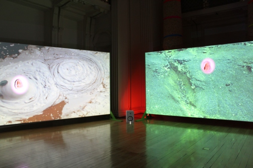
Yet in among all this technological-based motifs I was surprised to view what looked like mud puddles on screen. They were very anthropomorphic and alien given their electric colours, yet I half expected a David Attenborough voice over mixed up DJ style to come on!  It would not have surprised me, as this work was a constant succession of surprises – and puzzles. There was one area of each screen which had a shell attached to it and a spot light which remained the same colour despite the constant shift in imagery. I could not for the life of me figure out how Drew had managed this! 

IMG_8485

There was not a moment of boredom in this space. Despite this being the first piece I saw of The British Art Show, and despite me witnessing several other works that day, this was the one I could not stop thinking about. I couldn’t get this psychedelic experience out of my head. Partially I think because I was both impressed and fascinated by how Drew had used technology and created such an absorbing work. But also partially due to the elaborate colour scheme – I myself almost wanted to start glowing and blend into the work! I think it’s safe to say Benedict Drew succeeded in captivating his audience, whilst also posing some challenging questions concerning modern life today. 

Flora Whiteley ‘Present Continuous’

IMG_8260

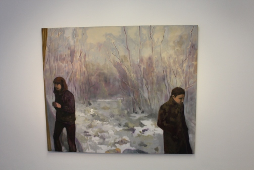
Talking more about getting back into painting is actually relevant to another exhibition I saw recently at Vane; Flora Whiteley’s ‘Present Continuous’. Given her cinematic background, her works have elements of film and stage-like set ups, which bring a new dimension to what are otherwise very painterly works. At present I’m not too interested in researching the background to her paintings and all of the concepts she was exploring; I’m simply wanting to look at and appreciate the paintings themselves. Particularly in terms of her use of colour. The above work is the perfect example. Through her pastel hues and soft palette, the cold of winter she’s depicting in the picture comes through to real life. You can almost feel the cold creeping into the gallery space. 

IMG_8266

It’s the same with this piece (see above) as well. The smoke from the girl’s cigarette has that wispy aesthetic of real life smoke. Although it’s a static image, you can see the cusp of energy it carries, as if the smoke could blow out of the painting and into your face as you view it. I think the lack of hard edges enhances this sense of movement. There’s a softness to the painting and a delicacy to the technique. What looks like fairly heavily applied paint is in fact an abundance of layers built up over time. The technique of the painting application varies between dry-brush and more of a solid application of colour. The contrast between the two creates a nice sense of balance within the painting. In some instances we are able to see the linen on which the paint is applied, in others we are presented with purely a build up of tonal work. 
IMG_8265

There’s a real sensitivity in her depictions of the figures as well. Their stances are not too posed, they simply hold themselves. The muted colours of their clothing allow them to almost blend into the background, not occupying too much attention within the piece. The tilted angles of the head, the slight bending of elbows, every element is thought out and all contribute to create a linear direction for the eye to travel round. 

IMG_8263

The scale Whiteley has chosen to utilise complements her figures as well. They are not quite life-size but they have that element of suggestion. You can relate your bodily proportions to the piece. They also allude more to Whiteley’s cinematic background – not quite on the scale of being a cinema screen, yet they are not far from it and have the potential to be one. There were also far smaller portrait paintings, yet I preferred the larger ones as they really allowed me to closely study her technique. 

IMG_8264

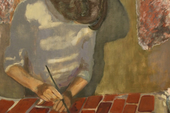
I don’t always take photographic close ups of work, as I prefer to have the entire body of the piece to contemplate as I reflect on it. However in this instance I was far more fascinated by close up studies of it all. The way Whiteley had broken up the pieces through angular lines and blocked colours. The shapes she formed through her placement of the figures. The depth created through the variation in colour. There was so much to see and absorb, that standing far back felt like I was missing out!

Jock Mooney Part 2

IMG_8246

Normally I’m quite wary about using or associating art with the word ‘kitsch’. All it encompasses are elements that do not cater to my usual taste. Kitsch to me normally creates associations of tackiness and poor taste – which to excess form the definition of it. Yet that was the word that sprang to mind when I walked in and saw these pieces. For once in my life I don’t mind using the word, as I think it totally works in this instance. Even better, I’m getting the ironic vibes here which means I’m even more comfortable in applying the term to Mooney’s work. I don’t feel he’s done it without the intention of being sarcastic. 

IMG_8250

So Mooney has succeeded in being the first artist to ever have me accept ‘kitsch’ as a good thing. Kudos. Not only that, he’s also managed to incorporate bizarre and seemingly random motifs into his work which I can’t stop looking at. Of course they’re not random at all. He’s got Janus cats for one. The name Janus coming from the Roman god who is normally depicted looking forward into the future and back into the past with his two different faces. This symbolises Mooney’s contemplation of life in this exhibition. Then there are all these cake-like sculptures, which reference certain religious festivals and religions through grotesque formations that in some instances take the form of the severed head of Marie Antoinette. Culture, history, religion are all just some of the components Mooney explores here. It’s all slightly unnerving and creepy, yet the vibrant colours reign it back into the realm of playfulness. 

IMG_8253

What I didn’t find too playful was this floor-based work. I think this ginger bread picnic mat for me was slightly mad. You’ve got severed fingers scattered across it, along with laughing faces who you can almost hear jeering at you. Not sure I fancy eating a cucumber sandwich sat with all that watching me. But it worked very well within the exhibition context, especially given the play on space. It’s really interesting that modern day sculpture is abandoning the plinth in favour of the floor, as it forces the viewer into a direct relationship with the work. Especially with a piece like this, is it a picnic mat or is it a sculpture? Where does art begin and art end? It’s all about the blurring of boundaries and comes back to that idea of exhibitions that are designed to challenge conventional perceptions of artwork.

Alice Theobald and Atomik Architecture

DSC00201

 I have viewed this piece at The Baltic a few times now. I did not run to write a blog about it, as I wasn’t entirely sure what I thought. I needed more time to process what I’d seen and I also felt like I had to see it again before I could formulate my thoughts into anything worthwhile. That is not a negative thing. The fact that this work forced me to really think and contemplate my experience of it shows its staying power and effectiveness. The work is co-authored by Alice Theobald and Atomik Architecture. It’s an endevour to blend an artistic practice with architecture. Given that Theobald works in performance, sound and installation, it’s quite an ambitious choice of blend. Hence my excessive contemplation over it all. 
DSC00194

It was interesting because when I arrived on Level 2 the above scene is what I was greeted by. There’s an instant blockade which suggests a lack of access. A lot of visitors did in fact question whether or not they were allowed to enter the structure. I don’t know if it’s because I’m an art student and have seen things like this before, or if it was just an assumption on my behalf, but I entered without hesitating. I knew it was designed to make the viewer question so I was instantly quite taken by it! That was before I even entered the structure which is made up of everyday objects such as duvets. The comfort of that item in a space as awkward and industrial as this was quite a contrast. It brought the idea of comfort zone and bedroom space into a gallery setting which was an unusual experience. Yet it demonstrates the success of the piece given its play on the conventional associations of architecture. 

DSC00195

There was writing scrawled across these interior duvet forms; it was difficult to make out so it took a lot of time to read. I found myself reading out loud in an attempt to process it better. This play on interior and exterior was brilliantly constructed. As the piece had all sorts of components including sound, video, performance through the installation, it could have been a very overwhelming experience. However, given how they had broken up the space by placing spherical structures at various intervals, it created an easing of the senses. There was singing playing throughout the gallery and the spoken word as well, yet when I entered the ‘duvet columns’ as I will call them, the exterior sound reduced slightly, allowing me to better concentrate on the text. 

DSC00197

These ‘duvet columns’ were dauntingly high, so much so that they reached the ceiling. As well as emphasisng the expansive nature of the piece, it also really highlighted the relationship between the work and the architecture of the gallery. It was entirely work-in-situ. This was highly effective as it is not often you contemplate the ceiling of a gallery space, yet Theobold and Atomik make it a key element. The height also furthers the emphasis on the difference between interior and exterior. As does the fact I was being videoed as I circulated the work. There was a live stream documenting people walk through the work. This meant at certain points there were projections of my face at certain points up on the outer walls of the structures! This was on the one hand quite funny and amusing, but on the other quite uncomfortable. It was a relief to get out of the view of the cameras once I was back inside the columns! This created two different emotions for me in response to the entire space. Outside and looking up at the columns made me feel small and exposed; being inside the columns surrounded by duvets and away from the cameras made me feel comfortable and safe. Two entirely different experiences, both within the same space. 

DSC00198

I’m so glad I went more than once before I wrote about it, as my experiences both times were entirely different. The first time I went there was music in the background and performers on the stage, the second time I went there were no performers with only a woman speaking as the audio. Two entirely different situations, but again within the same space. This led me to question how the piece is set up, do the performers come on at a fixed time everyday? Do they perform daily? Do they improvise? Why is there music when they are on stage in stead of the spoken word, is it to make it more theatrical? All very interesting questions that contribute towards the complexity of the piece. It’s not what people would call ‘pretty art’. Personally however, I far prefer art that challenges me and really forces me to question it. Theobald and Atomik are certainly successful in that respect. 

B. Wurtz at Baltic

DSC00218

Contemporary art is often controversial in it’s reception. Some people love it, some people hate it. Some people think their children could have done it. Other’s say their child didn’t do it and the artist beat them to it! This artwork is the perfect example of that retort. Wurtz’s practice revolves around taking a simple everyday object and turning it into something beautiful. In this case, he used food trays and painted the shapes on the bottom of them in different colours of acrylic. First off, I had never even noticed there were so many shapes to the bases of these trays. Second off, this is genius!

DSC00221

It is such an incredibly simple thing but surprisingly elegant too. Who would have thought food trays could look this good?! And together in this form of display they look absolutely brilliant! Walking into the room I half gasped in amazement. Initially I couldn’t figure out what the objects were, but on closer inspection I was stunned to realise it was merely food trays! 

DSC00219

The way they are all arranged is reminiscent of the way portraits are hung in an old historical castle. They have that sophisticated clustered vibe going on. The colours themselves are very rich and bold, almost like jewels. What Wurtz has succeeded in doing is elevating the most simple commonplace object into an art object. Marcel Duchamp’s urinal here we go again!

DSC00223

I think what’s so lovely about this is though is the air of playfulness! It’s not trying to be anything fancy or anything that it’s not. It is purely an adaption of a simple material that is undergoing a transformation into something more beautiful. It’s almost like Wurst is the fairy godmother to house hold materials! He does it with other bits and pieces such as plastic bags and shoe laces but the one that really caught my eye was what I call his photographic tree:

DSC00215

They are little photographic strips hung delicately in this form. Again, so basic but so clever. The best part about all this is it really shows that you don’t need lots of money to make art. Anyone can do it, it’s just about using your imagination and experimenting to see what happens!

Yvonne Hindle ‘Supertranslations’

IMG_8227

IMG_8239

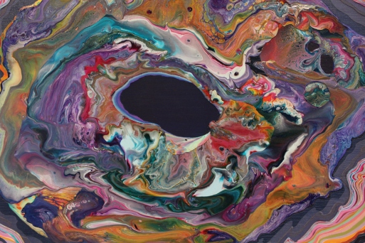
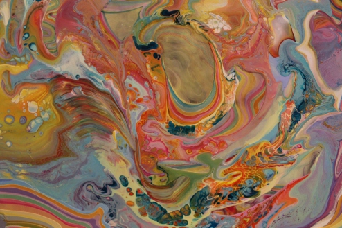
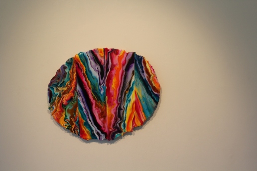
Yvonne Hindle’s ‘Supertranslations’ is an exhibition at Gallery North which sadly ends today. It is truly beautiful and she is clearly a master of paint.  There is so much going on in her paintings, they’re like her own individually created universe. When you look at them you feel as if you are falling and being absorbed by a city of colours. They have so much energy that the paintings seem to pulsate and burst from the wall. What catches your attention first and foremost as you enter are of course the colours; they are truly stunning. What I love is the bold mix, there’s everything from soft yellows and pinks, tame blues, to black-like purples. The contrasts are therefore strong and this is enhanced by how Hindle has segmented them. What looks like a swirling mass of coloured chaos is in fact an orderly and structured arrangement, almost like the stratas of a layer of rocks.

IMG_8231

IMG_8243

This is where her interest in the micro comes in. From afar the paintings look like happy accidents; close up they look highly intuitive – no layer or colour has been added without purpose. There is a precision to it all, clear divides between segments and carefully considered colour dilution. Texture also plays a part in it all. Most pieces are relatively smooth, allowing the swirling colours to take centre stage. Others are far more textured and temptingly tactile. Personally, I prefer the smoother ones as that way I can concentrate solely on the colour. I’m not saying however the textured ones aren’t interesting, if anything they make me want to get my modelling paste out and work in a truly impasto style! Which I may do anyway having seen all of this work. The marbled effect of the paint allows me to see it’s movement; how it’s seeped and ebbed together. You feel as the process has the potential to still be going; as if at any minute the colours are going to start moving into each other again.

IMG_8228

IMG_8236

What I also like about all the paintings are the edges of them all. The paint starts to tailor off in lot of cases and that is where the layering technique starts to be revealed. The pieces hint at how the colour has been built but at the same time gives nothing away. I also really like the lack of hard edge, I think this works really well in relation to the contents of the paintings. It adds to that sense of chaos ordered as non-chaos. Scale wise it’s perfect too, not too big and overwhelming but not too small to prevent you from viewing the detail. They really are such energetic and lively pieces, if I had a wall of them in my house I’d never be uninspired ever again!

Brian Griffiths: ‘BILL MURRAY: A Story of Distance, Size and Sincerity

DSC00206.JPG

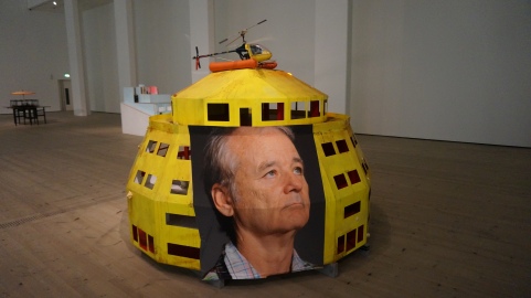
So this was also at Baltic when I visited. I saw it last time I was there but never got round to writing about it. I think this is because I had so many people say to me “have you seen that Bill Murray exhibition at Baltic?” and so by the time I eventually did get round to seeing it, I was already slightly  sick of it! Even after all they’d said, this was not what I  expected! I don’t really know what I was expecting…cardboard cut outs of him maybe? Or some all singing all dancing video installation? Satellite-like installations and little dolls houses were therefore quite a surprise! 

DSC00207

As was the childlike aesthetic which was particularly evident in the painted house piece. The whole exhibition had this childhood nostalgia to it, I think because dolls houses were present. They were lit from the inside and invited you in. They felt very homey in a way but simultaneously distant, as if they were pushing and pulling you into and away from them. Teasing you. Become a part of it or leave it alone? It was quite exciting peeping in not knowing what you’d see. In most cases it was shells from the ocean which I really liked, as they contrasted nicely with the wooden construction of the pieces. 

DSC00212

As well as childhood nostalgia, I also felt there was a certain melancholy to it all. I don’t know if that’s because the space felt so big and silent for these sculptures. Although they are fairly sizable in themselves, they are the smallest structures I’ve ever seen on this floor of the Baltic. The silence just seemed so loud because of this, it was almost eerie. Haunting. Like you weren’t meant to be there but of course that’s a contradiction given it’s a gallery where the sole purpose is to view art.

DSC00210

Most pieces were quite precariously balanced which I think also added to the child-like element. It kind of made me want to get some bits and pieces of my own and start adding to the work! Or bring in some of my own houses to fill out the space and create more liveliness! Bring in one of my old dolls houses. Oooh wow, imagine an exhibition where everyone contributed their old dolls house! In a way it would be kind of creepy. Or maybe that’s just me, sometimes stuff like this freaks me out! 

DSC00211

I wonder what it’s like to be Bill Murray and have an exhibition  focused on you…Must be truly bizarre – that is, if he even knows about it!