Panic Attack Series

026

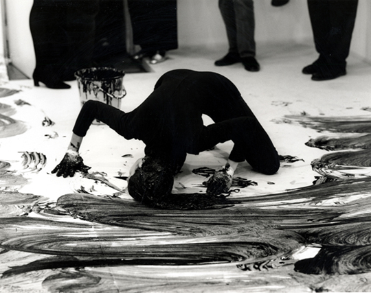
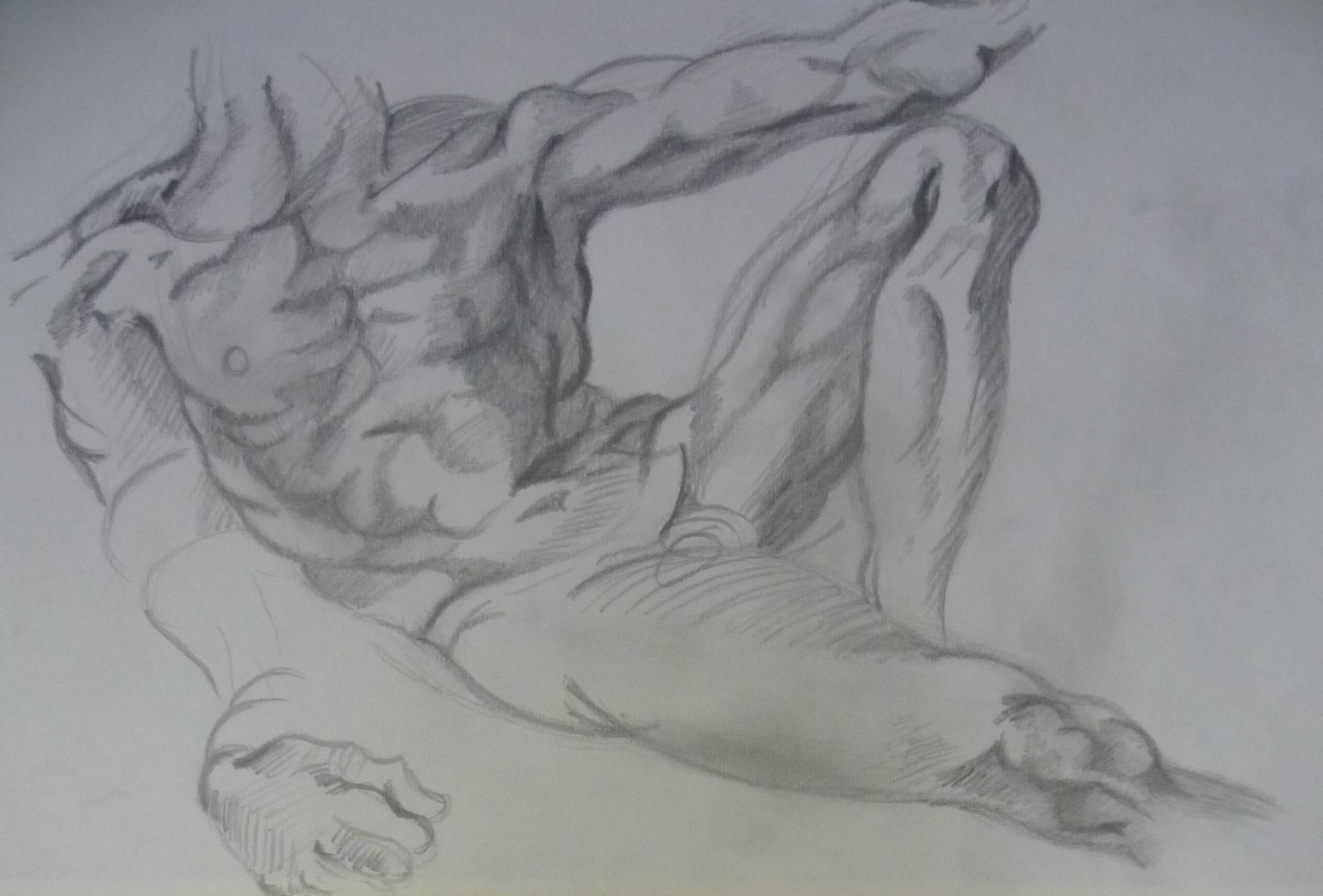
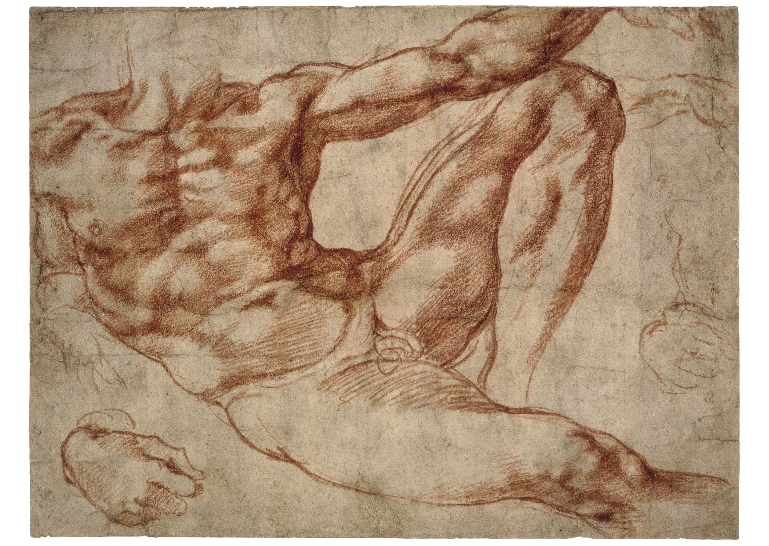
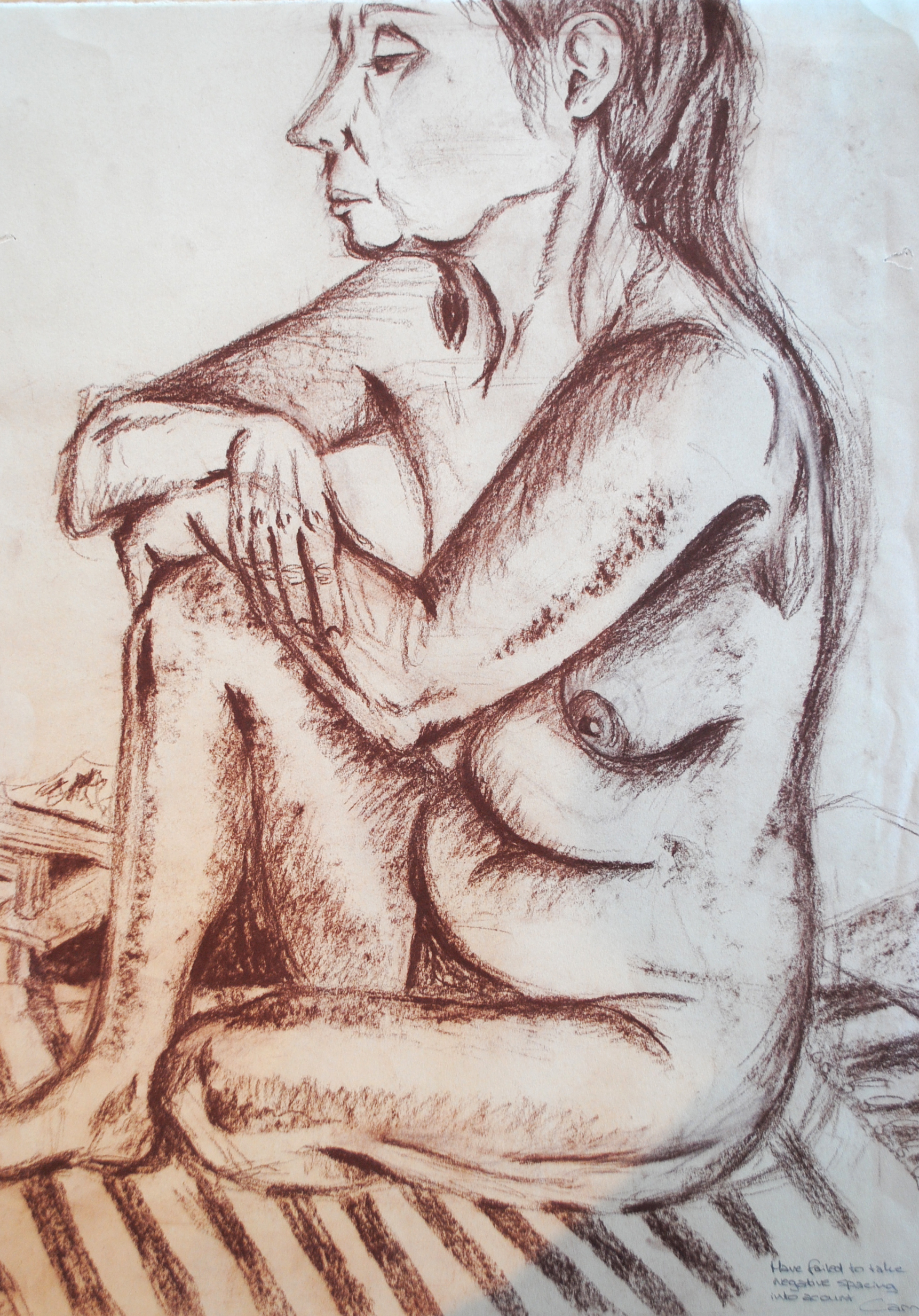
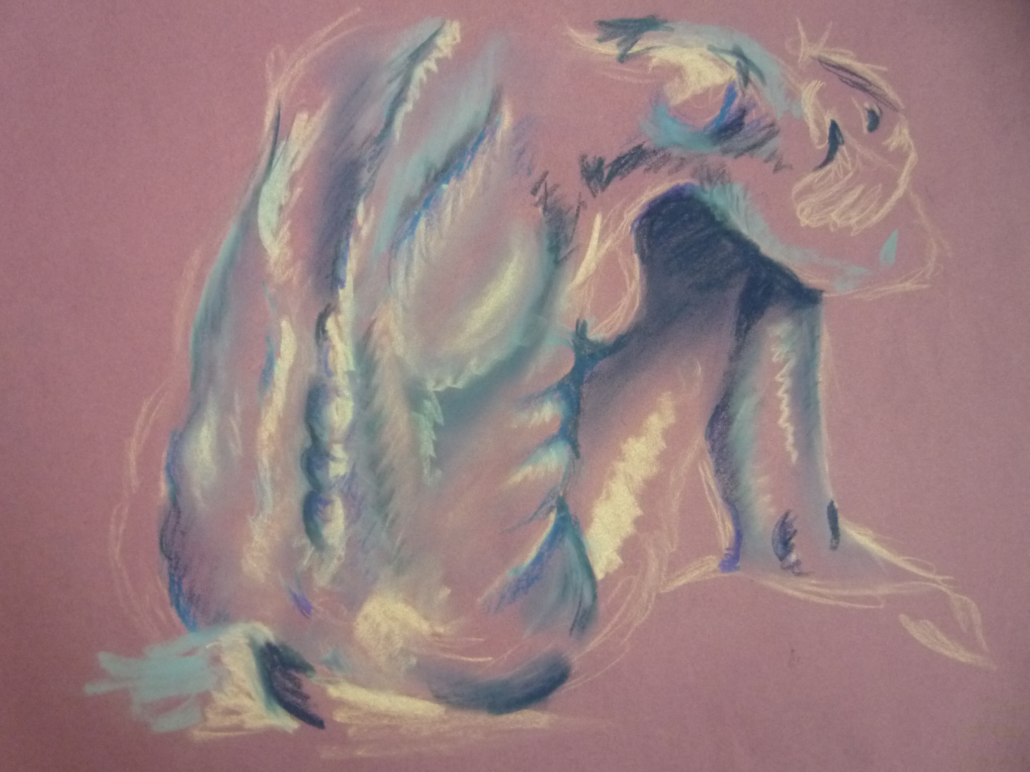
Being a creative person is the best thing in times of trauma, sadness and general unhappiness. Being creative provides you with an outlet that may not otherwise exist; a space to release all the inner burdens. I had a series of panic attacks last year as a result of some emotional baggage and initially they were out of control and horrific. They are very physical events that consume your entire body. I’d never experienced anything like them before so it was something entirely new and very unpleasant. However, as usual art came to my rescue and I found refuge in it as an expressive tool. Having experienced the physicality of the panic attacks, it seemed natural to translate this kinetic experience into the art-making process. Consequently I created a series of works, what I call my ‘Panic Attack Series’. 

015

Given the process it took in creating them, they could be considered Action Paintings. Action Painting first came into being in the late 1940s and early 50s with pioneering artists such as Jackson Pollock and Willem de Kooning leading the way. Action Painting is a loose and fluid mode of art making in which the paint is dripped or smeared onto the canvas. In this instance I was smearing it on, using my forearm as a brush which given the friction between the paint and paper was painful at times. Yet this pain became part of the piece. Working large scale was necessary as I required the breathing space to expel my negative energy. The works are far from perfect, but I think my vitality comes across especially given the unconscious circular motions I ended up working in. I was surprised to find I visualised my panic attacks as circles and this meant that they went from being a nightmarish experience to a visual object which I think aided my healing process. I was not surprised by the fact black felt like the only suitable colour; darkness and the heaviness of my emotions was encapsulated perfectly in this palette. 

027

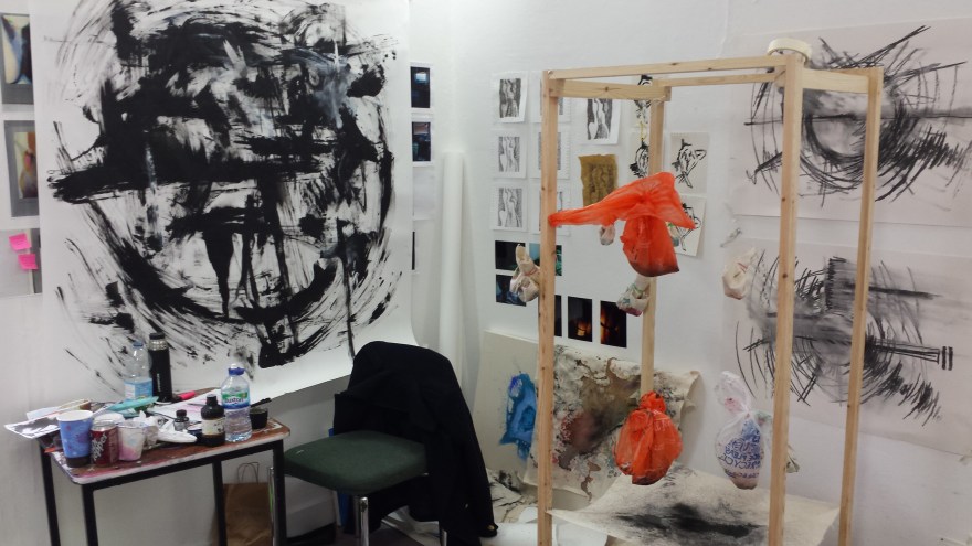
I also did some smaller charcoal renditions which looked almost like circular sound waves (top right of the above photo). I think the need to get messy was an instinctive impulse I had in these expressive works. Sitting tidily working in a sketchbook would not have had the same impact. I needed to immerse myself physically as well as mentally in the work to be truly unburdened. 

021

And it definitely worked. The creation of these pieces was incredibly liberating and I literally felt like a weight had been lifted. My shoulders felt lighter and my head felt clearer. It was as if by creating these works I had expelled this mass of black energy from my system and I was free to start again. 

Performance Art

loving care 1

Janine Antoni ‘Loving Care’, image sourced from Artnet.

Having always used and worked with the body as a theme and a medium, it seems only natural that this year I have started to work with Performance Art. This was a movement that came into existence in the 1960s and 70s and is rooted in Conceptual Art. Performance Art is where the artist uses their own body or the body of a model to perform tasks and actions that become the artwork themselves. Famous Performance Artists include Marina Abramovic, Yoko Ono, Yves Klein, Nam June Paik, Bruce Nauman – the list is endless! Pictured above is one of my favourite artists, who has been a huge inspiration since I discovered her two years ago; Janine Antoni performing ‘Loving Care’. This is a work in which she dipped her hair in the hair dye and used her body as a painterly tool. This is in a sense a parody of Jackson Pollock’s painterly techniques and the male-dominated Abstract Expressionist movement, as well as being a social commentary on the domesticity of women. 

Image6

‘Loving Care’ has been a piece that has stuck with me for a while now and I have always been curious to test this idea of extending the paintbrush beyond itself. I recently cut my hair and therefore thought it would be interesting to do a performance which acted as a reversal to that.  I also wanted to make a gesture towards the impracticality of hair extensions and their artificial qualities. I cut my hair really short, so I wanted to extend it really long. I used the stretchy exercise bands that most people use in the gym, partially because they were a practical object to use in this instance and partially due to the presence of the gym and exercise in my work. 

Image13

The white objects I am using are obscure and grotesque limb-like forms that I made out of papier-mâché. This was a very laborious and time-consuming task not only because I made a lot of these objects, but also because of their drying time and formation process. However, the labour was another element to this performance. In it I am not only exploring this idea of body image through the representation of hair extensions, but I am also exploring the repetitive and mundane. Labour is an element not only in the construction of the objects, but also in creating the drawing given how many times I walked up and down the paper.

Image14

There was also an element of pain present as although these objects are relatively light, when attached to your hair and roots they are less so! I had a pot of ink and water that I kept dipping these objects into and my intention was to continue until I had used this up, however the pain prevented me from doing so.

Image19

It was interesting to blend such traditional art materials (cartridge paper and Indian ink) with an act that was so far-removed from conventional painting methods. This mode of working falls into the category of Action Painting, a movement that really took off in the 1960s and is something that I myself have never tried before. There have been moments and elements of it present in my work before, but never in such a direct way. 

Image20

Given the fact that this art form falls and touches on a lot of aspects of performance itself, costume is consequently a very important part and something I put a lot of consideration into. In some cases I have gone for the stereotypical artsy all-black ensemble, but in this instance I wanted to return to the studio aesthetic which I think tied in well with the rest of the materials I was using.

Image22

As well as thinking about what I’ll put on my body for performance work, I also think about what I’ll remove. I am a complete jewellery junkie, always adorned with rings and dangly earrings! I tend to remove all of these elements for the purpose of performance work. However in this instance I kept it all on as I wanted the jewellery to be a part of the work, as an indicator of its constant presence on my body. 

Image23

I think for me one of the most interesting things about working with Performance Art is focusing on and thinking about the objects left behind and how they are imbued both with the trace of human presence and a past kinetic action. What’s exciting is that although the performance is an ephemeral event, the objects left behind hold so much potential for further exploration.

Image27


John Virtue

P1180052

I was looking through some old work when I came across these images of my First Year studio. This was probably the one and only time my choice of topic deviated from Body Art and instead focused on the natural landscape. I think I surprised even myself in this shift as there was no real explanation for it apart from my discovery of oil paint. I think I felt that abstract landscapes were a better means of exploring this medium, as opposed to again working with the female body which I was already so familiar with. This shift was also due to the fact I discovered the work of John Virtue (see below).

 john virtue

‘Landscape No. 707’, 2003-4, image sourced from The National Gallery website.

I fell in love with his whimsical monochrome depictions; how they were abstract yet figurative simultaneously. How he combined nature with industry. The blend of such intense darkness against the stark white also lends a satisfying balance to his work I found. This equilibrium allows the eye to shift peacefully across the page, taking the time to absorb intricate aspects such as texture which are so imbued with the studio aesthetic.

P1180042

What I found particularly interesting about Virtue’s work was his ritualistic aspect of his art making. Every day without fail he would walk to the same location to sketch. This of course resulted in an excess of drawings, but the dedication this required fascinated me. So for a while I chose to copy this method of working and walked to a park everyday. It was quite out of my way and in some cases an inconvenience to all of the other daily necessities occuring in my life. However, having this task and this escape also gave me the best kind of zehn I could have wished for. I had an excuse to leave behind the rush and pace of daily life to focus fully on ritual-based art making. 

P1180051

I also tried to employ Virtue’s use of the monochrome palette by removing colour from my work. Depicting landscapes and working with oil paint was a time where I was using really vibrant and sunset-based hues, so this removal was a real challenge for me. It forced me to think a lot more critically about texture, shape, scale and all of the other elements that could compensate for lack of colour. I poked needle-thin holes through paper, I worked with impasto and modelling paste, I used charcoal and inks to create that messy studio look. I tried everything and had great fun experimenting, but of course I gradually began bringing colour back into my work. I also sadly had to stop my daily excursions to the park given all my other commitments, but I may some day start that again for a brief period at least. Employing the working methods of another artist was a really interesting and liberating experience for me, as I was giving up all sense of control that I had over my work and instead completely yielding myself to working in a certain way. It was an incredibly enjoyable experiment and is something I think I’ll definitely go back to at some point!

Jock Mooney Part 1

IMG_8247

Vane Gallery recently had Jock Mooney’s ‘Who Are You and What Do You Want?‘ exhibited. Mooney is represented by Vane so I’m quite familiar with his work through that. This exhibition however was quite unlike his usual stuff as it was far more personal and autobiographical. It is an exploration of Mooney’s joys and fears surrounding life; his hopes for the future and all the whimsical elements of life. I’m not saying this exhibition was totally unfamiliar given his choice of theme as his iconic gruesome figures and lavish colours were of course still present – it wouldn’t be true Mooney without those components! 

IMG_8249

The pieces that caught my attention most were his incredibly intricate drawings. Not only was the detail and patience they must have required unparalleled, but the variation in tone was endless. Mooney really had pushed monochromatic drawing to the extreme. Along with the slightly grotesque swirling knots and fluid shapes, Mooney had also brought in a bit of cheeky humour. Eye-adorned bottoms were a motif in a lot of his drawings and this balanced out what would otherwise have been quite gruesome and curdling depictions. 

IMG_8248

The one above is my favourite as it is a blend of both an action and a reaction. On the one hand you have what looks like a woman’s dress blowing up, the action, and then within that you have the popping eyes in reaction to this occurrence. Very clever. The eyes have that excessive, over-the-top, Tom & Jerry style look to them as well which heightens this sense of amusement. As does Mooney’s playful titles: ‘Avocado Pear-shaped Palm’, ‘Speculative Teetering’, ‘The Curse of the UHT Guacomole Snowman’, ‘The Dysfunctional Rapture of Brassica Bumface’ the list is endless and just so much fun. I think we really get a taste of Mooney himself through the language he applied to his work which is why I personally find the titling of a work crucial. It is the cherry on the cupcake if you like. And although these drawings are fantastic and fun even if they were titled something entirely mundane like I don’t know…’Cereal Bowl’ (yes, I’ve just had cereal), the title does succeed in adding that extra bit of mischief.

Doodle Galaxy (Doodle Time Part 2)

Doodle2

I didn’t really notice the kind of doodler I was until I compiled them altogether for these posts. Given that they tend to be entirely separate and individual occurrences, I don’t pay much attention to the technique or style at the time. So photocopying them from my notebook and creating digital copies was quite a sterile process for me, as it almost diluted the fluidity of such personal drawings. 

Doodle3

For someone who is generally not too interested in natural forms, it is interesting to see how much these feed my depictions. Flower motifs are abundant in my drawings which is highly unusual when compared to my body of work, as I tend to avoid explicit feminine depictions like the plague!

Doodle6

Yet for me there is something incredibly soothing in creating these organic forms. Water and leaves are also core components to the drawings, as is an almost excessive use of line which I exploit almost to the point of exhaustion. 

Doodle1

It’s a soothing and somewhat addictive repetition. Molten forms and swirling shapes cluster the pages. Unlike a painting I don’t think you can ever overwork a doodle, as you can simply adjust your progression across the page if it goes wrong. In most cases however I know when a doodle is done, as I no longer have the urge to pursue and extend it. I just know that I have done all I can and all that I want to do and as long as I have that therapeutic longing satisfied, then that is all that matters. 

Doodle Time Part 1

Doodle7

So I think it’s safe to say I have a slight tendency to doodle. I do it very unconsciously; it just kind of happens and before I know it half the pages in my notebook are filled up with drawings. I have this really annoying habit of doodling in random pages towards the back of my notebook, so as I near the end of it I still think I have loads of pages left, when in actual fact they’re all consumed by drawings.

Doodle5

Because for me the doodles are a very visual and fluid thing, I’m not going to talk much about them. I don’t feel the need to as I’m not creating them with the intention of forming an analysis. I’m not really creating them for any particular reason either apart from filling time (and supplementing boredom). So I don’t want to dissect them too much as I feel that will take away from them for me.

Doodle8

I do think however my time abroad has been a major influence to my doodling. My depictions are very Middle Eastern in terms of the pattern and shapes that are present. My time spent in Oman and India absorbing the culture, visiting souks and buying jewelry are all components that feed into these creations and it’s only now that I’m looking at the doodles on a screen and talking about them that I realise this. 

In Time

P1170868.JPG

It’s always funny looking back at old artwork. This is because I look at it with all of the feelings and emotions I was applying at the time of its creation, yet I’m also looking at it with my more current artistic views. So there ends up being this two-way reading of a work. What I felt then and what I feel now. Which can either be quite paralleled, but more often then not is more of a “what the hell was I doing?!” kind of reaction. It’s sometimes quite amusing to see the difference in the two thought processes. One of the reasons I am so grateful that I’ve made art throughout my life, is that all my works are essentially a document and narrative to my growth and development. Or at least, to my development as an artistic practitioner. It is me expressing myself during a given time period and over the years my drawings have taken on all sorts of forms. These include Beatrix Potter-like creations of animals in clothes, fashion illustrations, running inky portraits, landscapes, sketched copies from the work of Egon Schiele and Michalengelo, life drawing, the list goes on. The above image is from my experimental phase with Indian and batik ink. I love the fluidity and seeping of colours, as I never know how a piece is going to turn out, which for me is incredibly exciting. This way of working led onto a whole bunch of ink-based experimentation and essentially changed the way I paint forever, as I still apply dripping and watered-down techniques today. Funny how one thing can lead to another and you never look back!

Life Drawing Inspiration

michaelangelo copy

Yes it worked! I’ve got your attention with this muscly naked man! Woo, what I would do to have abs like that…Right, enough swooning. This is a direct copy of a Michelangelo sketch (and if you don’t know who that is please go and hide under a rock). Below is the original:

M

I know I said I don’t copy art much, well I lied. I did it quite a lot when I was younger. I just found it soothing. I got to draw without actually having to think anything up. I guess it’s kind of the lazy way of making art. There’s been a lot of debate about this actually. Yes still life work looks lovely and you can hang it on your wall etc etc, but how much skill does it really take? Conceptual art is far more challenging as you’re actually having to think things up and create something from nothing. All very interesting and a debate that I’m sure would get very heated with a lot of people. So for now I’m just going to avoid the controversy.

schiele copy      egooonnn

Left: my copy of Egon Schiele’s sketch, Right: Egon Schiele’s sketch.

I think it is safe to say Egon Schiele is one of my ALL TIME favourite artists! His work is just so stylised and expressive. Gruesome in a sense even. I don’t know what the majority of people think about it, they probably think it’s a bit creepy or there are far too many vaginas going on. But personally, I love it all! It’s all just so scratchy and scrawly. Schiele is one artist who definately understands mark-making! You can see where he’s put pressure on his pencil, you can see how successful his limited colour palettes are with yellows and reds often featuring. He’s got a very interesting history to accompany his art as well. He was an art school drop out. He was also mentored by Gustav Klimt (lucky sod!) He was jailed at one point and a lot of his work that was deemed ‘pornographic’ was confiscated. I always think the personality of the artist goes hand in hand with the art work and in Schiele’s case this is definately evident. He was a notorious womaniser and his work truly reveals his raw sexuality. I love imitating his bony, almost anorexic-looking creations.

s

Life Drawing

Life Drawing

I remember my first Life Drawing class. I was sixteen. The model walked in and removed her dressing gown. I felt ridiculously uncomfortable. There were three boys in my class and they were smirking and trying not to giggle. The room was unbearably hot to stop the model getting cold. My teacher walked over and directed the model into a pose. I prayed I got the back of her so I didn’t have to look at any intimate parts. Just my luck, I got the view with everything! I didn’t know where to look! But once we started drawing I wondered what the hell I was worried about. It was just a naked body after all. And this naked female body felt like the most interesting thing I had ever drawn! The curves and shadows, the folds of skin and the wrinkle creases, the muscle tone. I was hooked. Life Drawing became one of the highlights of my week. Looking and studying the human body as it moved, as it maintained a position over a set amount of time, at the shadows falling across it. This was where my love of studying the human form truly set in and I have never looked back since.

P1160280