Creative Outlets

13687254_141506512950038_1833900222_n“I think that the very great artists were not trying to express themselves.They were trying to trap the fact, because after all, artists are obsessed by life and by certain things that obsess them that they want to record. And they’ve tried to find systems and construct the cages in which these things can be caught.” – Francis Bacon, Tate Liverpool ‘Invisible Rooms’ exhibition catalogue

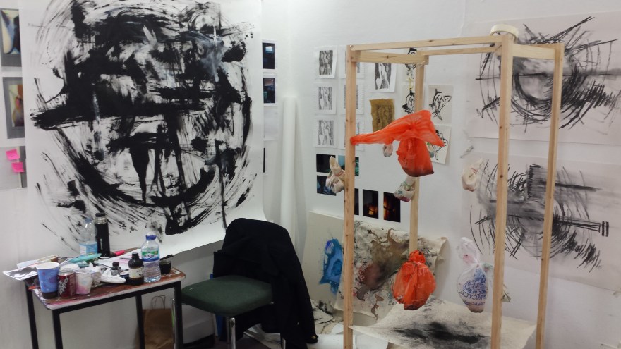
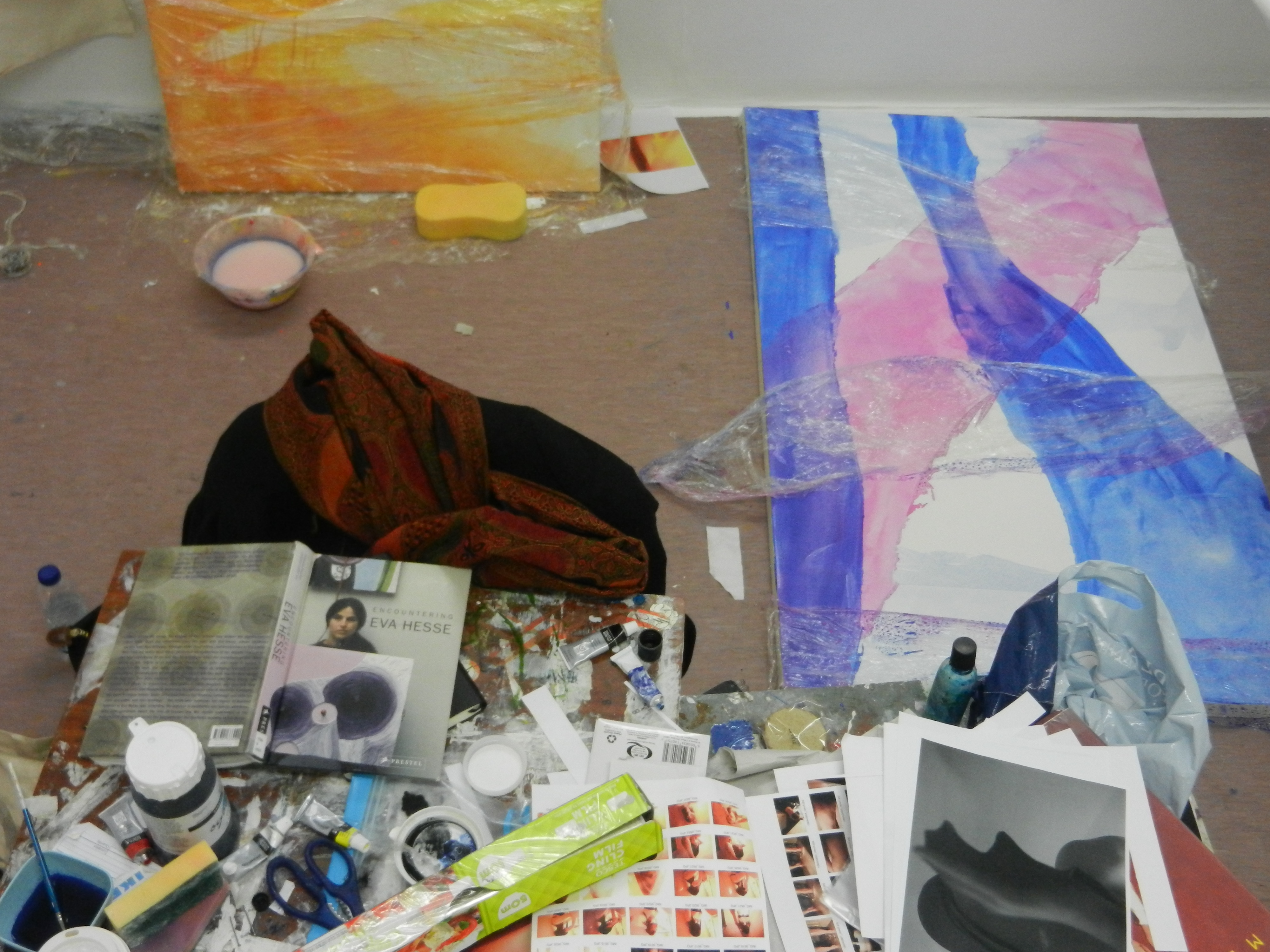
I read this quote last night and it has stuck with me as I tried to grapple with Bacon’s analysis in relation to my own work. In my view he is absolutely right, artists are obsessed with life; whether it is the architecture we live in, our own bodies, nature and the natural environment, urbanism, industrialism, consumerism. You name it. We’ve made art about everything. Art in a sense could almost be compared to science. It is a route to discovery, a journey of experimentation and deduction. Much like scientists employing  mathematics in an attempt to predict the movements of particles, artists engage with their surroundings and various mediums in an attempt to express themselves and their ideas. Conceptual art is at the forefront of modern art today, as by utilizing artworks as tools we are able to realise an idea and convey it to a public audience. Yet there is also and will always be the most expressive form of art; art that does not require proposals and adherences to restricted budget costs, art that does not require a white cube gallery space to be displayed in, but art that simply is from the self. Raw, unaltered sketches, drawings, illustrations and doodles. The purest form of expression and that emotional/creative release.

13735868_264947560551635_1114348383_n

Doodling culture and the professional art world have more in common than most people initially think as they are both incredibly different, yet simultaneously the same. Yes, in galleries there are large scale installations and elaborate industrial sculptures Jeff Koons style, but it all began in the artist’s mind. It quite likely originated with a little paper doodle or a frantic sketch on a table napkin at the crucial moment of realising the sketchbook was left on the coffee table at home. I feel in a lot of cases there are too many barriers between ‘high’ and ‘low’ art forms, too many words that separate what is classified as good and not so good work. Of course, personal taste and style plays a vital part in these judgements as negotiating personal opinion is one of art’s main experiments; to make people question, to challenge them into realising what it is they do and don’t like is at the core of several artistic practices. In a lot of cases however it is the observers who validate what qualifies as good and bad artwork, who make the official distinction which everyone should follow.

13741139_1834179690139235_442586275_n

Like anything else in this world, people are happy to follow trends. Whether that is reading a book that everyone else is reading, engaging with an artist who everyone is talking about, visiting an exhibition that everyone else has seen. Despite the creation of artwork being one of the purest forms of human expression and the most individual and personal entity in human existence, art  is still not exempt from the trap of following what is considered mainstream. In a sense however, this actually makes it more interesting as you could ask the question who do we make art for? In this day and age, with the pace of social media and the digital information we are constantly fed, there is a heightened sense of expectation in artmaking and inevitably, artists react to this. So who do artists actually make art for? Is it purely for themselves as the most raw forms of self expression? Is it for an art based audience who will engage with it in the way that the artist themself has? Or is it for a public audience, whose art background and knowledge is probably sparse? Or does it fall within all of these categories? It’s interesting as in a lot of cases I would say it is a combination. You often make art for different purposes which include selling, giving as presents and so these distinctions in themselves also affect the purpose and thinking surrounding the making of the piece.

13745080_1066762653392291_342997592_n

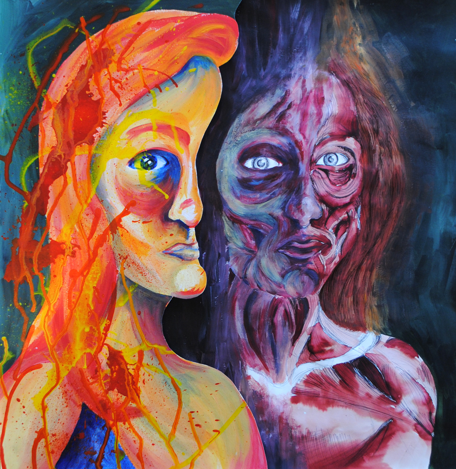
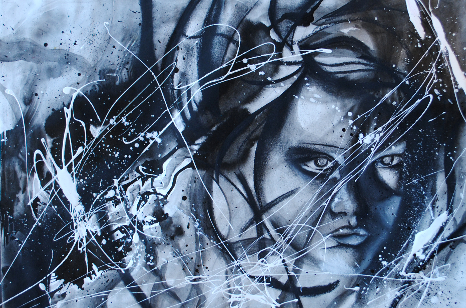
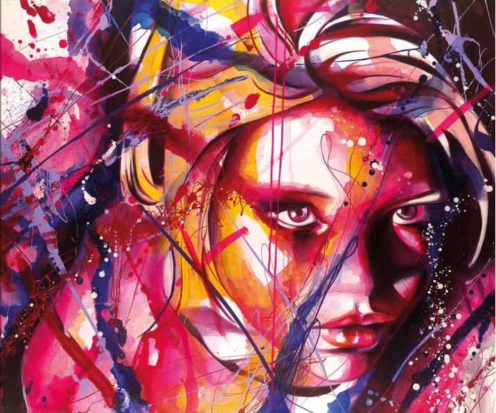
I’m not criticising any of these modes of artmaking. I think art is personal and the purpose of the artwork extends within that personal realm. Each person is different, as is each artwork and artist. I know that my artwork varies a lot of the time depending on audience, how I’m feeling, whether it’s for myself or for display. Given that traditionally and throughout human history art has been hung on the wall in Salons and grand entrance halls for all people to see, it is ironic that my art is actually very private. My doodles are my ‘me time’ turned into physical forms. I find it soothing to get lost in a swirling world of colour and fine lines as I carefully navigate across the page. My performances are less concentrated and more physical expressions of my innermost thoughts which can only be conveyed and released through this immersive and bodily art form. I think the reason Bacon’s quote caught me was because I myself can relate to it quite strongly. Although it is not always a conscious decision, life is fundamentally a core part of my artwork. As Eva Hesse once said “my inner soul art and life are inseparable”.


Panic Attack Series

026

Being a creative person is the best thing in times of trauma, sadness and general unhappiness. Being creative provides you with an outlet that may not otherwise exist; a space to release all the inner burdens. I had a series of panic attacks last year as a result of some emotional baggage and initially they were out of control and horrific. They are very physical events that consume your entire body. I’d never experienced anything like them before so it was something entirely new and very unpleasant. However, as usual art came to my rescue and I found refuge in it as an expressive tool. Having experienced the physicality of the panic attacks, it seemed natural to translate this kinetic experience into the art-making process. Consequently I created a series of works, what I call my ‘Panic Attack Series’. 

015

Given the process it took in creating them, they could be considered Action Paintings. Action Painting first came into being in the late 1940s and early 50s with pioneering artists such as Jackson Pollock and Willem de Kooning leading the way. Action Painting is a loose and fluid mode of art making in which the paint is dripped or smeared onto the canvas. In this instance I was smearing it on, using my forearm as a brush which given the friction between the paint and paper was painful at times. Yet this pain became part of the piece. Working large scale was necessary as I required the breathing space to expel my negative energy. The works are far from perfect, but I think my vitality comes across especially given the unconscious circular motions I ended up working in. I was surprised to find I visualised my panic attacks as circles and this meant that they went from being a nightmarish experience to a visual object which I think aided my healing process. I was not surprised by the fact black felt like the only suitable colour; darkness and the heaviness of my emotions was encapsulated perfectly in this palette. 

027

I also did some smaller charcoal renditions which looked almost like circular sound waves (top right of the above photo). I think the need to get messy was an instinctive impulse I had in these expressive works. Sitting tidily working in a sketchbook would not have had the same impact. I needed to immerse myself physically as well as mentally in the work to be truly unburdened. 

021

And it definitely worked. The creation of these pieces was incredibly liberating and I literally felt like a weight had been lifted. My shoulders felt lighter and my head felt clearer. It was as if by creating these works I had expelled this mass of black energy from my system and I was free to start again. 

Acrylic Work


eye
Eye Study (Warm Hues)

It’s fascinating looking back at old work and seeing how my style has evolved and changed over time. What intrigues me most is not simply my evolution in technique, but my interest and use of material. I have experimented a lot over the years and have come to find that you can never fail with fine liner pen! You could argue it’s a very simple material; everyone owns a black pen, yet I have come to find it is also the most effective in a lot of cases. For me the addition of fine liner is often the perfect finishing touch to a painting. My love for pen has remained constant over the years, yet my feelings for other materials have changed drastically. When I was younger I found watercolours difficult to use and frustrating to control, yet these days most of my paintings are water and ink based; I can’t seem to get enough of the fluidity!

eye2
Eye Study (Cold Hues)

I went through a phase where acrylic paint was my favourite medium (this was before I discovered oil paint!) mainly due to the layering it allowed. When I paint I build my work up slowly by gradually applying multiple layers, as you can see in these colourful eye studies. Acrylic was perfect for working in this way as it meant a short drying time which was perfect for my instantaneous manner of working. It’s also a very affordable material, especially when compared to oil paint which is depressingly expensive most of the time. I came across these old painterly experiments when I was looking through things I’d submitted as part of my university and scholarship portfolios. They’re about four or five years old now and I haven’t used acrylic paint much since then. Having looked back over them, I’m tempted to give acrylic paint another go given how much my skills have changed over time.

John Virtue

P1180052

I was looking through some old work when I came across these images of my First Year studio. This was probably the one and only time my choice of topic deviated from Body Art and instead focused on the natural landscape. I think I surprised even myself in this shift as there was no real explanation for it apart from my discovery of oil paint. I think I felt that abstract landscapes were a better means of exploring this medium, as opposed to again working with the female body which I was already so familiar with. This shift was also due to the fact I discovered the work of John Virtue (see below).

 john virtue

‘Landscape No. 707’, 2003-4, image sourced from The National Gallery website.

I fell in love with his whimsical monochrome depictions; how they were abstract yet figurative simultaneously. How he combined nature with industry. The blend of such intense darkness against the stark white also lends a satisfying balance to his work I found. This equilibrium allows the eye to shift peacefully across the page, taking the time to absorb intricate aspects such as texture which are so imbued with the studio aesthetic.

P1180042

What I found particularly interesting about Virtue’s work was his ritualistic aspect of his art making. Every day without fail he would walk to the same location to sketch. This of course resulted in an excess of drawings, but the dedication this required fascinated me. So for a while I chose to copy this method of working and walked to a park everyday. It was quite out of my way and in some cases an inconvenience to all of the other daily necessities occuring in my life. However, having this task and this escape also gave me the best kind of zehn I could have wished for. I had an excuse to leave behind the rush and pace of daily life to focus fully on ritual-based art making. 

P1180051

I also tried to employ Virtue’s use of the monochrome palette by removing colour from my work. Depicting landscapes and working with oil paint was a time where I was using really vibrant and sunset-based hues, so this removal was a real challenge for me. It forced me to think a lot more critically about texture, shape, scale and all of the other elements that could compensate for lack of colour. I poked needle-thin holes through paper, I worked with impasto and modelling paste, I used charcoal and inks to create that messy studio look. I tried everything and had great fun experimenting, but of course I gradually began bringing colour back into my work. I also sadly had to stop my daily excursions to the park given all my other commitments, but I may some day start that again for a brief period at least. Employing the working methods of another artist was a really interesting and liberating experience for me, as I was giving up all sense of control that I had over my work and instead completely yielding myself to working in a certain way. It was an incredibly enjoyable experiment and is something I think I’ll definitely go back to at some point!

Flora Whiteley ‘Present Continuous’

IMG_8260

Talking more about getting back into painting is actually relevant to another exhibition I saw recently at Vane; Flora Whiteley’s ‘Present Continuous’. Given her cinematic background, her works have elements of film and stage-like set ups, which bring a new dimension to what are otherwise very painterly works. At present I’m not too interested in researching the background to her paintings and all of the concepts she was exploring; I’m simply wanting to look at and appreciate the paintings themselves. Particularly in terms of her use of colour. The above work is the perfect example. Through her pastel hues and soft palette, the cold of winter she’s depicting in the picture comes through to real life. You can almost feel the cold creeping into the gallery space. 

IMG_8266

It’s the same with this piece (see above) as well. The smoke from the girl’s cigarette has that wispy aesthetic of real life smoke. Although it’s a static image, you can see the cusp of energy it carries, as if the smoke could blow out of the painting and into your face as you view it. I think the lack of hard edges enhances this sense of movement. There’s a softness to the painting and a delicacy to the technique. What looks like fairly heavily applied paint is in fact an abundance of layers built up over time. The technique of the painting application varies between dry-brush and more of a solid application of colour. The contrast between the two creates a nice sense of balance within the painting. In some instances we are able to see the linen on which the paint is applied, in others we are presented with purely a build up of tonal work. 

IMG_8265

There’s a real sensitivity in her depictions of the figures as well. Their stances are not too posed, they simply hold themselves. The muted colours of their clothing allow them to almost blend into the background, not occupying too much attention within the piece. The tilted angles of the head, the slight bending of elbows, every element is thought out and all contribute to create a linear direction for the eye to travel round. 

IMG_8263

The scale Whiteley has chosen to utilise complements her figures as well. They are not quite life-size but they have that element of suggestion. You can relate your bodily proportions to the piece. They also allude more to Whiteley’s cinematic background – not quite on the scale of being a cinema screen, yet they are not far from it and have the potential to be one. There were also far smaller portrait paintings, yet I preferred the larger ones as they really allowed me to closely study her technique. 

IMG_8264

I don’t always take photographic close ups of work, as I prefer to have the entire body of the piece to contemplate as I reflect on it. However in this instance I was far more fascinated by close up studies of it all. The way Whiteley had broken up the pieces through angular lines and blocked colours. The shapes she formed through her placement of the figures. The depth created through the variation in colour. There was so much to see and absorb, that standing far back felt like I was missing out!

Pink in Progress (Over/Under work)

IMG_8268

‘Rizzo’ in progress

Working for the piece for the Pop Up Pink exhibition has made me realise how much I miss painting. Although I love the direction my work has taken and all the exciting things it’s led to that I thought I would never do (performance being the prime example), I will never give up the paint brush. There is just something so special sitting down with and focusing on a material; building on it, contemplating it, analysing the creation process. When I paint, I can not get enough water. I love loose fluid works, drips, diluted colours, layers. 

IMG_8269

My paintings are very time consuming and are very much a long drawn out process, mostly due to the necessity of drying time. If I get to eager and paint over a layer that’s still wet, my effect is ruined. So patience is key. I tend to paint in stages, dipping in and out of a work. I think this is actually the way I work best in most senses, as when I write an academic piece, I have to let it sit for a few days before I go back and look at it again. I tend to bang it out in one go and then leave it for a week and almost forget about it as the deadline nears! But it’s the same when I work with paint. I like to be fully absorbed by the process, but then I also like to step back and leave it. Really think about what I’m doing and how I’m layering it. Sometimes this really doesn’t work as despite my attempts at contemplating, I still over work the paint. 

IMG_8267

This is the most frustrating moment for me, as my paintings are not the kind where you can just cover up a mistake. Once the mistake is made it’s there to stay as the paint is applied so thinly, it would completely ruin everything if I tried to obscure it. So I think this is why I have started to implement time into a piece more over the years. the older I’ve got, the more I’ve realised you can not hurry or push the creative process. Otherwise you put a pressure on it and it backfires with you creating nothing! With this work I feel I overworked it slightly, but hey I’ll know for next time!

In Time

P1170868.JPG

It’s always funny looking back at old artwork. This is because I look at it with all of the feelings and emotions I was applying at the time of its creation, yet I’m also looking at it with my more current artistic views. So there ends up being this two-way reading of a work. What I felt then and what I feel now. Which can either be quite paralleled, but more often then not is more of a “what the hell was I doing?!” kind of reaction. It’s sometimes quite amusing to see the difference in the two thought processes. One of the reasons I am so grateful that I’ve made art throughout my life, is that all my works are essentially a document and narrative to my growth and development. Or at least, to my development as an artistic practitioner. It is me expressing myself during a given time period and over the years my drawings have taken on all sorts of forms. These include Beatrix Potter-like creations of animals in clothes, fashion illustrations, running inky portraits, landscapes, sketched copies from the work of Egon Schiele and Michalengelo, life drawing, the list goes on. The above image is from my experimental phase with Indian and batik ink. I love the fluidity and seeping of colours, as I never know how a piece is going to turn out, which for me is incredibly exciting. This way of working led onto a whole bunch of ink-based experimentation and essentially changed the way I paint forever, as I still apply dripping and watered-down techniques today. Funny how one thing can lead to another and you never look back!

Yvonne Hindle ‘Supertranslations’

IMG_8227

IMG_8239

Yvonne Hindle’s ‘Supertranslations’ is an exhibition at Gallery North which sadly ends today. It is truly beautiful and she is clearly a master of paint.  There is so much going on in her paintings, they’re like her own individually created universe. When you look at them you feel as if you are falling and being absorbed by a city of colours. They have so much energy that the paintings seem to pulsate and burst from the wall. What catches your attention first and foremost as you enter are of course the colours; they are truly stunning. What I love is the bold mix, there’s everything from soft yellows and pinks, tame blues, to black-like purples. The contrasts are therefore strong and this is enhanced by how Hindle has segmented them. What looks like a swirling mass of coloured chaos is in fact an orderly and structured arrangement, almost like the stratas of a layer of rocks.

IMG_8231

IMG_8243

This is where her interest in the micro comes in. From afar the paintings look like happy accidents; close up they look highly intuitive – no layer or colour has been added without purpose. There is a precision to it all, clear divides between segments and carefully considered colour dilution. Texture also plays a part in it all. Most pieces are relatively smooth, allowing the swirling colours to take centre stage. Others are far more textured and temptingly tactile. Personally, I prefer the smoother ones as that way I can concentrate solely on the colour. I’m not saying however the textured ones aren’t interesting, if anything they make me want to get my modelling paste out and work in a truly impasto style! Which I may do anyway having seen all of this work. The marbled effect of the paint allows me to see it’s movement; how it’s seeped and ebbed together. You feel as the process has the potential to still be going; as if at any minute the colours are going to start moving into each other again.

IMG_8228

IMG_8236

What I also like about all the paintings are the edges of them all. The paint starts to tailor off in lot of cases and that is where the layering technique starts to be revealed. The pieces hint at how the colour has been built but at the same time gives nothing away. I also really like the lack of hard edge, I think this works really well in relation to the contents of the paintings. It adds to that sense of chaos ordered as non-chaos. Scale wise it’s perfect too, not too big and overwhelming but not too small to prevent you from viewing the detail. They really are such energetic and lively pieces, if I had a wall of them in my house I’d never be uninspired ever again!

Painting Digression

DSCN2555

It’s strange when I think how I used to consider myself as an artist. I was adamant painting would always and forever be my one and truly love. How wrong I was…As much as I love painting, it really does have it’s limitations. Not in the sense that all painting is bad, it’s just sometimes not the right means for what you are trying to express. Sculpture often offers an expansion painting cannot. It offers the three-dimensional, the play with space and where you put it. Nowadays I like to bring sculptural elements into my paintings. I like to play between the two realms and have overlap and interplay such as in these paintings. Here I am using cling film as a barrier. I am arranging it across the canvas as a blockade whilst I lay down paint in the revealed areas. I then allow this to dry before I rearrange the cling film and repeat the process. I do this in layers and layers until I finally reach a point where I am happy. 

DSCN2557

It’s a good technique as it allows me to reflect on the piece; think about the colours, think about the shapes I want to create. It also allows me to work in my favourite painterly medium, inks. I absolutely love ink! It gets everywhere, it’s absorbent, it’s uncontrollable. When I use ink I feel like I am going on a journey with an unknown ending. Ink is perfect for layering up as well as you can choose how dense or faint it is. Layering and repetition are elements I can’t get away from. I like to exhaust a drawing by repeating it multiple times until it is dead and I am sick of it! Working on canvas is another favourite of mine as well as I have the stretchiness spring back at me whilst I’m working it and it absorbs my ink in an incredibly satisfactory way. Large scale is also best for me as I feel it gives me the breathing space to work that small scale cannot. Although I’ve taken a step back from all of this for now, I know that painting will be calling me back soon. 

Portraiture

Facial Deconstruction

During Sixth Form was when I truly realised that studying the human body was what I was interested in. I think starting life drawing had a lot to do with that, as did my sudden interest in going to the gym. For me, studying the body was necessary not only through visual observation, but also through experiencing my body’s movements. I became very interested in the work of Dr Gunther von Hagen. To me he is as much an artist as he is an anatomist. He invented the technique of plastination in the mid-1970s. This allows the human body to be fully preserved by embalming it and then draining it of all bodily fluids. Quite a disgusting and technical process (sorry for you squeamish people!) but the results are incredible. Well, to me they are, to a lot of people it’s a very controversial affair. I think I’m just fascinated by seeing a real life human body and all the bodily tissues that make us up. An almost morbid fascination. The touring exhibition BODYWORLDS visited Newcastle last year and of course I jumped at the chance to see it in real life having been reading about it from the age of fifteen! Anyway, I am getting side tracked. Basically Von Hagen was a huge influence to me during this time and the above picture is inspired by his work as well as being a blend of Emma Grzonkowski’s style.

Grzonkowski Imitation

Above: my copy of her Grzonkowski’s work ‘Secret’.

grzonkowski

Above: Her original piece.

I was looking at Emma Grzonkowski’s work around the same time I was looking more in-depth at Von Hagen’s. This resulted in an interesting and complex blend of styles. Grzonkowski is a commercial artist who creates figurative pieces, she’s done a series on The Seven Deadly Sins. It’s all quite lovely and rather beautiful. Quite girly for me though so of course I had to reinterpret her piece in monochrome when I copied it. I don’t directly copy work often, but I do quite enjoy it when I do as I get a feeling for what the artist was doing. I like to think so anyway!