Beautiful Berlin

13735919_1762331277356099_202182029_n

It’s been a long time since a city has inspired me as much as Berlin. Amsterdam was absolutely fantastic – there was so much to see. Our art-orientated sightseeing ranged from seeing traditional artwork at the Van Gogh Museum to more contemporary works at the Stedelijk, Amsterdam’s equivalent of New York’s Museum of Modern Art (MoMA). However with Berlin, it’s different. You’re not just entering buildings and spaces to look at the art; it’s everywhere. It’s in the buildings, not just physically, but inherently. It’s ingrained as part of the architecture, it’s on the street, down alleyways, on subway routes, it’s even encapsulated by people’s eclectic mix of clothing. The city seems to pulsate with this artistic aura, which threatens to overwhelm you it’s so inspiring. You feel as if you’re going to burst with this creative warmth brewing in your stomach as you take it all in!

13643712_1760636187554487_663881564_n

The history of the place seems to enhance this sense of creative energy, particularly given the fall of the Berlin Wall in 1989. With the fall of the wall, came the fall in both political systems and social barriers. Berlin realized a new kind of freedom that had never been felt before and consequently aspects such as the music scene flourished as people endlessly celebrated the reunification. Given their history it seems people in Berlin have something to say; it’s as if the years of oppression made them realise that they want to be heard. With transient chalk-based artworks on the pavement, alleyways bursting with colourful graffiti, the life and soul of the city can be found anywhere and everywhere. I think this is why it had such an impact on me. The creative culture of the city was not confined to sketchbooks and galleries, or exclusive artistic spaces. Instead it was living and breathing on the street, trickling into the galleries from outside.

14026766_916042935191772_370954739_n

Walking through this cultural hub that is Berlin really focuses your mind. Because there is so much to absorb, you realise what it is you want to pinpoint and fixate on; what explorations you want to further. I’ve always been fascinated by graffiti, however in the past it was more of a subconscious fascination. It was only as we walked through Berlin and I was catching glimpses of it in places and on the facade of big buildings that I became aware of how interested in it I actually am. Now that I am more aware of this interest I reflect and realise that there have been very poignant moments that fueled my interest in street art. One of those moments was years ago when I was walking behind Edinburgh Waverly station and I came across this wall absolutely crammed with colour and bubble shaped writing, graffiti creatures curling out of the wall. There was someone spray painting and I remember thinking how free they must have felt in that moment. To have no paper or easel, no barrier between their spray can and a permanent site. They were leaving their mark in a space that didn’t belong to them and I thought it was beautiful. Joseph Beuys once said that anyone can be an artist if they realise their potential and find the necessary form in which to communicate their ideas. This sentiment has caused a lot of debate and I am in agreement with him to an extent. However I am more of the belief that art is everywhere. Even though we don’t necessarily see it, or aren’t necessarily looking, it is still present. It’s present in the black polka dots of a lady bug climbing over a green leaf,  it’s present in the synced rhythms of our breathing and living bodies, it’s present in the way we gesture as we speak. Art is everywhere and it is the ability to take the things we see; to capture them and their essence and translate them into an entirely new form, that I believe makes you a true artist.

Creative Outlets

13687254_141506512950038_1833900222_n
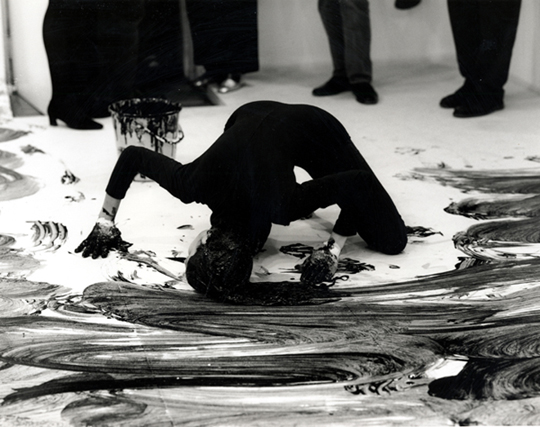
“I think that the very great artists were not trying to express themselves.They were trying to trap the fact, because after all, artists are obsessed by life and by certain things that obsess them that they want to record. And they’ve tried to find systems and construct the cages in which these things can be caught.” – Francis Bacon, Tate Liverpool ‘Invisible Rooms’ exhibition catalogue

I read this quote last night and it has stuck with me as I tried to grapple with Bacon’s analysis in relation to my own work. In my view he is absolutely right, artists are obsessed with life; whether it is the architecture we live in, our own bodies, nature and the natural environment, urbanism, industrialism, consumerism. You name it. We’ve made art about everything. Art in a sense could almost be compared to science. It is a route to discovery, a journey of experimentation and deduction. Much like scientists employing  mathematics in an attempt to predict the movements of particles, artists engage with their surroundings and various mediums in an attempt to express themselves and their ideas. Conceptual art is at the forefront of modern art today, as by utilizing artworks as tools we are able to realise an idea and convey it to a public audience. Yet there is also and will always be the most expressive form of art; art that does not require proposals and adherences to restricted budget costs, art that does not require a white cube gallery space to be displayed in, but art that simply is from the self. Raw, unaltered sketches, drawings, illustrations and doodles. The purest form of expression and that emotional/creative release.

13735868_264947560551635_1114348383_n

Doodling culture and the professional art world have more in common than most people initially think as they are both incredibly different, yet simultaneously the same. Yes, in galleries there are large scale installations and elaborate industrial sculptures Jeff Koons style, but it all began in the artist’s mind. It quite likely originated with a little paper doodle or a frantic sketch on a table napkin at the crucial moment of realising the sketchbook was left on the coffee table at home. I feel in a lot of cases there are too many barriers between ‘high’ and ‘low’ art forms, too many words that separate what is classified as good and not so good work. Of course, personal taste and style plays a vital part in these judgements as negotiating personal opinion is one of art’s main experiments; to make people question, to challenge them into realising what it is they do and don’t like is at the core of several artistic practices. In a lot of cases however it is the observers who validate what qualifies as good and bad artwork, who make the official distinction which everyone should follow.

13741139_1834179690139235_442586275_n

Like anything else in this world, people are happy to follow trends. Whether that is reading a book that everyone else is reading, engaging with an artist who everyone is talking about, visiting an exhibition that everyone else has seen. Despite the creation of artwork being one of the purest forms of human expression and the most individual and personal entity in human existence, art  is still not exempt from the trap of following what is considered mainstream. In a sense however, this actually makes it more interesting as you could ask the question who do we make art for? In this day and age, with the pace of social media and the digital information we are constantly fed, there is a heightened sense of expectation in artmaking and inevitably, artists react to this. So who do artists actually make art for? Is it purely for themselves as the most raw forms of self expression? Is it for an art based audience who will engage with it in the way that the artist themself has? Or is it for a public audience, whose art background and knowledge is probably sparse? Or does it fall within all of these categories? It’s interesting as in a lot of cases I would say it is a combination. You often make art for different purposes which include selling, giving as presents and so these distinctions in themselves also affect the purpose and thinking surrounding the making of the piece.

13745080_1066762653392291_342997592_n

I’m not criticising any of these modes of artmaking. I think art is personal and the purpose of the artwork extends within that personal realm. Each person is different, as is each artwork and artist. I know that my artwork varies a lot of the time depending on audience, how I’m feeling, whether it’s for myself or for display. Given that traditionally and throughout human history art has been hung on the wall in Salons and grand entrance halls for all people to see, it is ironic that my art is actually very private. My doodles are my ‘me time’ turned into physical forms. I find it soothing to get lost in a swirling world of colour and fine lines as I carefully navigate across the page. My performances are less concentrated and more physical expressions of my innermost thoughts which can only be conveyed and released through this immersive and bodily art form. I think the reason Bacon’s quote caught me was because I myself can relate to it quite strongly. Although it is not always a conscious decision, life is fundamentally a core part of my artwork. As Eva Hesse once said “my inner soul art and life are inseparable”.


NUFA16

IMG_9137

Tyler Coop

I can remember being in my first year of uni and looking up to the third years thinking it was impossible that one day I would be putting on a show. I’ve always kind of felt that when I looked up to older students even at school; I remember wondering how people sat exams, how people traveled by themselves, how people had the confidence to drive cars, etc etc. All these thoughts feel silly and irrelevant now looking back, because of course you learn and grow and change. I didn’t realise however quite how much an art course would change me. I never imagined I would go down the route of performance art, if anything I’ve always been someone who shied away from the stage and was instead content painting background scenery and doing backstage make-up. Yet during the time on this course I have experimented with mediums I never planned to work with such as sculpture, print, photography, video, projection, all sorts. I’ve really pushed the boat out in ways I never imagined or expected.

IMG_9181

Woon Prize Nominee Sheyda Porter 

I think that’s what’s so wonderful about embarking on a course as practical and creative as this. Not only are you exploring your artistic potentials, but you are also exploring the tools which allow you to realise your ideas. You’re learning so much theory too, with all the seminars, Art History lectures  and of course extensive research and reading meaning my knowledge of the artworld has grown so much. As has my coffee table collection of artist books which are now looking to require a bookshelf…

IMG_9169

Saman Ahmadzadeh

That’s partially the exciting thing however, the fact that my bookshelf keeps expanding. The fact that despite finishing this course, I am nowhere near finished. There’s so much more to explore, there’s so much more to experiment with. Despite all of the nostalgia I am currently feeling, I am also feeling incredibly inspired. Seeing everybody’s work come together in this way is amazing not only because there are some incredibly strong and thought-provoking works, but also because we have witnessed one another’s artistic journeys. We’ve seen experiments in the studio go horribly wrong, or moments where tubes of purple paint explode everywhere (yes, it had to be all over me), moments where you walk into the studio to find your studio floor has been taken over by glitter, glue and sprinkles (I have the best studio pal – we are the messiest bunch together and it’s been great!)

IMG_9146

Rebecca Gavigan & Victoria McDermott

So seeing everything reduced to this clean cut and perfectly executed Show is almost overwhelming. I suppose it must be kind of like being a director and finally watching your own Broadway Show. You’ve had moments where everyone is yelling backstage, costume changes haven’t worked, scripts haven’t been learnt, people are stressing and scrabbling around. Yet on the night it all flows smoothly and could not be more perfect. And in that moment you have a feeling of pride in how it has all came together, in how the stress and tears of backstage have dissolved as the characters dominate the stage. I suppose it’s kind of like that, just instead of one director, there are seventy-eight emerging artists.

IMG_9174

Joseph Crookall

Seventy-eight of us whose work could not differ more greatly from the other. I will always remember local artist Narbi Price saying in one of his talks at Vane Gallery, that the more artwork that is made, the more there is a burden on artists to come. This has stuck with me because it is so very true. A lot of people dispel history and say it’s in the past, it doesn’t matter. Yet in being an artist and making artwork it is absolutely critical you know your history, you have to be so aware of what came before you. I have found this particularly vital in looking at the female body in Performance Art, because the 1960s really shaped a lot of things today in that realm and no one can ignore that. So when Narbi said that, it really hit home and seeing such a broad range of work in the Degree Show alone, it’s resonating with me more than ever and making me excited to push things even further.

IMG_9178

Alexandra Karyn

‘Vinyl Icons: Persian Pop and Turkish Psychedelia’

IMG_8729

Having been away from Newcastle for a while, visiting Vane Gallery’s preview of ‘Vinyl Icons: Persian Pop and Turkish Psychedelia’ was the best way to get me inspired enough to return to writing. Curated by Sara Makari-Aghdam, this exhibition explores her dual heritage, as she is an exotic blend of Persian and English. ‘Vinyl Icons…’ also explores the rich Iranian culture of the 1960s and 70s by combining the work of five artists, three of whom lived through the 1979 Revolution. The show is therefore bubbling with culture and heritage, histories and lost pasts. It encapsulates these themes through an explosion of colours and textures; the pieces bounce off the walls in their ecstatic vibrancy. As I enter the gallery space I am greeted by the soaring melodies of Turkish and Iranian pop music and a wave of nostalgia instantly hits and transports me back to the souks and markets of Oman. I recall the smell of incense that used to burn as I walked along the corniche to watch the sun set over the Omani coastline. Having lived in the Middle East for several years, this exhibition brought about a lot of sentimental feelings for me.

IMG_8745

‘Vinyl Icons…’ consisted of an eclectic blend of items, much like an Arabian or Turkish market would. There was opulent jewellery and brooches dripping from and decorating vintage clothes collected and found in America. There were vintage Clarks shoes from 1969, there were extravagant light boxes paying homage to religious shrines, there were photographic montages, family photos, handpainted dresses, a wide collection of sexy record covers and vintage magazines from the ’60s and ’70s. There was even a piece inspired by Afsoon’s mood boards that she creates in her London studio. 

IMG_8740

I was particularly taken by this piece. As the eye shifts across the work, it is constantly met with fantastically bold items such as maps, stamps, tapestries, dish towels and jewellery. It is highly tactile piece that for me really appealed as I felt like I was being invited into the artist’s methods and thought process. I could see from the variety of items present that collecting is integral to her practice. Colours, textures and the considered distribution of both these elements contributed to the success of this beautifully energetic work. 

IMG_8708

Talking with Afsoon, she told me she uses a lot of matchboxes in her work. She likes the surprise of finding unexpected items stored inside such as a hair pin or a tooth, when she buys and collects vintage match boxes from places. Who would have thought an everyday object that I mostly associate with frustration (given my inability to light most matches) could be transformed into something so delicate and beautiful? Housed in their little plinth-based box, these match boxes stood proudly showing off their collaged covers. 

IMG_8706

I was delighted by the constant surprises this exhibition held for me. What originally seemed like pretty little hand-painted shoes (above), soon revealed as I circulated the delicate figure of a nude female body. This simple yet highly effective manipulation of the object was for me one of the best parts of the exhibition. It was cheeky, beautiful and unexpected. Hand-painted shoes were also present on another lower laying plinth, which brought the eye nearer to ground level. From a distance the boots look as if they are decorated in loose swirls, but upon closer inspection exotic feminine eyes can be revealed. 

IMG_8702

 Feminine motifs ran throughout the gallery, with dresses, jewellery, naked bodies and portraits littering the walls. Having lived in regions of the Middle East where women wear abyas all of the time, it was interesting to see a mix of clothing  that ranged from the hand made to collected  vintage items. It was also really interesting to see such Arabian looking objects such as the vinyl case (below left), cleverly placed next to another casing with such an erotic depiction of the female body (below right). Yet Iran was originally very much influenced by the West and was very liberal and this exhibition successfully highlights and explores this blend of East meeting West.

IMG_8722

‘Vinyl Icons: Persian Pop and Turkish Psychedelia’ is for me one of those exhibitions that completely transforms the white walls of the gallery space. Through the highly visual and tactile materials, the variety of items on display and the ever-present music, I felt entirely transported to another place. I felt incredibly inspired by the colours of it all and the memories of Oman that it reminded me of. It was a strange sensation as I stepped back out onto ordinary Pilgrim Street and my doorway into the rich culture of the East faded and remained within the walls of Vane Gallery. I was transported from one world to another, but that is not the end of my experiences as I will definitely be returning to this show on numerous occasions!

To read more blog posts about this exhibition see:

Part II

Part III

Performance Art

loving care 1

Janine Antoni ‘Loving Care’, image sourced from Artnet.

Having always used and worked with the body as a theme and a medium, it seems only natural that this year I have started to work with Performance Art. This was a movement that came into existence in the 1960s and 70s and is rooted in Conceptual Art. Performance Art is where the artist uses their own body or the body of a model to perform tasks and actions that become the artwork themselves. Famous Performance Artists include Marina Abramovic, Yoko Ono, Yves Klein, Nam June Paik, Bruce Nauman – the list is endless! Pictured above is one of my favourite artists, who has been a huge inspiration since I discovered her two years ago; Janine Antoni performing ‘Loving Care’. This is a work in which she dipped her hair in the hair dye and used her body as a painterly tool. This is in a sense a parody of Jackson Pollock’s painterly techniques and the male-dominated Abstract Expressionist movement, as well as being a social commentary on the domesticity of women. 

Image6

‘Loving Care’ has been a piece that has stuck with me for a while now and I have always been curious to test this idea of extending the paintbrush beyond itself. I recently cut my hair and therefore thought it would be interesting to do a performance which acted as a reversal to that.  I also wanted to make a gesture towards the impracticality of hair extensions and their artificial qualities. I cut my hair really short, so I wanted to extend it really long. I used the stretchy exercise bands that most people use in the gym, partially because they were a practical object to use in this instance and partially due to the presence of the gym and exercise in my work. 

Image13

The white objects I am using are obscure and grotesque limb-like forms that I made out of papier-mâché. This was a very laborious and time-consuming task not only because I made a lot of these objects, but also because of their drying time and formation process. However, the labour was another element to this performance. In it I am not only exploring this idea of body image through the representation of hair extensions, but I am also exploring the repetitive and mundane. Labour is an element not only in the construction of the objects, but also in creating the drawing given how many times I walked up and down the paper.

Image14

There was also an element of pain present as although these objects are relatively light, when attached to your hair and roots they are less so! I had a pot of ink and water that I kept dipping these objects into and my intention was to continue until I had used this up, however the pain prevented me from doing so.

Image19

It was interesting to blend such traditional art materials (cartridge paper and Indian ink) with an act that was so far-removed from conventional painting methods. This mode of working falls into the category of Action Painting, a movement that really took off in the 1960s and is something that I myself have never tried before. There have been moments and elements of it present in my work before, but never in such a direct way. 

Image20

Given the fact that this art form falls and touches on a lot of aspects of performance itself, costume is consequently a very important part and something I put a lot of consideration into. In some cases I have gone for the stereotypical artsy all-black ensemble, but in this instance I wanted to return to the studio aesthetic which I think tied in well with the rest of the materials I was using.

Image22

As well as thinking about what I’ll put on my body for performance work, I also think about what I’ll remove. I am a complete jewellery junkie, always adorned with rings and dangly earrings! I tend to remove all of these elements for the purpose of performance work. However in this instance I kept it all on as I wanted the jewellery to be a part of the work, as an indicator of its constant presence on my body. 

Image23

I think for me one of the most interesting things about working with Performance Art is focusing on and thinking about the objects left behind and how they are imbued both with the trace of human presence and a past kinetic action. What’s exciting is that although the performance is an ephemeral event, the objects left behind hold so much potential for further exploration.

Image27


British Art Show 8

IMG_8497

We had an art trip to Edinburgh on Friday to see the British Art Show 8. I felt like a school girl again being on the bus with everyone. Let’s just say I’m not a morning person when lacking my usual caffeine intake! It was lovely to get away from Newcastle to a city as stunning and creative as Edinburgh. I am completely in love with the city and it’s architecture, everywhere you look there is something new to absorb, especially when the sun is shining and dancing across the beautiful buildings. The gallery buildings we were visiting, such as The Talbot Rice Gallery, University of Edinburgh (pictured above) are visually captivating enough in themselves – and that’s before we’d even seen the work in the show itself! The British Art Show takes place every five years and is an exhibition that tours nationally to show the most current contemporary art in the UK today. It hosts a broad variety of artists all of whom work across various media. The theme of the British Art Show this year was materiality and how we approach it both virtually and physically in contemporary art. 

IMG_8498

Initially I misread the text accompanying the exhibition and took it to mean the theme was materiality alone and was consequently disgusted by the ridiculous excess of screens. Not joking, there were more video works in that show than I’ve probably witnessed in my life! In my outrage at this approach to materiality I felt disillusioned by the entire show, until I came to realise my mistake. However, despite the theme being an exploration of materiality across the real and the virtual, I did find the predominant selection of video works quite difficult to absorb. Drifting from screen to screen to screen did start to feel slightly repetitive and exhausting. This is the problem with an excess of video in a gallery setting. You walk in at the wrong time or half way through and the narrative is entirely lost on you! In some cases this approach to viewing video is a success, in other cases it is far from that. Half the time you have no idea of the duration so you are forced to decide when you leave or if you stay and then of course you have all the social pressures of that situation in a gallery setting. You don’t want to be the first to leave the art work, or you don’t want to hurriedly get up when you’ve only just sat down. It can lead to a multiple of awkward situations. 

IMG_8492

That is why I loved this piece ‘The Common Sense’ by Melanie Gilligan so much. There was no issue of when to stop and start viewing. Given the absence of the conventional dark space for viewing video work, I felt under far less pressure and therefore was more inclined to participate with the piece. Partially because I was fascinated by the technology. I put the headphones on expecting to hear things straight away, but it wasn’t until I was in close proximity to the screens that any sound was audible. As you approached each screen you were greeted by a different segment of the film and it’s audio. Yet as you walked between screens you could hear nothing but silence. It was all done through motion sensor and created a highly intriguing experience. Unless of course you didn’t have headphones, then you just felt lost and disinterested. Being lucky enough to have claimed a pair of headphones, ‘The Common Sense’ seemed like a fascinating dystopian film which I would have loved to have been able to see all the way through!

IMG_8489

Also in The Talbot Rice Gallery was this work by Eileen Simpson and Ben White. In the above image, it doesn’t look like much, apart from being a selection of funky coloured record players. However in reality it was an engaging sound installation that echoed throughout the top floor of the gallery. The records played a compilation of extracts taken from chart hits of 1962 – the final year in which commercial records could be retrieved for public use. It sounded like a hollow and empty kind of disco, like you almost wanted to dance and party but the robotic tone was stopping you from letting loose. 

IMG_8519

Sound installations along with video seemed to be core motifs to the Show. The above image is a gravestone bench by Alex Kane, which was in the room of Laure Prouvost’s haunting sound work. There was a silky woman’s voice reverberating across the room as I sat down, the kind of voice that makes the hair stand up on the back of your neck. At first I thought the bench was part of Prouvost’s work, until I read the accompanying text. Although the sound installation was a generic address to the viewer, it felt like the woman’s voice was pinpointing and talking to directly to me. Incredibly haunting and eerie enough that I left that room with my skin crawling. Although The British Art Show was less sculpture filled than I’d expected, it was rich in experience. I left each room with new thoughts and feelings racing through my head, different things making me uncomfortable or mesmerising me into staying. Sometimes I feel contemporary art should have the simple title of ‘experience art’, as that was definitely what I felt the British Art Show was; an experience. 

Flora Whiteley ‘Present Continuous’

IMG_8260

Talking more about getting back into painting is actually relevant to another exhibition I saw recently at Vane; Flora Whiteley’s ‘Present Continuous’. Given her cinematic background, her works have elements of film and stage-like set ups, which bring a new dimension to what are otherwise very painterly works. At present I’m not too interested in researching the background to her paintings and all of the concepts she was exploring; I’m simply wanting to look at and appreciate the paintings themselves. Particularly in terms of her use of colour. The above work is the perfect example. Through her pastel hues and soft palette, the cold of winter she’s depicting in the picture comes through to real life. You can almost feel the cold creeping into the gallery space. 

IMG_8266

It’s the same with this piece (see above) as well. The smoke from the girl’s cigarette has that wispy aesthetic of real life smoke. Although it’s a static image, you can see the cusp of energy it carries, as if the smoke could blow out of the painting and into your face as you view it. I think the lack of hard edges enhances this sense of movement. There’s a softness to the painting and a delicacy to the technique. What looks like fairly heavily applied paint is in fact an abundance of layers built up over time. The technique of the painting application varies between dry-brush and more of a solid application of colour. The contrast between the two creates a nice sense of balance within the painting. In some instances we are able to see the linen on which the paint is applied, in others we are presented with purely a build up of tonal work. 

IMG_8265

There’s a real sensitivity in her depictions of the figures as well. Their stances are not too posed, they simply hold themselves. The muted colours of their clothing allow them to almost blend into the background, not occupying too much attention within the piece. The tilted angles of the head, the slight bending of elbows, every element is thought out and all contribute to create a linear direction for the eye to travel round. 

IMG_8263

The scale Whiteley has chosen to utilise complements her figures as well. They are not quite life-size but they have that element of suggestion. You can relate your bodily proportions to the piece. They also allude more to Whiteley’s cinematic background – not quite on the scale of being a cinema screen, yet they are not far from it and have the potential to be one. There were also far smaller portrait paintings, yet I preferred the larger ones as they really allowed me to closely study her technique. 

IMG_8264

I don’t always take photographic close ups of work, as I prefer to have the entire body of the piece to contemplate as I reflect on it. However in this instance I was far more fascinated by close up studies of it all. The way Whiteley had broken up the pieces through angular lines and blocked colours. The shapes she formed through her placement of the figures. The depth created through the variation in colour. There was so much to see and absorb, that standing far back felt like I was missing out!

Jock Mooney Part 2

IMG_8246

Normally I’m quite wary about using or associating art with the word ‘kitsch’. All it encompasses are elements that do not cater to my usual taste. Kitsch to me normally creates associations of tackiness and poor taste – which to excess form the definition of it. Yet that was the word that sprang to mind when I walked in and saw these pieces. For once in my life I don’t mind using the word, as I think it totally works in this instance. Even better, I’m getting the ironic vibes here which means I’m even more comfortable in applying the term to Mooney’s work. I don’t feel he’s done it without the intention of being sarcastic. 

IMG_8250

So Mooney has succeeded in being the first artist to ever have me accept ‘kitsch’ as a good thing. Kudos. Not only that, he’s also managed to incorporate bizarre and seemingly random motifs into his work which I can’t stop looking at. Of course they’re not random at all. He’s got Janus cats for one. The name Janus coming from the Roman god who is normally depicted looking forward into the future and back into the past with his two different faces. This symbolises Mooney’s contemplation of life in this exhibition. Then there are all these cake-like sculptures, which reference certain religious festivals and religions through grotesque formations that in some instances take the form of the severed head of Marie Antoinette. Culture, history, religion are all just some of the components Mooney explores here. It’s all slightly unnerving and creepy, yet the vibrant colours reign it back into the realm of playfulness. 

IMG_8253

What I didn’t find too playful was this floor-based work. I think this ginger bread picnic mat for me was slightly mad. You’ve got severed fingers scattered across it, along with laughing faces who you can almost hear jeering at you. Not sure I fancy eating a cucumber sandwich sat with all that watching me. But it worked very well within the exhibition context, especially given the play on space. It’s really interesting that modern day sculpture is abandoning the plinth in favour of the floor, as it forces the viewer into a direct relationship with the work. Especially with a piece like this, is it a picnic mat or is it a sculpture? Where does art begin and art end? It’s all about the blurring of boundaries and comes back to that idea of exhibitions that are designed to challenge conventional perceptions of artwork.

Jock Mooney Part 1

IMG_8247

Vane Gallery recently had Jock Mooney’s ‘Who Are You and What Do You Want?‘ exhibited. Mooney is represented by Vane so I’m quite familiar with his work through that. This exhibition however was quite unlike his usual stuff as it was far more personal and autobiographical. It is an exploration of Mooney’s joys and fears surrounding life; his hopes for the future and all the whimsical elements of life. I’m not saying this exhibition was totally unfamiliar given his choice of theme as his iconic gruesome figures and lavish colours were of course still present – it wouldn’t be true Mooney without those components! 

IMG_8249

The pieces that caught my attention most were his incredibly intricate drawings. Not only was the detail and patience they must have required unparalleled, but the variation in tone was endless. Mooney really had pushed monochromatic drawing to the extreme. Along with the slightly grotesque swirling knots and fluid shapes, Mooney had also brought in a bit of cheeky humour. Eye-adorned bottoms were a motif in a lot of his drawings and this balanced out what would otherwise have been quite gruesome and curdling depictions. 

IMG_8248

The one above is my favourite as it is a blend of both an action and a reaction. On the one hand you have what looks like a woman’s dress blowing up, the action, and then within that you have the popping eyes in reaction to this occurrence. Very clever. The eyes have that excessive, over-the-top, Tom & Jerry style look to them as well which heightens this sense of amusement. As does Mooney’s playful titles: ‘Avocado Pear-shaped Palm’, ‘Speculative Teetering’, ‘The Curse of the UHT Guacomole Snowman’, ‘The Dysfunctional Rapture of Brassica Bumface’ the list is endless and just so much fun. I think we really get a taste of Mooney himself through the language he applied to his work which is why I personally find the titling of a work crucial. It is the cherry on the cupcake if you like. And although these drawings are fantastic and fun even if they were titled something entirely mundane like I don’t know…’Cereal Bowl’ (yes, I’ve just had cereal), the title does succeed in adding that extra bit of mischief.

In Time

P1170868.JPG

It’s always funny looking back at old artwork. This is because I look at it with all of the feelings and emotions I was applying at the time of its creation, yet I’m also looking at it with my more current artistic views. So there ends up being this two-way reading of a work. What I felt then and what I feel now. Which can either be quite paralleled, but more often then not is more of a “what the hell was I doing?!” kind of reaction. It’s sometimes quite amusing to see the difference in the two thought processes. One of the reasons I am so grateful that I’ve made art throughout my life, is that all my works are essentially a document and narrative to my growth and development. Or at least, to my development as an artistic practitioner. It is me expressing myself during a given time period and over the years my drawings have taken on all sorts of forms. These include Beatrix Potter-like creations of animals in clothes, fashion illustrations, running inky portraits, landscapes, sketched copies from the work of Egon Schiele and Michalengelo, life drawing, the list goes on. The above image is from my experimental phase with Indian and batik ink. I love the fluidity and seeping of colours, as I never know how a piece is going to turn out, which for me is incredibly exciting. This way of working led onto a whole bunch of ink-based experimentation and essentially changed the way I paint forever, as I still apply dripping and watered-down techniques today. Funny how one thing can lead to another and you never look back!