Self-Portraits

I’ve been thinking a lot about imagery lately.

I have an exhibition that I keep meaning to return to so that I can write about it, as wherever possible I far prefer sourcing my own images. Otherwise it kind of feels like stealing. Especially when I have the chance to photograph work in the way that I, as opposed to others, see it. Photographing and capturing something visually is as much a language as a piece of writing. This urge to document and provide my own source work has led me into thinking about the necessity of images and how we use them to frame both our written texts and our lives. Particularly in terms of how people constantly feel the need to document not only the world around them, but themselves. The way in which we can convey, warp and shape the reception of our persona through our careful selection and sensoring of our own imagery. How, through specific choice we can create the perfect presentation of ourselves. A facade that once the spell is broken and the true self becomes revealed, can never return to the idealised perfection. Once the mask has been removed, there is no return.

I find this very interesting, as in the sea of images out there, people attempt to make their own mark; to create an identity for themselves and a projection for the world. I think this way of thinking and my interest in this peeked following my visit to the exhibition at the Portrait Gallery. ‘Facing the World: From Rembrandt to Ai Weiwei’ is an exhibition that I have now visited…four times. I would highly recommend going more than once. Or even, like myself, splitting your visits into two so that you view only half the exhibition at first and then return another day to view the rest of it. I have never done this before, however I found it incredibly fulfilling, as it enabled me to better absorb the artwork as my mind was not too saturated with it all at once. It gave me more time to reflect and made me realise the works that I was truly interested in. It’s difficult, as there is so much to gain from every work in the exhibition, however the self-portraits that really struck a chord with me were Andy Warhol’s and Robert Mappleforth’s. You could argue I am cliched in my Warhol orientated interest, he is after all, renowned for his self-portraits. However these were works that I have never studied up close and they had quite the impact on me.

warhol-2

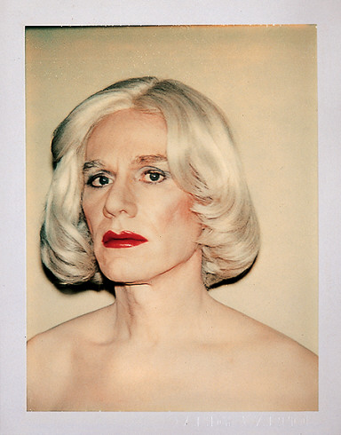
Warhol in drag. Yes, I’ve come across it before, but there was something about it in the context of the exhibition. The scale I should have realised were small poleroids, whereas when I’d seen the work in books, I’d mistakenly imagined it more A4 or even large scale. The size of course, changes the meaning of the self-portrait entirely. In my imagination, the large scale of the portrait was garish and intruding to the viewer, cocky even. However, when I viewed it during my ‘Facing the World…’ visit, I was struck by the intimacy that the poleroid scale allowed. I had to stand up close to study it. There were four of these small self-portrait’s of Andy’s on the wall and from afar all you could see was the stylish black frame, you could not make out the facial features. Yet upon close inspection there was so much to see and draw out, a rawness and an insight which felt personal and floor shattering. Almost as if I was an intruder catching Warhol in a moment which belonged only to him.

warhol-skull

Suddenly, my assumptions of Warhol with his elaborate pop art flamboyancy melted away and I was left with this striking affinity I felt for the pieces. I have read Warhol’s autobiography ‘The Philosophy of Andy Warhol: From A to B and Back Again’ and I must say that it changed the way in which I viewed him. I think changed is actually an understatement. It revolutionised the way I view him. I feel I have a far greater insight and understanding to both his methods and intensions of working because of this book. A lot of people like Warhol and his work. A lot of people don’t. It’s always the people who don’t like him to whom I recommend read this book. I can never decide as to how I feel about him exactly; I am fascinated by his life in the Factory and his relationship with celebrity icons like Eddie Sedgwick, his intentionally monotonous yet revolutionary films like ‘Empire‘, yet I am also reserved in my interest. His fascination and fear of death is perhaps what speaks to me most. Following the assassination attempt on his life and his near-death experience, Warhol began to explore this theme in his work. He created silk-screens of gruesomely smashed up cars wrapped round trees, he did portraits of celebrities like  Marilyn Monroe and Elvis, both of whom supposedly died of a drug overdose. In among his colourful depictions and his Campbell’s soup cans, lies tragedy in the work of Warhol. There is a personal undercurrent that hums quietly underneath the elaborate facade and  his artistic persona, which once exposed, is truly magnificent. It is this undercurrent and its subtleties which I am drawn to with Warhol. I found therefore found these portraits very touching and almost kind of melancholy.

robert-mapplethorpe-fashion-sh37415

I viewed the self-portraits of Robert Mapplethorpe with much the same air. It feels as if there is an inherent sadness to his work, one which you can’t escape from in the process of viewing. Perhaps it is his striking eyes, which pour so deeply into your soul that you can’t help feeling as exposed as he is in his portrait. Or perhaps it is the monochrome, the lack of colour an allusion to a lack of life. Yet his portraits are filled with life, with intimacy and with themes that are dictated by the erotic. Perhaps it his aura, the knowing tilt of the head and the carefully applied mascara. The sensual addition of the fur. Or perhaps it is merely the contrast provided by his opposing self portrait that was in the exhibition, which is infused with a reasserting masculinity. Mapplethorpe employs the same dark backdrop, yet creates an entirely contrasting presentation of himself. The hardened expression, the tough leather jacket. The casual cigarette protruding from his full-bodied lips. What is it about Mapplethrope that is so sensually infused? Is it the chiseled cheek bones? Or is it his defiance? His ability to present himself in an entirely modest, yet simultaneously proud way?

mappleforth

I think Mapplethorpe’s work has a solid beauty to it.You can’t ignore the sensual air, or the sculpted bodies. For me, the use of monochrome is a very striking elemt. It removes unnecessary details from the work, the fact that colour is absent forces you to focus more on the features. The depth and tone created through the clothing texture (or lack of it) and pure human flesh is striking. Given the iconic features of his work and the raw portrayal of himself and his subjects, I think it is safe to say Mapplethorpe is one of my favourite photographers.

‘Facing the World: From Rembrandt to Ai Weiwei’ is an exhibition unlike any I have seen before. Mainly due to the fact I have never before encountered a portrait-based exhibition. The range of work created quite the pictorial journey with incredibly interesting content, particularly given the evolution of the portrait itself. How these days, the full human body is as much a portrait as more traditional depictions which include only the upper torso. Yet for me, it was the works of Warhol and Mapplethorpe that stood out. I felt that they were the most successful in capturing the essence of themselves and conveying who they were or what they could be. I was spell-bound by their works to the point I felt as if there was a direct correlation between myself and their portraits. As if I, stood staring up at their work as I occupied the gallery space, ceased to exist for a moment. I disappeared into them; I became irrelevant. This ability to strike up such a close and inclusive dialogue with the viewer can be a rarity within an artwork, but in this instance I left with a lasting affinity towards the works and their subjects.

Images sourced from:

http://67.media.tumblr.com/ead8fd2dbfd137095a33ae12ed892ca3

http://theredlist.com

http://www.tate.org.uk

Surreal Encounters: Collecting The Marvelous

img_2623

Installation shot including various works by Salvador Dali

“Everything tends to make us believe that there exists a certain point of the mind at which life and death, the real and the imagined, past and future, the communicable and the incommunicable, high and low, cease to be perceived as contradictions.”
– André Breton, Manifesto of Surrealism

Recently I visited the Scottish National Gallery of Modern Art on what I thought would be a brief afternoon excursion. Almost four hours later I emerged from’Surreal Encounters: Collecting The Marvelous’ enlightened and inspired. Marvelous; there could not be a more apt word to apply to this broad collection of artworks. Immediately upon entry you are greeted by renowned and famous names including Picasso, Man Ray and Duchamp. Seeing a collection of those artists merely in the corridor – before I’d even entered a room – made me realise the sheer stature of this exhibition. This was and is quite the collection of Surrealist works. Never before have I seen so many Dali and Magritte pieces clustered in such close proximity. The result was mesmerizing. I felt like Alice in Wonderland tumbling down the rabbit hole into a world of dreams, blue endless skies, obscure depictions and dripping, blurring creatures. For someone who has read countless books on Dada and Surrealism, two art movements that changed and shaped the course of art history, it was like walking into a shrine dedicated to works of the past. I couldn’t quite believe what I was seeing.

img_2624

Installation shot hosting the works of René Magritte

The exhibition was beautifully curated and very insightful in terms of how the collections came about. As a viewer you are given an in depth account of how Roland Penrose, Edward James, Gabrielle Keiller and Ulla and Heiner Pietzsch came to acquire the works. This was done through a series of conducted interviews. I thought this was a very effective component of the exhibition as in among all of these monumental and historical works by Miro and Magritte, there were TV screens with the interviews being played out. With the giggles between partners Ulla and Heiner Pietzsch echoing throughout the space as they discussed their plans for their collections, I couldn’t help but feel that their stories brought the collections and the artwork even more to life. As a viewer, not only were you busy plummeting into a whimsical world within the frame and trying to decipher and make sense of something so non-nonsensical, but you also became aware of how it came to be hung on the wall in front of you. The care and thought that went into the collections and the articulate eye required to amount such works, was extraordinary. It was fascinating hearing how Gabrielle Keiller had realised Duchamp’s artistic potential and decided to gather his works. Of course it was equally fascinating seeing the works themselves; Duchamp’s mini replication of ‘The Bride Stripped Bare By Her Bachelors‘ was rather mesmerising in itself. 

feuille-de-vigne-femelle-female-fig-leaf-1950-1961

‘Female Fig Leaf’,  Marcel Duchamp, 1961

Marcel Duchamp is an artists I have studied very closely, so for me seeing his work was kind of like seeing a celebrity on the red carpet. His concept of the Readymade turned the art world upside down when he declared a urinal a work of art. A Readymade is a work that consists of objects that were, believe it or not, ready made. They become an artwork essentially through the declaration of the artist. This of course caused outrage in the artworld at the time and Duchamp’s urinal, or ‘Fountain‘ as he named it, was in fact refused entry to the Parisian Salon des Indépendants. At the time it was revolutionary and outrageous, now this act and the creation of the readymade is just another dictionary term in the art collection alongside Minimalism, Impressionism and all of the other movements which were not accepted at the time as they are presently. I loved’Female Fig Leaf‘ (above), I think it was one of my highlights of the exhibition not only because it was a Duchamp piece, but also because of its cheekiness. It is an imprint of the female genetalia, which Duchamp actually gifted to his wife. 

94d7ac8dcb40d950a6b342fcf3d010dd

‘Nude Woman Lying in the Sun on the Beach’, Pablo Picasso, 1932

Picasso, dare I say it, has always been very hit or miss for me. I can appreciate his work, his technique, his skill and his status. However his work has never quite struck the cord with me on a personal level. That is of course with the exception of ‘Guernica’ (1937), one of his most famous works depicting the horrors and brutalities of war. However, in this Surrealist exhibition, I was for once incredibly taken by a Picasso piece in the form of ‘Nude Woman Lying in the Sun on the Beach’. It absolutely fascinated me. The title provided the perfect insight into the subject of the work and the colours and composition were incredibly satisfying to my eye. I love the muted and restricted palettes of mint green and baby blue alongside the triangular creations. I was so drawn to this work that I even bought a postcard of it as a momento to the exhibition! 

coupleauxtetespleinesdenuages_dali

‘Couple aux tȇtes pleines de nuages’, Salvador Dali, 9136

‘Surreal Encounters’ was surreal for me in more ways than one. It was of course surreal in the sense that I was seeing the biggest body of Surrealism I have yet witnessed in my lifetime, but it was also because I was in a dumbfounded haze of surreal disbelief at seeing works such as these. Particularly the large scale Dali pieces. The skill and techniques, the mastery Dali displays with his paint and the colour choices and balances are all compiled together to form compositions so breathtaking that I was grateful to be able to occupy the seats dotted throughout the gallery space! It was one of those exhibitions where you really have to sit down and just breathe in and absorb the work in front of you. Realise how insignificant you are when faced with these grand works, grand scales and even grander artists. There was a room filled only with Dali and Magritte pieces which has to have been my favourite. Mainly because René Magritte is in fact one of my favourite artists. Coming from someone who has a very long list of favourite artists, that is quite the compliment to Magritte. I will never forget the first time I saw his work. It was at The Peggy Guggenheim Collection in Venice. Again, there was a room filled primarily with Dali and Magritte and I remember feeling as if the air in my body had been physically knocked out of me. I had only ever come across these works in books or on the internet prior to that moment and to be greeted face to face with the brush strokes (or lack of them) of Magritte was truly one of my most memorable moments in my experience of viewing art.

14134560_294394854251021_1491073811_n1

‘La Représentation’, René Magritte, 1937

Walking into the Dali/Magritte room in the Modern Art Gallery was very much like experiencing my Guggenheim epiphany all over again. Seeing Magritte’s countless sky scapes, his mysterious face reflections and erotic depictions cast a spell of serenity over me. Time seemed to stand still as I immersed myself in the works, trying to read them and imagine what strange things had been blurring through the mind of Magritte as he painted. I tend to avoid reading the information that sits alongside a painting, at least until I return to the exhibition a second time, as I prefer to formulate my own ideas and opinions about a piece before giving in to the direction leaflets and writings provide. Trying to read a Surrealist work however is quite the task and I decided that the best way to do this was to free my mind. To allow my conscious to let go of assumptions and float and drift instead into more sporadic realms.

Eine Kleine Nachtmusik 1943 by Dorothea Tanning 1910-2012

‘Eine Kleine Nachtmusik’, Dorothea Tanning, 1943

I think ‘Eine Kleine Nachtmusik‘ was one of my favourite works within the exhibition (not counting all of the Magritte’s, that goes without saying given how big a fan I am!) However, I have never come across Tanning’s work and this piece really stuck with me. It’s predominantly the bold colours that appeal to me; the blood red carpet against the sunshine yellow of the sunflower. The angles of the staircase alongside the open door at the end of the corridor. The way in which the girl’s hair appears to be sucked and gusted upwards towards the ceiling, yet she remains stood still and straight as if the presence of a giant sunflower on the stairwell was a perfectly natural occurrence. Yet there lies the success of the Surrealists; the ability to take the abnormal, the strange, the absurd and transform it into something so nonchalant that we begin to question our own senses of normality. They take the ordinary and transform it into such an extraordinary that we are left both stunned and speechless yet simultaneously brimming with an overflowing cauldron of ideas in our heads. In heads thatupon witnessing these works of art suddenly feel too small for all of these bizarre and beautiful notions. Consequently, the only thing that we can do is release ourselves to the surreal and the experience it provides. Needless to say, this exhibition succeeded in providing that experience and more. I was left reeling and contemplating it for days and this contemplation will continue, as will our own surreal encounters. 


We were not allowed to take photographs in the exhibition,therefore my images are sourced from the following websites:

https://www.nationalgalleries.org

http://georginacoburnarts.co.uk

Home


NUFA16

IMG_9137

Tyler Coop

I can remember being in my first year of uni and looking up to the third years thinking it was impossible that one day I would be putting on a show. I’ve always kind of felt that when I looked up to older students even at school; I remember wondering how people sat exams, how people traveled by themselves, how people had the confidence to drive cars, etc etc. All these thoughts feel silly and irrelevant now looking back, because of course you learn and grow and change. I didn’t realise however quite how much an art course would change me. I never imagined I would go down the route of performance art, if anything I’ve always been someone who shied away from the stage and was instead content painting background scenery and doing backstage make-up. Yet during the time on this course I have experimented with mediums I never planned to work with such as sculpture, print, photography, video, projection, all sorts. I’ve really pushed the boat out in ways I never imagined or expected.

IMG_9181

Woon Prize Nominee Sheyda Porter 

I think that’s what’s so wonderful about embarking on a course as practical and creative as this. Not only are you exploring your artistic potentials, but you are also exploring the tools which allow you to realise your ideas. You’re learning so much theory too, with all the seminars, Art History lectures  and of course extensive research and reading meaning my knowledge of the artworld has grown so much. As has my coffee table collection of artist books which are now looking to require a bookshelf…

IMG_9169

Saman Ahmadzadeh

That’s partially the exciting thing however, the fact that my bookshelf keeps expanding. The fact that despite finishing this course, I am nowhere near finished. There’s so much more to explore, there’s so much more to experiment with. Despite all of the nostalgia I am currently feeling, I am also feeling incredibly inspired. Seeing everybody’s work come together in this way is amazing not only because there are some incredibly strong and thought-provoking works, but also because we have witnessed one another’s artistic journeys. We’ve seen experiments in the studio go horribly wrong, or moments where tubes of purple paint explode everywhere (yes, it had to be all over me), moments where you walk into the studio to find your studio floor has been taken over by glitter, glue and sprinkles (I have the best studio pal – we are the messiest bunch together and it’s been great!)

IMG_9146

Rebecca Gavigan & Victoria McDermott

So seeing everything reduced to this clean cut and perfectly executed Show is almost overwhelming. I suppose it must be kind of like being a director and finally watching your own Broadway Show. You’ve had moments where everyone is yelling backstage, costume changes haven’t worked, scripts haven’t been learnt, people are stressing and scrabbling around. Yet on the night it all flows smoothly and could not be more perfect. And in that moment you have a feeling of pride in how it has all came together, in how the stress and tears of backstage have dissolved as the characters dominate the stage. I suppose it’s kind of like that, just instead of one director, there are seventy-eight emerging artists.

IMG_9174

Joseph Crookall

Seventy-eight of us whose work could not differ more greatly from the other. I will always remember local artist Narbi Price saying in one of his talks at Vane Gallery, that the more artwork that is made, the more there is a burden on artists to come. This has stuck with me because it is so very true. A lot of people dispel history and say it’s in the past, it doesn’t matter. Yet in being an artist and making artwork it is absolutely critical you know your history, you have to be so aware of what came before you. I have found this particularly vital in looking at the female body in Performance Art, because the 1960s really shaped a lot of things today in that realm and no one can ignore that. So when Narbi said that, it really hit home and seeing such a broad range of work in the Degree Show alone, it’s resonating with me more than ever and making me excited to push things even further.

IMG_9178

Alexandra Karyn

Vinyl Icons: Persian Pop and Turkish Psychedelia Part II

IMG_8736

‘Vinyl Icons: Persian Pop and Turkish Psychedelia’ is a unique exhibition unlike anything I’ve seen in Newcastle before, despite having lived here for almost three years now. This show  perfectly encapsulates what contemporary art represents. It is about making art in the present and using this as a platform to reflect and comment on the world around us. The strength of this show lies in its explorations of history; the revolution in Iran and how an oppressive regime followed, forcing artists and musicians to close shop and adapt to more censored ways of working. Yet throughout the show this historical narrative is not overly explicit and loud in its protest, but instead it is subtle and sophisticated. Snapshots of the world and stories of the past come through in the objects, in the travelling and collection process that has been carried out.

IMG_8720 

One of the things I love most about this exhibition is it creates a real sense of the nomadic lifestyle. The evidence of travelling to far flung places and finding hidden gems is entirely present throughout. It makes me want to be more imaginative with my findings. I am a sentimental person in the sense that I have an old shoe box filled with my special moments. The box contains what would be considered throwaway items to most people, such as a cinema ticket or a used stamp, but for me these little things hold precious memories. My box contains items such as concert tickets, doodles done on restaurant napkins, brooches, Kinder Egg toys, clothes labels, cards I’ve been sent, photographs, plastic and childish rings, the list goes on. Now, some people may consider that junk and to an extent I suppose it is, but each of those items retains a precious moment for me; a good time where I was laughing with my siblings or joking with my boyfriend. Through items we capture and record life and ‘Vinyl Icons: Persian Pop and Turkish Psychedelia’is the perfect example of this. 

IMG_8696

Having lived and travelled a lot throughout my life, it’s fair to say I have my fair share of collected exotic items. Little marble statues from India, patterned scarves from Kenya, silver rings from Oman, postcards from all over Scotland. These items are the little jigsaw pieces that come together to document my life and where I’ve been. I love the surprise of going into an old handbag pocket and finding within it a keyring I picked up on my travels. Much like curator Sara Makari-Aghdam, I find stories in the items we keep and I think that is why I love this exhibition so much, because I can truly relate to it. Sara discovered her father’s old cassette collection of Persian pop music years ago and it has fueled and inspired this show. What I find most intriguing about objects is their own personal journey; if it’s a vintage dress who owned it before it was procured? What kind of occassions was it worn to? Was the person told by their lover that they look lovely? Looking at old items, all these questions come flooding to my mind. Through objects a strong sense of presence comes through and in ‘Vinyl Icons: Persian Pop and Turkish Psychedelia’, this presence is excitedly overwhelming. 

‘Vinyl Icons: Persian Pop and Turkish Psychedelia’

IMG_8729

Having been away from Newcastle for a while, visiting Vane Gallery’s preview of ‘Vinyl Icons: Persian Pop and Turkish Psychedelia’ was the best way to get me inspired enough to return to writing. Curated by Sara Makari-Aghdam, this exhibition explores her dual heritage, as she is an exotic blend of Persian and English. ‘Vinyl Icons…’ also explores the rich Iranian culture of the 1960s and 70s by combining the work of five artists, three of whom lived through the 1979 Revolution. The show is therefore bubbling with culture and heritage, histories and lost pasts. It encapsulates these themes through an explosion of colours and textures; the pieces bounce off the walls in their ecstatic vibrancy. As I enter the gallery space I am greeted by the soaring melodies of Turkish and Iranian pop music and a wave of nostalgia instantly hits and transports me back to the souks and markets of Oman. I recall the smell of incense that used to burn as I walked along the corniche to watch the sun set over the Omani coastline. Having lived in the Middle East for several years, this exhibition brought about a lot of sentimental feelings for me.

IMG_8745

‘Vinyl Icons…’ consisted of an eclectic blend of items, much like an Arabian or Turkish market would. There was opulent jewellery and brooches dripping from and decorating vintage clothes collected and found in America. There were vintage Clarks shoes from 1969, there were extravagant light boxes paying homage to religious shrines, there were photographic montages, family photos, handpainted dresses, a wide collection of sexy record covers and vintage magazines from the ’60s and ’70s. There was even a piece inspired by Afsoon’s mood boards that she creates in her London studio. 

IMG_8740

I was particularly taken by this piece. As the eye shifts across the work, it is constantly met with fantastically bold items such as maps, stamps, tapestries, dish towels and jewellery. It is highly tactile piece that for me really appealed as I felt like I was being invited into the artist’s methods and thought process. I could see from the variety of items present that collecting is integral to her practice. Colours, textures and the considered distribution of both these elements contributed to the success of this beautifully energetic work. 

IMG_8708

Talking with Afsoon, she told me she uses a lot of matchboxes in her work. She likes the surprise of finding unexpected items stored inside such as a hair pin or a tooth, when she buys and collects vintage match boxes from places. Who would have thought an everyday object that I mostly associate with frustration (given my inability to light most matches) could be transformed into something so delicate and beautiful? Housed in their little plinth-based box, these match boxes stood proudly showing off their collaged covers. 

IMG_8706

I was delighted by the constant surprises this exhibition held for me. What originally seemed like pretty little hand-painted shoes (above), soon revealed as I circulated the delicate figure of a nude female body. This simple yet highly effective manipulation of the object was for me one of the best parts of the exhibition. It was cheeky, beautiful and unexpected. Hand-painted shoes were also present on another lower laying plinth, which brought the eye nearer to ground level. From a distance the boots look as if they are decorated in loose swirls, but upon closer inspection exotic feminine eyes can be revealed. 

IMG_8702

 Feminine motifs ran throughout the gallery, with dresses, jewellery, naked bodies and portraits littering the walls. Having lived in regions of the Middle East where women wear abyas all of the time, it was interesting to see a mix of clothing  that ranged from the hand made to collected  vintage items. It was also really interesting to see such Arabian looking objects such as the vinyl case (below left), cleverly placed next to another casing with such an erotic depiction of the female body (below right). Yet Iran was originally very much influenced by the West and was very liberal and this exhibition successfully highlights and explores this blend of East meeting West.

IMG_8722

‘Vinyl Icons: Persian Pop and Turkish Psychedelia’ is for me one of those exhibitions that completely transforms the white walls of the gallery space. Through the highly visual and tactile materials, the variety of items on display and the ever-present music, I felt entirely transported to another place. I felt incredibly inspired by the colours of it all and the memories of Oman that it reminded me of. It was a strange sensation as I stepped back out onto ordinary Pilgrim Street and my doorway into the rich culture of the East faded and remained within the walls of Vane Gallery. I was transported from one world to another, but that is not the end of my experiences as I will definitely be returning to this show on numerous occasions!

To read more blog posts about this exhibition see:

Part II

Part III

Critical Writing for Vane Gallery

Recently I have been trying really hard to work on and expand my writing skills; as much as I love blogging and using colloquial language, I also enjoy writing in more formal and critical terms. Recently therefore I submitted two pieces of critical writing Vane Gallery and I am delighted to have found that they have both been published. Feel free to have a read on the links below:

IMG_8250

‘The Beauty in Grotesque’, a critical review of Jock Mooney’s exhibition ‘Who Are You and What Do You Want?’ at Vane Gallery. Click here to read. 

IMG_8256

‘Layers of Meaning’, a critical review of Oliver Braid’s exhibition ‘The Nude Ignity’ at Vane Gallery. Click here to read.

Scottish National Gallery of Modern Art

IMG_8525

It’s weird, but sometimes the Scottish National Gallery of Modern Art is the thing that makes me feel most Scottish! That’s not because there’s a bunch of Scottish memorabilia in it – far from it! Instead there’s an impressive collection of artworks ranging from Francis Bacon, to Andy Warhol, to David Hockney, to one of my favourite artists Samuel John Peploe (part of the Scottish Colourist movement). Having lived abroad most of my life, there are moments where I struggle to find places where I feel truly at home or have a strong connection with. This Gallery has become one of those places of nostalgia. I remember visiting it for the first time when I was seventeen, living back in Scotland for the first time. Sixth Form was what I’ll call my ‘art awakening’; the period in which I realised what kind of art I wanted to be making (Barbara Kruger was a key influence at this point). So the combination of this revelation along with several art trips to this Gallery during that time have made it a very sentimental place for me. 

IMG_8528

This of course is partially due to the sheer beauty of the place. The gallery’s architecture in itself is stunning (I think it’s safe to say I have a crush on Edinburgh architecture!) and the lush greenery surrounding it only enhances the feelings of tranquility. As does the presence of water, which on a beautiful sunny day like last Friday, sparkles and dances in the light. 

IMG_8527

Walking around this landscape is an incredibly serene experience and although it is still relatively central to Edinburgh’s center, the hectic bustle of the city seems distant and far removed. Almost as if you are stood in an art filled bubble of peace. This swirling blend of land and water can’t help being viewed as an impressive Land Art piece, which for me brings to mind the works of Richard Long and Robert Smithson with his iconic ‘Spiral Jetty‘. 

IMG_8522

In the grounds there’s also works by Henry Moore, who in my opinion is the father of all sculpture. His ‘Reclining Figure‘ series, one of which is pictured above, was a huge inspiration to me at the time I discovered it. I was and still of course am, fascinated by the blend of abstraction and figuration; by the way in which he has designed his pieces to allow the eye to travel smoothly along the figure. Barbara Hepworth is another sculpture pioneer who I greatly admire and on my list to one day visit is the Yorkshire Sculpture Park! Although I greatly enjoy modern art, I also love stepping away from it and looking to older masters. Particularly given my interest in the human body; there is nothing more exciting than exploring how body art has evolved throughout the decades.

Benedict Drew

IMG_8496

I think it’s say to say that Benedict Drew’s wacky installation was by far my favourite work in The British Art Show 8. Exhibited within the Talbot Rice Gallery, Drew’s work is the definition of transforming a space into something completely new and exciting. What had been quite a clean cut angular-looking gallery space prior to my entry into this room, was soon turned upside down as I entered Drew’s work. I was instantly transported from the traditional gallery layout to what felt like a psychedelic sci-fi space. I was in awe. Sound pulsated heavily across the room; I could feel it in my core and reverberating through my entire body. There were headphones placed on the table which of course I reached out and tried on only to find that they amplified the sound that was already echoing around the room. It was almost like an electro heartbeat and instantly made me feel like I myself was a part of the piece.

IMG_8476

The utilisation of the architecture within the work furthered Drew’s success as I felt the gallery dissolved and blended into the installation to the point I felt fully consumed by the piece. Just like this installation, Drew’s practice spans a wide range of media including sound, performance, video and various other forms. He often creates chaotic and absorbing environments that pulsate with life, drawing in the viewer and providing them with a multi-sensory experience. Although there was a lot to take in when I viewed Drew’s work, surprisingly it was not overwhelming. Installations such as this have that risk factor; bombard your audience and your work is often lost on them. Yet Drew defied this by carefully distributing the pieces, creating a walkway for the viewer to enter and navigate their way effectively through his work. The shapes I was met with and the colours that were used all complemented and blended with each other allowing the human eye to adjust to the bright colour palette that was present. 

IMG_8481

When I got to the back end of the installation I was greeted by large, cinematic screens. Drew’s attention to detail was plain to see with the modern white speakers contrasting to the excess of cables wrapped believe it or not, in tinfoil. Drew took a domestic everyday item and turned it into an art piece that distracted nicely from the ridiculous amount of cables that all his technology requires. It also furthered my reading of the sci-fi elements. It was not just the detail in the cable layout, but also in the stands of the screens. Instead of being a dull conventional black they were a lime green that instantly caught my eye (probably due to the fact I seem to have developed an unexplained love for lime green). 

IMG_8482

According to The British Art Show’s text accompaniment to this piece, Drew was articulating “the horror of the modern world” through this work. Through his multi-media approach he explored this horror thoroughly! It was impossible to ignore the screens that bombarded you as you approached, an obvious reference to our screen culture of today. There was sound that shook through your bones, the way music does in a club. Colours and structures clustered everywhere in excess alluding to our material and consumer culture. There was no escape in this whimsical and all-consuming environment; the pace of it drew you in and refused to let go much in the way that modern day life does. 

IMG_8480

Yet in among all this technological-based motifs I was surprised to view what looked like mud puddles on screen. They were very anthropomorphic and alien given their electric colours, yet I half expected a David Attenborough voice over mixed up DJ style to come on!  It would not have surprised me, as this work was a constant succession of surprises – and puzzles. There was one area of each screen which had a shell attached to it and a spot light which remained the same colour despite the constant shift in imagery. I could not for the life of me figure out how Drew had managed this! 

IMG_8485

There was not a moment of boredom in this space. Despite this being the first piece I saw of The British Art Show, and despite me witnessing several other works that day, this was the one I could not stop thinking about. I couldn’t get this psychedelic experience out of my head. Partially I think because I was both impressed and fascinated by how Drew had used technology and created such an absorbing work. But also partially due to the elaborate colour scheme – I myself almost wanted to start glowing and blend into the work! I think it’s safe to say Benedict Drew succeeded in captivating his audience, whilst also posing some challenging questions concerning modern life today. 

British Art Show 8

IMG_8497

We had an art trip to Edinburgh on Friday to see the British Art Show 8. I felt like a school girl again being on the bus with everyone. Let’s just say I’m not a morning person when lacking my usual caffeine intake! It was lovely to get away from Newcastle to a city as stunning and creative as Edinburgh. I am completely in love with the city and it’s architecture, everywhere you look there is something new to absorb, especially when the sun is shining and dancing across the beautiful buildings. The gallery buildings we were visiting, such as The Talbot Rice Gallery, University of Edinburgh (pictured above) are visually captivating enough in themselves – and that’s before we’d even seen the work in the show itself! The British Art Show takes place every five years and is an exhibition that tours nationally to show the most current contemporary art in the UK today. It hosts a broad variety of artists all of whom work across various media. The theme of the British Art Show this year was materiality and how we approach it both virtually and physically in contemporary art. 

IMG_8498

Initially I misread the text accompanying the exhibition and took it to mean the theme was materiality alone and was consequently disgusted by the ridiculous excess of screens. Not joking, there were more video works in that show than I’ve probably witnessed in my life! In my outrage at this approach to materiality I felt disillusioned by the entire show, until I came to realise my mistake. However, despite the theme being an exploration of materiality across the real and the virtual, I did find the predominant selection of video works quite difficult to absorb. Drifting from screen to screen to screen did start to feel slightly repetitive and exhausting. This is the problem with an excess of video in a gallery setting. You walk in at the wrong time or half way through and the narrative is entirely lost on you! In some cases this approach to viewing video is a success, in other cases it is far from that. Half the time you have no idea of the duration so you are forced to decide when you leave or if you stay and then of course you have all the social pressures of that situation in a gallery setting. You don’t want to be the first to leave the art work, or you don’t want to hurriedly get up when you’ve only just sat down. It can lead to a multiple of awkward situations. 

IMG_8492

That is why I loved this piece ‘The Common Sense’ by Melanie Gilligan so much. There was no issue of when to stop and start viewing. Given the absence of the conventional dark space for viewing video work, I felt under far less pressure and therefore was more inclined to participate with the piece. Partially because I was fascinated by the technology. I put the headphones on expecting to hear things straight away, but it wasn’t until I was in close proximity to the screens that any sound was audible. As you approached each screen you were greeted by a different segment of the film and it’s audio. Yet as you walked between screens you could hear nothing but silence. It was all done through motion sensor and created a highly intriguing experience. Unless of course you didn’t have headphones, then you just felt lost and disinterested. Being lucky enough to have claimed a pair of headphones, ‘The Common Sense’ seemed like a fascinating dystopian film which I would have loved to have been able to see all the way through!

IMG_8489

Also in The Talbot Rice Gallery was this work by Eileen Simpson and Ben White. In the above image, it doesn’t look like much, apart from being a selection of funky coloured record players. However in reality it was an engaging sound installation that echoed throughout the top floor of the gallery. The records played a compilation of extracts taken from chart hits of 1962 – the final year in which commercial records could be retrieved for public use. It sounded like a hollow and empty kind of disco, like you almost wanted to dance and party but the robotic tone was stopping you from letting loose. 

IMG_8519

Sound installations along with video seemed to be core motifs to the Show. The above image is a gravestone bench by Alex Kane, which was in the room of Laure Prouvost’s haunting sound work. There was a silky woman’s voice reverberating across the room as I sat down, the kind of voice that makes the hair stand up on the back of your neck. At first I thought the bench was part of Prouvost’s work, until I read the accompanying text. Although the sound installation was a generic address to the viewer, it felt like the woman’s voice was pinpointing and talking to directly to me. Incredibly haunting and eerie enough that I left that room with my skin crawling. Although The British Art Show was less sculpture filled than I’d expected, it was rich in experience. I left each room with new thoughts and feelings racing through my head, different things making me uncomfortable or mesmerising me into staying. Sometimes I feel contemporary art should have the simple title of ‘experience art’, as that was definitely what I felt the British Art Show was; an experience. 

Flora Whiteley ‘Present Continuous’

IMG_8260

Talking more about getting back into painting is actually relevant to another exhibition I saw recently at Vane; Flora Whiteley’s ‘Present Continuous’. Given her cinematic background, her works have elements of film and stage-like set ups, which bring a new dimension to what are otherwise very painterly works. At present I’m not too interested in researching the background to her paintings and all of the concepts she was exploring; I’m simply wanting to look at and appreciate the paintings themselves. Particularly in terms of her use of colour. The above work is the perfect example. Through her pastel hues and soft palette, the cold of winter she’s depicting in the picture comes through to real life. You can almost feel the cold creeping into the gallery space. 

IMG_8266

It’s the same with this piece (see above) as well. The smoke from the girl’s cigarette has that wispy aesthetic of real life smoke. Although it’s a static image, you can see the cusp of energy it carries, as if the smoke could blow out of the painting and into your face as you view it. I think the lack of hard edges enhances this sense of movement. There’s a softness to the painting and a delicacy to the technique. What looks like fairly heavily applied paint is in fact an abundance of layers built up over time. The technique of the painting application varies between dry-brush and more of a solid application of colour. The contrast between the two creates a nice sense of balance within the painting. In some instances we are able to see the linen on which the paint is applied, in others we are presented with purely a build up of tonal work. 

IMG_8265

There’s a real sensitivity in her depictions of the figures as well. Their stances are not too posed, they simply hold themselves. The muted colours of their clothing allow them to almost blend into the background, not occupying too much attention within the piece. The tilted angles of the head, the slight bending of elbows, every element is thought out and all contribute to create a linear direction for the eye to travel round. 

IMG_8263

The scale Whiteley has chosen to utilise complements her figures as well. They are not quite life-size but they have that element of suggestion. You can relate your bodily proportions to the piece. They also allude more to Whiteley’s cinematic background – not quite on the scale of being a cinema screen, yet they are not far from it and have the potential to be one. There were also far smaller portrait paintings, yet I preferred the larger ones as they really allowed me to closely study her technique. 

IMG_8264

I don’t always take photographic close ups of work, as I prefer to have the entire body of the piece to contemplate as I reflect on it. However in this instance I was far more fascinated by close up studies of it all. The way Whiteley had broken up the pieces through angular lines and blocked colours. The shapes she formed through her placement of the figures. The depth created through the variation in colour. There was so much to see and absorb, that standing far back felt like I was missing out!