Critical Writing for Vane Gallery

Recently I have been trying really hard to work on and expand my writing skills; as much as I love blogging and using colloquial language, I also enjoy writing in more formal and critical terms. Recently therefore I submitted two pieces of critical writing Vane Gallery and I am delighted to have found that they have both been published. Feel free to have a read on the links below:

IMG_8250

‘The Beauty in Grotesque’, a critical review of Jock Mooney’s exhibition ‘Who Are You and What Do You Want?’ at Vane Gallery. Click here to read. 

IMG_8256

‘Layers of Meaning’, a critical review of Oliver Braid’s exhibition ‘The Nude Ignity’ at Vane Gallery. Click here to read.

Benedict Drew

IMG_8496

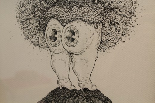
I think it’s say to say that Benedict Drew’s wacky installation was by far my favourite work in The British Art Show 8. Exhibited within the Talbot Rice Gallery, Drew’s work is the definition of transforming a space into something completely new and exciting. What had been quite a clean cut angular-looking gallery space prior to my entry into this room, was soon turned upside down as I entered Drew’s work. I was instantly transported from the traditional gallery layout to what felt like a psychedelic sci-fi space. I was in awe. Sound pulsated heavily across the room; I could feel it in my core and reverberating through my entire body. There were headphones placed on the table which of course I reached out and tried on only to find that they amplified the sound that was already echoing around the room. It was almost like an electro heartbeat and instantly made me feel like I myself was a part of the piece.

IMG_8476

The utilisation of the architecture within the work furthered Drew’s success as I felt the gallery dissolved and blended into the installation to the point I felt fully consumed by the piece. Just like this installation, Drew’s practice spans a wide range of media including sound, performance, video and various other forms. He often creates chaotic and absorbing environments that pulsate with life, drawing in the viewer and providing them with a multi-sensory experience. Although there was a lot to take in when I viewed Drew’s work, surprisingly it was not overwhelming. Installations such as this have that risk factor; bombard your audience and your work is often lost on them. Yet Drew defied this by carefully distributing the pieces, creating a walkway for the viewer to enter and navigate their way effectively through his work. The shapes I was met with and the colours that were used all complemented and blended with each other allowing the human eye to adjust to the bright colour palette that was present. 

IMG_8481

When I got to the back end of the installation I was greeted by large, cinematic screens. Drew’s attention to detail was plain to see with the modern white speakers contrasting to the excess of cables wrapped believe it or not, in tinfoil. Drew took a domestic everyday item and turned it into an art piece that distracted nicely from the ridiculous amount of cables that all his technology requires. It also furthered my reading of the sci-fi elements. It was not just the detail in the cable layout, but also in the stands of the screens. Instead of being a dull conventional black they were a lime green that instantly caught my eye (probably due to the fact I seem to have developed an unexplained love for lime green). 

IMG_8482

According to The British Art Show’s text accompaniment to this piece, Drew was articulating “the horror of the modern world” through this work. Through his multi-media approach he explored this horror thoroughly! It was impossible to ignore the screens that bombarded you as you approached, an obvious reference to our screen culture of today. There was sound that shook through your bones, the way music does in a club. Colours and structures clustered everywhere in excess alluding to our material and consumer culture. There was no escape in this whimsical and all-consuming environment; the pace of it drew you in and refused to let go much in the way that modern day life does. 

IMG_8480

Yet in among all this technological-based motifs I was surprised to view what looked like mud puddles on screen. They were very anthropomorphic and alien given their electric colours, yet I half expected a David Attenborough voice over mixed up DJ style to come on!  It would not have surprised me, as this work was a constant succession of surprises – and puzzles. There was one area of each screen which had a shell attached to it and a spot light which remained the same colour despite the constant shift in imagery. I could not for the life of me figure out how Drew had managed this! 

IMG_8485

There was not a moment of boredom in this space. Despite this being the first piece I saw of The British Art Show, and despite me witnessing several other works that day, this was the one I could not stop thinking about. I couldn’t get this psychedelic experience out of my head. Partially I think because I was both impressed and fascinated by how Drew had used technology and created such an absorbing work. But also partially due to the elaborate colour scheme – I myself almost wanted to start glowing and blend into the work! I think it’s safe to say Benedict Drew succeeded in captivating his audience, whilst also posing some challenging questions concerning modern life today. 

Flora Whiteley ‘Present Continuous’

IMG_8260

Talking more about getting back into painting is actually relevant to another exhibition I saw recently at Vane; Flora Whiteley’s ‘Present Continuous’. Given her cinematic background, her works have elements of film and stage-like set ups, which bring a new dimension to what are otherwise very painterly works. At present I’m not too interested in researching the background to her paintings and all of the concepts she was exploring; I’m simply wanting to look at and appreciate the paintings themselves. Particularly in terms of her use of colour. The above work is the perfect example. Through her pastel hues and soft palette, the cold of winter she’s depicting in the picture comes through to real life. You can almost feel the cold creeping into the gallery space. 

IMG_8266

It’s the same with this piece (see above) as well. The smoke from the girl’s cigarette has that wispy aesthetic of real life smoke. Although it’s a static image, you can see the cusp of energy it carries, as if the smoke could blow out of the painting and into your face as you view it. I think the lack of hard edges enhances this sense of movement. There’s a softness to the painting and a delicacy to the technique. What looks like fairly heavily applied paint is in fact an abundance of layers built up over time. The technique of the painting application varies between dry-brush and more of a solid application of colour. The contrast between the two creates a nice sense of balance within the painting. In some instances we are able to see the linen on which the paint is applied, in others we are presented with purely a build up of tonal work. 

IMG_8265

There’s a real sensitivity in her depictions of the figures as well. Their stances are not too posed, they simply hold themselves. The muted colours of their clothing allow them to almost blend into the background, not occupying too much attention within the piece. The tilted angles of the head, the slight bending of elbows, every element is thought out and all contribute to create a linear direction for the eye to travel round. 

IMG_8263

The scale Whiteley has chosen to utilise complements her figures as well. They are not quite life-size but they have that element of suggestion. You can relate your bodily proportions to the piece. They also allude more to Whiteley’s cinematic background – not quite on the scale of being a cinema screen, yet they are not far from it and have the potential to be one. There were also far smaller portrait paintings, yet I preferred the larger ones as they really allowed me to closely study her technique. 

IMG_8264

I don’t always take photographic close ups of work, as I prefer to have the entire body of the piece to contemplate as I reflect on it. However in this instance I was far more fascinated by close up studies of it all. The way Whiteley had broken up the pieces through angular lines and blocked colours. The shapes she formed through her placement of the figures. The depth created through the variation in colour. There was so much to see and absorb, that standing far back felt like I was missing out!

Jock Mooney Part 2

IMG_8246

Normally I’m quite wary about using or associating art with the word ‘kitsch’. All it encompasses are elements that do not cater to my usual taste. Kitsch to me normally creates associations of tackiness and poor taste – which to excess form the definition of it. Yet that was the word that sprang to mind when I walked in and saw these pieces. For once in my life I don’t mind using the word, as I think it totally works in this instance. Even better, I’m getting the ironic vibes here which means I’m even more comfortable in applying the term to Mooney’s work. I don’t feel he’s done it without the intention of being sarcastic. 

IMG_8250

So Mooney has succeeded in being the first artist to ever have me accept ‘kitsch’ as a good thing. Kudos. Not only that, he’s also managed to incorporate bizarre and seemingly random motifs into his work which I can’t stop looking at. Of course they’re not random at all. He’s got Janus cats for one. The name Janus coming from the Roman god who is normally depicted looking forward into the future and back into the past with his two different faces. This symbolises Mooney’s contemplation of life in this exhibition. Then there are all these cake-like sculptures, which reference certain religious festivals and religions through grotesque formations that in some instances take the form of the severed head of Marie Antoinette. Culture, history, religion are all just some of the components Mooney explores here. It’s all slightly unnerving and creepy, yet the vibrant colours reign it back into the realm of playfulness. 

IMG_8253

What I didn’t find too playful was this floor-based work. I think this ginger bread picnic mat for me was slightly mad. You’ve got severed fingers scattered across it, along with laughing faces who you can almost hear jeering at you. Not sure I fancy eating a cucumber sandwich sat with all that watching me. But it worked very well within the exhibition context, especially given the play on space. It’s really interesting that modern day sculpture is abandoning the plinth in favour of the floor, as it forces the viewer into a direct relationship with the work. Especially with a piece like this, is it a picnic mat or is it a sculpture? Where does art begin and art end? It’s all about the blurring of boundaries and comes back to that idea of exhibitions that are designed to challenge conventional perceptions of artwork.

Jock Mooney Part 1

IMG_8247

Vane Gallery recently had Jock Mooney’s ‘Who Are You and What Do You Want?‘ exhibited. Mooney is represented by Vane so I’m quite familiar with his work through that. This exhibition however was quite unlike his usual stuff as it was far more personal and autobiographical. It is an exploration of Mooney’s joys and fears surrounding life; his hopes for the future and all the whimsical elements of life. I’m not saying this exhibition was totally unfamiliar given his choice of theme as his iconic gruesome figures and lavish colours were of course still present – it wouldn’t be true Mooney without those components! 

IMG_8249

The pieces that caught my attention most were his incredibly intricate drawings. Not only was the detail and patience they must have required unparalleled, but the variation in tone was endless. Mooney really had pushed monochromatic drawing to the extreme. Along with the slightly grotesque swirling knots and fluid shapes, Mooney had also brought in a bit of cheeky humour. Eye-adorned bottoms were a motif in a lot of his drawings and this balanced out what would otherwise have been quite gruesome and curdling depictions. 

IMG_8248

The one above is my favourite as it is a blend of both an action and a reaction. On the one hand you have what looks like a woman’s dress blowing up, the action, and then within that you have the popping eyes in reaction to this occurrence. Very clever. The eyes have that excessive, over-the-top, Tom & Jerry style look to them as well which heightens this sense of amusement. As does Mooney’s playful titles: ‘Avocado Pear-shaped Palm’, ‘Speculative Teetering’, ‘The Curse of the UHT Guacomole Snowman’, ‘The Dysfunctional Rapture of Brassica Bumface’ the list is endless and just so much fun. I think we really get a taste of Mooney himself through the language he applied to his work which is why I personally find the titling of a work crucial. It is the cherry on the cupcake if you like. And although these drawings are fantastic and fun even if they were titled something entirely mundane like I don’t know…’Cereal Bowl’ (yes, I’ve just had cereal), the title does succeed in adding that extra bit of mischief.

Alice Theobald and Atomik Architecture

DSC00201

 I have viewed this piece at The Baltic a few times now. I did not run to write a blog about it, as I wasn’t entirely sure what I thought. I needed more time to process what I’d seen and I also felt like I had to see it again before I could formulate my thoughts into anything worthwhile. That is not a negative thing. The fact that this work forced me to really think and contemplate my experience of it shows its staying power and effectiveness. The work is co-authored by Alice Theobald and Atomik Architecture. It’s an endevour to blend an artistic practice with architecture. Given that Theobald works in performance, sound and installation, it’s quite an ambitious choice of blend. Hence my excessive contemplation over it all. 

DSC00194

It was interesting because when I arrived on Level 2 the above scene is what I was greeted by. There’s an instant blockade which suggests a lack of access. A lot of visitors did in fact question whether or not they were allowed to enter the structure. I don’t know if it’s because I’m an art student and have seen things like this before, or if it was just an assumption on my behalf, but I entered without hesitating. I knew it was designed to make the viewer question so I was instantly quite taken by it! That was before I even entered the structure which is made up of everyday objects such as duvets. The comfort of that item in a space as awkward and industrial as this was quite a contrast. It brought the idea of comfort zone and bedroom space into a gallery setting which was an unusual experience. Yet it demonstrates the success of the piece given its play on the conventional associations of architecture. 

DSC00195

There was writing scrawled across these interior duvet forms; it was difficult to make out so it took a lot of time to read. I found myself reading out loud in an attempt to process it better. This play on interior and exterior was brilliantly constructed. As the piece had all sorts of components including sound, video, performance through the installation, it could have been a very overwhelming experience. However, given how they had broken up the space by placing spherical structures at various intervals, it created an easing of the senses. There was singing playing throughout the gallery and the spoken word as well, yet when I entered the ‘duvet columns’ as I will call them, the exterior sound reduced slightly, allowing me to better concentrate on the text. 

DSC00197

These ‘duvet columns’ were dauntingly high, so much so that they reached the ceiling. As well as emphasisng the expansive nature of the piece, it also really highlighted the relationship between the work and the architecture of the gallery. It was entirely work-in-situ. This was highly effective as it is not often you contemplate the ceiling of a gallery space, yet Theobold and Atomik make it a key element. The height also furthers the emphasis on the difference between interior and exterior. As does the fact I was being videoed as I circulated the work. There was a live stream documenting people walk through the work. This meant at certain points there were projections of my face at certain points up on the outer walls of the structures! This was on the one hand quite funny and amusing, but on the other quite uncomfortable. It was a relief to get out of the view of the cameras once I was back inside the columns! This created two different emotions for me in response to the entire space. Outside and looking up at the columns made me feel small and exposed; being inside the columns surrounded by duvets and away from the cameras made me feel comfortable and safe. Two entirely different experiences, both within the same space. 

DSC00198

I’m so glad I went more than once before I wrote about it, as my experiences both times were entirely different. The first time I went there was music in the background and performers on the stage, the second time I went there were no performers with only a woman speaking as the audio. Two entirely different situations, but again within the same space. This led me to question how the piece is set up, do the performers come on at a fixed time everyday? Do they perform daily? Do they improvise? Why is there music when they are on stage in stead of the spoken word, is it to make it more theatrical? All very interesting questions that contribute towards the complexity of the piece. It’s not what people would call ‘pretty art’. Personally however, I far prefer art that challenges me and really forces me to question it. Theobald and Atomik are certainly successful in that respect. 

B. Wurtz at Baltic

DSC00218

Contemporary art is often controversial in it’s reception. Some people love it, some people hate it. Some people think their children could have done it. Other’s say their child didn’t do it and the artist beat them to it! This artwork is the perfect example of that retort. Wurtz’s practice revolves around taking a simple everyday object and turning it into something beautiful. In this case, he used food trays and painted the shapes on the bottom of them in different colours of acrylic. First off, I had never even noticed there were so many shapes to the bases of these trays. Second off, this is genius!

DSC00221

It is such an incredibly simple thing but surprisingly elegant too. Who would have thought food trays could look this good?! And together in this form of display they look absolutely brilliant! Walking into the room I half gasped in amazement. Initially I couldn’t figure out what the objects were, but on closer inspection I was stunned to realise it was merely food trays! 

DSC00219

The way they are all arranged is reminiscent of the way portraits are hung in an old historical castle. They have that sophisticated clustered vibe going on. The colours themselves are very rich and bold, almost like jewels. What Wurtz has succeeded in doing is elevating the most simple commonplace object into an art object. Marcel Duchamp’s urinal here we go again!

DSC00223

I think what’s so lovely about this is though is the air of playfulness! It’s not trying to be anything fancy or anything that it’s not. It is purely an adaption of a simple material that is undergoing a transformation into something more beautiful. It’s almost like Wurst is the fairy godmother to house hold materials! He does it with other bits and pieces such as plastic bags and shoe laces but the one that really caught my eye was what I call his photographic tree:

DSC00215

They are little photographic strips hung delicately in this form. Again, so basic but so clever. The best part about all this is it really shows that you don’t need lots of money to make art. Anyone can do it, it’s just about using your imagination and experimenting to see what happens!

Brian Griffiths: ‘BILL MURRAY: A Story of Distance, Size and Sincerity

DSC00206.JPG

So this was also at Baltic when I visited. I saw it last time I was there but never got round to writing about it. I think this is because I had so many people say to me “have you seen that Bill Murray exhibition at Baltic?” and so by the time I eventually did get round to seeing it, I was already slightly  sick of it! Even after all they’d said, this was not what I  expected! I don’t really know what I was expecting…cardboard cut outs of him maybe? Or some all singing all dancing video installation? Satellite-like installations and little dolls houses were therefore quite a surprise! 

DSC00207

As was the childlike aesthetic which was particularly evident in the painted house piece. The whole exhibition had this childhood nostalgia to it, I think because dolls houses were present. They were lit from the inside and invited you in. They felt very homey in a way but simultaneously distant, as if they were pushing and pulling you into and away from them. Teasing you. Become a part of it or leave it alone? It was quite exciting peeping in not knowing what you’d see. In most cases it was shells from the ocean which I really liked, as they contrasted nicely with the wooden construction of the pieces. 

DSC00212

As well as childhood nostalgia, I also felt there was a certain melancholy to it all. I don’t know if that’s because the space felt so big and silent for these sculptures. Although they are fairly sizable in themselves, they are the smallest structures I’ve ever seen on this floor of the Baltic. The silence just seemed so loud because of this, it was almost eerie. Haunting. Like you weren’t meant to be there but of course that’s a contradiction given it’s a gallery where the sole purpose is to view art.

DSC00210

Most pieces were quite precariously balanced which I think also added to the child-like element. It kind of made me want to get some bits and pieces of my own and start adding to the work! Or bring in some of my own houses to fill out the space and create more liveliness! Bring in one of my old dolls houses. Oooh wow, imagine an exhibition where everyone contributed their old dolls house! In a way it would be kind of creepy. Or maybe that’s just me, sometimes stuff like this freaks me out! 

DSC00211

I wonder what it’s like to be Bill Murray and have an exhibition  focused on you…Must be truly bizarre – that is, if he even knows about it!


Hajra Waheed

P1180427

So I had a wee trip down to The Baltic this afternoon thinking there wouldn’t be anything new on given how often I go. But I fancied a walk and some fresh air before the gym so decided to go anyway. I was pleasantly surprised to be greeted by Hajra Waheed’s exhibition. Waheed’s work explores the increasing militarization of the sky and how satellite surveillance is becoming more commonplace in our everyday. She works in mixed media ranging from collage to video installation. Her works include archive fragments and field notes which bring an interesting dimension to the artwork as it feels so much more intense with those elements in it. To me that is, maybe to science orientated people it’s more of a natural dialect. 

P1180426

I am often fascinated when an artistic practice blends itself with science as that is a theme that differs so greatly from my own. Science and technology are fascinating to me, mostly I think because I have no knowledge about them. To me they are merely the great unknown! Yet strangely in this case I have no urge to make this unknown known, it’s almost as if I prefer it all being a mystery so that I can continue to appreciate it from the outside. Or maybe my brain is already too full with arty stuff, which is probably more accurate if I’m being completely honest!

P1180430

What really struck me about this exhibition was the layout; you could tell how much thought had been put into this aspect. There were divides within the space so that some work was hidden when you first entered, there was a separate room and then a little alcove in the wall. There were waist high plinths and then plinths that were just above ground level – the exhibition really forced your eye to travel and it was fantastic! It felt almost like a journey through the artwork. There was also sound playing across the entirety of the room which I think was the sound of materials scraping against the floor as they were being moved. I may be wrong as it was kind of obscure and difficult to pinpoint but given the satellite material laid out on the low-lying plinth, it did suggest the sounds were depicting the movement of these items. If not then I am intrigued by what the sound was capturing; in a way it is this ambiguity that makes it all the more interesting. 

P1180431

My photographs sadly, do not justify the exhibition. Because I didn’t think there was a new one on, I just chucked my basic little camera into my bag last minute. Speaking to a member of the Baltic crew, he said Waheed is very particular about how her exhibitions are documented given the thought and time she puts into layout. So she would probably hate me right now with these awful snapshots of her work. They do give you an idea however of the space. The artwork itself did not trigger much response from me I think because I was too fascinated by the arrangement of it all. I particularly liked how she’d arranged all her framed works, it had a satisfying regimental quality to it (photo above). 

P1180433

I don’t think I’ve ever witnessed an exhibition where the lighting has made such an impression on me. It was both dramatic and subtle at the same time. There was kind of a blue hue throughout the entire space which created a real sense of calm despite the quite intense subject matter. Waheed grew up on the gated Aramco compound of Saudi Arabia where I myself spent some time when I was growing up. It was interesting looking at her work once I found this out as there are some controversial explorations carried out which I think are heightened by the fact she had lived in Saudi and is not simply an artist observing from the outset. Controversial and highly political and not something I am really wanting to get into given my experiences.

P1180432

On the whole I think this was a very successful exhibition. The artwork itself was not exactly to my taste and doesn’t make me want to run off and research her. However the thought and skilled arrangement of it all does. You can tell this is an artist who thinks about the bigger picture when making artwork and I think that’s really important to being successful in today’s art world. 

Suffragette

SuffragetteCroped

I went to see ‘Suffragette’ yesterday and I think it’s safe to say it is a film you cannot afford to miss! It is truly truly brilliant. It is incredibly well cast – Carey Mulligan and Helen Bonham Carter do not disappoint! I was however worried that by using such well established actresses, the film would be overshadowed by their star status. Thankfully this is far from the case. Their star status is almost consumed by the film’s sheer brilliance; their positions in the acting world are irrelevant! To my surprise Meryl Streep features incredibly briefly as Emmeline Pankhurst, whilst the main character is in fact the fictional Maud Watts. I’m not sure how I feel about a fictional character playing the lead, as I felt it took away the film’s historical credibility. Yet at the same time it works so perfectly. By using artistic license to create a made-up character who the entire film revolves around, it does in fact highlight the lives of all ordinary women at the time. Everyone knows the story of the Pankhursts. Everyone knows the Suffragettes were extreme. What people don’t know is the side stories of every woman involved. And every woman affected by the changes. And I suppose this film is designed to highlight that. 

020414SH_14522.nef

Not only is the film an incredible feminist piece (no surprises there), it is also beautifully artistic. The cinematography features an almost ridiculous amount of extreme close ups, yet as a viewer you feel you would be lost without this intensity. We look straight into the eyes of characters, see the shadows forming on the tears rolling down their cheeks. There is no escape from the emotional intensity of this film. A lot of the filmwork is also done using the handheld technique, which only amplifies the chaos you are experiencing as a viewer, particularly during scenes of riot and political unrest. Another thing I loved about the filmwork was the constant switch between being sharply in focus and being so blurred you can only make shapes out. It is incredibly effective as it really draws you into the film and the experience’s of the characters. The director Sarah Gavron has in my opinion, created quite a masterpiece. The Suffragettes would be very proud. 

Images courtesy of:

https://www.thecapitolhorsham.com

http://www.theguardian.com