I went to what was essentially a ‘pop up’ exhibition last night held at the Second Floor Studios of The Newbridge Project. It was a sculptural exhibit by artist Alexandra Searle in collaboration with Left Leg Gallery. Entry was through the back of Newbridge bookshop and up two flights of stairs. As I climbed the staircase my eyes were bombarded with posters of all sorts of upcoming art events and people to get in touch with. I officially felt like I was entering art world. Almost in the way that Alice fell down the rabbit hole into Wonderland. This feeling intensified as I made my way along the corridor towards the exhibit; there were materials scattered to my left and right and I could feel the creative energy of this building pulsating. As I entered the exhibition space I was met by a small crowd of people and a table filled with pink lemonade and cake. As I turned I was finally greeted by the artwork. There were wooden structures precariously balanced against the wall, a wooden pole stood straight as if it were holding up the ceiling, items hanging from industrial rope. Balance and the precarious nature of the work were evidently strong themes.
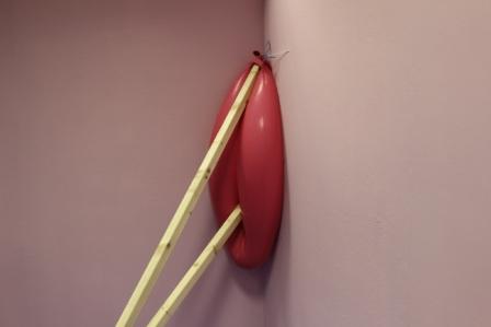
The wall was a pastel pink with a drain pipe running along the top of it and the floor a foam blue. I thought these colours were incredibly complementary of the work, yet when it came to discussing the work with Searle, it turned out she had no part in the colour scheme of the backdrop. Sometimes it’s just the happy coincidences in life. As I questioned her it became clear that she had both a relationship with and a truly in-depth understanding of how to use material and fully stretch it to its limits. Playfulness is a predominant part of her work. When I asked her what her core concepts were to these pieces she said “exploring the materials and their weight”. Balance, volume and an element of risk are key features in this. The latex structure in the corner looks incredibly solid, yet of course the material itself is not. I suppose this was the moment where I felt the playfulness theme was the strongest. The temptation to reach out and touch this corner sculpture was incredibly difficult to resist given how tactile it looked! It contrasts brilliantly with the industrial heaviness of the concrete that made up the floor works. Given that this residency was merely ten days long, Searle did not have the time to use concrete but still wanted it present. Although she did not have the time to manipulate it, she did use it as a means of imprinting into her floor-based plaster works. A subtle yet incredibly effective way to correlate the pieces.
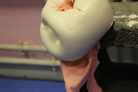
I suppose in most cases I’m biased in my reading of an artwork. All my work orientates on the human body therefore it’s difficult for me to move outside of myself and perceive a work outwith of this frame of mine. With Searle’s sculptures I felt I didn’t have to. There were too many bodily connotations for me to ignore. Casts alluding to nipples, bum-like works handing from the ceiling and then a piece suggestive of a vagina (above in case you hadn’t already noticed). I asked Searle if this was intentional and she said no, it was merely a happy side effect. She liked that her work could represent bodily elements, but that was by no means the objective. And I like that too. I think ambiguity is something I really struggle with in my work as it is often obvious that it’s all about the body, yet ambiguity is something I find so attractive in art. God damn artists that have it nailed!

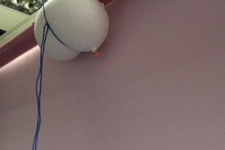
When I spoke to Searle about her influences, I was delighted to hear Eva Hesse featured! Honestly, I am a sucker for all aspects of Hesse’s art. One of the things I find so refreshing about her as an artist is the fact she often favoured her work being presented in her studio as opposed to a gallery. And I suppose last nights exhibition was more studio then gallery based in terms of where it was presented. It’s only as I’m putting this post together that I realise all the photographs I took are close ups, none actually demonstrate how the space was used. Which is kind of irritating and stupid of me, but I think it’s just because I was so taken by the details. I wanted to touch everything and I think the zoom on my camera kind of became my substitute for the ability to touch.
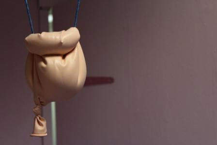
This was one of my favourite pieces (above). Again, I am unable to avoid the bodily connotations as to me it is suggestive of a bladder. What I love most though is it looks like it’s going to fall off at any minute. Yet at the same time it looks like it’s stubbornly going to hang on forever. I almost felt like I wanted to blow on it and watch it swing, tempting it to fall, testing it’s ability to hang on. And I feel like it would have succeeded. Having seen this exhibition, casting is definitely a route I want to go down. I don’t know why I’ve waited this long (well I do, I was going to do it last year but there were complications over workshop spaces.) Anyway, I’m going to try again. Plaster just seems to play with your senses. Invite you in and tease you, yet of course you wouldn’t dare touch an artwork in a space like this. Maybe I’ll make art that people can touch. Or maybe I’ll be too precious about it by the time I’ve made it. Or maybe I’ll try working with plaster and it will be a total disaster. Who knows, that’s the fun of it! And it seems Searle had fun here. Ten days is a tight schedule. Even tighter is the two days in which her work actually came together. I find that in most cases, the last minute rush is where you produce your best and most complex work and then you wish you had more time. But hey, if the end result is anything like Searle’s, who needs time?