Auction Preview Night

IMG_1515

So last night was our Preview Night in preparation of our Fine Art Auction next Tuesday. One week to go (drum roll please!) The team did a brilliant job of putting the work on display. Having been one of the people to run around collecting multiple artworks from all over the place I had kind of lost sight of them all as pieces themselves. Seeing them all arranged so beautifully brought back the ability to view them as artwork and not just number five on my list for collection! It’s strange how putting work in a certain setting can completely transform your view of things. I think that’s why taking your work out of your studio is such an important moment, you really get an idea of how it functi0ns without the safety net of a studio.

IMG_1504

I think what I’m most pleased about in terms of the work we had on display last night and in our Auction is the variety. It perfectly demonstrates the expressive abilities of art.

IMG_1519

I was really impressed with the arrangement of things, it was so well thought out. Items leaning against the wall creating interesting shadows, easels all lined up like soldiers, plinths in the centre of the room commanding the space, etc. Makes me feel like I really need to step up and start thinking more about the display and presentation of my work. Definitely not a strong point of mine…

IMG_1512

We have some really strong pieces as well. The above piece, ‘Andria’, is definitely one that’s going to cause some conflict on the night I reckon. This is just a work that says straight out “you need me in your life”. Yes I do you beauty! This is just one of many really strong works. With less than one week to go, feel free to view them at:

http://nuartauction.tumblr.com/

Laurence Kavanagh: ‘October’

IMG_0604

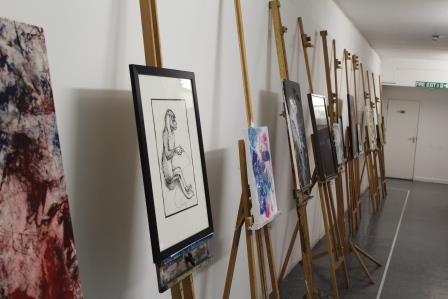
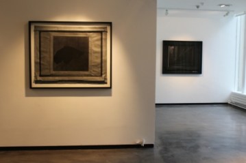
As promised here is the post about Laurence Kavanagh whose work I viewed the other night at Gallery North. I wasn’t sure what to make of it initially. My first observation was the lack of colour. The show was entirely  monochrome with the exception of one piece. As a result it was evident that Kavanagh had truly pushed his monochrome palette to it’s limits, using tonal shades of grey I didn’t even know existed! It made me think of the work of John Virtue (see below).

JV

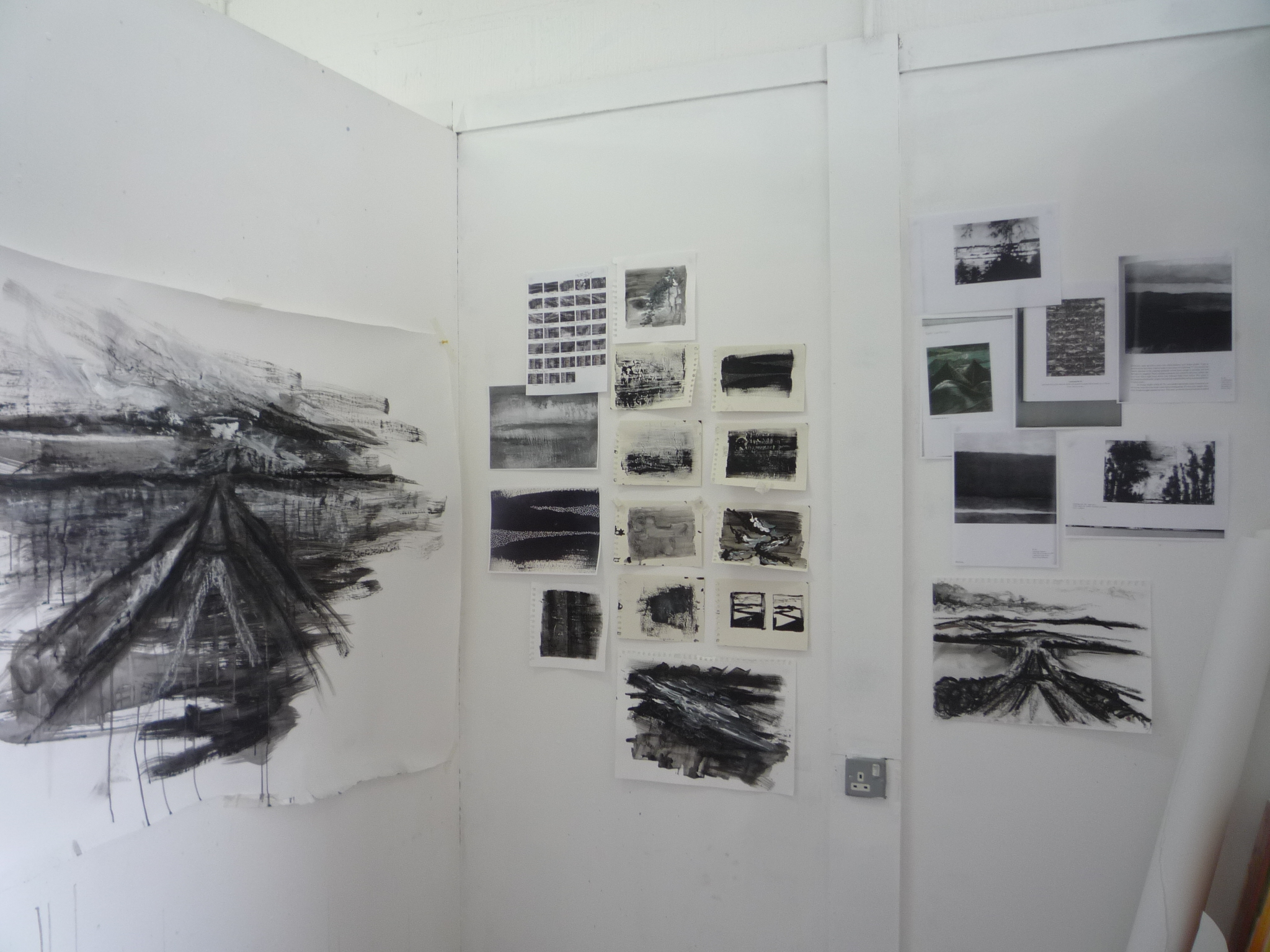
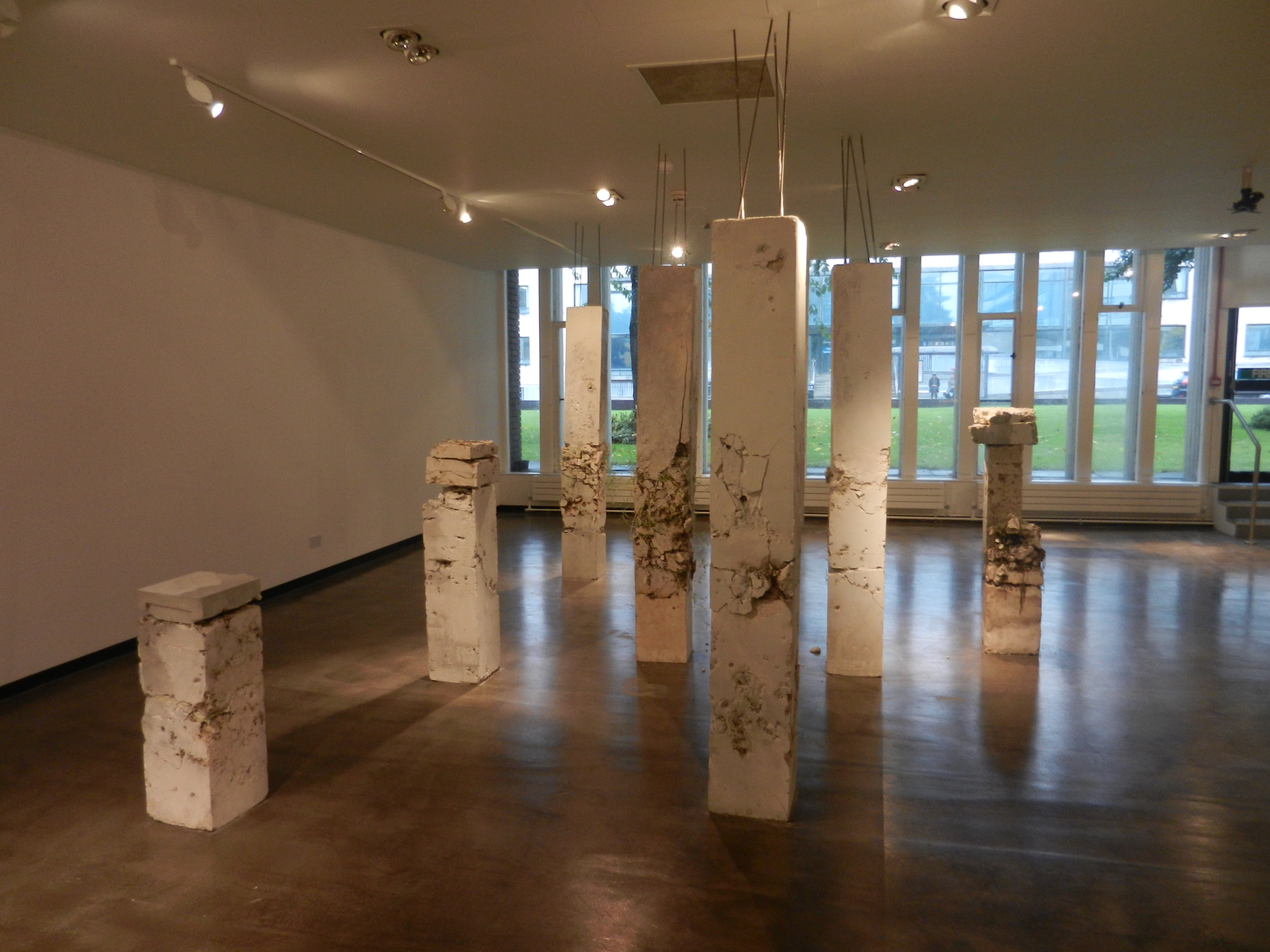
Virtue’s work is purely black and white as well. In first year I came across him and at the time I was painting colourful landscapes using oil and white spirit. So my work was incredibly liquid based – I was even dabbling in egg tempura. Upon discovering Virtue’s work I decided to remove all colour from mine; something I had never done before. And something I will never do again! It really did feel limiting. Yet at the same time it was incredibly refreshing as it forced me to use far more imagination, particularly in the textural sense. I used pins to poke holes in my paper, impasto paste mixed into my paint, allowed my liquids to become far more volatile and fluid. It was however quite a struggle, especially when you look at how stark and colourless my studio became (see below).

P1180042

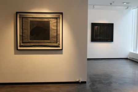
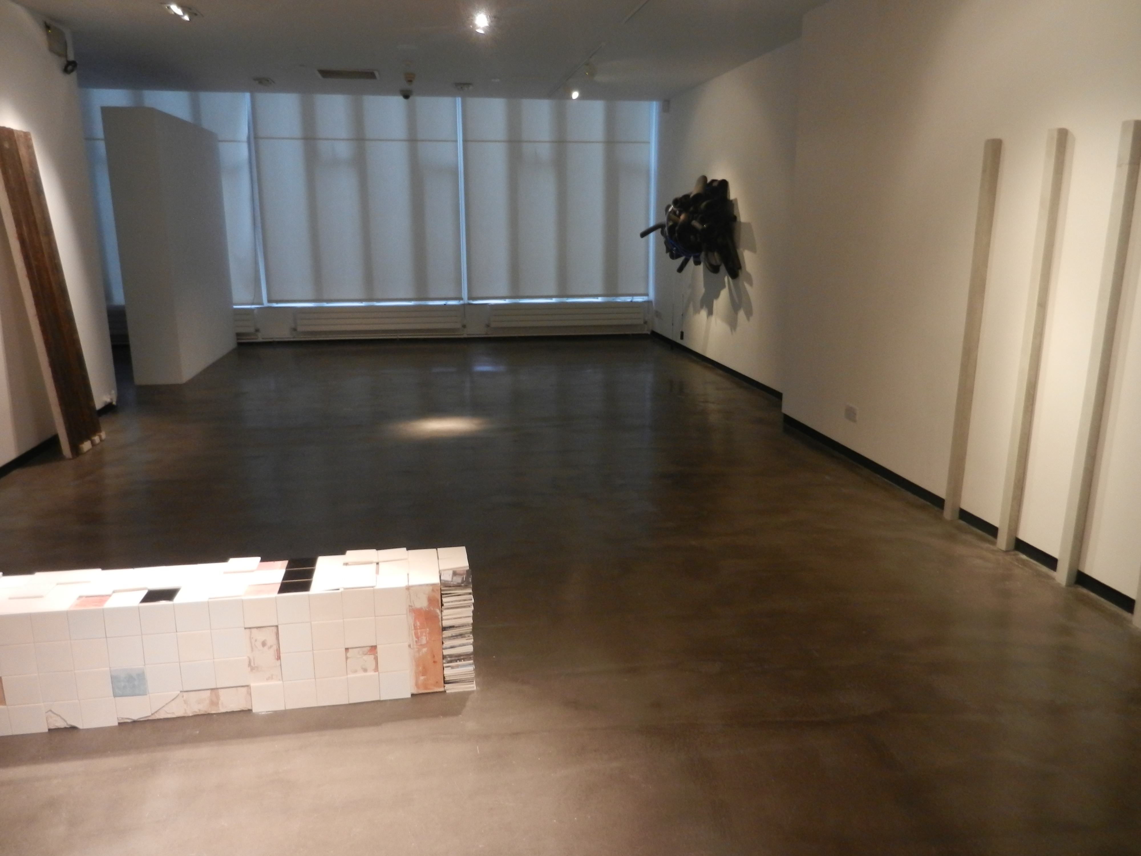
So I am actually in relative awe that Kavanagh managed to create an entire exhibition in this colour palette without exploding! He too however turns to texture as a substitute for colour. The way in which he folds his paper is incredibly efffective, not only does it appeal to our tactile senses, but it also creates dramatic shadows given the gallery lighting. 

IMG_0599

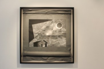
I think this image above has to be my favourite piece. The little house is just adorable! The paper folds and creases give it an almost child-like quality which I find very appealing. The frame offsets the piece perfectly. People always debate over the importance of framing saying an artwork should be able to stand whether it’s in a good frame or not. I disagree. I think a frame can make or break an artwork. If my work is framed incorrectly it just pisses me off and I feel like the entire work is lost. Slightly over dramatic I know, but when you envision how an artwork should look and it goes wrong, it’s just irritating. However, Kavanagh doesn’t need to worry because his simple and elegant black frames compliment his work perfectly. 

IMG_0601

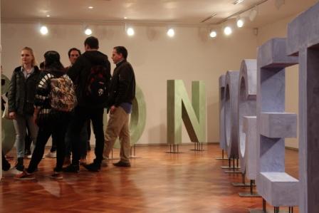
The exhibition was aesthetically pleasing in terms of its layout as well. I loved when I walked in and was greeted by an almost cinema screen-like sculpture (top photo). This piece is probably most suggestive of the concepts behind his work. He is exploring the correlation between how we view touch in both the physical and visual sense. Taking the two-dimensional and the three-dimensional and using them as a means to explore the relationship between subject and photographic imagery. 

IMG_0603

I like how there is all of this allusion and suggestion of cinema, yet there is a total absence of moving image work. Instead, you have sculptures reminiscent of cinema projectors occupying floor space. Long shadows, spotlights and rectangular shapes all suggest but nothing confirms the cinematic presence. There is an air of expectation in the room, yet the pieces simply hang still and mysteriously giving nothing away. 

Laurence Kavanagh is a Warwich Stafford Fellow and produced ‘October’ through his research into Star and Shadow Cinema.

Exhibition Preview

IMG_0499Last night I attended a couple of exhibition previews that were going on simultaneously. One was in Gallery North and the other in the University Gallery. It was a truly inspiring evening with so many interesting people. And lots of wine. Let’s not forget the wine! The exhibition held in Gallery North was Laurence Kavanagh’s ‘October’. Yes you heard me right, an exhibition called October in October. Slightly misleading for the posters but there we go. It was beautifully presented. It was a collection of purely monochrome works whose textures were so temptingly tactile. The gallery space had been fully utilised and the lighting successfully manipulated to really highlight the work. The lighting was also very atmospheric for the evening, I almost felt like I was in some kind of film where all the characters have flyaway hair, speak fluent french and wear fancy black coats as they scrutinize the artwork. Whilst holding a glass of wine. Although for Kavanagh’s exhibit wine was not allowed into the gallery which I’m assuming was because of some of his floor based works. At this point in the evening I hadn’t got my camera out (stupid I know) but don’t worry, I will be going back and photographing ‘October’ for an upcoming post where I will go far more depth about the exhibition. For now I want to talk more about the evening itself because it was damn good night!

IMG_0489

The University Gallery had Hope Stebbing and Oliver Perry’s collaborative work they did for The Great North Run. Having successfully pitched their idea to the Great North Run’s panel they were given approximately a year and £4000 to complete their work. What they created was put at different points of the Great North Run but when run together the words read ‘onward’ ‘together’ ‘as one’. They choose to paint these words in the most gorgeous pastel colours. Honestly, having seen this, pastel is my new thing! The atmosphere across the two galleries was very different I felt. This was interesting and of course inevitable given how different the works and the layout were. Kavanagh’s exhibition was slightly more reserved and serious. People were quieter and observing. In Stedding and Perry’s exhibition people were milling about, laughing loudly, fighting for the incredibly yummy cheese and other nibbles on offer! It’s nights like this where you can learn so much just from looking and being there. Listening is what I did for half the night and some of the things I heard and left thinking about will stay with me. 

IMG_0503

Ramona Zoladek

DSCN2560

Recently I visited Ramona Zoladek’s exhibition at Gallery North, Northumbria University. I was instantly captivated by her use of materials. Her blend of the organic and man made was just absolutely beautiful. Her work fixates on the relationships between nature, architecture and objects and these themes are highly evident throughout the entirety of this exhibition. There is a strong sense of fragility throughout most of her sculptures, particularly in the concrete units which look as if they on the verge of collapse at any minute! Yet they simultaneously have this sense of strength, it may have been the height and their dimensions, but despite the crumbling ruins they seemed impressively stable. The way in which they had been laid out was very dynamic, almost like a satisfying jigsaw. The lighting was incredibly effective as well, as beautiful long shadows were cast across the gallery floor. Zoladek had used the floor as a space as well which I loved as the dialogue created between the differing heights added an entirely new dimension to the exhibition. She had even allowed dirt and dust to cascade onto the floor which was so effective given its organic quality. 

DSCN2561

The blend of concrete and plant was almost ethereal with the sparse white against the vibrant green. This was where Zoladek’s exploration of decay really came across. You felt almost as if you were watching the process; almost as if the ruin was pulsating and collapsing in on itself. I felt very tranquil as I studied these columns. I felt almost as if I could be transported to a Scottish island stood in a field of greenery looking at ancient ruins battered by the rain. I felt time was heavily present throughout this exhibition and of course that is another major theme in Zoladek’s work. 

DSCN2564

Zoledek’s themes are intricately woven throughout her work and they come across in a beautifully subtle manner, yet they are highly evident. However, there’s also a simplicity and a minimalism to Zoladek’s creations as well. Her arrangement of her pieces, her use of the floor and the wall. You don’t feel overwhelmed by it all despite the fact there is a lot going on. I think this is a very important element. It’s almost as if the layout and the colour schemes have created a kind of energy. By navigating the space you are participating and responding to this sense of energy. That was how I felt at least, which was why I chose not to watch the film around the corner. I felt it was not relevant to my interpretation of this exhibition. It was almost as if it would be an interference. Maybe I should have watched it. Maybe it would have entirely transformed how I thought about it all. But I didn’t want to. I felt the peace among the ruin-like structures was enough for me. 

DSCN2565