Alice Theobald and Atomik Architecture

DSC00201

 I have viewed this piece at The Baltic a few times now. I did not run to write a blog about it, as I wasn’t entirely sure what I thought. I needed more time to process what I’d seen and I also felt like I had to see it again before I could formulate my thoughts into anything worthwhile. That is not a negative thing. The fact that this work forced me to really think and contemplate my experience of it shows its staying power and effectiveness. The work is co-authored by Alice Theobald and Atomik Architecture. It’s an endevour to blend an artistic practice with architecture. Given that Theobald works in performance, sound and installation, it’s quite an ambitious choice of blend. Hence my excessive contemplation over it all. 

DSC00194

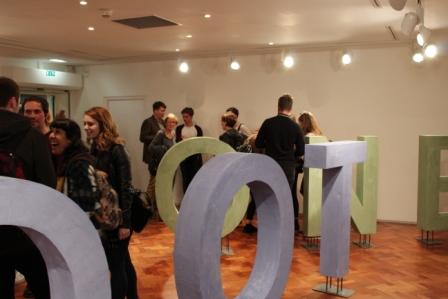
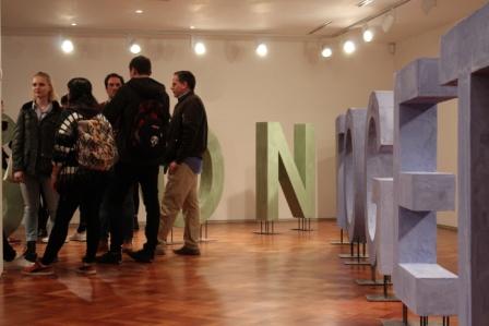
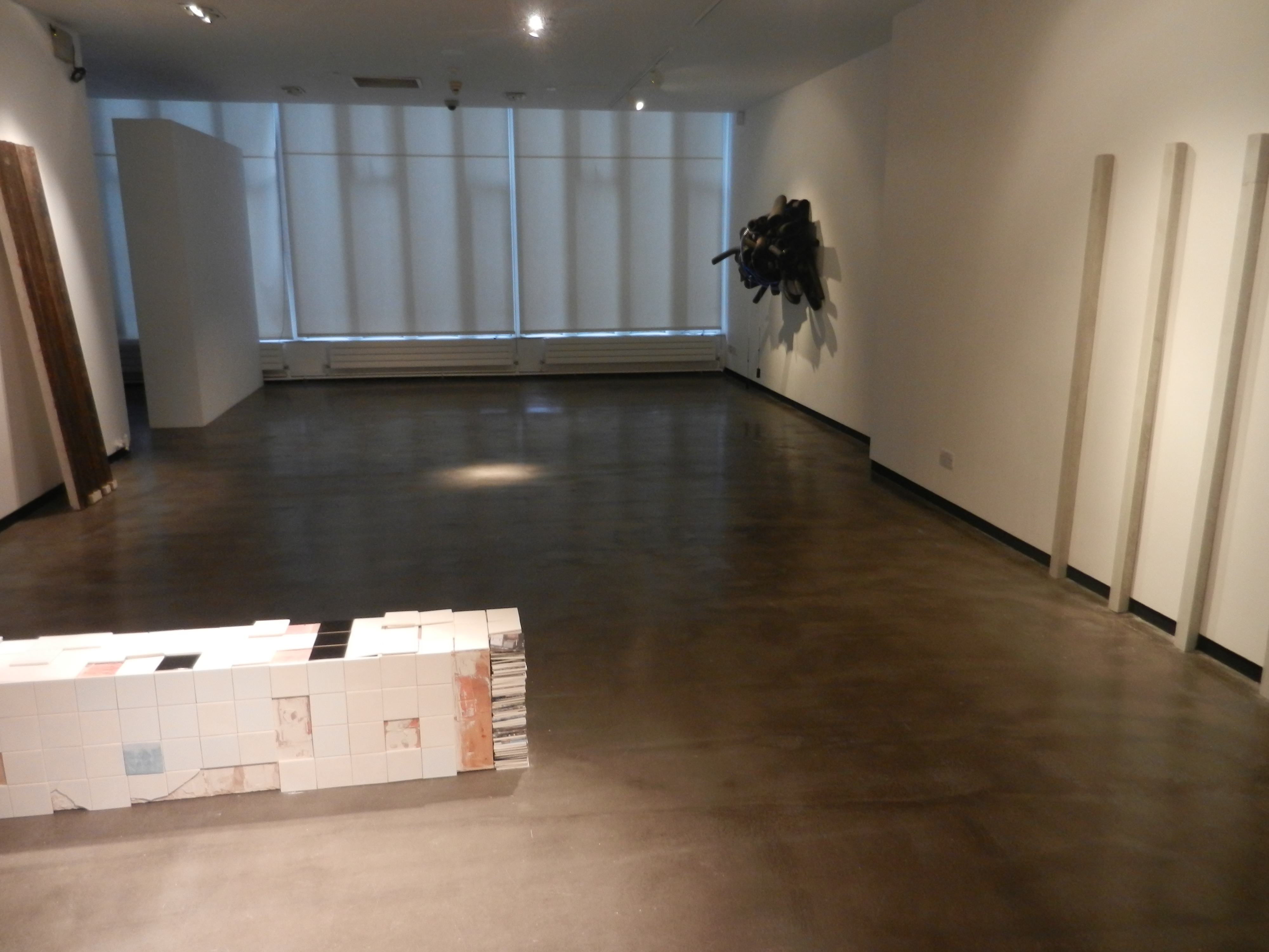
It was interesting because when I arrived on Level 2 the above scene is what I was greeted by. There’s an instant blockade which suggests a lack of access. A lot of visitors did in fact question whether or not they were allowed to enter the structure. I don’t know if it’s because I’m an art student and have seen things like this before, or if it was just an assumption on my behalf, but I entered without hesitating. I knew it was designed to make the viewer question so I was instantly quite taken by it! That was before I even entered the structure which is made up of everyday objects such as duvets. The comfort of that item in a space as awkward and industrial as this was quite a contrast. It brought the idea of comfort zone and bedroom space into a gallery setting which was an unusual experience. Yet it demonstrates the success of the piece given its play on the conventional associations of architecture. 

DSC00195

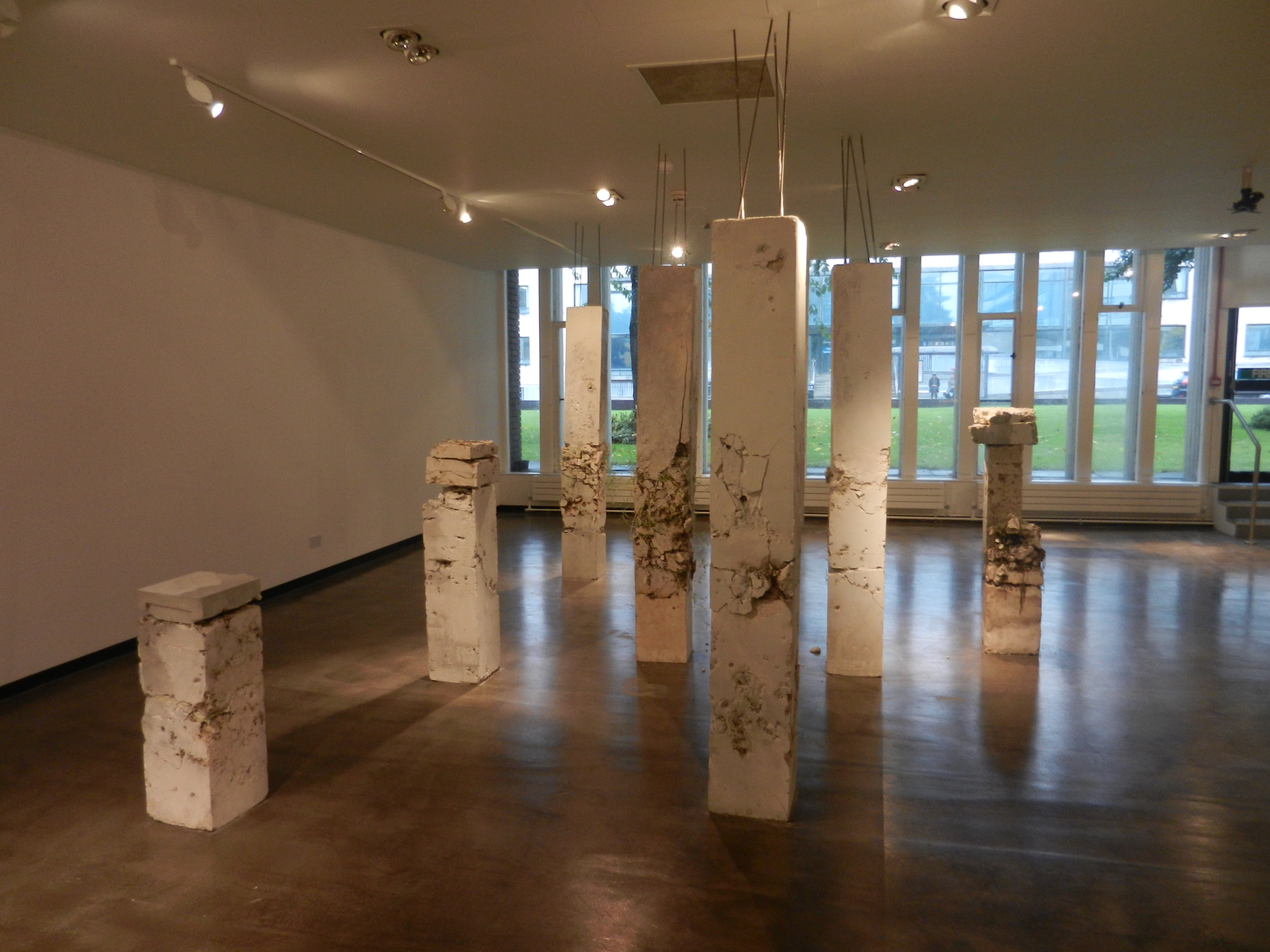
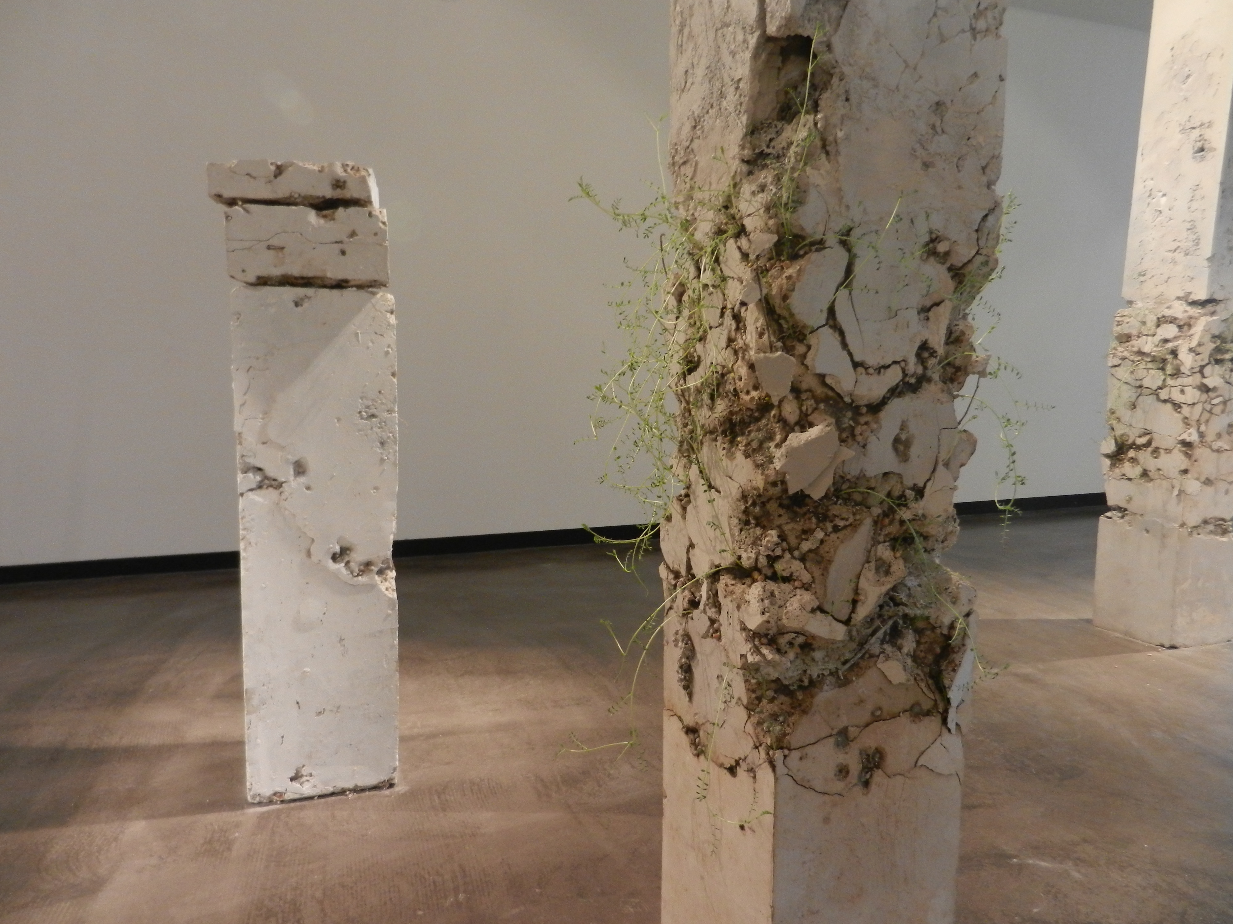
There was writing scrawled across these interior duvet forms; it was difficult to make out so it took a lot of time to read. I found myself reading out loud in an attempt to process it better. This play on interior and exterior was brilliantly constructed. As the piece had all sorts of components including sound, video, performance through the installation, it could have been a very overwhelming experience. However, given how they had broken up the space by placing spherical structures at various intervals, it created an easing of the senses. There was singing playing throughout the gallery and the spoken word as well, yet when I entered the ‘duvet columns’ as I will call them, the exterior sound reduced slightly, allowing me to better concentrate on the text. 

DSC00197

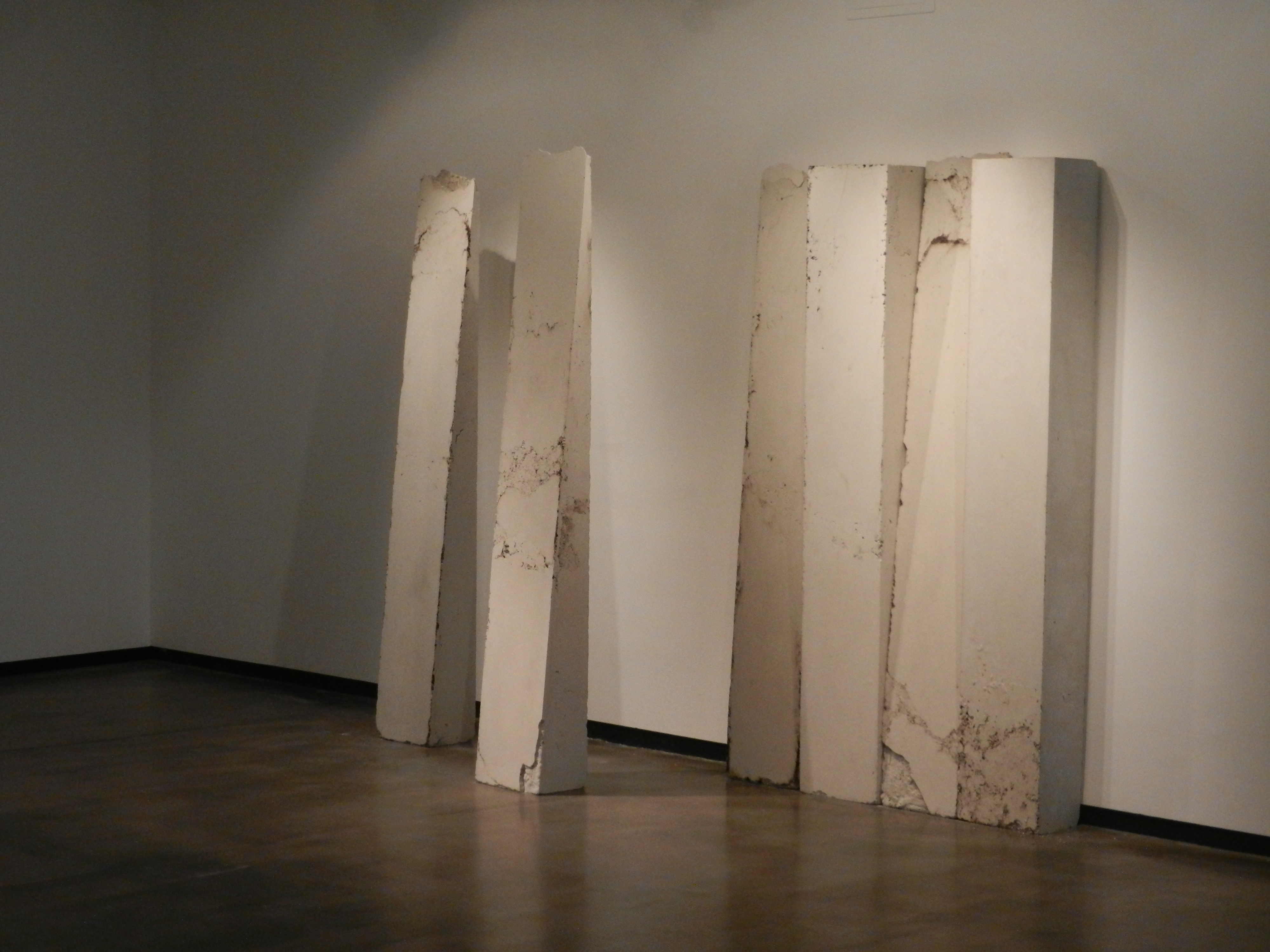
These ‘duvet columns’ were dauntingly high, so much so that they reached the ceiling. As well as emphasisng the expansive nature of the piece, it also really highlighted the relationship between the work and the architecture of the gallery. It was entirely work-in-situ. This was highly effective as it is not often you contemplate the ceiling of a gallery space, yet Theobold and Atomik make it a key element. The height also furthers the emphasis on the difference between interior and exterior. As does the fact I was being videoed as I circulated the work. There was a live stream documenting people walk through the work. This meant at certain points there were projections of my face at certain points up on the outer walls of the structures! This was on the one hand quite funny and amusing, but on the other quite uncomfortable. It was a relief to get out of the view of the cameras once I was back inside the columns! This created two different emotions for me in response to the entire space. Outside and looking up at the columns made me feel small and exposed; being inside the columns surrounded by duvets and away from the cameras made me feel comfortable and safe. Two entirely different experiences, both within the same space. 

DSC00198

I’m so glad I went more than once before I wrote about it, as my experiences both times were entirely different. The first time I went there was music in the background and performers on the stage, the second time I went there were no performers with only a woman speaking as the audio. Two entirely different situations, but again within the same space. This led me to question how the piece is set up, do the performers come on at a fixed time everyday? Do they perform daily? Do they improvise? Why is there music when they are on stage in stead of the spoken word, is it to make it more theatrical? All very interesting questions that contribute towards the complexity of the piece. It’s not what people would call ‘pretty art’. Personally however, I far prefer art that challenges me and really forces me to question it. Theobald and Atomik are certainly successful in that respect. 

B. Wurtz at Baltic

DSC00218

Contemporary art is often controversial in it’s reception. Some people love it, some people hate it. Some people think their children could have done it. Other’s say their child didn’t do it and the artist beat them to it! This artwork is the perfect example of that retort. Wurtz’s practice revolves around taking a simple everyday object and turning it into something beautiful. In this case, he used food trays and painted the shapes on the bottom of them in different colours of acrylic. First off, I had never even noticed there were so many shapes to the bases of these trays. Second off, this is genius!

DSC00221

It is such an incredibly simple thing but surprisingly elegant too. Who would have thought food trays could look this good?! And together in this form of display they look absolutely brilliant! Walking into the room I half gasped in amazement. Initially I couldn’t figure out what the objects were, but on closer inspection I was stunned to realise it was merely food trays! 

DSC00219

The way they are all arranged is reminiscent of the way portraits are hung in an old historical castle. They have that sophisticated clustered vibe going on. The colours themselves are very rich and bold, almost like jewels. What Wurtz has succeeded in doing is elevating the most simple commonplace object into an art object. Marcel Duchamp’s urinal here we go again!

DSC00223

I think what’s so lovely about this is though is the air of playfulness! It’s not trying to be anything fancy or anything that it’s not. It is purely an adaption of a simple material that is undergoing a transformation into something more beautiful. It’s almost like Wurst is the fairy godmother to house hold materials! He does it with other bits and pieces such as plastic bags and shoe laces but the one that really caught my eye was what I call his photographic tree:

DSC00215

They are little photographic strips hung delicately in this form. Again, so basic but so clever. The best part about all this is it really shows that you don’t need lots of money to make art. Anyone can do it, it’s just about using your imagination and experimenting to see what happens!

If Only…

P1160708

I was looking through some old photos on my laptop and came across some snaps I’d taken years back at the exhibition ‘From Death to Death and Other Small Tales: Masterpieces from the Scottish National Gallery of Modern Art and the D. Daskalopoulos Collection’. I could kick my younger self! If only I could go back and relive this exhibition knowing what I know now! I must have been about…seventeen when I saw this? I think. So only really starting to realise the direction my art would take. This exhibition, although I did not realise it at the some, had some really big names to it. Artists such as Paul McCarthy, Mona Hatoum, Helen Chadwick, Ernesto Neto were all part of it. I have researched and studied them all since being at uni and therefore have an entirely new found appreciation for their work. 

P1160710

It gets worse though. Other artist work included belonged to Marina Abramovic – one of THE innovators of performance art. One of the most prominent females in what had previously been a largely male dominated art form. One of my current main influences! Marcel Duchamp as well, one of the pioneers of the Dada movement which not only fueled Surrealism but was the platform for conceptual art. Joseph Beuys, again very revolutionary and brought about a whole new dimension and meaning to the word sculpture. 

P1160705

Knowing what I know now, I could not be more frustrated by the naivety of my younger self. I was looking at revolutionary artwork by revolutionary artists and I didn’t even know it! So frustrating…The absolute worst past is that the entire exhibition is centered on the human body which is of course the subject of all my work these days. If only I could see the entire exhibition again!

P1160709

I think one of the works I would be most excited to see again is the work of Ernesto Neto (above). I still remember my reaction when I walked into the room. It was not the site that struck me initially; it was the smell. He had filled his installation with a variety of spices to the point that is was almost overwhelming. Yet it was also incredibly exciting as for the first time I was experiencing multi-sensory artwork! It actually inspired me to use spices in my own work. Slight mistake given that at A Level you have to paint your final piece in two days straight. Not good when you’re using spices – I don’t think curry powder has ever given me such a headache!

Laurence Kavanagh: ‘October’

IMG_0604

As promised here is the post about Laurence Kavanagh whose work I viewed the other night at Gallery North. I wasn’t sure what to make of it initially. My first observation was the lack of colour. The show was entirely  monochrome with the exception of one piece. As a result it was evident that Kavanagh had truly pushed his monochrome palette to it’s limits, using tonal shades of grey I didn’t even know existed! It made me think of the work of John Virtue (see below).

JV

Virtue’s work is purely black and white as well. In first year I came across him and at the time I was painting colourful landscapes using oil and white spirit. So my work was incredibly liquid based – I was even dabbling in egg tempura. Upon discovering Virtue’s work I decided to remove all colour from mine; something I had never done before. And something I will never do again! It really did feel limiting. Yet at the same time it was incredibly refreshing as it forced me to use far more imagination, particularly in the textural sense. I used pins to poke holes in my paper, impasto paste mixed into my paint, allowed my liquids to become far more volatile and fluid. It was however quite a struggle, especially when you look at how stark and colourless my studio became (see below).

P1180042

So I am actually in relative awe that Kavanagh managed to create an entire exhibition in this colour palette without exploding! He too however turns to texture as a substitute for colour. The way in which he folds his paper is incredibly efffective, not only does it appeal to our tactile senses, but it also creates dramatic shadows given the gallery lighting. 

IMG_0599

I think this image above has to be my favourite piece. The little house is just adorable! The paper folds and creases give it an almost child-like quality which I find very appealing. The frame offsets the piece perfectly. People always debate over the importance of framing saying an artwork should be able to stand whether it’s in a good frame or not. I disagree. I think a frame can make or break an artwork. If my work is framed incorrectly it just pisses me off and I feel like the entire work is lost. Slightly over dramatic I know, but when you envision how an artwork should look and it goes wrong, it’s just irritating. However, Kavanagh doesn’t need to worry because his simple and elegant black frames compliment his work perfectly. 

IMG_0601

The exhibition was aesthetically pleasing in terms of its layout as well. I loved when I walked in and was greeted by an almost cinema screen-like sculpture (top photo). This piece is probably most suggestive of the concepts behind his work. He is exploring the correlation between how we view touch in both the physical and visual sense. Taking the two-dimensional and the three-dimensional and using them as a means to explore the relationship between subject and photographic imagery. 

IMG_0603

I like how there is all of this allusion and suggestion of cinema, yet there is a total absence of moving image work. Instead, you have sculptures reminiscent of cinema projectors occupying floor space. Long shadows, spotlights and rectangular shapes all suggest but nothing confirms the cinematic presence. There is an air of expectation in the room, yet the pieces simply hang still and mysteriously giving nothing away. 

Laurence Kavanagh is a Warwich Stafford Fellow and produced ‘October’ through his research into Star and Shadow Cinema.

Exhibition Preview

IMG_0499Last night I attended a couple of exhibition previews that were going on simultaneously. One was in Gallery North and the other in the University Gallery. It was a truly inspiring evening with so many interesting people. And lots of wine. Let’s not forget the wine! The exhibition held in Gallery North was Laurence Kavanagh’s ‘October’. Yes you heard me right, an exhibition called October in October. Slightly misleading for the posters but there we go. It was beautifully presented. It was a collection of purely monochrome works whose textures were so temptingly tactile. The gallery space had been fully utilised and the lighting successfully manipulated to really highlight the work. The lighting was also very atmospheric for the evening, I almost felt like I was in some kind of film where all the characters have flyaway hair, speak fluent french and wear fancy black coats as they scrutinize the artwork. Whilst holding a glass of wine. Although for Kavanagh’s exhibit wine was not allowed into the gallery which I’m assuming was because of some of his floor based works. At this point in the evening I hadn’t got my camera out (stupid I know) but don’t worry, I will be going back and photographing ‘October’ for an upcoming post where I will go far more depth about the exhibition. For now I want to talk more about the evening itself because it was damn good night!

IMG_0489

The University Gallery had Hope Stebbing and Oliver Perry’s collaborative work they did for The Great North Run. Having successfully pitched their idea to the Great North Run’s panel they were given approximately a year and £4000 to complete their work. What they created was put at different points of the Great North Run but when run together the words read ‘onward’ ‘together’ ‘as one’. They choose to paint these words in the most gorgeous pastel colours. Honestly, having seen this, pastel is my new thing! The atmosphere across the two galleries was very different I felt. This was interesting and of course inevitable given how different the works and the layout were. Kavanagh’s exhibition was slightly more reserved and serious. People were quieter and observing. In Stedding and Perry’s exhibition people were milling about, laughing loudly, fighting for the incredibly yummy cheese and other nibbles on offer! It’s nights like this where you can learn so much just from looking and being there. Listening is what I did for half the night and some of the things I heard and left thinking about will stay with me. 

IMG_0503

Ramona Zoladek

DSCN2560

Recently I visited Ramona Zoladek’s exhibition at Gallery North, Northumbria University. I was instantly captivated by her use of materials. Her blend of the organic and man made was just absolutely beautiful. Her work fixates on the relationships between nature, architecture and objects and these themes are highly evident throughout the entirety of this exhibition. There is a strong sense of fragility throughout most of her sculptures, particularly in the concrete units which look as if they on the verge of collapse at any minute! Yet they simultaneously have this sense of strength, it may have been the height and their dimensions, but despite the crumbling ruins they seemed impressively stable. The way in which they had been laid out was very dynamic, almost like a satisfying jigsaw. The lighting was incredibly effective as well, as beautiful long shadows were cast across the gallery floor. Zoladek had used the floor as a space as well which I loved as the dialogue created between the differing heights added an entirely new dimension to the exhibition. She had even allowed dirt and dust to cascade onto the floor which was so effective given its organic quality. 

DSCN2561

The blend of concrete and plant was almost ethereal with the sparse white against the vibrant green. This was where Zoladek’s exploration of decay really came across. You felt almost as if you were watching the process; almost as if the ruin was pulsating and collapsing in on itself. I felt very tranquil as I studied these columns. I felt almost as if I could be transported to a Scottish island stood in a field of greenery looking at ancient ruins battered by the rain. I felt time was heavily present throughout this exhibition and of course that is another major theme in Zoladek’s work. 

DSCN2564

Zoledek’s themes are intricately woven throughout her work and they come across in a beautifully subtle manner, yet they are highly evident. However, there’s also a simplicity and a minimalism to Zoladek’s creations as well. Her arrangement of her pieces, her use of the floor and the wall. You don’t feel overwhelmed by it all despite the fact there is a lot going on. I think this is a very important element. It’s almost as if the layout and the colour schemes have created a kind of energy. By navigating the space you are participating and responding to this sense of energy. That was how I felt at least, which was why I chose not to watch the film around the corner. I felt it was not relevant to my interpretation of this exhibition. It was almost as if it would be an interference. Maybe I should have watched it. Maybe it would have entirely transformed how I thought about it all. But I didn’t want to. I felt the peace among the ruin-like structures was enough for me. 

DSCN2565