First Year Work

P1170410      P1170408

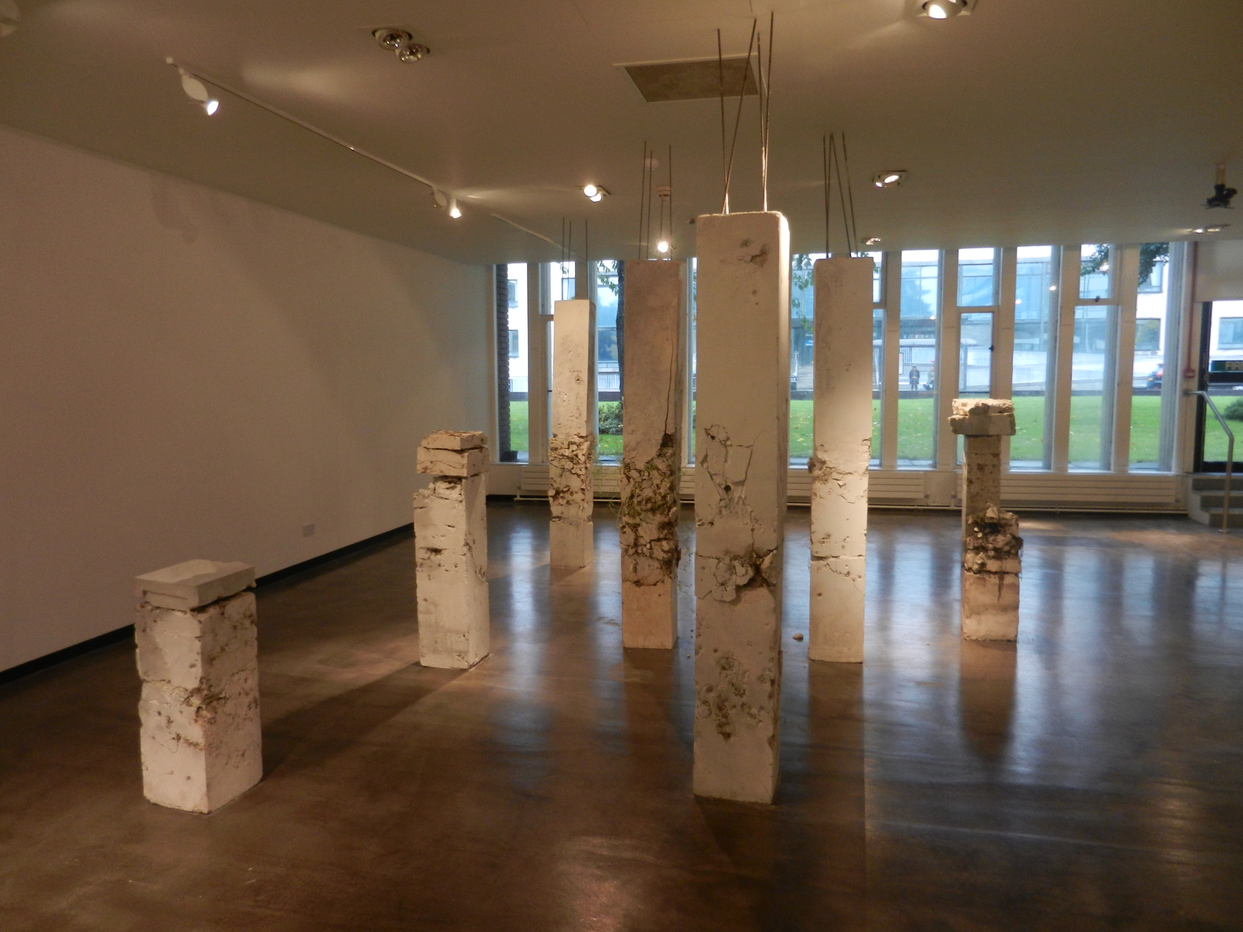
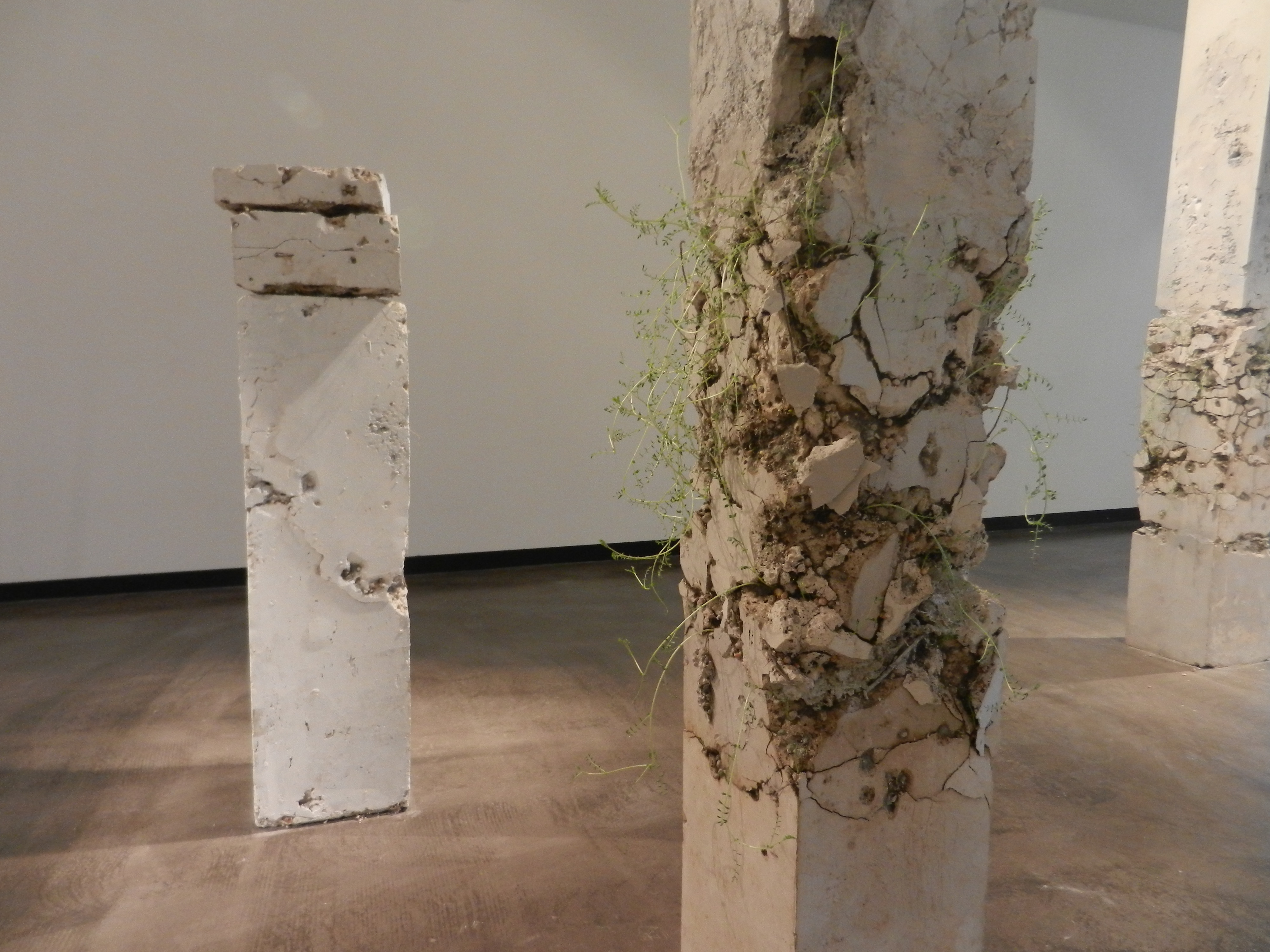
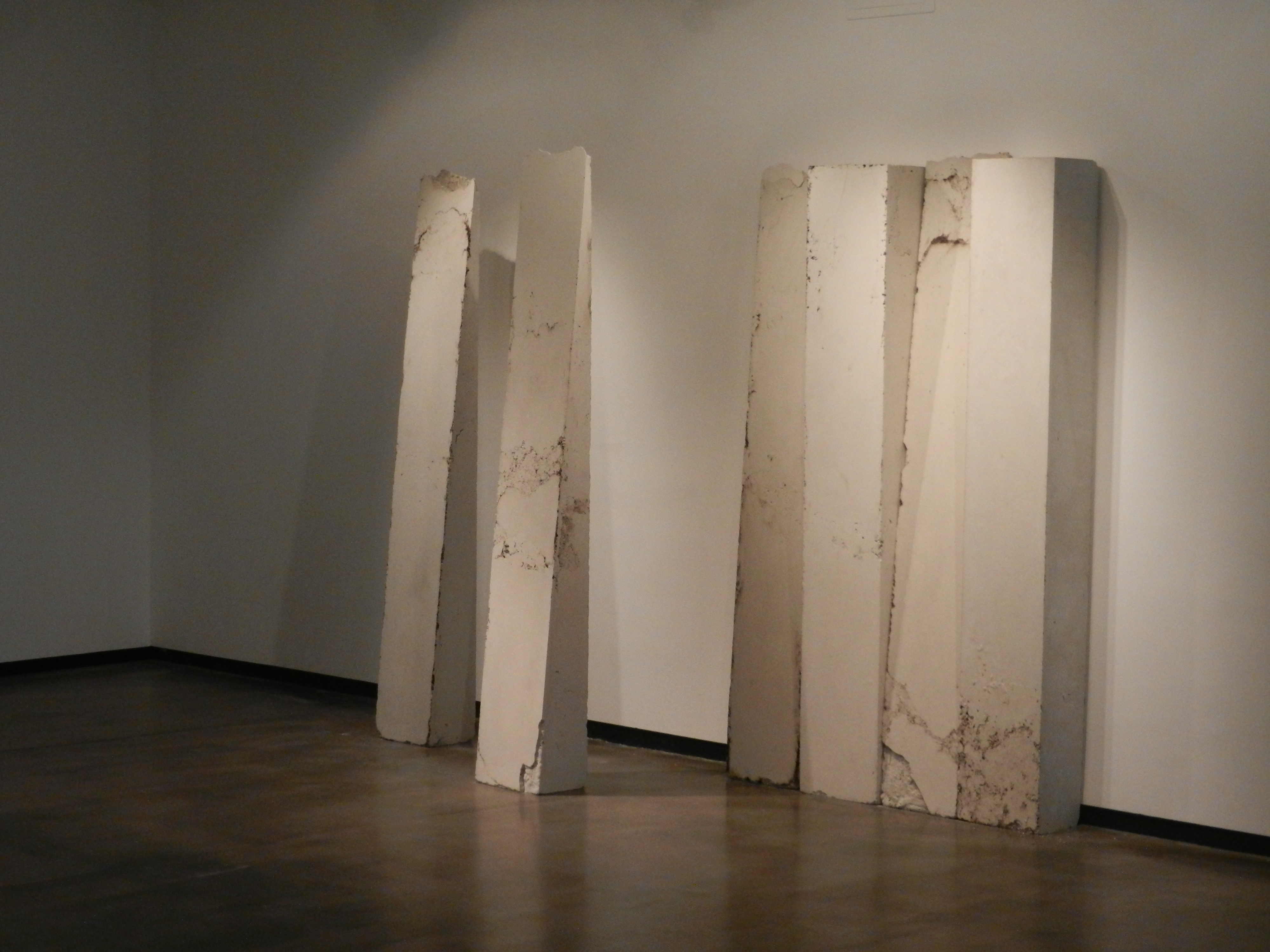
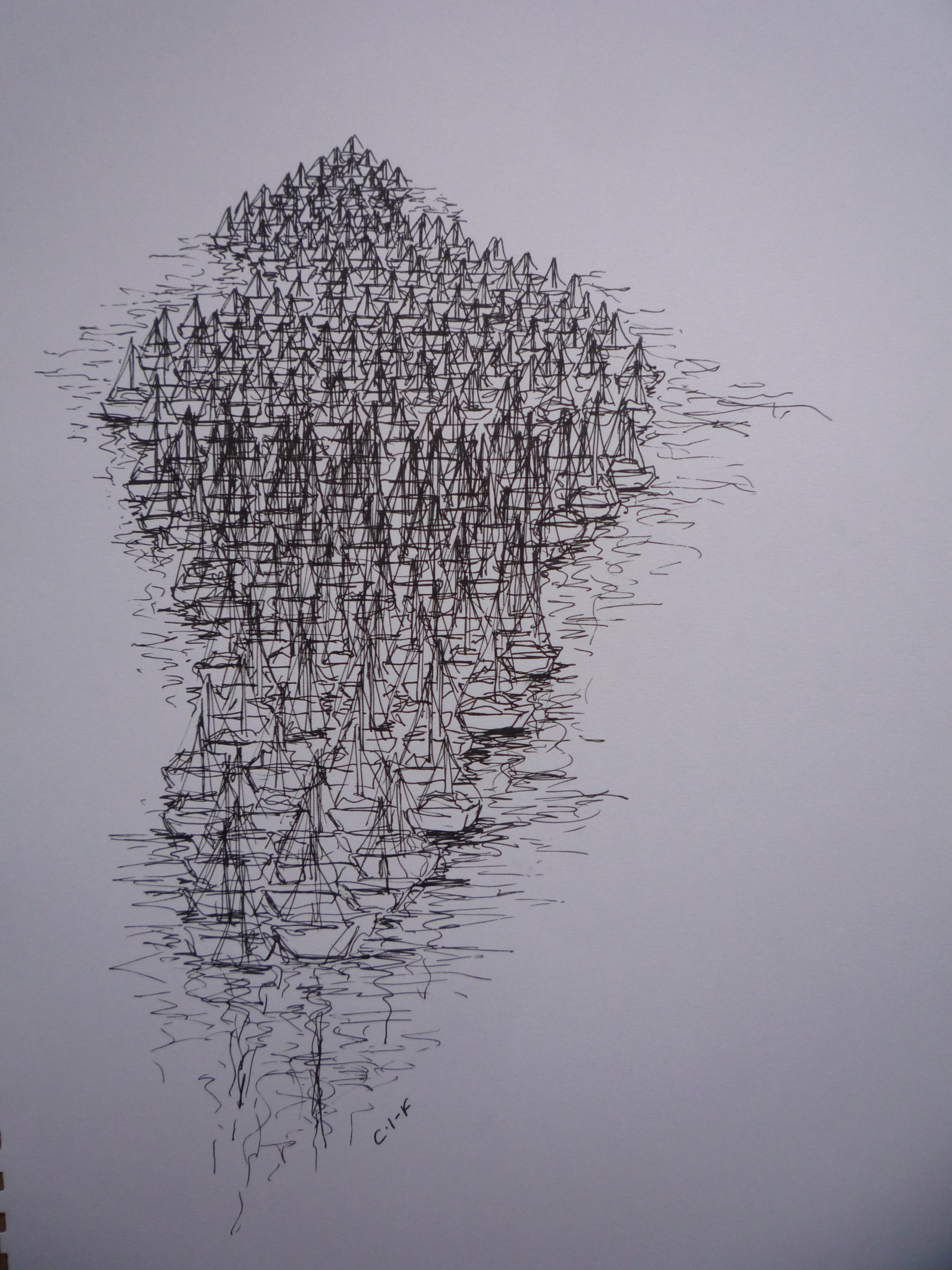
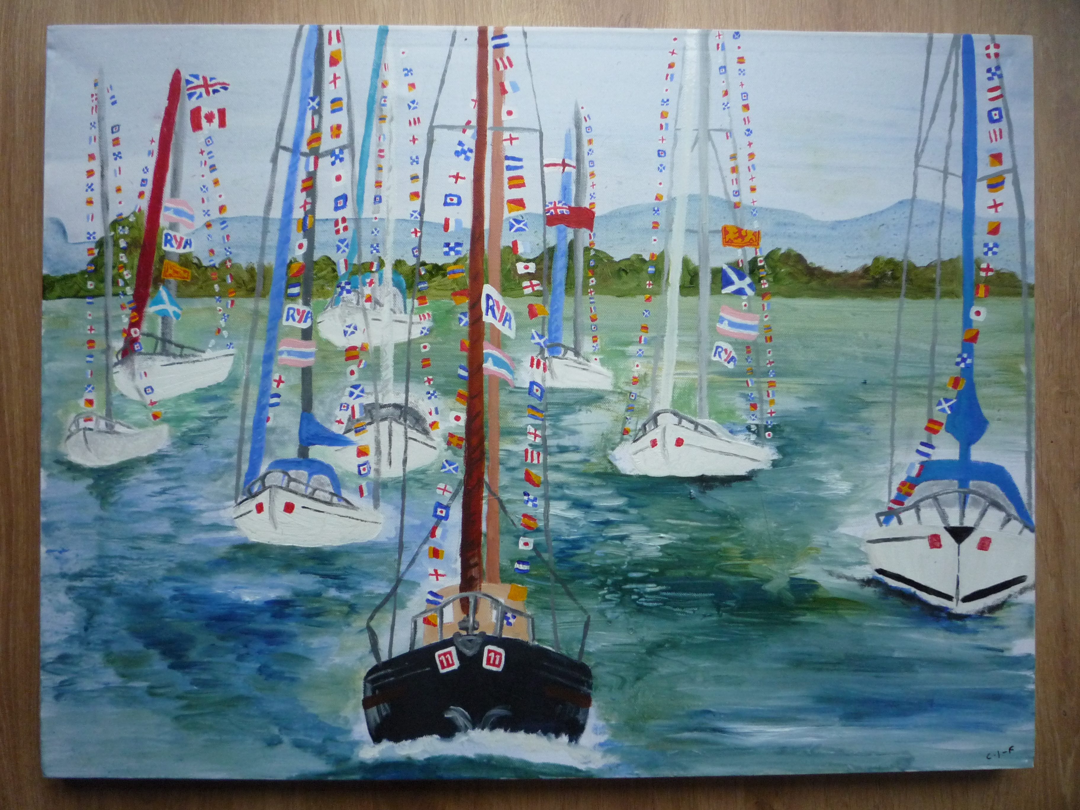
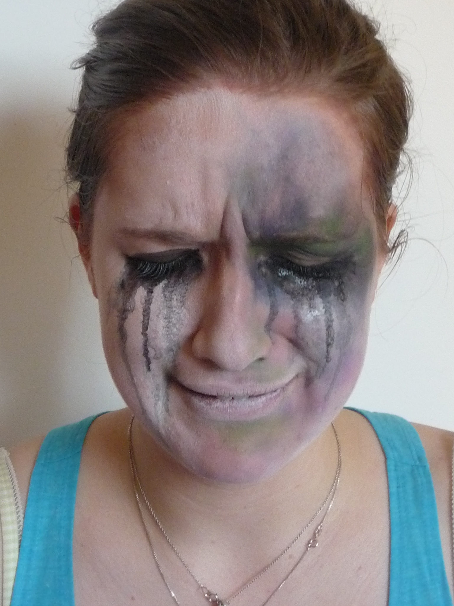
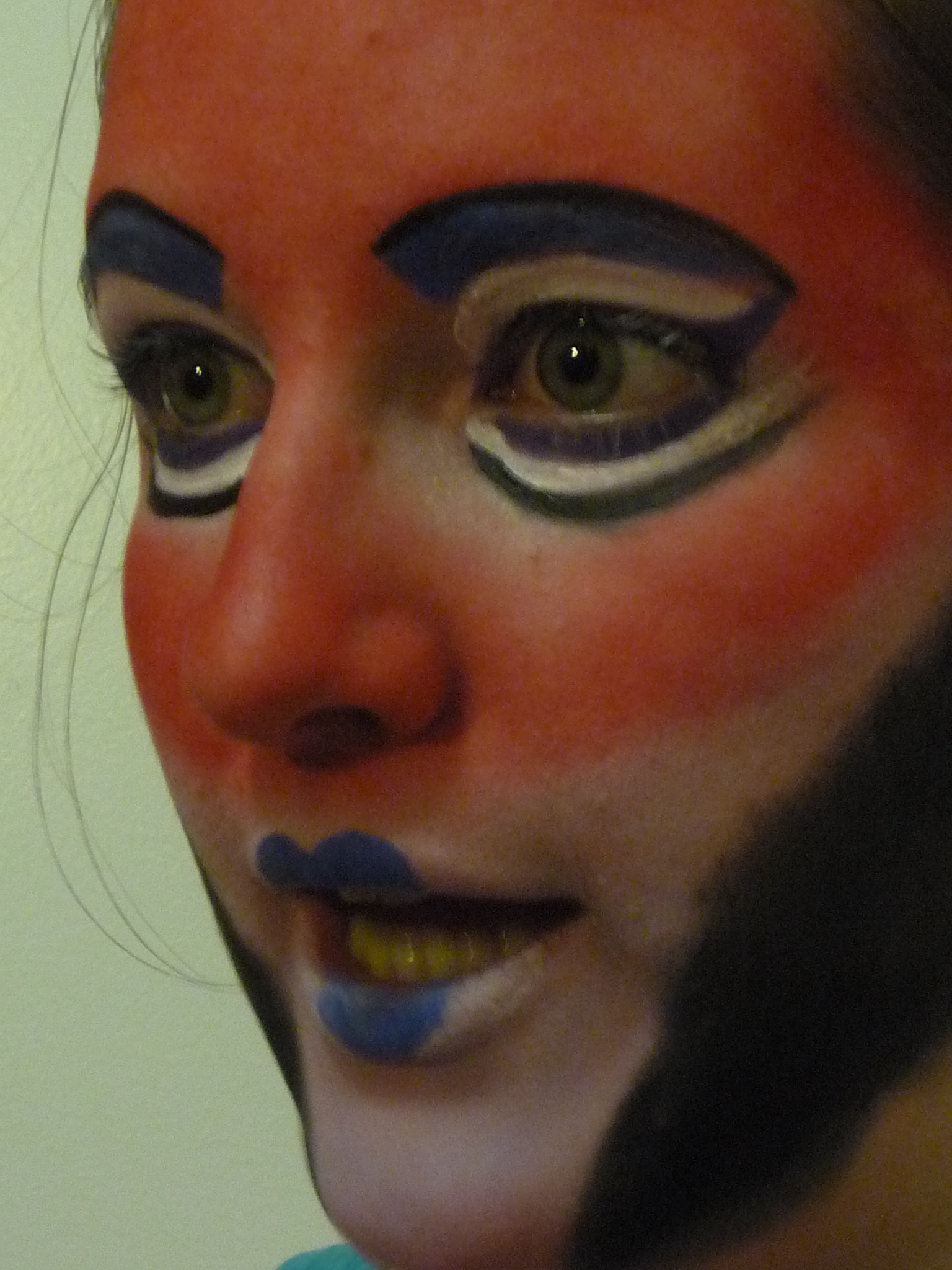
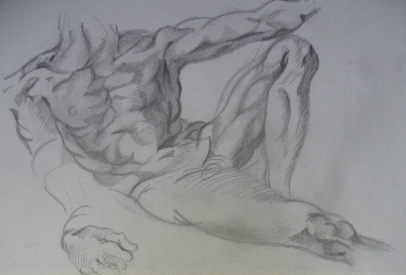
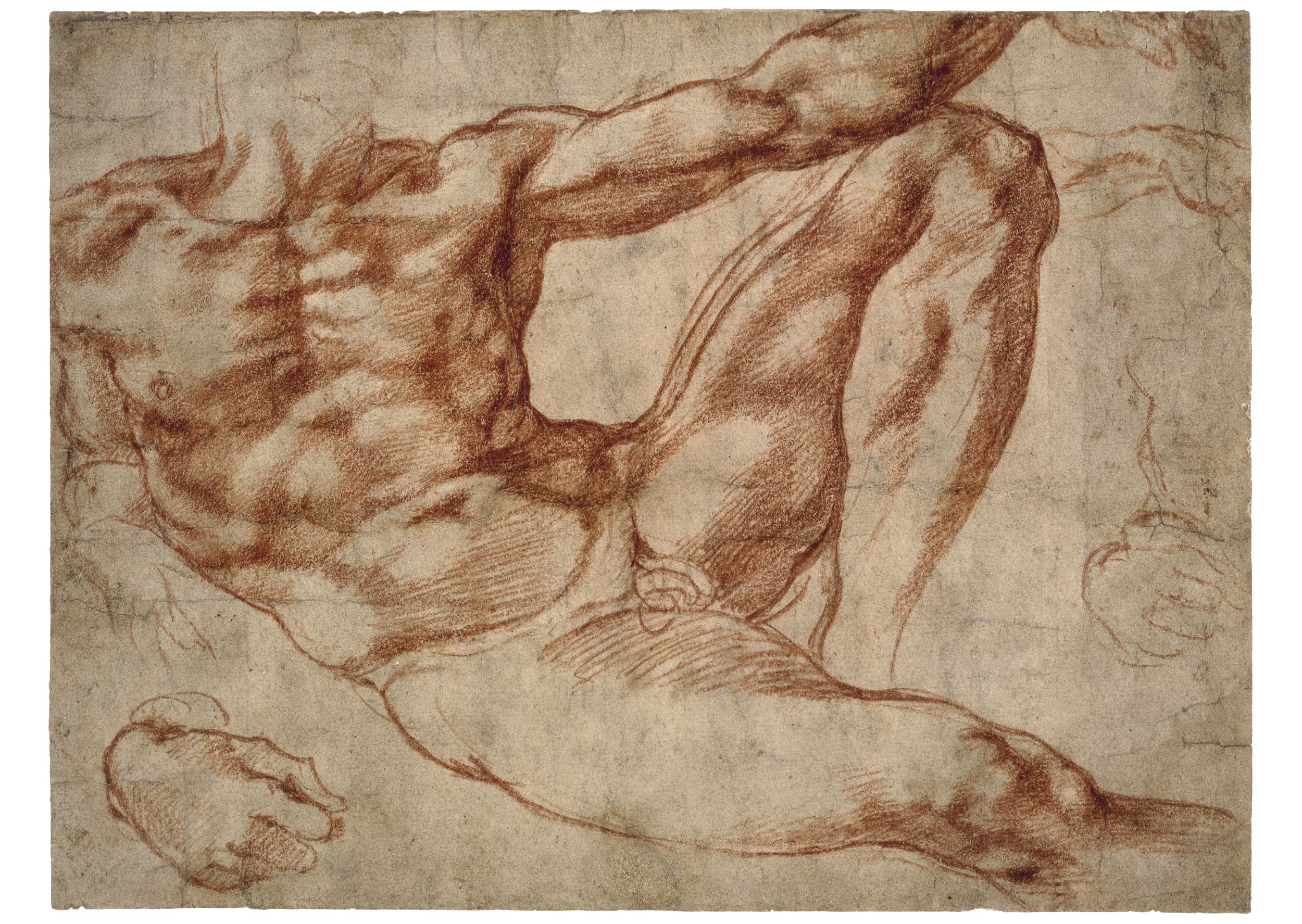
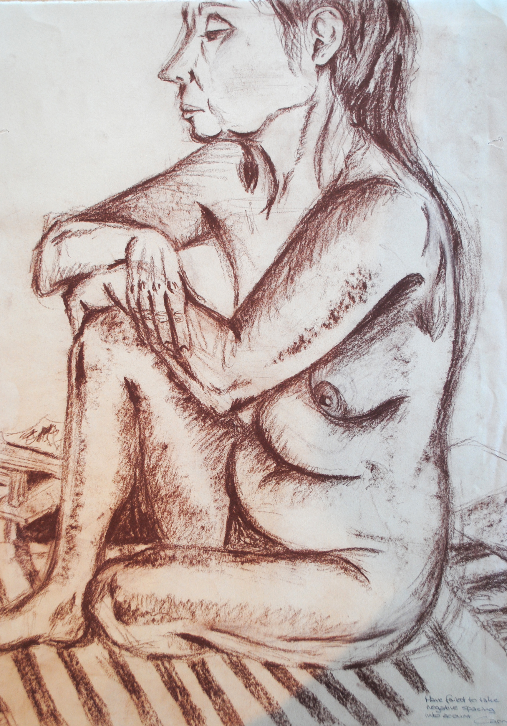
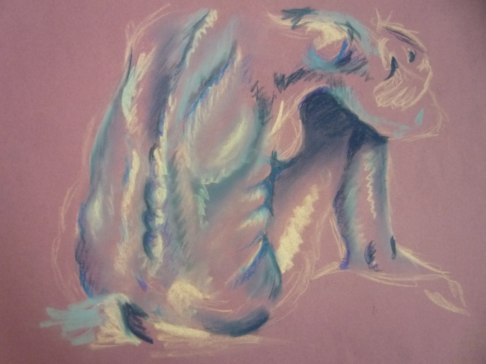
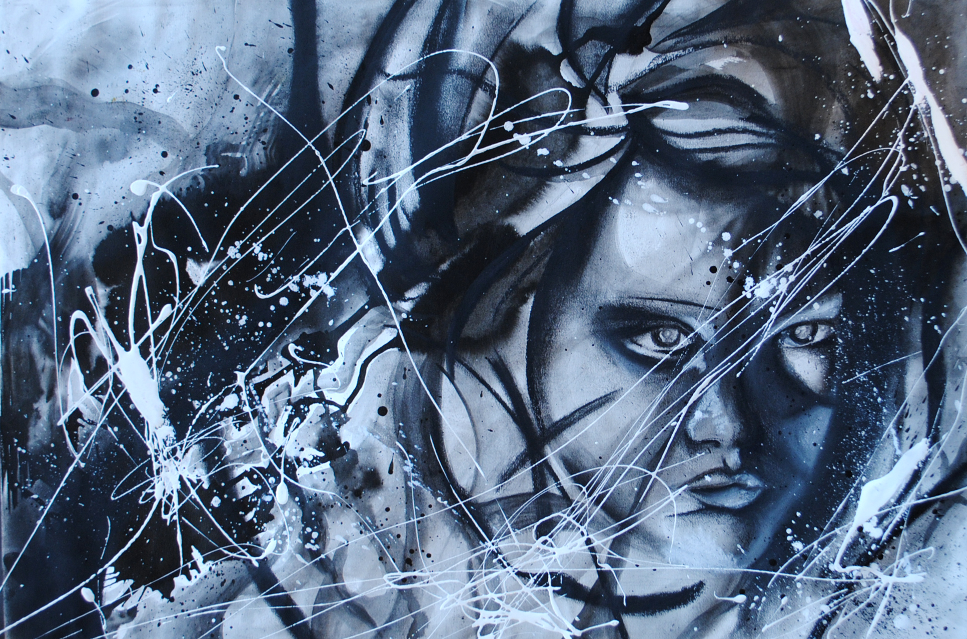
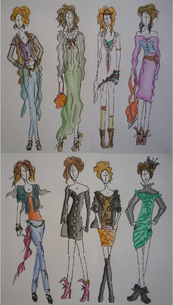
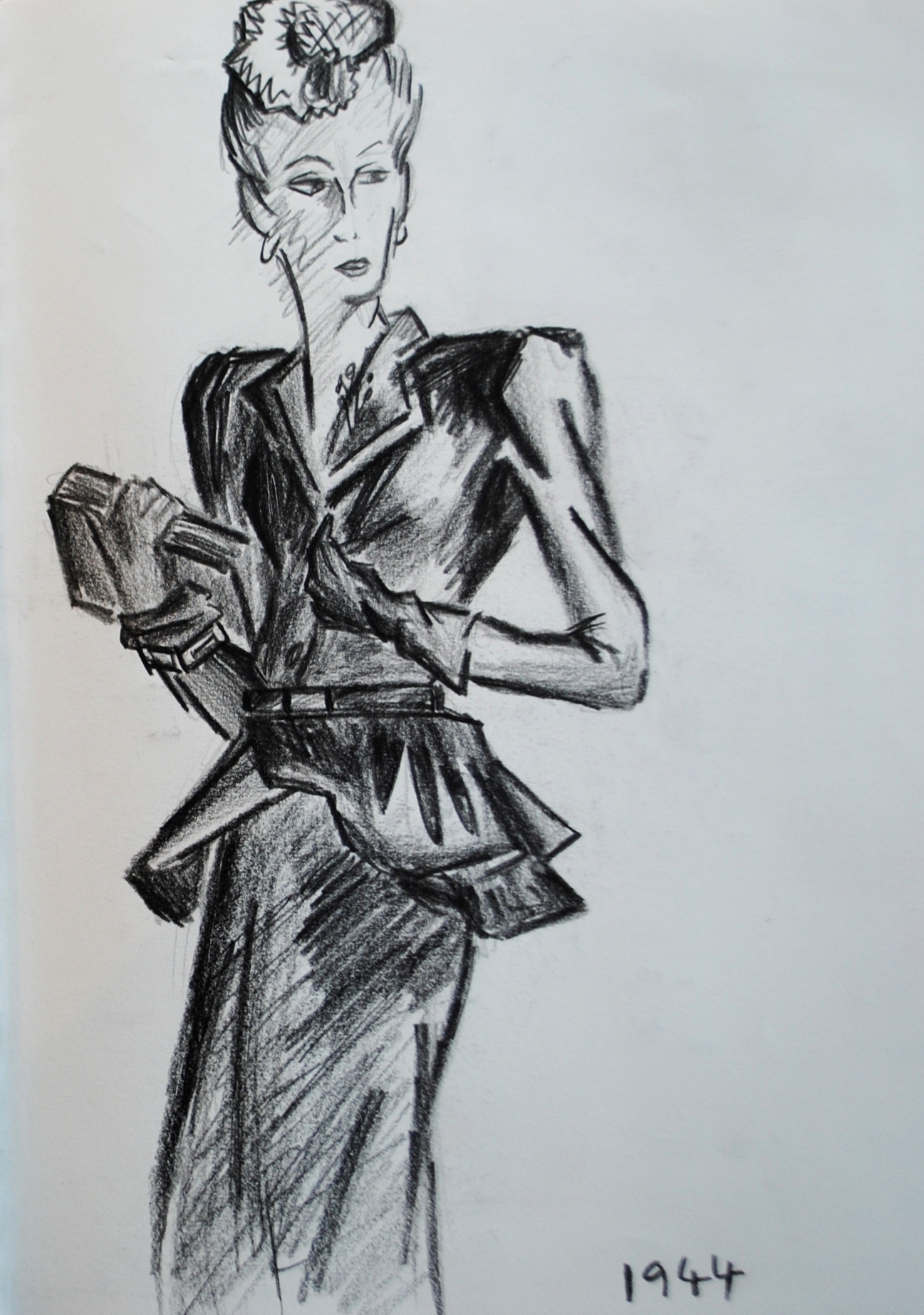
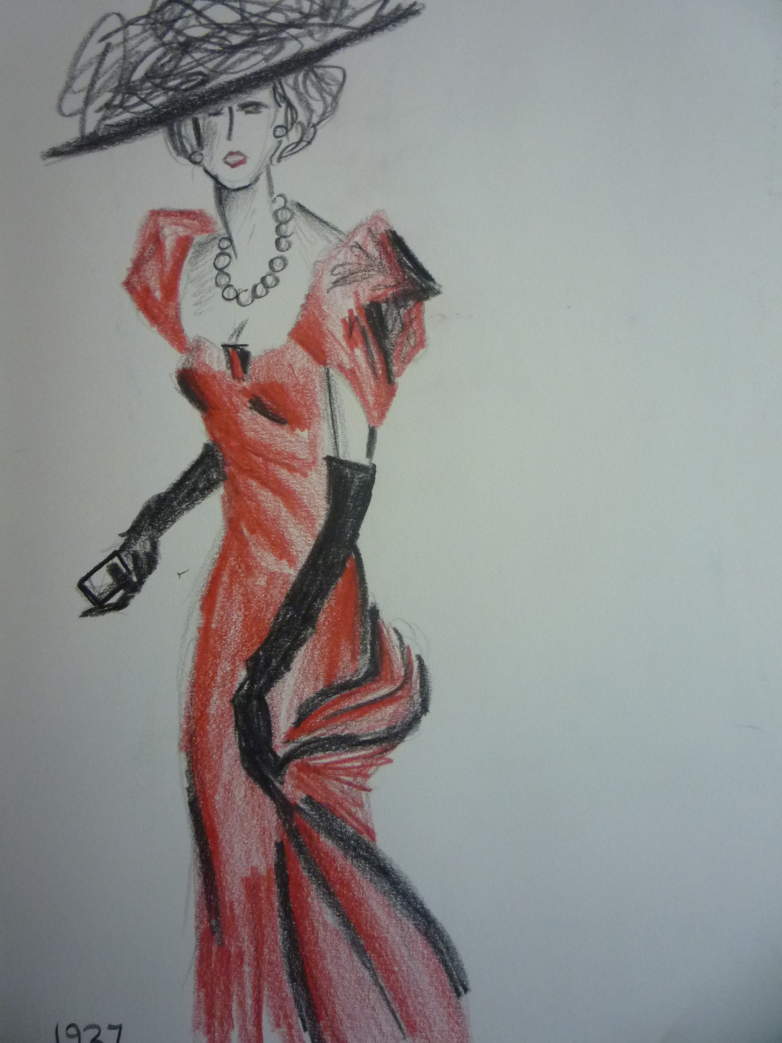
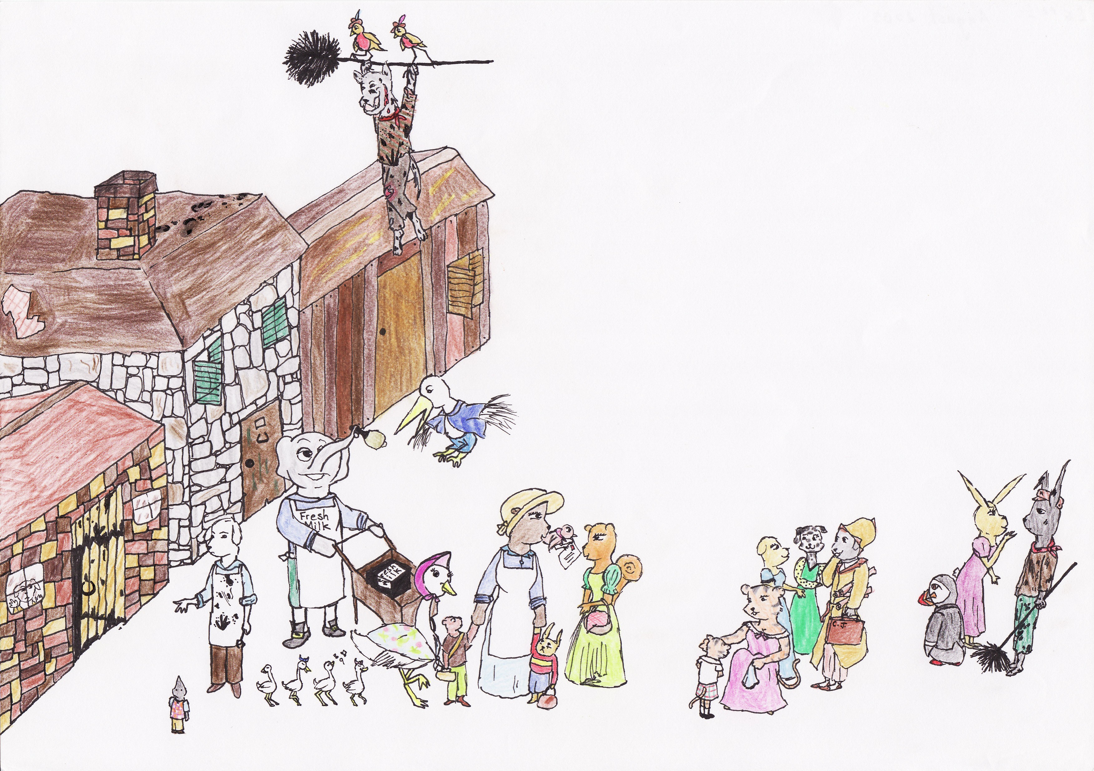
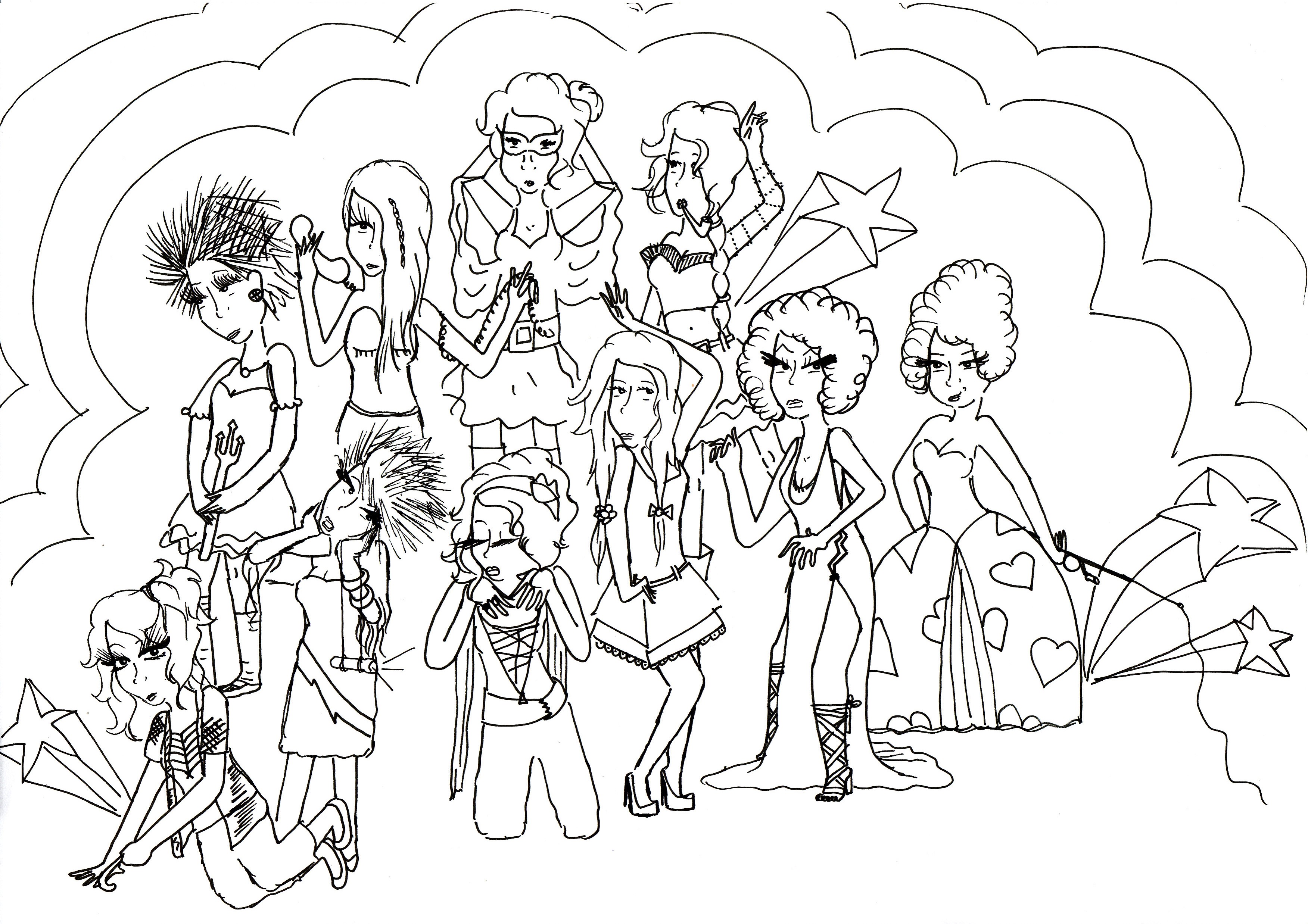
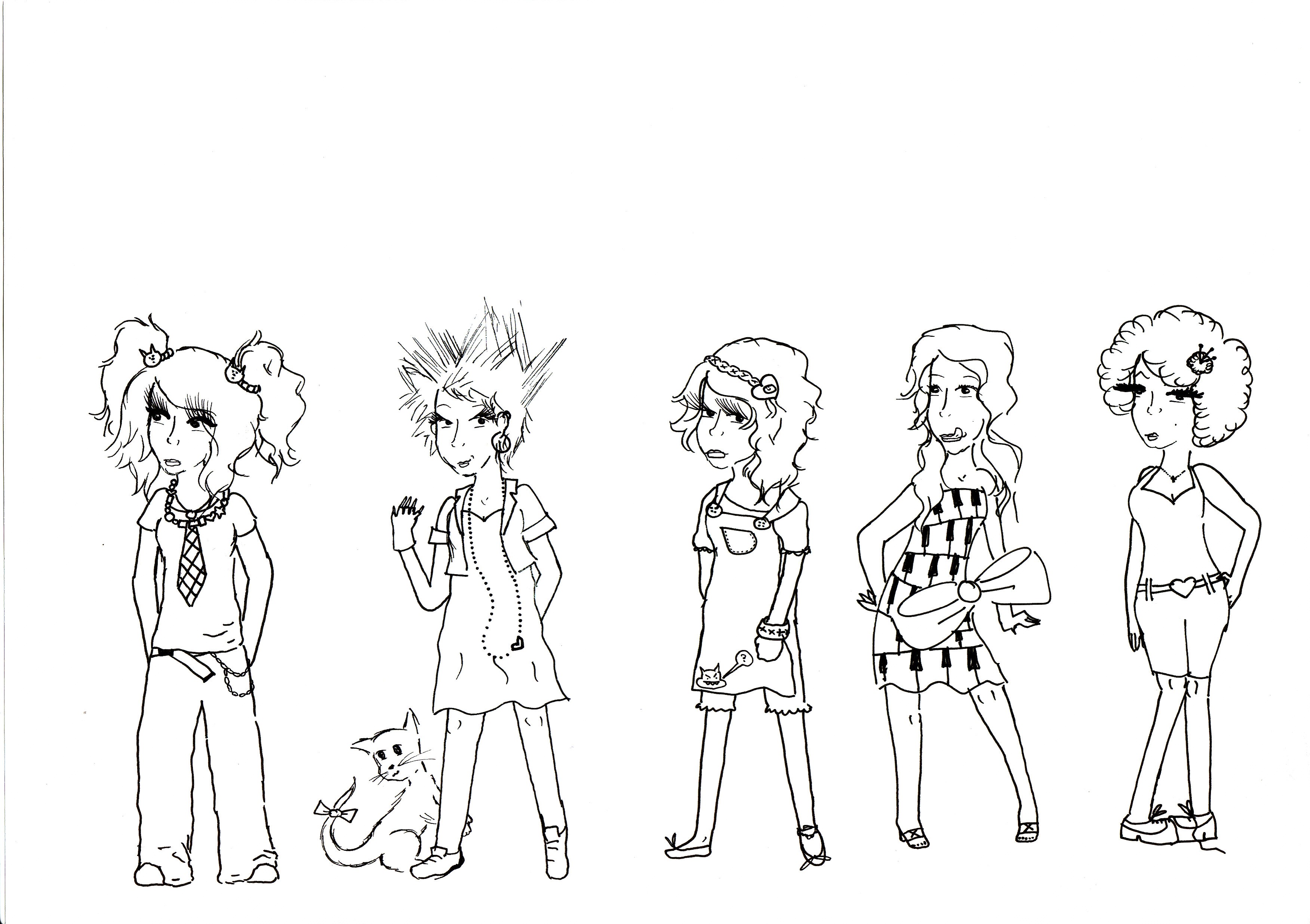
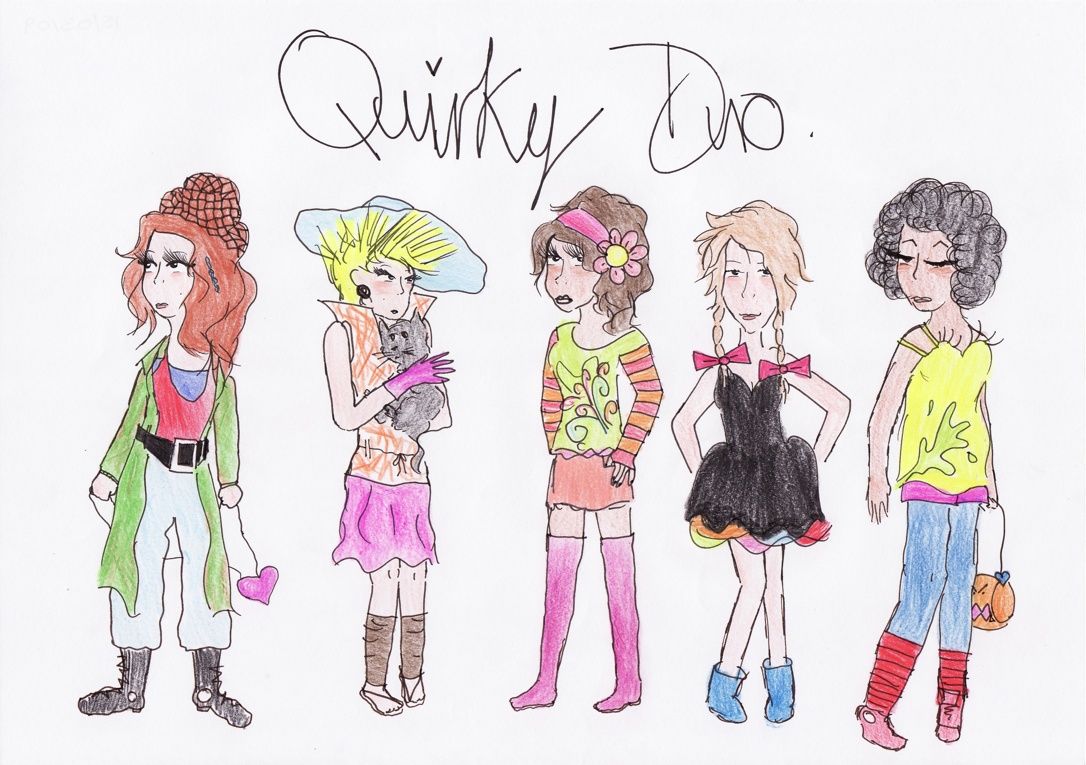
I think it is safe to say my work has changed a lot since my first year at Northumbria University in Newcastle. To be honest I would be very worried if it hadn’t as art is all about growth and development and frankly you’re wasting your time if you’re a tape recorder stuck on repeat. That’s not to say you can’t go back to things – draw them out and redevelop them. That often results in some of the most successful art! However, there are some things I will not be going back to again and first year has a lot of that kind of stuff. My way of thinking about art has changed a lot over the time I have been at University. I read more then I’ve ever read about art in my life. I’ve learnt about all sorts of different artists, been introduced to mediums I would never have registered as art forms before and learnt about so many interesting historical movements. My way of thinking has been transformed and it is healthy. It shows I have grown and evolved alongside my art which is a very exciting prospect. Also sometimes a very overwhelming one. Sometimes your creative energy can feel like too much and the only thing you can do to release it is get it down on paper!

P1170409

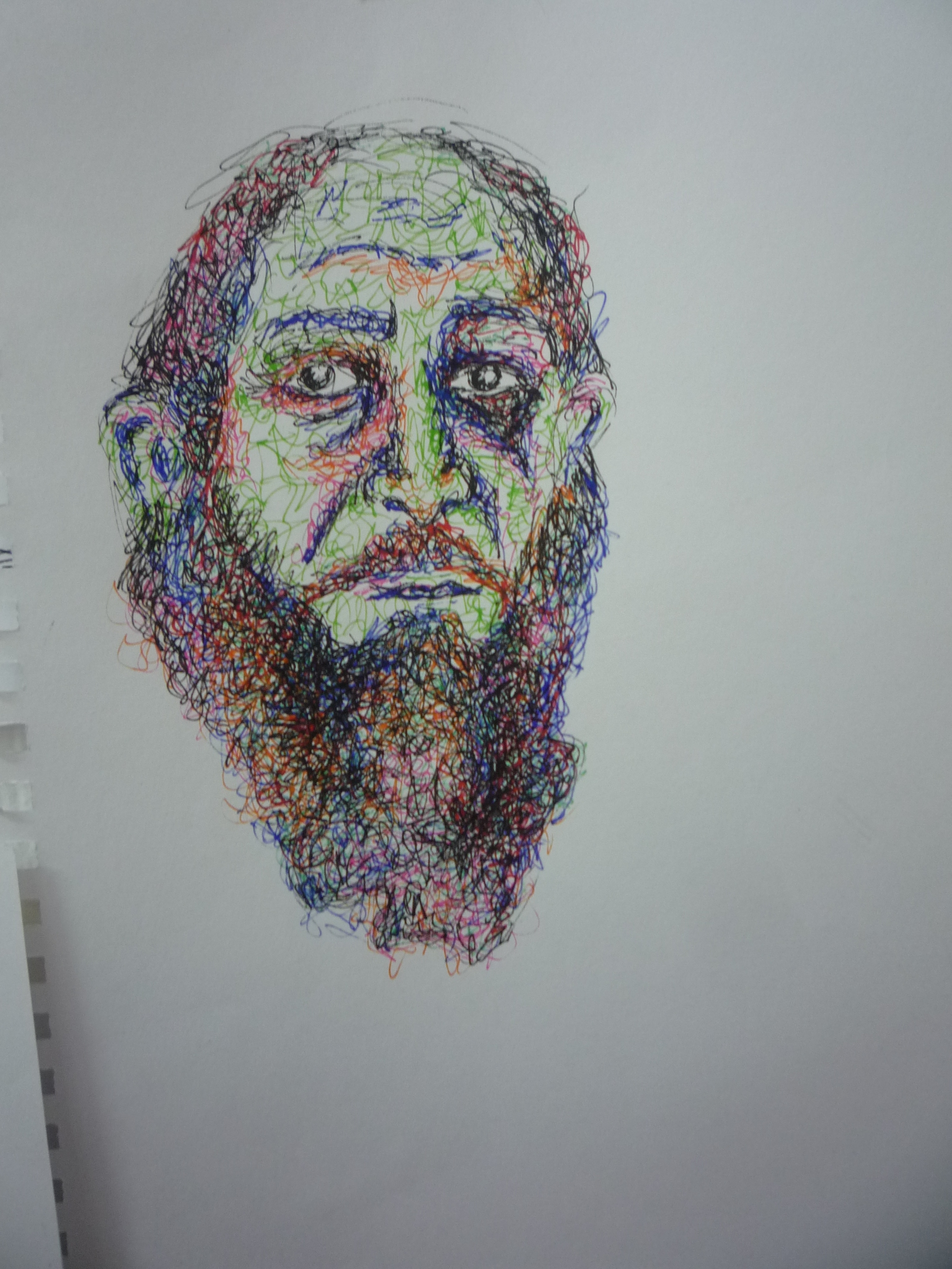
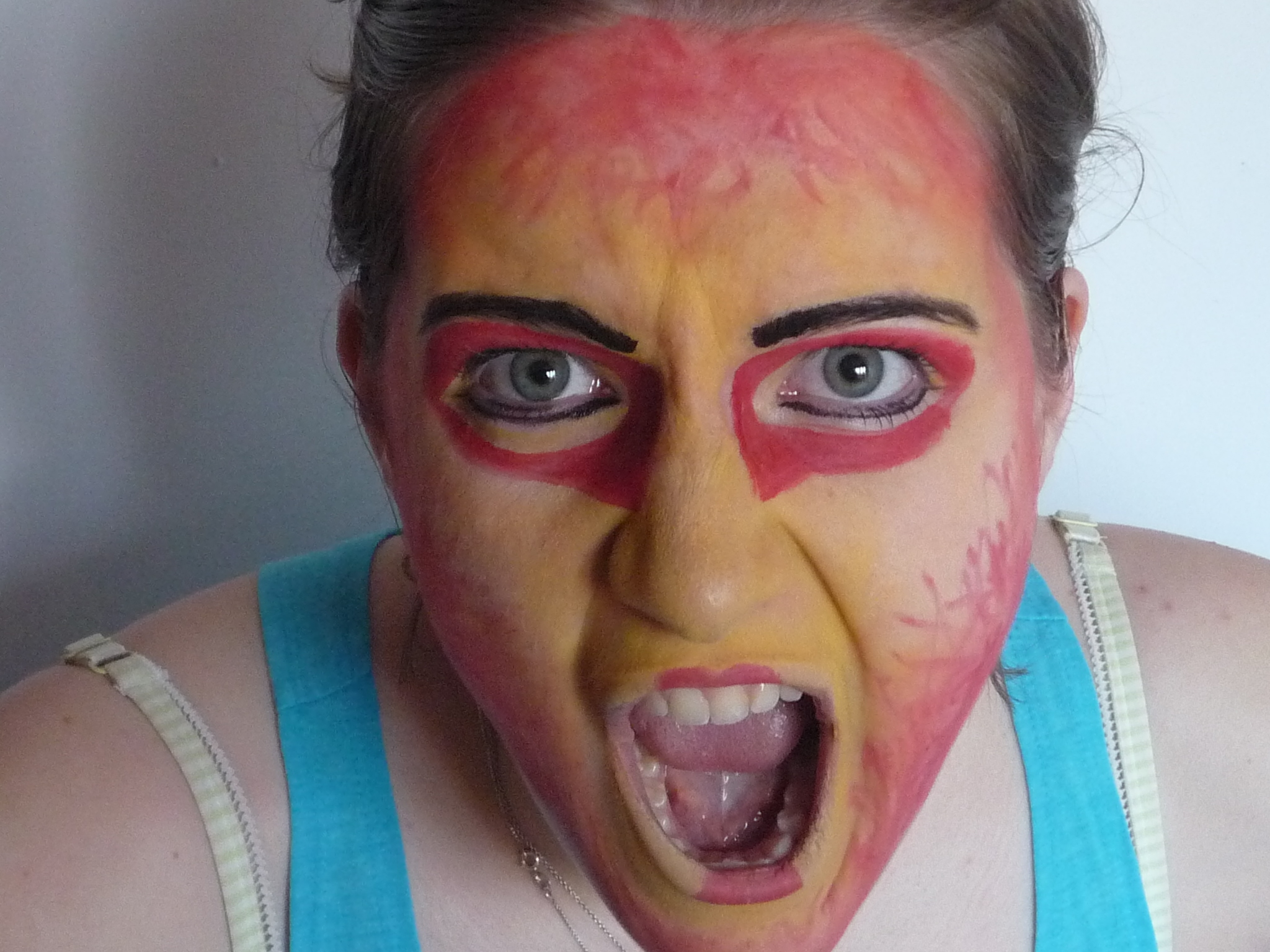
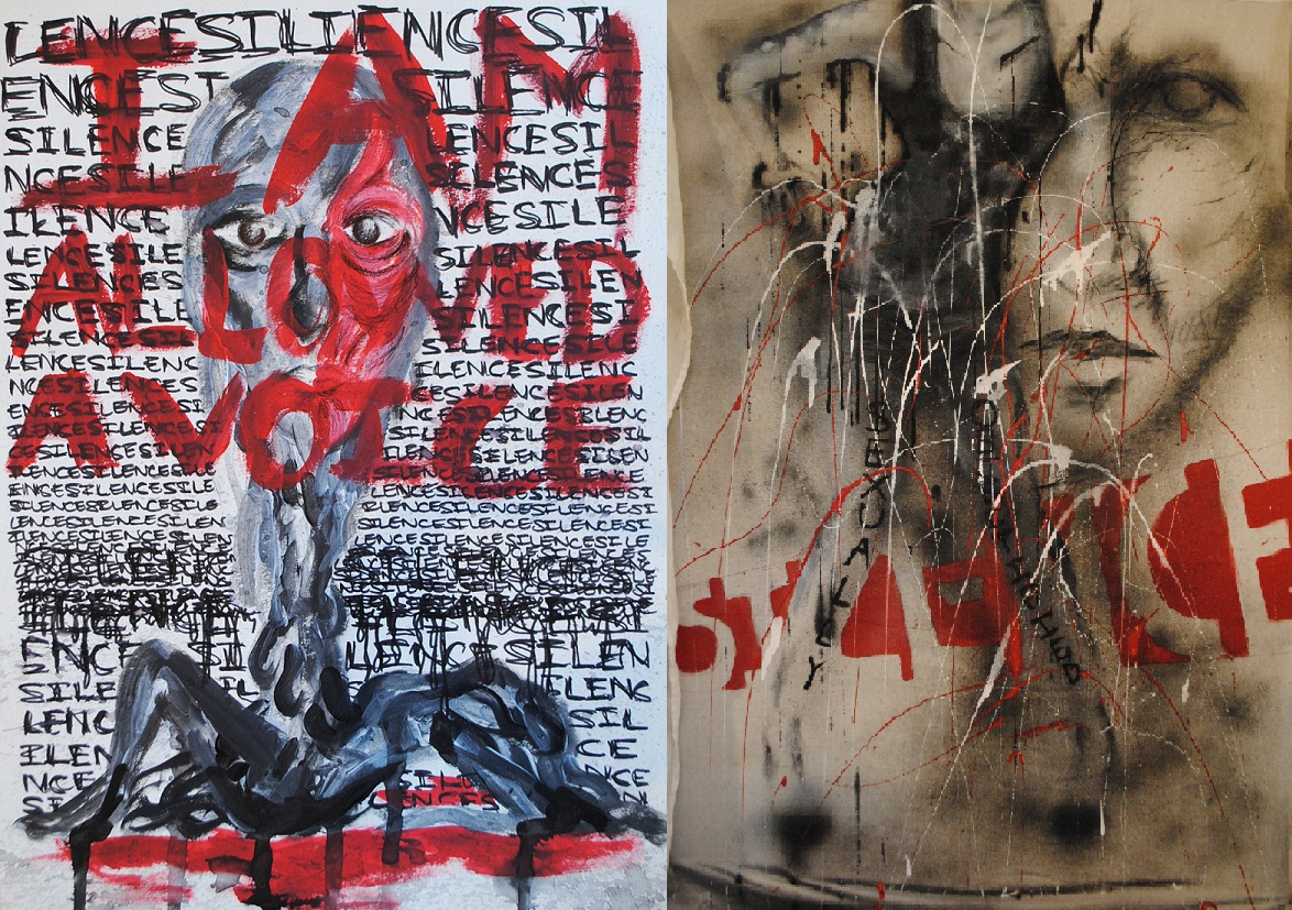
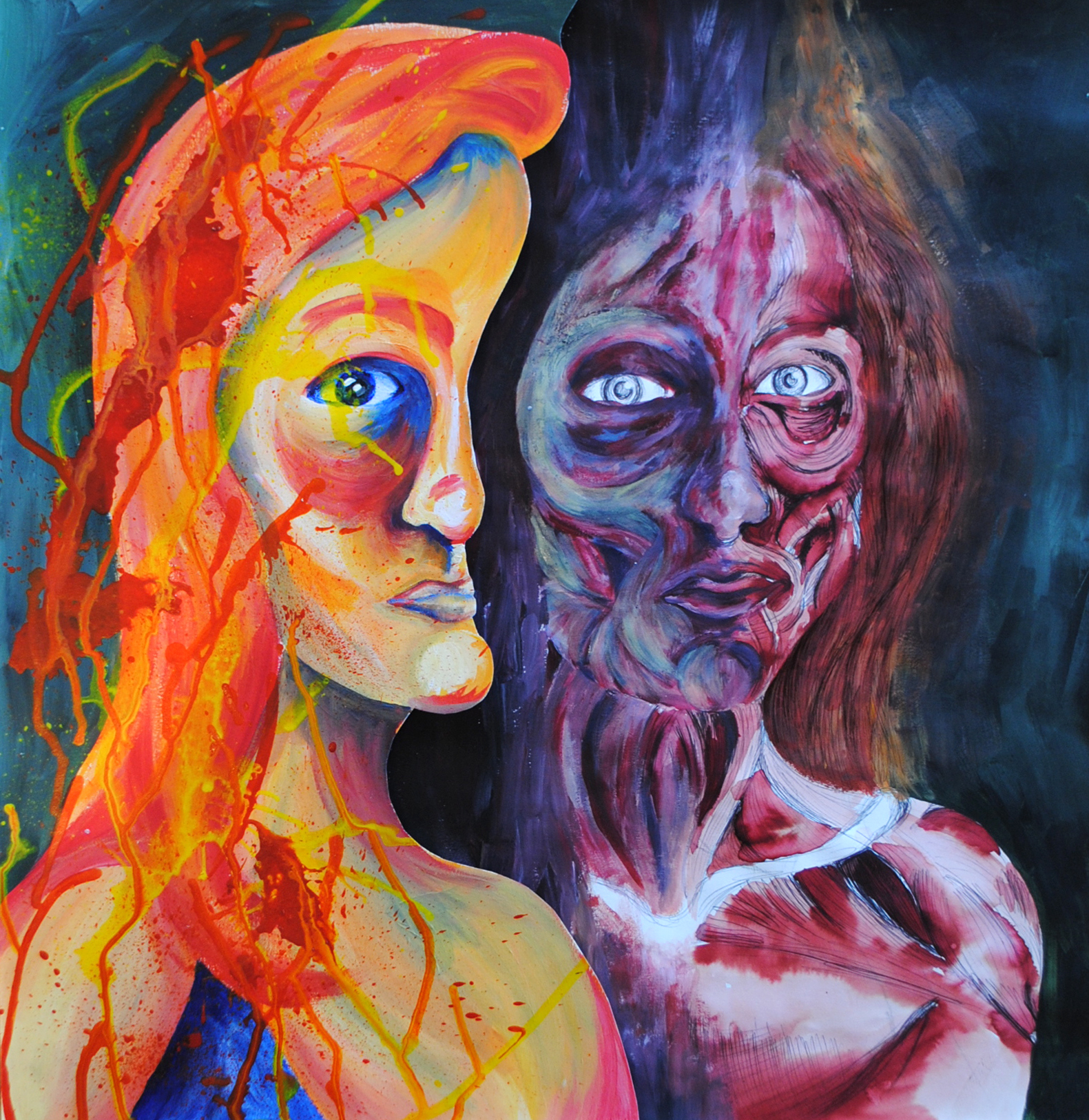
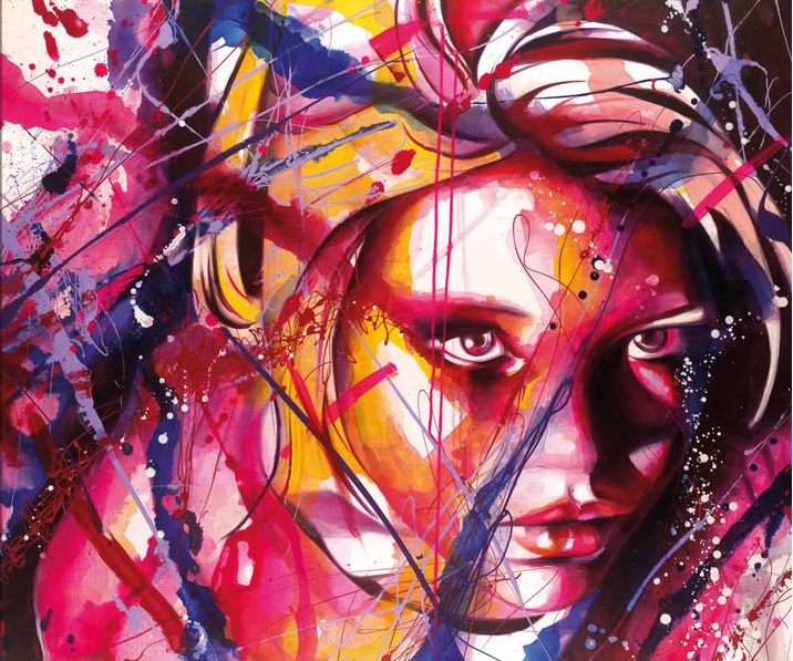
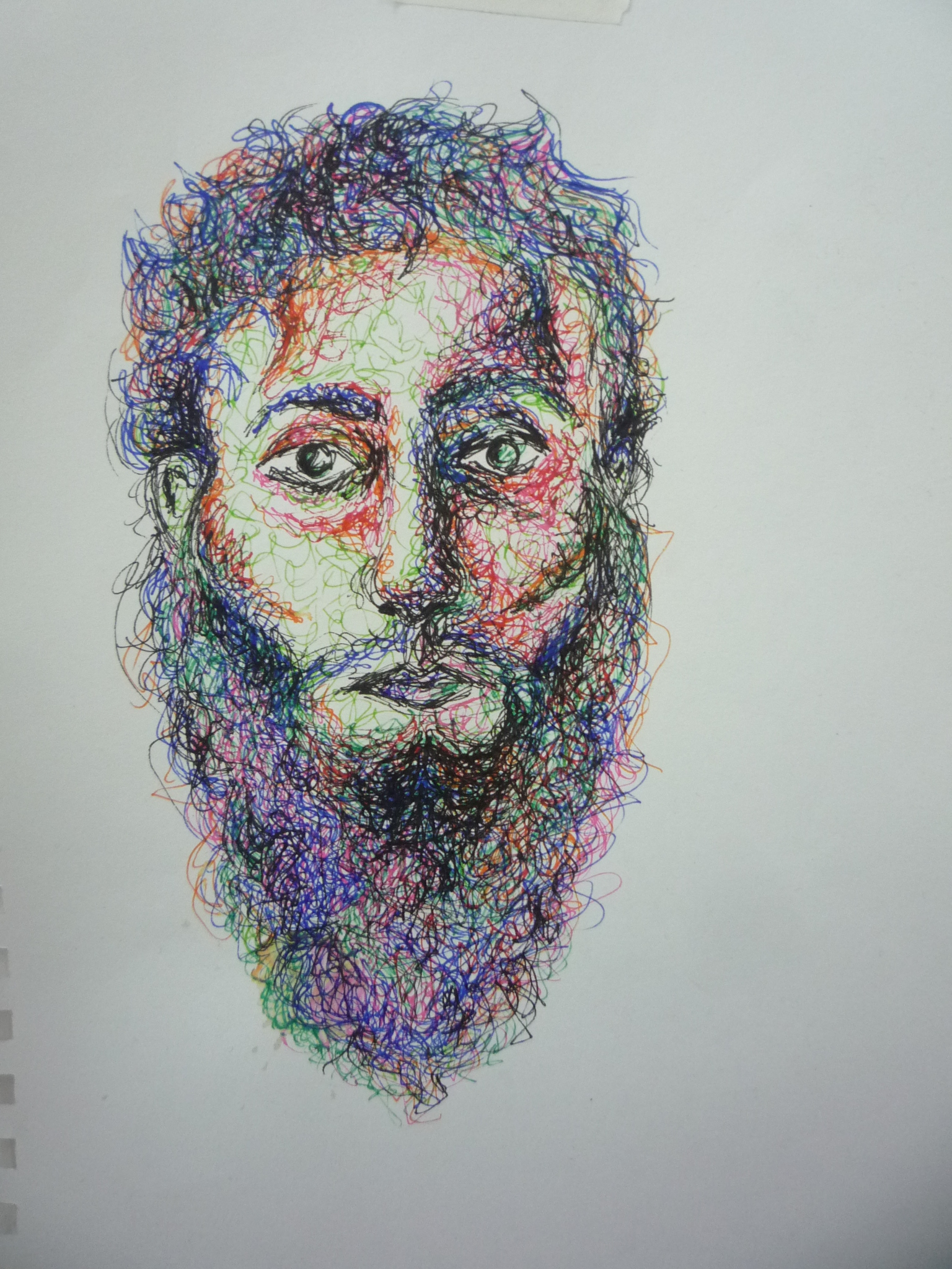
I think out of all the work I did in first year these sketches are my favourite. They are portraits of terrorists and I wanted to create a beautiful image of a very ugly person. The delicate outlines of these faces contrasts with the brutality these men have committed. I think my favourite element is the colours. They are vibrant and they are intense. Yet when they are dense they solidify and loose this vibrancy. And I like that, the idea that something can be lost when there is an excess of it.

Ramona Zoladek

DSCN2560

Recently I visited Ramona Zoladek’s exhibition at Gallery North, Northumbria University. I was instantly captivated by her use of materials. Her blend of the organic and man made was just absolutely beautiful. Her work fixates on the relationships between nature, architecture and objects and these themes are highly evident throughout the entirety of this exhibition. There is a strong sense of fragility throughout most of her sculptures, particularly in the concrete units which look as if they on the verge of collapse at any minute! Yet they simultaneously have this sense of strength, it may have been the height and their dimensions, but despite the crumbling ruins they seemed impressively stable. The way in which they had been laid out was very dynamic, almost like a satisfying jigsaw. The lighting was incredibly effective as well, as beautiful long shadows were cast across the gallery floor. Zoladek had used the floor as a space as well which I loved as the dialogue created between the differing heights added an entirely new dimension to the exhibition. She had even allowed dirt and dust to cascade onto the floor which was so effective given its organic quality. 

DSCN2561

The blend of concrete and plant was almost ethereal with the sparse white against the vibrant green. This was where Zoladek’s exploration of decay really came across. You felt almost as if you were watching the process; almost as if the ruin was pulsating and collapsing in on itself. I felt very tranquil as I studied these columns. I felt almost as if I could be transported to a Scottish island stood in a field of greenery looking at ancient ruins battered by the rain. I felt time was heavily present throughout this exhibition and of course that is another major theme in Zoladek’s work. 

DSCN2564

Zoledek’s themes are intricately woven throughout her work and they come across in a beautifully subtle manner, yet they are highly evident. However, there’s also a simplicity and a minimalism to Zoladek’s creations as well. Her arrangement of her pieces, her use of the floor and the wall. You don’t feel overwhelmed by it all despite the fact there is a lot going on. I think this is a very important element. It’s almost as if the layout and the colour schemes have created a kind of energy. By navigating the space you are participating and responding to this sense of energy. That was how I felt at least, which was why I chose not to watch the film around the corner. I felt it was not relevant to my interpretation of this exhibition. It was almost as if it would be an interference. Maybe I should have watched it. Maybe it would have entirely transformed how I thought about it all. But I didn’t want to. I felt the peace among the ruin-like structures was enough for me. 

DSCN2565

Professional Practice

DSCN1886

I was incredibly lucky and honoured to be asked to be the Official Artist for the Commonwealth Flotilla held in July of 2014. It was an event organised by the RYA (Royal Yachting Association) and took place up the River Clyde in Glasgow. 250 boats and 1,900 people took part and what a spectacle it was! Never has the Clyde seen anything so exciting! The event was officially from Friday 25th-Saturday 26th however it was  unofficially a couple days longer as most boats started further up the Scottish coast. I was part of this initial journey which was just as well as I had never drawn a boat before in my life! I needed those extra couple of days to wrap my head round the linear qualities of all these boats. For someone who is used to drawing the human figure drawing boats is quite a jump!

 20140707_13125020140707_131239

Pen is something you really can’t go wrong with. Given that the boats were constantly moving I had to draw quickly. I’d never sketched anything in motion before so it was both frustrating and brilliant simultaneously. It was also one of the most calming and enjoyable experiences ever. I got to sit for four days with my sketch pads and water colours and just draw. Of course a lot of people came and looked over my shoulder which made me rather self-conscious, but I think people found it exciting to see somebody actively documenting the event through a media that was not digital.

P1180310

 P1180321

P1180314

A sample of the final works.

These were exhibited at the Glasgow Science Centre in September alongside the photographs and some video documentation of the event. I am so grateful to have had this fantastic opportunity, especially given the scale of the event. It is definitely something I will never forget!

GLASGOW

Face Paint Experimentation

P1140020

Following my Kruger-inspired leg graffiti, using myself and my body in my art became a lot more of a frequent occurrence to the point that now I don’t know how I would make art without it! Something that has always fascinated me is make-up. Why do we wear it? Because we look shit without it? Apparently so. But why do we think that? Depressingly it’s because that’s what society has led us to believe. And I am a hypocrite when I say all this because I wear make-up on a daily basis and I love the transformation my eyes undergo between pre and post-make-up. I bought face paint one day wanting to exaggerate the transformation process that make-up could create. Here are some of the results:

P1140036

P1140080

P1140170

I created nine looks in one day. BAD IDEA. My face was so unbelievably raw by the end of it from repeated removal and reapplication. But it was a very interesting process. Obviously these faces are terribly exaggerated in comparison to what make-up does to us, but it really highlights the fact that every time we put something on our face, we are putting on a mask.

Feminist Art

Feminist Art

I discovered Feminism in Sixth Form. Yes, Sixth Form again I know,but it was very much a time of realising where my art was going and what it could be. Discovering Barbara Kruger’s work was probably one of the best things that ever happened to me! I got caught up in her fiery passion, her bold statements, her fantastic colour schemes predominantly made up of black and red. I even for the first time started using my own body. This was a very bold move for me as at the time I was incredibly self-conscious but I felt comfortable enough doing it ‘in the name of art’.

DSCN0023

My family were slightly taken aback by the route my art had suddenly decided to turn. But I was loving it. For the first time I really felt a connection to what I was doing and this connection has just continued to blossom. I discovered the writings of Caitlin Moran and boy, did I fall in love with this woman. She is a  columnist at The Times, TV critic and an English broadcaster. She’shad a load of books published including one titled ‘How to Be A Woman’. She is witty and direct and completely reclaims Feminism. Nowadays we have this whole stigma surrounding the word ‘feminism’ that you just can’t avoid. I hate it. I hate the connotations it carries because on several occasions where I have said I am a feminist I have been given funny looks. It drives me nuts! It’s got all these extremist attachments and it’s really not about any of that. If you believe women are equal to men, you are a feminist. Simple as that!

Kruger Influence

 I’ll leave you with a quote of  Moran’s to give you something to think about and just to prove to you how witty she is: “It’s difficult to see the glass ceiling because it’s made of glass. Virtually invisible. What we need is for more birds to fly above it and shit all over it, so we can see it properly.” 

Truly brilliant.

Life Drawing Inspiration

michaelangelo copy

Yes it worked! I’ve got your attention with this muscly naked man! Woo, what I would do to have abs like that…Right, enough swooning. This is a direct copy of a Michelangelo sketch (and if you don’t know who that is please go and hide under a rock). Below is the original:

M

I know I said I don’t copy art much, well I lied. I did it quite a lot when I was younger. I just found it soothing. I got to draw without actually having to think anything up. I guess it’s kind of the lazy way of making art. There’s been a lot of debate about this actually. Yes still life work looks lovely and you can hang it on your wall etc etc, but how much skill does it really take? Conceptual art is far more challenging as you’re actually having to think things up and create something from nothing. All very interesting and a debate that I’m sure would get very heated with a lot of people. So for now I’m just going to avoid the controversy.

schiele copy      egooonnn

Left: my copy of Egon Schiele’s sketch, Right: Egon Schiele’s sketch.

I think it is safe to say Egon Schiele is one of my ALL TIME favourite artists! His work is just so stylised and expressive. Gruesome in a sense even. I don’t know what the majority of people think about it, they probably think it’s a bit creepy or there are far too many vaginas going on. But personally, I love it all! It’s all just so scratchy and scrawly. Schiele is one artist who definately understands mark-making! You can see where he’s put pressure on his pencil, you can see how successful his limited colour palettes are with yellows and reds often featuring. He’s got a very interesting history to accompany his art as well. He was an art school drop out. He was also mentored by Gustav Klimt (lucky sod!) He was jailed at one point and a lot of his work that was deemed ‘pornographic’ was confiscated. I always think the personality of the artist goes hand in hand with the art work and in Schiele’s case this is definately evident. He was a notorious womaniser and his work truly reveals his raw sexuality. I love imitating his bony, almost anorexic-looking creations.

s

Life Drawing

Life Drawing

I remember my first Life Drawing class. I was sixteen. The model walked in and removed her dressing gown. I felt ridiculously uncomfortable. There were three boys in my class and they were smirking and trying not to giggle. The room was unbearably hot to stop the model getting cold. My teacher walked over and directed the model into a pose. I prayed I got the back of her so I didn’t have to look at any intimate parts. Just my luck, I got the view with everything! I didn’t know where to look! But once we started drawing I wondered what the hell I was worried about. It was just a naked body after all. And this naked female body felt like the most interesting thing I had ever drawn! The curves and shadows, the folds of skin and the wrinkle creases, the muscle tone. I was hooked. Life Drawing became one of the highlights of my week. Looking and studying the human body as it moved, as it maintained a position over a set amount of time, at the shadows falling across it. This was where my love of studying the human form truly set in and I have never looked back since.

P1160280

Portraiture

Facial Deconstruction

During Sixth Form was when I truly realised that studying the human body was what I was interested in. I think starting life drawing had a lot to do with that, as did my sudden interest in going to the gym. For me, studying the body was necessary not only through visual observation, but also through experiencing my body’s movements. I became very interested in the work of Dr Gunther von Hagen. To me he is as much an artist as he is an anatomist. He invented the technique of plastination in the mid-1970s. This allows the human body to be fully preserved by embalming it and then draining it of all bodily fluids. Quite a disgusting and technical process (sorry for you squeamish people!) but the results are incredible. Well, to me they are, to a lot of people it’s a very controversial affair. I think I’m just fascinated by seeing a real life human body and all the bodily tissues that make us up. An almost morbid fascination. The touring exhibition BODYWORLDS visited Newcastle last year and of course I jumped at the chance to see it in real life having been reading about it from the age of fifteen! Anyway, I am getting side tracked. Basically Von Hagen was a huge influence to me during this time and the above picture is inspired by his work as well as being a blend of Emma Grzonkowski’s style.

Grzonkowski Imitation

Above: my copy of her Grzonkowski’s work ‘Secret’.

grzonkowski

Above: Her original piece.

I was looking at Emma Grzonkowski’s work around the same time I was looking more in-depth at Von Hagen’s. This resulted in an interesting and complex blend of styles. Grzonkowski is a commercial artist who creates figurative pieces, she’s done a series on The Seven Deadly Sins. It’s all quite lovely and rather beautiful. Quite girly for me though so of course I had to reinterpret her piece in monochrome when I copied it. I don’t directly copy work often, but I do quite enjoy it when I do as I get a feeling for what the artist was doing. I like to think so anyway!

Fashion Illustration

Fashion Sketches No 1    Fashion Sketches No 2

In my mid teens I became very interested in fashion. Vogue, Elle, Harper’s Bazaar were the things I read. Ironically some of my favourite pages in these magazines was not the editorial content, but the photo shoot pages and the adverts with the seasonal campaigns for the mainstream designer brands such as Louis Vuitton, Mui Mui, Prada, Yves Saint Laurent, etc. It was the composition of these images that fascinated me. The way the light fell, the pose of a model, the colour palette selected. The clean cut clothes against billowing desert winds. I loved the contrasts, I loved the imagination that went into depicting something as simple as clothing. I was convinced as a result that I wanted to work in fashion. I began to sketch religiously. I made a scrapbook with images cut out of magazines and drew outfits inspired by the ‘rock’ look or the ‘hippy chic’. I think all of this also fuelled my fashion sense, as I began to experiment a lot more and explore outfits that suited my body as opposed to fitting trends.                                                                                                                                                                                                                                                                                                     

????????????????????????????????????

P1160275

As my interest in fashion developed, so did my interest in fashion illustration. It was Vogue that introduced me to this world; their past covers featured some of the most renowned fashion illustrators. I of course felt the urge to experiment as a result of encountering all these images. It was the simplicity that resulted in their success. The minimalist lines and the sharp bursts of colour. The emphasis of pencil pressure. Above are my imitations of two Rene Bouet illustrations, they are essentially identical to the originals although I have adapted the colour palette of  Rene Bouet’s original which is shown below:

rene bouet

Imitating an artists work is something I find incredibly easy (unless it’s hands or horses, those are my problematic areas!) It allows me to explore a media with the guidance of an art work that already exists. It also allows me more into the mind of an artist and let’s just say it would have been pretty fantastic to have been Rene Bouet!

Childhood Drawings

IMG_0021

When I was young, this kind of thing was basically all I drew. Animals dressed in clothes in all sorts of scenes. I think I must have done this one when I was ten as it’s Victorian themed and we were studying the Victorian Era around that time (I remember being horrified by what the poor chimney sweeps had to go through. Let’s just say it was nothing like Mary Poppins suggests!) I also drew an ongoing love story between a cat and a dog. Not very original I know, but as a youngster I felt I had kind of premeditated Captain Amelia and Dr Doppler’s love story in Disney’s ‘Treasure Planet’ – still one of my favourite films to this day! For any of you that haven’t seen this film, put it on your to watch list right now!

IMG (2) IMG_0001 (2)

As I got older the dressed up animals progressed and evolved into humans. It may have been because I was saying goodbye to cuddly toys and instead spending my money on new skirts and shoes. It’s only really now that I’m writing this that I realise my art really reflects the progression of my life and the experiences I have had. Currently my love of health and fitness fuel my interest in the human body and have done for about five years now. But at the time I was doodling all of these characters I was only just beginning to get interested in expressing myself through my clothes. I think I drew every outfit I could possibly think of! I had my characters wearing clothes I would never dare to, such as hideously girly pink combinations. I also had them wearing things I wish I had been brave enough to try, such as all sorts of wacky hair styles. It was around this time that my own style was distinctly changing and I was discovering make-up. I had a hideous phase of turquoise eyeliner (what was I thinking?!) and logo T-shirts…So I guess my characters were a reflection of my experimentation with my self-image. 

IMG_0008IMG_0007

Despite my passion for drawing, I was also lazy with it. Colouring was not my strong point, I got impatient with it as I was more interested in creating as opposed to filling in what was already there. So fine liner pens in all sorts of thicknesses were my best friends. They gave me the freedom to be loose and scratchy with my creations. Some of my favourite past works are in fact the monochrome ones as the lack of colour forced me to be a lot more imaginative with what I created. The above drawings are of characters that later formed my imaginary girl band ‘Quirky Duo’. 

IMG_0006

So that’s my childhood evolution as a drawer. At this point I wasn’t very experimental with materials – that all came later. My youth was more of an outlet for my imagination. All the story books I read as a child were definitely a huge influence, as was the TV programme ‘Totally Spies’ and probably the bands I listened to at the time (yes, S Club 7 did feature and I thought I was really cool…) There’s a giant box still under my bed filled with years worth of drawings. I haven’t opened it in such a long time and for some reason I feel scared to. I think in a way I’m reluctant to let go of my childhood. It’s all safely stored in that box and for now it’s best kept that way.