Performance Art

loving care 1

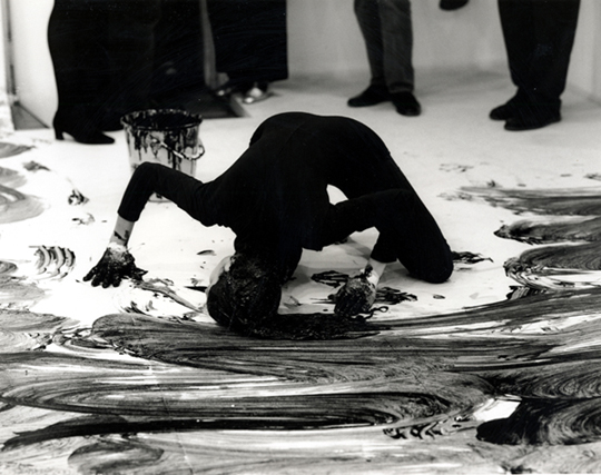
Janine Antoni ‘Loving Care’, image sourced from Artnet.

Having always used and worked with the body as a theme and a medium, it seems only natural that this year I have started to work with Performance Art. This was a movement that came into existence in the 1960s and 70s and is rooted in Conceptual Art. Performance Art is where the artist uses their own body or the body of a model to perform tasks and actions that become the artwork themselves. Famous Performance Artists include Marina Abramovic, Yoko Ono, Yves Klein, Nam June Paik, Bruce Nauman – the list is endless! Pictured above is one of my favourite artists, who has been a huge inspiration since I discovered her two years ago; Janine Antoni performing ‘Loving Care’. This is a work in which she dipped her hair in the hair dye and used her body as a painterly tool. This is in a sense a parody of Jackson Pollock’s painterly techniques and the male-dominated Abstract Expressionist movement, as well as being a social commentary on the domesticity of women. 

Image6

‘Loving Care’ has been a piece that has stuck with me for a while now and I have always been curious to test this idea of extending the paintbrush beyond itself. I recently cut my hair and therefore thought it would be interesting to do a performance which acted as a reversal to that.  I also wanted to make a gesture towards the impracticality of hair extensions and their artificial qualities. I cut my hair really short, so I wanted to extend it really long. I used the stretchy exercise bands that most people use in the gym, partially because they were a practical object to use in this instance and partially due to the presence of the gym and exercise in my work. 

Image13

The white objects I am using are obscure and grotesque limb-like forms that I made out of papier-mâché. This was a very laborious and time-consuming task not only because I made a lot of these objects, but also because of their drying time and formation process. However, the labour was another element to this performance. In it I am not only exploring this idea of body image through the representation of hair extensions, but I am also exploring the repetitive and mundane. Labour is an element not only in the construction of the objects, but also in creating the drawing given how many times I walked up and down the paper.

Image14

There was also an element of pain present as although these objects are relatively light, when attached to your hair and roots they are less so! I had a pot of ink and water that I kept dipping these objects into and my intention was to continue until I had used this up, however the pain prevented me from doing so.

Image19

It was interesting to blend such traditional art materials (cartridge paper and Indian ink) with an act that was so far-removed from conventional painting methods. This mode of working falls into the category of Action Painting, a movement that really took off in the 1960s and is something that I myself have never tried before. There have been moments and elements of it present in my work before, but never in such a direct way. 

Image20

Given the fact that this art form falls and touches on a lot of aspects of performance itself, costume is consequently a very important part and something I put a lot of consideration into. In some cases I have gone for the stereotypical artsy all-black ensemble, but in this instance I wanted to return to the studio aesthetic which I think tied in well with the rest of the materials I was using.

Image22

As well as thinking about what I’ll put on my body for performance work, I also think about what I’ll remove. I am a complete jewellery junkie, always adorned with rings and dangly earrings! I tend to remove all of these elements for the purpose of performance work. However in this instance I kept it all on as I wanted the jewellery to be a part of the work, as an indicator of its constant presence on my body. 

Image23

I think for me one of the most interesting things about working with Performance Art is focusing on and thinking about the objects left behind and how they are imbued both with the trace of human presence and a past kinetic action. What’s exciting is that although the performance is an ephemeral event, the objects left behind hold so much potential for further exploration.

Image27


John Virtue

P1180052

I was looking through some old work when I came across these images of my First Year studio. This was probably the one and only time my choice of topic deviated from Body Art and instead focused on the natural landscape. I think I surprised even myself in this shift as there was no real explanation for it apart from my discovery of oil paint. I think I felt that abstract landscapes were a better means of exploring this medium, as opposed to again working with the female body which I was already so familiar with. This shift was also due to the fact I discovered the work of John Virtue (see below).

 john virtue

‘Landscape No. 707’, 2003-4, image sourced from The National Gallery website.

I fell in love with his whimsical monochrome depictions; how they were abstract yet figurative simultaneously. How he combined nature with industry. The blend of such intense darkness against the stark white also lends a satisfying balance to his work I found. This equilibrium allows the eye to shift peacefully across the page, taking the time to absorb intricate aspects such as texture which are so imbued with the studio aesthetic.

P1180042

What I found particularly interesting about Virtue’s work was his ritualistic aspect of his art making. Every day without fail he would walk to the same location to sketch. This of course resulted in an excess of drawings, but the dedication this required fascinated me. So for a while I chose to copy this method of working and walked to a park everyday. It was quite out of my way and in some cases an inconvenience to all of the other daily necessities occuring in my life. However, having this task and this escape also gave me the best kind of zehn I could have wished for. I had an excuse to leave behind the rush and pace of daily life to focus fully on ritual-based art making. 

P1180051

I also tried to employ Virtue’s use of the monochrome palette by removing colour from my work. Depicting landscapes and working with oil paint was a time where I was using really vibrant and sunset-based hues, so this removal was a real challenge for me. It forced me to think a lot more critically about texture, shape, scale and all of the other elements that could compensate for lack of colour. I poked needle-thin holes through paper, I worked with impasto and modelling paste, I used charcoal and inks to create that messy studio look. I tried everything and had great fun experimenting, but of course I gradually began bringing colour back into my work. I also sadly had to stop my daily excursions to the park given all my other commitments, but I may some day start that again for a brief period at least. Employing the working methods of another artist was a really interesting and liberating experience for me, as I was giving up all sense of control that I had over my work and instead completely yielding myself to working in a certain way. It was an incredibly enjoyable experiment and is something I think I’ll definitely go back to at some point!

Back to The Empty Quarter

2

Recently I’ve been thinking a lot more about my body against the natural environment and of possible places to shoot. I’m interested in how different environments create different messages when the body is posed in a particular setting. Such as with my graveyard and park shoot pictured above (click here to see post). Those were two selected settings with a chosen purpose at a certain time. My boyfriend was very kindly the photographer and it was interesting working with him and taking on board his notions of the surroundings. Varying interpretations are created all the time in artwork and it’s a really important thing to be aware of, particularly given that I work with the female body in the climate of social media and society’s conventional expectations of what beauty is and should be.

P1090883

I like the idea of shooting in a setting that has some personal attachment to me. I don’t just want to use anywhere as a canvas for my body. The personal relationship to place is integral as that is the only way I feel I can translate the intimate relationship I have with my body into the image. So I started thinking about places that I had been and thought back to The Empty Quarter in Oman, Middle East. It is one of those places that has really stuck with me throughout my life. The powerful feeling of solitude and silence in this empty wilderness leaves a lot for thought. When I think of Oman, I think of beaches, water, diving, mountains and here. There are no words to describe the beauty of this endless desert. We camped there meaning we got to see the transition from scorching hot sunlight, to a glowing sunset that never seemed to end. We climbed to the very top of the sand dune (which gave us all a good dose of exercise!) and we were greeted by the view I’ve captured in these images.

P1090885

The photographs definitely do not do this place justice, but they draw me back in as if I have never left given my experience of it. I feel like I can enter that image and fall back into the slippery sand that would not leave my socks, feel it tickle the backs of my legs, feel the warmth of the sun and the slight discomfort of the humidity. This is why I need  to work with a location which has some form of nostalgia, or that was from a different time in my life. I like the idea of bringing the past into my work and in a sense bringing the past forwards into the present. 

P1090882

If only I could go back to this beautiful untouched landscape. The dunes sat so perfectly, their lines looked as if they had been drawn with a precise fine liner pen. The sand was so soft in my hands and it danced off into the sunset as I let it go. I would love to go back there and do a subtly nude shoot. Nothing of a sexual nature, just a shoot that encapsulated the female body in one of the most beautiful settings in the world. Sadly I no longer have access to this (maybe one day I’ll return) and as it’s on the border of Saudi Arabia, posing naked in the desert is probably not the best idea!

P1090877

I am however on the look out for a beautiful place to escape to. I think it’s really healthy to step out of the studio and away from modern day life into nature. And what could be a more perfect way to do so than through the medium of my own body? 

Critical Writing for Vane Gallery

Recently I have been trying really hard to work on and expand my writing skills; as much as I love blogging and using colloquial language, I also enjoy writing in more formal and critical terms. Recently therefore I submitted two pieces of critical writing Vane Gallery and I am delighted to have found that they have both been published. Feel free to have a read on the links below:

IMG_8250

‘The Beauty in Grotesque’, a critical review of Jock Mooney’s exhibition ‘Who Are You and What Do You Want?’ at Vane Gallery. Click here to read. 

IMG_8256

‘Layers of Meaning’, a critical review of Oliver Braid’s exhibition ‘The Nude Ignity’ at Vane Gallery. Click here to read.

Scottish National Gallery of Modern Art

IMG_8525

It’s weird, but sometimes the Scottish National Gallery of Modern Art is the thing that makes me feel most Scottish! That’s not because there’s a bunch of Scottish memorabilia in it – far from it! Instead there’s an impressive collection of artworks ranging from Francis Bacon, to Andy Warhol, to David Hockney, to one of my favourite artists Samuel John Peploe (part of the Scottish Colourist movement). Having lived abroad most of my life, there are moments where I struggle to find places where I feel truly at home or have a strong connection with. This Gallery has become one of those places of nostalgia. I remember visiting it for the first time when I was seventeen, living back in Scotland for the first time. Sixth Form was what I’ll call my ‘art awakening’; the period in which I realised what kind of art I wanted to be making (Barbara Kruger was a key influence at this point). So the combination of this revelation along with several art trips to this Gallery during that time have made it a very sentimental place for me. 

IMG_8528

This of course is partially due to the sheer beauty of the place. The gallery’s architecture in itself is stunning (I think it’s safe to say I have a crush on Edinburgh architecture!) and the lush greenery surrounding it only enhances the feelings of tranquility. As does the presence of water, which on a beautiful sunny day like last Friday, sparkles and dances in the light. 

IMG_8527

Walking around this landscape is an incredibly serene experience and although it is still relatively central to Edinburgh’s center, the hectic bustle of the city seems distant and far removed. Almost as if you are stood in an art filled bubble of peace. This swirling blend of land and water can’t help being viewed as an impressive Land Art piece, which for me brings to mind the works of Richard Long and Robert Smithson with his iconic ‘Spiral Jetty‘. 

IMG_8522

In the grounds there’s also works by Henry Moore, who in my opinion is the father of all sculpture. His ‘Reclining Figure‘ series, one of which is pictured above, was a huge inspiration to me at the time I discovered it. I was and still of course am, fascinated by the blend of abstraction and figuration; by the way in which he has designed his pieces to allow the eye to travel smoothly along the figure. Barbara Hepworth is another sculpture pioneer who I greatly admire and on my list to one day visit is the Yorkshire Sculpture Park! Although I greatly enjoy modern art, I also love stepping away from it and looking to older masters. Particularly given my interest in the human body; there is nothing more exciting than exploring how body art has evolved throughout the decades.

Benedict Drew

IMG_8496

I think it’s say to say that Benedict Drew’s wacky installation was by far my favourite work in The British Art Show 8. Exhibited within the Talbot Rice Gallery, Drew’s work is the definition of transforming a space into something completely new and exciting. What had been quite a clean cut angular-looking gallery space prior to my entry into this room, was soon turned upside down as I entered Drew’s work. I was instantly transported from the traditional gallery layout to what felt like a psychedelic sci-fi space. I was in awe. Sound pulsated heavily across the room; I could feel it in my core and reverberating through my entire body. There were headphones placed on the table which of course I reached out and tried on only to find that they amplified the sound that was already echoing around the room. It was almost like an electro heartbeat and instantly made me feel like I myself was a part of the piece.

IMG_8476

The utilisation of the architecture within the work furthered Drew’s success as I felt the gallery dissolved and blended into the installation to the point I felt fully consumed by the piece. Just like this installation, Drew’s practice spans a wide range of media including sound, performance, video and various other forms. He often creates chaotic and absorbing environments that pulsate with life, drawing in the viewer and providing them with a multi-sensory experience. Although there was a lot to take in when I viewed Drew’s work, surprisingly it was not overwhelming. Installations such as this have that risk factor; bombard your audience and your work is often lost on them. Yet Drew defied this by carefully distributing the pieces, creating a walkway for the viewer to enter and navigate their way effectively through his work. The shapes I was met with and the colours that were used all complemented and blended with each other allowing the human eye to adjust to the bright colour palette that was present. 

IMG_8481

When I got to the back end of the installation I was greeted by large, cinematic screens. Drew’s attention to detail was plain to see with the modern white speakers contrasting to the excess of cables wrapped believe it or not, in tinfoil. Drew took a domestic everyday item and turned it into an art piece that distracted nicely from the ridiculous amount of cables that all his technology requires. It also furthered my reading of the sci-fi elements. It was not just the detail in the cable layout, but also in the stands of the screens. Instead of being a dull conventional black they were a lime green that instantly caught my eye (probably due to the fact I seem to have developed an unexplained love for lime green). 

IMG_8482

According to The British Art Show’s text accompaniment to this piece, Drew was articulating “the horror of the modern world” through this work. Through his multi-media approach he explored this horror thoroughly! It was impossible to ignore the screens that bombarded you as you approached, an obvious reference to our screen culture of today. There was sound that shook through your bones, the way music does in a club. Colours and structures clustered everywhere in excess alluding to our material and consumer culture. There was no escape in this whimsical and all-consuming environment; the pace of it drew you in and refused to let go much in the way that modern day life does. 

IMG_8480

Yet in among all this technological-based motifs I was surprised to view what looked like mud puddles on screen. They were very anthropomorphic and alien given their electric colours, yet I half expected a David Attenborough voice over mixed up DJ style to come on!  It would not have surprised me, as this work was a constant succession of surprises – and puzzles. There was one area of each screen which had a shell attached to it and a spot light which remained the same colour despite the constant shift in imagery. I could not for the life of me figure out how Drew had managed this! 

IMG_8485

There was not a moment of boredom in this space. Despite this being the first piece I saw of The British Art Show, and despite me witnessing several other works that day, this was the one I could not stop thinking about. I couldn’t get this psychedelic experience out of my head. Partially I think because I was both impressed and fascinated by how Drew had used technology and created such an absorbing work. But also partially due to the elaborate colour scheme – I myself almost wanted to start glowing and blend into the work! I think it’s safe to say Benedict Drew succeeded in captivating his audience, whilst also posing some challenging questions concerning modern life today. 

Facebook Page

mindofmilla

You may have seen this coming following my creation of a Twitter and Instagram page, but here we go again! Yet another platform for my blog across social media. My boyfriend couldn’t quite believe this was the last one I was creating (he’s a lot smarter than me at the best of times!) Given the immediacy and the constant streaming on Facebook, it seemed inevitable I would end up making a page. So here we are with The Mind of Milla on Facebook, feel free to take a look and give it a like!

British Art Show 8

IMG_8497

We had an art trip to Edinburgh on Friday to see the British Art Show 8. I felt like a school girl again being on the bus with everyone. Let’s just say I’m not a morning person when lacking my usual caffeine intake! It was lovely to get away from Newcastle to a city as stunning and creative as Edinburgh. I am completely in love with the city and it’s architecture, everywhere you look there is something new to absorb, especially when the sun is shining and dancing across the beautiful buildings. The gallery buildings we were visiting, such as The Talbot Rice Gallery, University of Edinburgh (pictured above) are visually captivating enough in themselves – and that’s before we’d even seen the work in the show itself! The British Art Show takes place every five years and is an exhibition that tours nationally to show the most current contemporary art in the UK today. It hosts a broad variety of artists all of whom work across various media. The theme of the British Art Show this year was materiality and how we approach it both virtually and physically in contemporary art. 

IMG_8498

Initially I misread the text accompanying the exhibition and took it to mean the theme was materiality alone and was consequently disgusted by the ridiculous excess of screens. Not joking, there were more video works in that show than I’ve probably witnessed in my life! In my outrage at this approach to materiality I felt disillusioned by the entire show, until I came to realise my mistake. However, despite the theme being an exploration of materiality across the real and the virtual, I did find the predominant selection of video works quite difficult to absorb. Drifting from screen to screen to screen did start to feel slightly repetitive and exhausting. This is the problem with an excess of video in a gallery setting. You walk in at the wrong time or half way through and the narrative is entirely lost on you! In some cases this approach to viewing video is a success, in other cases it is far from that. Half the time you have no idea of the duration so you are forced to decide when you leave or if you stay and then of course you have all the social pressures of that situation in a gallery setting. You don’t want to be the first to leave the art work, or you don’t want to hurriedly get up when you’ve only just sat down. It can lead to a multiple of awkward situations. 

IMG_8492

That is why I loved this piece ‘The Common Sense’ by Melanie Gilligan so much. There was no issue of when to stop and start viewing. Given the absence of the conventional dark space for viewing video work, I felt under far less pressure and therefore was more inclined to participate with the piece. Partially because I was fascinated by the technology. I put the headphones on expecting to hear things straight away, but it wasn’t until I was in close proximity to the screens that any sound was audible. As you approached each screen you were greeted by a different segment of the film and it’s audio. Yet as you walked between screens you could hear nothing but silence. It was all done through motion sensor and created a highly intriguing experience. Unless of course you didn’t have headphones, then you just felt lost and disinterested. Being lucky enough to have claimed a pair of headphones, ‘The Common Sense’ seemed like a fascinating dystopian film which I would have loved to have been able to see all the way through!

IMG_8489

Also in The Talbot Rice Gallery was this work by Eileen Simpson and Ben White. In the above image, it doesn’t look like much, apart from being a selection of funky coloured record players. However in reality it was an engaging sound installation that echoed throughout the top floor of the gallery. The records played a compilation of extracts taken from chart hits of 1962 – the final year in which commercial records could be retrieved for public use. It sounded like a hollow and empty kind of disco, like you almost wanted to dance and party but the robotic tone was stopping you from letting loose. 

IMG_8519

Sound installations along with video seemed to be core motifs to the Show. The above image is a gravestone bench by Alex Kane, which was in the room of Laure Prouvost’s haunting sound work. There was a silky woman’s voice reverberating across the room as I sat down, the kind of voice that makes the hair stand up on the back of your neck. At first I thought the bench was part of Prouvost’s work, until I read the accompanying text. Although the sound installation was a generic address to the viewer, it felt like the woman’s voice was pinpointing and talking to directly to me. Incredibly haunting and eerie enough that I left that room with my skin crawling. Although The British Art Show was less sculpture filled than I’d expected, it was rich in experience. I left each room with new thoughts and feelings racing through my head, different things making me uncomfortable or mesmerising me into staying. Sometimes I feel contemporary art should have the simple title of ‘experience art’, as that was definitely what I felt the British Art Show was; an experience. 

Flora Whiteley ‘Present Continuous’

IMG_8260

Talking more about getting back into painting is actually relevant to another exhibition I saw recently at Vane; Flora Whiteley’s ‘Present Continuous’. Given her cinematic background, her works have elements of film and stage-like set ups, which bring a new dimension to what are otherwise very painterly works. At present I’m not too interested in researching the background to her paintings and all of the concepts she was exploring; I’m simply wanting to look at and appreciate the paintings themselves. Particularly in terms of her use of colour. The above work is the perfect example. Through her pastel hues and soft palette, the cold of winter she’s depicting in the picture comes through to real life. You can almost feel the cold creeping into the gallery space. 

IMG_8266

It’s the same with this piece (see above) as well. The smoke from the girl’s cigarette has that wispy aesthetic of real life smoke. Although it’s a static image, you can see the cusp of energy it carries, as if the smoke could blow out of the painting and into your face as you view it. I think the lack of hard edges enhances this sense of movement. There’s a softness to the painting and a delicacy to the technique. What looks like fairly heavily applied paint is in fact an abundance of layers built up over time. The technique of the painting application varies between dry-brush and more of a solid application of colour. The contrast between the two creates a nice sense of balance within the painting. In some instances we are able to see the linen on which the paint is applied, in others we are presented with purely a build up of tonal work. 

IMG_8265

There’s a real sensitivity in her depictions of the figures as well. Their stances are not too posed, they simply hold themselves. The muted colours of their clothing allow them to almost blend into the background, not occupying too much attention within the piece. The tilted angles of the head, the slight bending of elbows, every element is thought out and all contribute to create a linear direction for the eye to travel round. 

IMG_8263

The scale Whiteley has chosen to utilise complements her figures as well. They are not quite life-size but they have that element of suggestion. You can relate your bodily proportions to the piece. They also allude more to Whiteley’s cinematic background – not quite on the scale of being a cinema screen, yet they are not far from it and have the potential to be one. There were also far smaller portrait paintings, yet I preferred the larger ones as they really allowed me to closely study her technique. 

IMG_8264

I don’t always take photographic close ups of work, as I prefer to have the entire body of the piece to contemplate as I reflect on it. However in this instance I was far more fascinated by close up studies of it all. The way Whiteley had broken up the pieces through angular lines and blocked colours. The shapes she formed through her placement of the figures. The depth created through the variation in colour. There was so much to see and absorb, that standing far back felt like I was missing out!

Pink in Progress (Over/Under work)

IMG_8268

‘Rizzo’ in progress

Working for the piece for the Pop Up Pink exhibition has made me realise how much I miss painting. Although I love the direction my work has taken and all the exciting things it’s led to that I thought I would never do (performance being the prime example), I will never give up the paint brush. There is just something so special sitting down with and focusing on a material; building on it, contemplating it, analysing the creation process. When I paint, I can not get enough water. I love loose fluid works, drips, diluted colours, layers. 

IMG_8269

My paintings are very time consuming and are very much a long drawn out process, mostly due to the necessity of drying time. If I get to eager and paint over a layer that’s still wet, my effect is ruined. So patience is key. I tend to paint in stages, dipping in and out of a work. I think this is actually the way I work best in most senses, as when I write an academic piece, I have to let it sit for a few days before I go back and look at it again. I tend to bang it out in one go and then leave it for a week and almost forget about it as the deadline nears! But it’s the same when I work with paint. I like to be fully absorbed by the process, but then I also like to step back and leave it. Really think about what I’m doing and how I’m layering it. Sometimes this really doesn’t work as despite my attempts at contemplating, I still over work the paint. 

IMG_8267

This is the most frustrating moment for me, as my paintings are not the kind where you can just cover up a mistake. Once the mistake is made it’s there to stay as the paint is applied so thinly, it would completely ruin everything if I tried to obscure it. So I think this is why I have started to implement time into a piece more over the years. the older I’ve got, the more I’ve realised you can not hurry or push the creative process. Otherwise you put a pressure on it and it backfires with you creating nothing! With this work I feel I overworked it slightly, but hey I’ll know for next time!