Jock Mooney Part 2

IMG_8246

Normally I’m quite wary about using or associating art with the word ‘kitsch’. All it encompasses are elements that do not cater to my usual taste. Kitsch to me normally creates associations of tackiness and poor taste – which to excess form the definition of it. Yet that was the word that sprang to mind when I walked in and saw these pieces. For once in my life I don’t mind using the word, as I think it totally works in this instance. Even better, I’m getting the ironic vibes here which means I’m even more comfortable in applying the term to Mooney’s work. I don’t feel he’s done it without the intention of being sarcastic. 

IMG_8250

So Mooney has succeeded in being the first artist to ever have me accept ‘kitsch’ as a good thing. Kudos. Not only that, he’s also managed to incorporate bizarre and seemingly random motifs into his work which I can’t stop looking at. Of course they’re not random at all. He’s got Janus cats for one. The name Janus coming from the Roman god who is normally depicted looking forward into the future and back into the past with his two different faces. This symbolises Mooney’s contemplation of life in this exhibition. Then there are all these cake-like sculptures, which reference certain religious festivals and religions through grotesque formations that in some instances take the form of the severed head of Marie Antoinette. Culture, history, religion are all just some of the components Mooney explores here. It’s all slightly unnerving and creepy, yet the vibrant colours reign it back into the realm of playfulness. 

IMG_8253

What I didn’t find too playful was this floor-based work. I think this ginger bread picnic mat for me was slightly mad. You’ve got severed fingers scattered across it, along with laughing faces who you can almost hear jeering at you. Not sure I fancy eating a cucumber sandwich sat with all that watching me. But it worked very well within the exhibition context, especially given the play on space. It’s really interesting that modern day sculpture is abandoning the plinth in favour of the floor, as it forces the viewer into a direct relationship with the work. Especially with a piece like this, is it a picnic mat or is it a sculpture? Where does art begin and art end? It’s all about the blurring of boundaries and comes back to that idea of exhibitions that are designed to challenge conventional perceptions of artwork.

Jock Mooney Part 1

IMG_8247

Vane Gallery recently had Jock Mooney’s ‘Who Are You and What Do You Want?‘ exhibited. Mooney is represented by Vane so I’m quite familiar with his work through that. This exhibition however was quite unlike his usual stuff as it was far more personal and autobiographical. It is an exploration of Mooney’s joys and fears surrounding life; his hopes for the future and all the whimsical elements of life. I’m not saying this exhibition was totally unfamiliar given his choice of theme as his iconic gruesome figures and lavish colours were of course still present – it wouldn’t be true Mooney without those components! 

IMG_8249

The pieces that caught my attention most were his incredibly intricate drawings. Not only was the detail and patience they must have required unparalleled, but the variation in tone was endless. Mooney really had pushed monochromatic drawing to the extreme. Along with the slightly grotesque swirling knots and fluid shapes, Mooney had also brought in a bit of cheeky humour. Eye-adorned bottoms were a motif in a lot of his drawings and this balanced out what would otherwise have been quite gruesome and curdling depictions. 

IMG_8248

The one above is my favourite as it is a blend of both an action and a reaction. On the one hand you have what looks like a woman’s dress blowing up, the action, and then within that you have the popping eyes in reaction to this occurrence. Very clever. The eyes have that excessive, over-the-top, Tom & Jerry style look to them as well which heightens this sense of amusement. As does Mooney’s playful titles: ‘Avocado Pear-shaped Palm’, ‘Speculative Teetering’, ‘The Curse of the UHT Guacomole Snowman’, ‘The Dysfunctional Rapture of Brassica Bumface’ the list is endless and just so much fun. I think we really get a taste of Mooney himself through the language he applied to his work which is why I personally find the titling of a work crucial. It is the cherry on the cupcake if you like. And although these drawings are fantastic and fun even if they were titled something entirely mundane like I don’t know…’Cereal Bowl’ (yes, I’ve just had cereal), the title does succeed in adding that extra bit of mischief.

Alice Theobald and Atomik Architecture

DSC00201

 I have viewed this piece at The Baltic a few times now. I did not run to write a blog about it, as I wasn’t entirely sure what I thought. I needed more time to process what I’d seen and I also felt like I had to see it again before I could formulate my thoughts into anything worthwhile. That is not a negative thing. The fact that this work forced me to really think and contemplate my experience of it shows its staying power and effectiveness. The work is co-authored by Alice Theobald and Atomik Architecture. It’s an endevour to blend an artistic practice with architecture. Given that Theobald works in performance, sound and installation, it’s quite an ambitious choice of blend. Hence my excessive contemplation over it all. 

DSC00194

It was interesting because when I arrived on Level 2 the above scene is what I was greeted by. There’s an instant blockade which suggests a lack of access. A lot of visitors did in fact question whether or not they were allowed to enter the structure. I don’t know if it’s because I’m an art student and have seen things like this before, or if it was just an assumption on my behalf, but I entered without hesitating. I knew it was designed to make the viewer question so I was instantly quite taken by it! That was before I even entered the structure which is made up of everyday objects such as duvets. The comfort of that item in a space as awkward and industrial as this was quite a contrast. It brought the idea of comfort zone and bedroom space into a gallery setting which was an unusual experience. Yet it demonstrates the success of the piece given its play on the conventional associations of architecture. 

DSC00195

There was writing scrawled across these interior duvet forms; it was difficult to make out so it took a lot of time to read. I found myself reading out loud in an attempt to process it better. This play on interior and exterior was brilliantly constructed. As the piece had all sorts of components including sound, video, performance through the installation, it could have been a very overwhelming experience. However, given how they had broken up the space by placing spherical structures at various intervals, it created an easing of the senses. There was singing playing throughout the gallery and the spoken word as well, yet when I entered the ‘duvet columns’ as I will call them, the exterior sound reduced slightly, allowing me to better concentrate on the text. 

DSC00197

These ‘duvet columns’ were dauntingly high, so much so that they reached the ceiling. As well as emphasisng the expansive nature of the piece, it also really highlighted the relationship between the work and the architecture of the gallery. It was entirely work-in-situ. This was highly effective as it is not often you contemplate the ceiling of a gallery space, yet Theobold and Atomik make it a key element. The height also furthers the emphasis on the difference between interior and exterior. As does the fact I was being videoed as I circulated the work. There was a live stream documenting people walk through the work. This meant at certain points there were projections of my face at certain points up on the outer walls of the structures! This was on the one hand quite funny and amusing, but on the other quite uncomfortable. It was a relief to get out of the view of the cameras once I was back inside the columns! This created two different emotions for me in response to the entire space. Outside and looking up at the columns made me feel small and exposed; being inside the columns surrounded by duvets and away from the cameras made me feel comfortable and safe. Two entirely different experiences, both within the same space. 

DSC00198

I’m so glad I went more than once before I wrote about it, as my experiences both times were entirely different. The first time I went there was music in the background and performers on the stage, the second time I went there were no performers with only a woman speaking as the audio. Two entirely different situations, but again within the same space. This led me to question how the piece is set up, do the performers come on at a fixed time everyday? Do they perform daily? Do they improvise? Why is there music when they are on stage in stead of the spoken word, is it to make it more theatrical? All very interesting questions that contribute towards the complexity of the piece. It’s not what people would call ‘pretty art’. Personally however, I far prefer art that challenges me and really forces me to question it. Theobald and Atomik are certainly successful in that respect. 

Pop Up Pink (Part 1)

IMG_8280

Tuesday night was the Pop Up exhibition of Pink inspired by and a result of the ‘Pink’ talk for Colour Studio Northumbria (http://colourstudionorthumbria.weebly.com/). These are weekly conversations mostly led by fellow course mate Rebecca Gavigan. Having led one this week myself on the topic of ‘Time’, I am even more in awe of how she puts them together – especially on a weekly basis with everything else we have to contend with as final year students. Other students and tutors have also led talks  and it’s a really interesting mix of topics that are discussed including things like laughter, material, chance, etc.

IMG_8281

So it was really exciting to see one of the talks mould and shape an exhibition. One of the primary focuses of the exhibition was the motif of ‘shifts’ due to the development of our conversation during the Pink Talk. We covered and shifted across so many different topics that it seemed appropriate to incorporate this aspect into the exhibition. Whilst researching in preparation of the talk I kind of hit a wall. As I have an incredibly girly girl sister, it is difficult for me to look at pink in a way that surpasses my sister’s excessive use of it! I’m not saying that’s a bad thing, I love that when I think of her a colour instantly springs to mind, I think that’s a beautiful way to visualise someone you love. However, it did mean I had to try really hard to distance myself from those associations in an attempt to research more broadly.

IMG_8282

‘Transfer’, Sue Spark, Highlighter and oil on paper, 2016

The Pink Talk was mainly questioning the ‘art pink’ that is so present in the art world today. If you look at art thinking about pink you really do start to notice it’s presence everywhere. Whether it’s a pastel pink, a funky neon pink, or a muted dirty pink; all sorts of variations can be found in different places and across artistic practices. Even in catalogues and publications, pink really is the ‘in’ thing! I can’t tell whether or not I’m surprised it has become a trend, I suppose given the conventional associations of the colour all of these interpretations are an attempt to redefine what pink can be. 

IMG_8286

‘Untitled Slants’, Charles Danby, Acrylic, oil, pencil, ink, magazine, highlighter, paper, linen, 2008-16

What I love most about the Colour Talks is they take something simple and expands it into realms you had never even considered. In my reading of pink I was thinking about gender, feminine elements, flesh – those kind of associations. Of course in the talk we did discuss these. It turns out pink was historically more of a boy’s colour, as it is a diluted version of red which of course symbolises male strength. This is something I would never have guessed myself given all the pink baby girls clothing we are constantly bombarded with! The talk also covered things such as pink in the natural environment and how this colour  can be really striking in that context. The discussion had so many components to it that I don’t think I will ever look at pink in the same way again!

IMG_8283

‘Jawbone’, Projection, Matt Young and Nikki Lawson, 2016

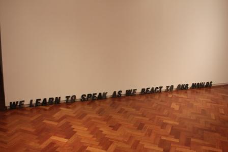
It was interesting how for the most part, those of us who exhibited a work were drawn to the use of a more high frequency pink. This was completely accidental as nobody had discussed the exact tone they would be using in their piece prior to exhibiting. We only realised once all the works were placed in the room. It therefore perfectly demonstrated exactly what we all felt was ‘art pink’. 

IMG_8285

‘Oh Sorry’, Rebecca Gavigan, PVC and highlighter, 2016

We were also all free to choose what we submitted in terms of media, so there was a good range as a result. The mix included installations, video, paintings, drawings, work in situ – there was a bit of everything. Eclectic textures were present too which evoked tactile sensations. Each work had been carefully placed and hung in order to allow the eye to travel across each piece. Placement was key to how the pieces were all viewed and navigated so I found having work on the floor as well as the wall added a dynamism to it all. It was curated in a day and although this was a very brief time period, it was long enough to let me see the thought and process that goes into curating. Something that I currently have little experience of!

IMG_8294

‘No Sexual Connotations Intended’, Samuel Johnson, Timber, mesh voile, gloss, oil and iridescent paint on canvas, 2016

Following this exhibition however I am intrigued by the idea of curating. There’s a responsibility to assembling works effectively; not only to the pieces themselves, but also to the artists who made them. I’ve never done it before but having seen how thoroughly Rebecca considered the hanging of each work, I feel it could be a really exciting thing to try!

IMG_8291

Close up of ‘Rizzo’, Camilla Irvine-Fortescue, Acrylic on canvas, 2016

Jim Lambie at GoMA

DSC00513.JPG

‘Forever Changes’, Jim Lambie

DSC00514

As well as visiting Kelvingrove at the weekend, we also visited the Gallery of Modern Art – or as it’s known in art slang – GoMA. There was an interesting collection of work on display, some that appealed to me, some that did not. The mix included well known art world names such as Karla Black, David Shrigley, Claire Barclay and of course Jim Lambie to name but a few. Yet a name is not everything as I felt some pieces really did not belong or were misplaced within this gallery setting. Particularly when set against the backdrop of another work. Frankly, anything alongside this exciting piece by Lambie took a backseat for me! I have a real thing for colour at the moment. I don’t know if it’s all the Colour Talks I’ve been attending in uni which are led by my friend and course mate, or if it’s just that I haven’t properly painted in so long I’m starting to yearn for physical colour again. Probably a mix of the two.

DSC00516

Either way, the colour and apparent clumsiness of this piece instantly appealed to me. What appears as a cluttered and chaotic arrangement of useless half-chairs, is in fact a highly considered and contemplated arrangement. As Eva Hesse would say, “it’s chaos structured as non-chaos”. It’s almost like something Alice would find in Wonderland. There is no sense of guidance for the eye to travel over, it is merely left to its own devices in registering and comprehending the work.

DSC00515

I thought the mirrored handbags were a fantastic addition to what was already a very exciting work. I have not researched the work, but I wonder if they are a commentary on our commercial and self-absorbed society. After all, women (and men) spend hundreds on an item used simply to carry other items. Then there is the addition of mosaic mirrors which allow us as viewers to view our own reflections. I am simply contemplating here but this was my interpretation of the piece. I may be entirely wrong and be taking far too obvious a reading from it. Either way however, Lambie is an artist I will definitely be looking into more following this absorbing experience!

B. Wurtz at Baltic

DSC00218

Contemporary art is often controversial in it’s reception. Some people love it, some people hate it. Some people think their children could have done it. Other’s say their child didn’t do it and the artist beat them to it! This artwork is the perfect example of that retort. Wurtz’s practice revolves around taking a simple everyday object and turning it into something beautiful. In this case, he used food trays and painted the shapes on the bottom of them in different colours of acrylic. First off, I had never even noticed there were so many shapes to the bases of these trays. Second off, this is genius!

DSC00221

It is such an incredibly simple thing but surprisingly elegant too. Who would have thought food trays could look this good?! And together in this form of display they look absolutely brilliant! Walking into the room I half gasped in amazement. Initially I couldn’t figure out what the objects were, but on closer inspection I was stunned to realise it was merely food trays! 

DSC00219

The way they are all arranged is reminiscent of the way portraits are hung in an old historical castle. They have that sophisticated clustered vibe going on. The colours themselves are very rich and bold, almost like jewels. What Wurtz has succeeded in doing is elevating the most simple commonplace object into an art object. Marcel Duchamp’s urinal here we go again!

DSC00223

I think what’s so lovely about this is though is the air of playfulness! It’s not trying to be anything fancy or anything that it’s not. It is purely an adaption of a simple material that is undergoing a transformation into something more beautiful. It’s almost like Wurst is the fairy godmother to house hold materials! He does it with other bits and pieces such as plastic bags and shoe laces but the one that really caught my eye was what I call his photographic tree:

DSC00215

They are little photographic strips hung delicately in this form. Again, so basic but so clever. The best part about all this is it really shows that you don’t need lots of money to make art. Anyone can do it, it’s just about using your imagination and experimenting to see what happens!

Brian Griffiths: ‘BILL MURRAY: A Story of Distance, Size and Sincerity

DSC00206.JPG

So this was also at Baltic when I visited. I saw it last time I was there but never got round to writing about it. I think this is because I had so many people say to me “have you seen that Bill Murray exhibition at Baltic?” and so by the time I eventually did get round to seeing it, I was already slightly  sick of it! Even after all they’d said, this was not what I  expected! I don’t really know what I was expecting…cardboard cut outs of him maybe? Or some all singing all dancing video installation? Satellite-like installations and little dolls houses were therefore quite a surprise! 

DSC00207

As was the childlike aesthetic which was particularly evident in the painted house piece. The whole exhibition had this childhood nostalgia to it, I think because dolls houses were present. They were lit from the inside and invited you in. They felt very homey in a way but simultaneously distant, as if they were pushing and pulling you into and away from them. Teasing you. Become a part of it or leave it alone? It was quite exciting peeping in not knowing what you’d see. In most cases it was shells from the ocean which I really liked, as they contrasted nicely with the wooden construction of the pieces. 

DSC00212

As well as childhood nostalgia, I also felt there was a certain melancholy to it all. I don’t know if that’s because the space felt so big and silent for these sculptures. Although they are fairly sizable in themselves, they are the smallest structures I’ve ever seen on this floor of the Baltic. The silence just seemed so loud because of this, it was almost eerie. Haunting. Like you weren’t meant to be there but of course that’s a contradiction given it’s a gallery where the sole purpose is to view art.

DSC00210

Most pieces were quite precariously balanced which I think also added to the child-like element. It kind of made me want to get some bits and pieces of my own and start adding to the work! Or bring in some of my own houses to fill out the space and create more liveliness! Bring in one of my old dolls houses. Oooh wow, imagine an exhibition where everyone contributed their old dolls house! In a way it would be kind of creepy. Or maybe that’s just me, sometimes stuff like this freaks me out! 

DSC00211

I wonder what it’s like to be Bill Murray and have an exhibition  focused on you…Must be truly bizarre – that is, if he even knows about it!


Hajra Waheed

P1180427

So I had a wee trip down to The Baltic this afternoon thinking there wouldn’t be anything new on given how often I go. But I fancied a walk and some fresh air before the gym so decided to go anyway. I was pleasantly surprised to be greeted by Hajra Waheed’s exhibition. Waheed’s work explores the increasing militarization of the sky and how satellite surveillance is becoming more commonplace in our everyday. She works in mixed media ranging from collage to video installation. Her works include archive fragments and field notes which bring an interesting dimension to the artwork as it feels so much more intense with those elements in it. To me that is, maybe to science orientated people it’s more of a natural dialect. 

P1180426

I am often fascinated when an artistic practice blends itself with science as that is a theme that differs so greatly from my own. Science and technology are fascinating to me, mostly I think because I have no knowledge about them. To me they are merely the great unknown! Yet strangely in this case I have no urge to make this unknown known, it’s almost as if I prefer it all being a mystery so that I can continue to appreciate it from the outside. Or maybe my brain is already too full with arty stuff, which is probably more accurate if I’m being completely honest!

P1180430

What really struck me about this exhibition was the layout; you could tell how much thought had been put into this aspect. There were divides within the space so that some work was hidden when you first entered, there was a separate room and then a little alcove in the wall. There were waist high plinths and then plinths that were just above ground level – the exhibition really forced your eye to travel and it was fantastic! It felt almost like a journey through the artwork. There was also sound playing across the entirety of the room which I think was the sound of materials scraping against the floor as they were being moved. I may be wrong as it was kind of obscure and difficult to pinpoint but given the satellite material laid out on the low-lying plinth, it did suggest the sounds were depicting the movement of these items. If not then I am intrigued by what the sound was capturing; in a way it is this ambiguity that makes it all the more interesting. 

P1180431

My photographs sadly, do not justify the exhibition. Because I didn’t think there was a new one on, I just chucked my basic little camera into my bag last minute. Speaking to a member of the Baltic crew, he said Waheed is very particular about how her exhibitions are documented given the thought and time she puts into layout. So she would probably hate me right now with these awful snapshots of her work. They do give you an idea however of the space. The artwork itself did not trigger much response from me I think because I was too fascinated by the arrangement of it all. I particularly liked how she’d arranged all her framed works, it had a satisfying regimental quality to it (photo above). 

P1180433

I don’t think I’ve ever witnessed an exhibition where the lighting has made such an impression on me. It was both dramatic and subtle at the same time. There was kind of a blue hue throughout the entire space which created a real sense of calm despite the quite intense subject matter. Waheed grew up on the gated Aramco compound of Saudi Arabia where I myself spent some time when I was growing up. It was interesting looking at her work once I found this out as there are some controversial explorations carried out which I think are heightened by the fact she had lived in Saudi and is not simply an artist observing from the outset. Controversial and highly political and not something I am really wanting to get into given my experiences.

P1180432

On the whole I think this was a very successful exhibition. The artwork itself was not exactly to my taste and doesn’t make me want to run off and research her. However the thought and skilled arrangement of it all does. You can tell this is an artist who thinks about the bigger picture when making artwork and I think that’s really important to being successful in today’s art world. 

Hope Stebbing and Oliver Perry: ‘Your World Tomorrow’

IMG_0518

There have already been some photographs of this exhibition up on my blog, but that was for my post about the preview night. This is more about Hope Stebbing and Oliver Perry’s artwork itself. Given the connotations this work carries through the partnership with the Great North Run and the consequent success of Stebbing and Perry, I feel like I am talking about something huge. Something very impressive to the point that I am going to shy away from all the bravado to instead focus on their work in a gallery setting. My happy place. It was unlike any work I’d previously seen in the University Gallery. Normally it’s more along the lines of Norman Cornish style art. So this felt like a statement. Literally! The words form ‘onward”together”as one’. They are bold and they are solid. Yet what I love is the fragility of the welded stands that hold them up. They look so precarious given the solidity of the structured words.

IMG_0490

I suppose part of what was so interesting about this exhibition was how they used the space. Very effectively in my opinion. As you wander through the exhibition, you are wondering through the words. Almost as if you are a character in a book submerged within your own story. I like how they were centered in the room rather than up against the wall, that would be so boring! The lighting in the gallery did wonders for the work as well. Shadows on the floor, on the walls, within the letters themselves. It just accentuated the artwork beautifully. And of course the colours are to die for, subtle yet exuberant. 

IMG_0483

I liked the contrast the large pastel lettering held with the miniature monochrome lettering. Again it demonstrates an understanding of the space; how important the floor is. A lot of people don’t realise this but the utilisation of the floor not only lay with the Abstract Expressionist artists such as Jackson Pollock, but is was also rooted in Korean traditional art. The Korean artists viewed the floor as superior to the wall in terms of a working space. They never bothered with easels instead choosing simply to kneel whilst they worked. I suppose this was linked to the cultural traditions that included the removal of shoes as a sign of respect upon entering somebody’s house. I will dig up my notes and do a post about it at some point as it is all very beautiful and inspiring to learn about. I stumbled across the traditions of Korean art when I was doing research a while back and coincidentally I had been doing most of my work by kneeling on the floor. It’s funny, but sometimes it really does feel like books speak to you. 

Laurence Kavanagh: ‘October’

IMG_0604

As promised here is the post about Laurence Kavanagh whose work I viewed the other night at Gallery North. I wasn’t sure what to make of it initially. My first observation was the lack of colour. The show was entirely  monochrome with the exception of one piece. As a result it was evident that Kavanagh had truly pushed his monochrome palette to it’s limits, using tonal shades of grey I didn’t even know existed! It made me think of the work of John Virtue (see below).

JV

Virtue’s work is purely black and white as well. In first year I came across him and at the time I was painting colourful landscapes using oil and white spirit. So my work was incredibly liquid based – I was even dabbling in egg tempura. Upon discovering Virtue’s work I decided to remove all colour from mine; something I had never done before. And something I will never do again! It really did feel limiting. Yet at the same time it was incredibly refreshing as it forced me to use far more imagination, particularly in the textural sense. I used pins to poke holes in my paper, impasto paste mixed into my paint, allowed my liquids to become far more volatile and fluid. It was however quite a struggle, especially when you look at how stark and colourless my studio became (see below).

P1180042

So I am actually in relative awe that Kavanagh managed to create an entire exhibition in this colour palette without exploding! He too however turns to texture as a substitute for colour. The way in which he folds his paper is incredibly efffective, not only does it appeal to our tactile senses, but it also creates dramatic shadows given the gallery lighting. 

IMG_0599

I think this image above has to be my favourite piece. The little house is just adorable! The paper folds and creases give it an almost child-like quality which I find very appealing. The frame offsets the piece perfectly. People always debate over the importance of framing saying an artwork should be able to stand whether it’s in a good frame or not. I disagree. I think a frame can make or break an artwork. If my work is framed incorrectly it just pisses me off and I feel like the entire work is lost. Slightly over dramatic I know, but when you envision how an artwork should look and it goes wrong, it’s just irritating. However, Kavanagh doesn’t need to worry because his simple and elegant black frames compliment his work perfectly. 

IMG_0601

The exhibition was aesthetically pleasing in terms of its layout as well. I loved when I walked in and was greeted by an almost cinema screen-like sculpture (top photo). This piece is probably most suggestive of the concepts behind his work. He is exploring the correlation between how we view touch in both the physical and visual sense. Taking the two-dimensional and the three-dimensional and using them as a means to explore the relationship between subject and photographic imagery. 

IMG_0603

I like how there is all of this allusion and suggestion of cinema, yet there is a total absence of moving image work. Instead, you have sculptures reminiscent of cinema projectors occupying floor space. Long shadows, spotlights and rectangular shapes all suggest but nothing confirms the cinematic presence. There is an air of expectation in the room, yet the pieces simply hang still and mysteriously giving nothing away. 

Laurence Kavanagh is a Warwich Stafford Fellow and produced ‘October’ through his research into Star and Shadow Cinema.